Extensions
The RadDiagramRibbon control allows you to easily add one or all of the following RadDiagram and RadRibbonView extensions. This way you can give the user ability to show/hide any of the specified extensions dynamically.
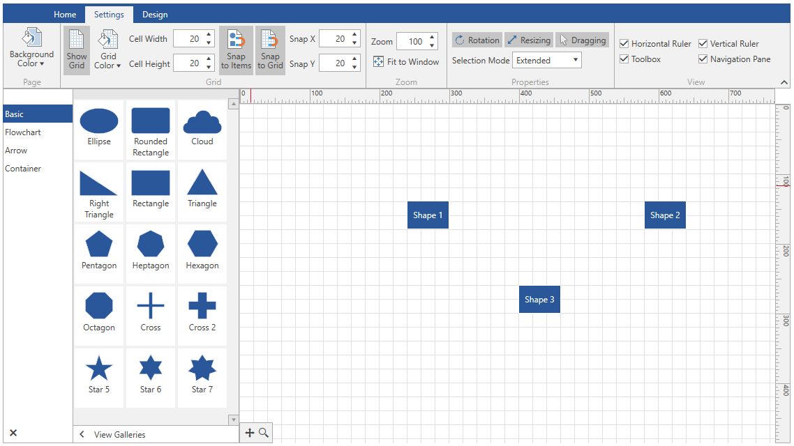
Figure 1: DiagramRibbon Extensions
RadDiagramToolBox
To add a RadDiagramToolbox to the RadDiagramRibbon control, you can bind the ToolBox property to a RadDiagramToolBox using an ElementName binding.
Example 1: Add RadDiagramToolbox to DiagramRibbon
	<Grid>
        <Grid.RowDefinitions>
            <RowDefinition Height="Auto"/>
            <RowDefinition Height="\*"/>
            <RowDefinition Height="Auto"/>
        </Grid.RowDefinitions>
        <Grid.ColumnDefinitions>
            <ColumnDefinition Width="Auto"/>
            <ColumnDefinition Width="\*"/>
        </Grid.ColumnDefinitions>
        <telerik:RadDiagramRibbon Grid.ColumnSpan="2" Diagram="{Binding ElementName=diagram}" Toolbox="{Binding ElementName=toolBox}"/>
        <telerik:RadDiagram x:Name="diagram" Grid.Row="1" Grid.Column="1">
            <telerik:RadDiagramShape Content="Shape 1"/>
        </telerik:RadDiagram>
        <telerik:RadDiagramToolbox x:Name="toolBox" Grid.Column="0" Grid.Row="1" ItemsSource="{Binding GalleryItems}" />
    </Grid>
DiagramNavigationPane
To add a RadDiagramNavigationPane to the RadDiagramRibbon control, you can bind the NavigationPane property to a RadDiagramNavigationPane using an ElementName binding.
Example 2: Add RadDiagramNavigationPane to DiagramRibbon
	<Grid>
        <Grid.RowDefinitions>
            <RowDefinition Height="Auto"/>
            <RowDefinition Height="\*"/>
            <RowDefinition Height="Auto"/>
        </Grid.RowDefinitions>
        <Grid.ColumnDefinitions>
            <ColumnDefinition Width="Auto"/>
            <ColumnDefinition Width="\*"/>
        </Grid.ColumnDefinitions>
        <telerik:RadDiagramRibbon Grid.ColumnSpan="2"
                                  Diagram="{Binding ElementName=diagram}"
                                  NavigationPane="{Binding ElementName=navigationPane}"/>
        <telerik:RadDiagram x:Name="diagram" Grid.Row="1" Grid.Column="1">
            <telerik:RadDiagramShape Content="Shape 1"/>
        </telerik:RadDiagram>
        <telerik:RadDiagramNavigationPane Grid.Column="1" Grid.Row="1" x:Name="navigationPane" Diagram="{Binding ElementName=diagram}" HorizontalAlignment="Left" VerticalAlignment="Bottom" />
    </Grid>
RadDiagramRuler
To add a RadDiagramRuler to the DiagramRibbon the VerticalRuler and HorizontalRuler properties can be bound to RadDiagramRuler instances using an ElementName binding.
Example 3: Add RadDiagramRuler to DiagramRibbon
		<Grid>
			<Grid.RowDefinitions>
				<RowDefinition Height="Auto"/>
				<RowDefinition Height="\*"/>
				<RowDefinition Height="Auto"/>
			</Grid.RowDefinitions>
			<Grid.ColumnDefinitions>
				<ColumnDefinition Width="Auto"/>
				<ColumnDefinition Width="\*"/>
			</Grid.ColumnDefinitions>
			<telerik:RadDiagramRibbon Grid.Column="1"
									  Diagram="{Binding ElementName=diagram}"
									  VerticalRuler="{Binding ElementName=verticalRuler}"
									  HorizontalRuler="{Binding ElementName=horizontalRuler}"/>
			<telerik:RadDiagram x:Name="diagram" Grid.Row="1" Grid.Column="1">
				<telerik:RadDiagramShape Content="Shape 1"/>
			</telerik:RadDiagram>
			<telerik:RadDiagramRuler x:Name="verticalRuler" Placement="Left" Diagram="{Binding ElementName=diagram}" Grid.Row="1" Grid.Column="0"/>
			<telerik:RadDiagramRuler x:Name="horizontalRuler" Placement="Bottom" Diagram="{Binding ElementName=diagram}" Grid.Column="1" Grid.Row="2" Grid.RowSpan="2"/>
		</Grid>
QuickAccessToolBar
To add QuickAccessToolBar to the DiagramRibbon you can bind the QuickAccessToolBar property a QuickAccessToolBar instance using an ElementName binding.
Example 4: Add QuickAccessToolBar to DiagramRibbon
		<Grid>
			<Grid.RowDefinitions>
				<RowDefinition Height="Auto"/>
				<RowDefinition Height="\*"/>
				<RowDefinition Height="Auto"/>
			</Grid.RowDefinitions>
			<Grid.ColumnDefinitions>
				<ColumnDefinition Width="Auto"/>
				<ColumnDefinition Width="*"/>
			</Grid.ColumnDefinitions>
			<telerik:RadDiagramRibbon Grid.Column="1"
									  Diagram="{Binding ElementName=diagram}"
									  QuickAccessToolBarPosition="BelowRibbon">
				<telerik:RadDiagramRibbon.QuickAccessToolBar>
					<telerik:QuickAccessToolBar/>
				</telerik:RadDiagramRibbon.QuickAccessToolBar>
			</telerik:RadDiagramRibbon>
			<telerik:RadDiagram x:Name="diagram" Grid.Row="1" Grid.Column="1">
				<telerik:RadDiagramShape Content="Shape 1"/>
			</telerik:RadDiagram>
		</Grid>
RadRibbonBackstage
To add a Backstage to the DiagramRibbon you can use the Backstage property and declare a RadRibbonBackstage element.
Example 5: Add Backstage to DiagramRibbon
	<Grid x:Name="LayoutRoot">
		<Grid.RowDefinitions>
			<RowDefinition Height="Auto"/>
			<RowDefinition Height="\*"/>
			<RowDefinition Height="Auto"/>
		</Grid.RowDefinitions>
		<telerik:RadDiagramRibbon Diagram="{Binding ElementName=diagram}"
								  BackstageClippingElement="{Binding ElementName=LayoutRoot}">
			<telerik:RadDiagramRibbon.Backstage>
				<telerik:RadRibbonBackstage>
					<telerik:RadRibbonBackstageItem Header="Samples" IsDefault="true">
						<ListBox x:Name="SamplesList" BorderThickness="0" HorizontalAlignment="Center"/>
					</telerik:RadRibbonBackstageItem>
				</telerik:RadRibbonBackstage>
			</telerik:RadDiagramRibbon.Backstage>
		</telerik:RadDiagramRibbon>
		<telerik:RadDiagram x:Name="diagram" Grid.Row="1">
			<telerik:RadDiagramShape Content="Shape 1"/>
		</telerik:RadDiagram>
	</Grid>