Customizing Appearance
You can customize the appearance of the ColorPicker component by using the available API.
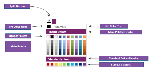
Customizing the Automatic Color
The default automatic color is Black. To change this, set the AutomaticColor property of RadColorPicker.
To change the word "Automatic" shown in the button, set the NoColorText property of RadColorPicker.
<telerik:RadColorPicker NoColorText="Select default" AutomaticColor="Green" />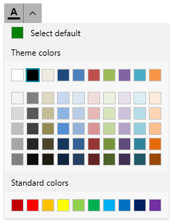
To hide the automatic color button, set the NoColorVisibility property of RadColorPicker.
<telerik:RadColorPicker NoColorVisibility="Collapsed" />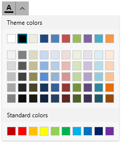
Customizing Palette Headers
To change the palette header text contents, set the MainPaletteHeaderText, StandardPaletteHeaderText and RecentColorsHeaderText properties of RadColorPicker.
	<telerik:RadColorPicker MainPaletteHeaderText="Main Palette"
				StandardPaletteHeaderText="Standard Palette"
				RecentColorsHeaderText="Recent Colors"
				IsRecentColorsActive="true"/>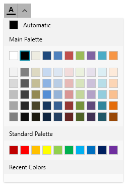
To hide the palettes, use the StandardPaletteVisibility and HeaderPaletteVisibility properties of RadColorPicker. The main palette cannot be hidden. The header palette is the first row with colors shown by default in the main palette.
Customizing the Button
The button of the ColorPicker component is represented by RadSplitButton.
The default visualization of the button content is the letter A with an underline matching the selected color. To replace this with custom content, use the ContentTemplate property of the RadColorPicker.
<telerik:RadColorPicker x:Name="colorPicker" SelectedColor="DeepSkyBlue" IsDropDownOpen="True">
<telerik:RadColorPicker.ContentTemplate>
<DataTemplate>
<TextBlock Text="Ab">
<TextBlock.Foreground>
<SolidColorBrush Color="{Binding ElementName=colorPicker, Path=SelectedColor}"/>
</TextBlock.Foreground>
</TextBlock>
</DataTemplate>
</telerik:RadColorPicker.ContentTemplate>
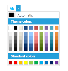
</telerik:RadColorPicker>RadColorPicker with custom button content
To change other properties of the button, use the SplitButtonStyle property of RadColorPicker.
	<telerik:RadColorPicker.SplitButtonStyle>
		<Style TargetType="telerik:RadSplitButton">
			<Setter Property="Foreground" Value="Purple"/>
		</Style>
	</telerik:RadColorPicker.SplitButtonStyle>
Customizing the Color Selector
The content in the drop down of the ColorPicker component is a RadColorSelector control. To change its appearance, set the ColorSelectorStyle property of RadColorPicker.
	<telerik:RadColorPicker.ColorSelectorStyle>
		<Style TargetType="telerik:RadColorSelector">
			<Setter Property="Background" Value="OliveDrab"/>
		</Style>
	</telerik:RadColorPicker.ColorSelectorStyle>