New to Telerik UI for WPF? Start a free 30-day trial
Custom Content
Updated on Sep 15, 2025
RadCircularProgressBar supports setting a complex structure of elements to the ContentTemplate property to represent the value set for the Content property. The Content property is of type object and can hold a value of any type.
Setting the Content and ContentTemplate properties
XAML
    <telerik:RadCircularProgressBar Name="circularProgressBar"
                                    Value="75"
                                    Maximum="100"
                                    Content="{Binding ElementName=circularProgressBar, Path=Value}">
        <telerik:RadCircularProgressBar.ContentTemplate>
            <DataTemplate>
                <StackPanel Orientation="Vertical">
                    <TextBlock Text="{Binding Path=., StringFormat={}{0}%}"
                       TextAlignment="Center"
                       FontSize="16"
                       FontWeight="SemiBold"
                       Foreground="{Binding ElementName=circularProgressBar, Path=IndicatorFill}"/>
                    <TextBlock Text="Completed"
                       FontSize="16"
                       FontWeight="SemiBold"
                       Foreground="{Binding ElementName=circularProgressBar, Path=IndicatorFill}"/>
                </StackPanel>
            </DataTemplate>
        </telerik:RadCircularProgressBar.ContentTemplate>
    </telerik:RadCircularProgressBar>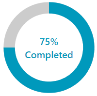
Custom content with indeterminate state
XAML
    <telerik:RadCircularProgressBar Name="circularProgressBar"
                                    Value="75"
                                    Maximum="100"
                                    IsIndeterminate="True"
                                    Content="In Progress">
        <telerik:RadCircularProgressBar.ContentTemplate>
            <DataTemplate>
                <TextBlock Text="{Binding}"
                           FontSize="16"
                           FontWeight="SemiBold"
                           Foreground="{Binding ElementName=circularProgressBar, Path=IndicatorFill}"/>
            </DataTemplate>
        </telerik:RadCircularProgressBar.ContentTemplate>
    </telerik:RadCircularProgressBar>
ContentStringFormat
RadCircularProgressBar allows you to set a string format to the ContentStringFormat property. This format will be applied to the Content property.
Custom ContentStringFormat
XAML
    <telerik:RadCircularProgressBar Name="circularProgressBar"
                                    Value="0.75"
                                    Content="{Binding ElementName=circularProgressBar, Path=Value}"
                                    ContentStringFormat="p2"/>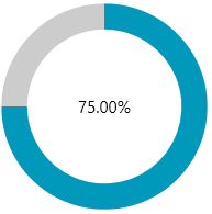
Check this article for more information on the supported formats.