WPF CircularProgressBar Overview
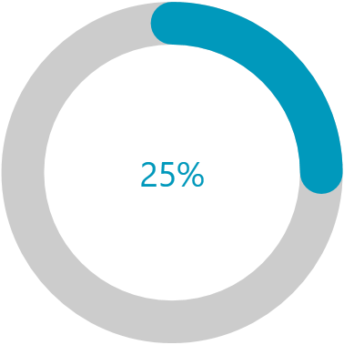
CircularProgressBar is a component that allows you to convey the progress of different tasks in a circular manner.
 Start Free Trial
Get started with the control with its Getting Started help article that shows how to use it in a basic scenario.
Key Features
-
Segments—The CircularProgressBar can be split into numerous segments to indicate its progress.
-
Color Ranges—CircularProgressBar supports defining ranges with different colors. Each range allows you to specify a start and end position, as well as an option to make its fill gradient.
-
Determinate and indeterminate states—The determinate state shows a specific amount of the progress. The indeterminate one plays an animation of the circular progress.
-
Customizable content—CircularProgressBar supports complex implementation for the content of its progress.
-
Radius manipulation—The control allows you to customize the indicator and track inner and outer radiuses.
-
Angles—You can control the beginning and ending angles of the component for a more customized appearance.
-
Secondary progress indicator—CircularProgressBar allows you to visualize an additional progress indicator. This is useful in scenarios where the primary indicator depends on the progress of the secondary one.
-
Indeterminate animation customization—You can modify the played animation when CircularProgressBar is in indeterminate state.
Check out the demos application at demos.telerik.com.
Telerik UI for WPF Support and Learning Resources
- Telerik UI for WPF CircularProgressBar Homepage
- Get Started with the Telerik UI for WPF CircularProgressBar
- Telerik UI for WPF API Reference
- Getting Started with Telerik UI for WPF Components
- Telerik UI for WPF Virtual Classroom (Training Courses for Registered Users)
- Telerik UI for WPF CircularProgressBar Forums
- Telerik UI for WPF Knowledge Base