Indeterminate State Animation Customization
The indeterminate state animation of RadCircularProgressBar is represented by the AnimationManager class. To customize the default animation, create a new RadDoubleAnimation object instance for the AnimationManager.AnimationSelector attached property. To apply the custom animation correctly, set the AnimationName property's value to IndeterminateIndicatorAnimation.
The
TargetElementNameproperty has to be set to PART_IndicatorPath.PropertyNameproperty has to be equal to (UIElement.RenderTransform).(TransformGroup.Children)[2].(RotateTransform.Angle).
Setting a custom RadDoubleAnimation
    <telerik:RadCircularProgressBar Name="circularProgressBar"
                                    IsIndeterminate="True"
                                    IndeterminateIndicatorRatio="0.25">
        <telerik:AnimationManager.AnimationSelector>
            <telerik:AnimationSelector>
                <telerik:RadDoubleAnimation AnimationName="IndeterminateIndicatorAnimation"
                                            Direction="Out"
                                            RepeatBehavior="Forever"
                                            Duration="00:00:01"
                                            StartValue="0"
                                            TargetValue="360"
                                            SpeedRatio="0.3"
                                            TargetElementName="PART_IndicatorPath"
                                            PropertyName="(UIElement.RenderTransform).(TransformGroup.Children)[2].(RotateTransform.Angle)">
                </telerik:RadDoubleAnimation>
            </telerik:AnimationSelector>
        </telerik:AnimationManager.AnimationSelector>
    </telerik:RadCircularProgressBar>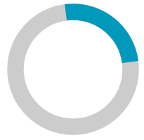
Animation Easing
The RadDoubleAnimation class supports applying animation easing. To do so, set any object that implements the IEasingFunction interface to its Easing property.
The following code snippet shows the above example with a custom BounceEase instance:
Applying a BounceEase animation easing
    <telerik:RadCircularProgressBar Name="circularProgressBar"
                                    IsIndeterminate="True"
                                    IndeterminateIndicatorRatio="0.25">
        <telerik:AnimationManager.AnimationSelector>
            <telerik:AnimationSelector>
                <telerik:RadDoubleAnimation AnimationName="IndeterminateIndicatorAnimation"
                                            Direction="Out"
                                            RepeatBehavior="Forever"
                                            Duration="00:00:01"
                                            StartValue="0"
                                            TargetValue="360"
                                            SpeedRatio="0.3"
                                            TargetElementName="PART_IndicatorPath"
                                            PropertyName="(UIElement.RenderTransform).(TransformGroup.Children)[2].(RotateTransform.Angle)">
                    <telerik:RadDoubleAnimation.Easing>
                        <BounceEase Bounces="25" Bounciness="5" EasingMode="EaseOut"/>
                    </telerik:RadDoubleAnimation.Easing>
                </telerik:RadDoubleAnimation>
            </telerik:AnimationSelector>
        </telerik:AnimationManager.AnimationSelector>
    </telerik:RadCircularProgressBar>