ToolBar Commands
Adding a Command
By default, the ToolBar of RadChat will not be visible. When a ToolBarCommand is added to the ToolBarCommands collection, the ToggleButton for opening the ToolBar will appear next to the Send Button. The ToolBarCommand element exposes the following two properties.
- Text: The text Content that will be set to the generated Button.
- Command: The ICommand that is to be executed when clicking the Button.
Example 1: Defining a sample Command Action
	 private void OnClickCommandExecute(object obj)
        {
            MessageBox.Show("Command executed!");
        }
Example 2: Adding a ToolBarCommand
this.chat.ToolBarCommands.Add(new ToolBarCommand() { Text = "Click", Command = new DelegateCommand(OnClickCommandExecute) });Adding such ToolBarCommand will have the following visual appearance.
Figure 1: Opening the ToolBar

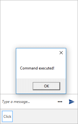
Clicking the generated Button will execute the defined ICommand.
Figure 2: Executing the defined Command

ToolBarCommandTemplateSelector
The Conversational UI supports defining custom DataTemplate for the elements generated in its ToolBar. This is done through the ToolBarCommandTemplateSelector. Its conditional logic can be implemented based on the given ToolBarCommand.
Example 3: Defining a ToolBarCommandTemplateSelector
	public class ToolBarCommandTemplateSelector : DataTemplateSelector
    {
        public override DataTemplate SelectTemplate(object item, DependencyObject container)
        {
            var toolBarCommand = item as ToolBarCommand;
            if (toolBarCommand.Text == "Click")
            {
				return ClickTemplate;
            }
            return base.SelectTemplate(item, container);
        }

        public DataTemplate ClickTemplate { get; set; }

    }
After having the ToolBarCommandTemplateSelector implemented, it can be defined in XAML as follows.
Example 4: Adding the ToolBarCommandTemplateSelector
	<Window.Resources>
        <my:ToolBarCommandTemplateSelector x:Key="ToolBarCommandTemplateSelector">
            <my:ToolBarCommandTemplateSelector.ClickTemplate>
                <DataTemplate>
                    <StackPanel Orientation="Horizontal" >
                        <Image Source="/Images/Hotelresidential.png" Width="70" Height="120"/>
                        <TextBlock Text="{Binding Text}" Margin="5"/>
                    </StackPanel>
                </DataTemplate>
            </my:ToolBarCommandTemplateSelector.ClickTemplate>
        </my:ToolBarCommandTemplateSelector>
    </Window.Resources>
Finally, the ToolBarCommandTemplateSelector can be applied to RadChat.
Example 5: Applying the ToolBarCommandTemplateSelector
<telerik:RadChat x:Name="chat" ToolBarCommandTemplateSelector="{StaticResource ToolBarCommandTemplateSelector}"/>Figure 3: Conversational UI with custom ToolBarCommandTemplateSelector
