Getting Started with WPF Breadcrumb
This tutorial will walk you through the creation of a RadBreadcrumb.
Adding Telerik Assemblies Using NuGet
To use RadBreadcrumb when working with NuGet packages, install the Telerik.Windows.Controls.Navigation.for.Wpf.Xaml package. The package name may vary slightly based on the Telerik dlls set - Xaml or NoXaml
Read more about NuGet installation in the Installing UI for WPF from NuGet Package article.
With the 2025 Q1 release, the Telerik UI for WPF has a new licensing mechanism. You can learn more about it here.
Adding Assembly References Manually
If you are not using NuGet packages, you can add a reference to the following assemblies:
- Telerik.Licensing.Runtime
- Telerik.Windows.Controls
- Telerik.Windows.Controls.Navigation
- Telerik.Windows.Data
You can find the required assemblies for each control from the suite in the Controls Dependencies help article.
Define a Breadcrumb control
Example 1 demonstrates a basic RadBreadcrumb definition.
Example 1: Defining a RadBreadcrumb in XAML
<telerik:RadBreadcrumb x:Name="breadcrumb" Header="Breadcrumb Header" HorizontalAlignment="Stretch" VerticalAlignment="Top"/>Example 2: Defining a RadBreadcrumb in code
	RadBreadcrumb breadcrumb = new RadBreadcrumb();
	breadcrumb.Header = "Breadcrumb Header";
	breadcrumb.HorizontalAlignment = System.Windows.HorizontalAlignment.Stretch;
	breadcrumb.VerticalAlignment = System.Windows.VerticalAlignment.Top;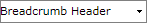
The RadBreacrumb control is a HeaderedItemsControl and its Header is used as a root element. Therefore the control always has one root element. If you don't set the Breadcrumb.Header property an empty root element will be created.
So far there is an empty RadBreadcrumb containing no items.
Add and remove items (RadBreadcrumbItem controls) and set their Header and DropDownHeader properties
You can add items to the RadBreadcrumb control by defining RadBreadcrumbItem controls inside the RadBreadcrumb definition in XAML:
Example 3: Adding RadBreadcrumbItems in XAML
	<telerik:RadBreadcrumb Header="Breadcrumb Header" HorizontalAlignment="Stretch" VerticalAlignment="Top">
	    <telerik:RadBreadcrumbItem Header="BreadcrumbItem 1" DropDownHeader="DropDownItem 1">
	        <telerik:RadBreadcrumbItem Header="BreadcrumbItem 1.1" DropDownHeader="DropDownItem 1.1"/>
	        <telerik:RadBreadcrumbItem Header="BreadcrumbItem 1.2" DropDownHeader="DropDownItem 1.2" />
	        <telerik:RadBreadcrumbItem Header="BreadcrumbItem 1.3" DropDownHeader="DropDownItem 1.3" />
	    </telerik:RadBreadcrumbItem>
	    <telerik:RadBreadcrumbItem Header="BreadcrumbItem 2" DropDownHeader="DropDownItem 2">
	        <telerik:RadBreadcrumbItem Header="BreadcrumbItem 2.1" DropDownHeader="DropDownItem 2.1" />
	        <telerik:RadBreadcrumbItem Header="BreadcrumbItem 2.2" DropDownHeader="DropDownItem 2.2" />
	        <telerik:RadBreadcrumbItem Header="BreadcrumbItem 2.3" DropDownHeader="DropDownItem 2.3" />
	    </telerik:RadBreadcrumbItem>
	    <telerik:RadBreadcrumbItem Header="BreadcrumbItem 3" DropDownHeader="DropDownItem 3" />
	</telerik:RadBreadcrumb>
Or you can populate the RadBreadcrumb.Items collection in code-behind:
Example 4: Adding RadBreadcrumbItems in code
	RadBreadcrumbItem item1 = new RadBreadcrumbItem() { Header = "BreadcrumbItem 1", DropDownHeader = "DropDownItem 1" };
	item1.Items.Add(new RadBreadcrumbItem() { Header = "BreadcrumbItem 1.1", DropDownHeader = "DropDownItem 1.1" });
	item1.Items.Add(new RadBreadcrumbItem() { Header = "BreadcrumbItem 1.2", DropDownHeader = "DropDownItem 1.2" });
	item1.Items.Add(new RadBreadcrumbItem() { Header = "BreadcrumbItem 1.3", DropDownHeader = "DropDownItem 1.3" });
	breadcrumb.Items.Add(item1);
	RadBreadcrumbItem item2 = new RadBreadcrumbItem() { Header = "BreadcrumbItem 2", DropDownHeader = "DropDownItem 2" };
	item2.Items.Add(new RadBreadcrumbItem() { Header = "BreadcrumbItem 2.1", DropDownHeader = "DropDownItem 2.1" });
	item2.Items.Add(new RadBreadcrumbItem() { Header = "BreadcrumbItem 2.2", DropDownHeader = "DropDownItem 2.2" });
	item2.Items.Add(new RadBreadcrumbItem() { Header = "BreadcrumbItem 2.3", DropDownHeader = "DropDownItem 2.3" });
	breadcrumb.Items.Add(item2);
	RadBreadcrumbItem item3 = new RadBreadcrumbItem() { Header = "BreadcrumbItem 3", DropDownHeader = "DropDownItem 3" };
	breadcrumb.Items.Add(item3);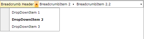
In order to remove items from the RadBreadcrumb control, you can remove them from the control's Items collection:
Example 5: Removing RadBreadcrumbItems
breadcrumb.Items.Remove(item2);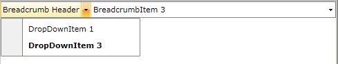
Enable LinearMode
By default the RadBreadcrumb control has two modes - normal and text mode. In the normal mode you can navigate through the Breadcrumb.Items using the BreadcrumbItems and their dropdown content, while in the text mode you can enter the path that you want to navigate to. The control also provides a Linear mode in which the BreadcrumbItem DropDown Items collection is hidden. In Linear mode you can navigate through the Items collection of the control by taking advantage of the text mode of the RadBreadcrumb, using its history, using the key navigation or setting the destination path from code-behind.
In order to enable the Linear mode of the RadBreadcrumb control, you have to set the IsLinearMode property to True :
Example 6: Enabling linear mode in XAML
	<telerik:RadBreadcrumb  Header="Breadcrumb Header" HorizontalAlignment="Stretch"
	        VerticalAlignment="Top" IsLinearMode="True">
	    <telerik:RadBreadcrumbItem Header="BreadcrumbItem 1" DropDownHeader="DropDownItem 1">
	        <telerik:RadBreadcrumbItem Header="BreadcrumbItem 1.1" DropDownHeader="DropDownItem 1.1" />
	        <telerik:RadBreadcrumbItem Header="BreadcrumbItem 1.2" DropDownHeader="DropDownItem 1.2" />
	        <telerik:RadBreadcrumbItem Header="BreadcrumbItem 1.3" DropDownHeader="DropDownItem 1.3" />
	    </telerik:RadBreadcrumbItem>
	    <telerik:RadBreadcrumbItem Header="BreadcrumbItem 2" DropDownHeader="DropDownItem 2">
	        <telerik:RadBreadcrumbItem Header="BreadcrumbItem 2.1" DropDownHeader="DropDownItem 2.1" />
	        <telerik:RadBreadcrumbItem Header="BreadcrumbItem 2.2" DropDownHeader="DropDownItem 2.2" />
	        <telerik:RadBreadcrumbItem Header="BreadcrumbItem 2.3" DropDownHeader="DropDownItem 2.3" />
	    </telerik:RadBreadcrumbItem>
	    <telerik:RadBreadcrumbItem Header="BreadcrumbItem 3" DropDownHeader="DropDownItem 3" />
	</telerik:RadBreadcrumb>
Example 7: Enabling linear mode in code
breadcrumb.IsLinearMode = true;
Change the number of paths saved in the Breadcrumb history
By default the RadBreadcrumb control keeps a history of 10 visited paths. If you want to increase or decrease this number, you can set the HistorySize property:
Example 8: Setting the history size in XAML
	<telerik:RadBreadcrumb Header="Breadcrumb Header" HorizontalAlignment="Stretch"
	        VerticalAlignment="Top" HistorySize="15">
	    ...
	</telerik:RadBreadcrumb>
Example 9: Setting the history size in code
breadcrumb.HistorySize = 15;Setting a Theme
The controls from our suite support different themes. You can see how to apply a theme different than the default one in the Setting a Theme help article.
Changing the theme using implicit styles will affect all controls that have styles defined in the merged resource dictionaries. This is applicable only for the controls in the scope in which the resources are merged.
To change the theme, you can follow the steps below:
-
Choose between the themes and add reference to the corresponding theme assembly (ex: Telerik.Windows.Themes.Fluent.dll). You can see the different themes applied in the Theming examples from our WPF Controls Examples application.
-
Merge the ResourceDictionaries with the namespace required for the controls that you are using from the theme assembly. For the RadBreadcrumb, you will need to merge the following resources:
- Telerik.Windows.Controls
- Telerik.Windows.Controls.Navigation
Example 2 demonstrates how to merge the ResourceDictionaries so that they are applied globally for the entire application.
Example 2: Merge the ResourceDictionaries
	<Application.Resources>
		<ResourceDictionary>
			<ResourceDictionary.MergedDictionaries>
				<ResourceDictionary Source="/Telerik.Windows.Themes.Fluent;component/Themes/System.Windows.xaml"/>
				<ResourceDictionary Source="/Telerik.Windows.Themes.Fluent;component/Themes/Telerik.Windows.Controls.xaml"/>
				<ResourceDictionary Source="/Telerik.Windows.Themes.Fluent;component/Themes/Telerik.Windows.Controls.Navigation.xaml"/>
			</ResourceDictionary.MergedDictionaries>
		</ResourceDictionary>
	</Application.Resources>
Alternatively, you can use the theme of the control via the StyleManager.
Figure 2 shows a RadBreadcrumb with the Fluent theme applied.
Figure 2: RadBreadcrumb with the Fluent theme

Telerik UI for WPF Learning Resources
- Telerik UI for WPF Breadcrumb Component
- Getting Started with Telerik UI for WPF Components
- Telerik UI for WPF Installation
- Telerik UI for WPF and WinForms Integration
- Telerik UI for WPF Visual Studio Templates
- Setting a Theme with Telerik UI for WPF
- Telerik UI for WPF Virtual Classroom (Training Courses for Registered Users)
- Telerik UI for WPF License Agreement