Overview
The RadBreadcrumb and RadBreacrumbItem controls expose a set of properties to allow further customization of their behavior and layout:
RadBreadcrumb Common Properties
-
Header: Gets/sets the root element of the breadcrumb control.
-
CurrentItem: A property of type object, which gets the current destination data item.
-
CurrentContainer: A property of type RadBreadcrumbBarItem, which gets the RadBreadcrumbItem container of the current destination data item.
-
Path: Gets/sets the destination target path.
-
PathSeparator: Gets/sets the path separator symbol.

-
IsLinearMode: A property of type bool, which controls whether the breadcrumb is in linear mode. By default this property is False .
-
IsIconVisible: A property of type bool, which controls whether the icon of the breadcrumb control should be displayed. By default this property is False .
-
IsTextModeEnabled: A property of type bool, which controls whether the text mode of the breadcrumb is enabled. By default this property is True .
-
IsHistoryEnabled: A property of type bool, which specifies whether history of visited paths should be kept. By default this property is True .
Even if the IsHistoryEnabled property is set to False, you can add items to the RadBreadcrumb.HistoryItems collection. You can use this collection to create a set of favorites for example.
RadBreadcrumbItem Common Properties
-
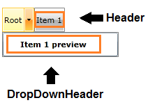
Header: Gets/sets the header of the BreadcrumbItem.
-
DropDownHeader: Gets/sets the header of the RadBreadcrumbItem that is used to visualize the item when displayed inside its parent's dropdown content.
-
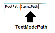
TextModePath: Gets/sets the string representation of the RadBreadcrumbItem in text mode
-
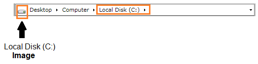
Image: A property of type ImageSource, which allows setting an icon for the item.
Please avoid using the character set as a PathSeparator in the Header of the items, because this can lead to an unexpected behavior when you try to expand a path. Also, keep in mind that the '' character is the default PathSeparator.