Pages
RadWizard contains a collection of WizardPage elements. The pages are Internal (WizardPage), Welcome (WizardWelcomePage), and Completion (WizardCompletionPage).
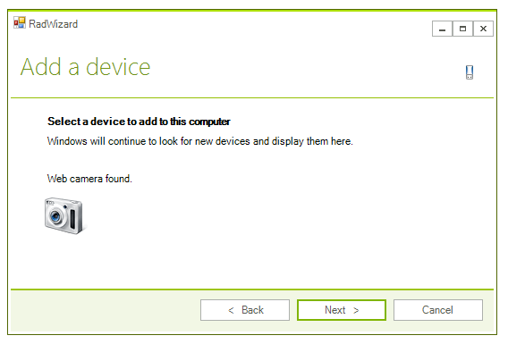
Each wizard page contains a ContentArea which hosts Win Forms controls. Below is an example of a page containing several controls:
You can define the page header’s title and header text by using the Title and Header properties of the page.
RadWizard allows you to customize the elements of its page header. You can use the properties of the control to apply preferences for all pages or use the properties of a page to customize it.
The exposed in RadWizard properties for customization of the page header are:
| Property | Description |
|---|---|
| PageTitleTextVisibility | defines the visibility of the page header's title element. |
| PageHeaderTextVisibility | defines the visibility of the page header's header element. |
| PageHeaderIcon | defines the page header icon. |
| PageHeaderIconAlignment | defines the page header icon alignment. |
The page header customization properties of the page are considered if its CustomizePageHeader property has value true. They have higher priority than the defined in the control. You can use the following properties to customize the page header of a particular page:
| Property | Description |
|---|---|
| TitleVisibility | defines the visibility of the page header's title element for the particular page. |
| HeaderVisibility | defines the visibility of the page header's header element for the particular page. |
| Icon | defines the page header icon for the particular page. |
The WizardWelcomePage and WizardCompletionPage have an image before its ContentArea. These images are defined and customized using similar to the explained above approach.
The exposed in RadWizard properties for customization of the welcome images are:
| Property | Description |
|---|---|
| WelcomeImage | defines the image of the welcome pages. |
| HideWelcomeImage | defines whether the image of the welcome pages should be visible. |
| WelcomeImageLayout | defines the layout of the welcome pages image. |
| WelcomeImageBackgroundShape | defines the background image shape of the welcome pages. It is usually defined in the control theme. |
The welcome page’s WelcomeImage property defines the image for the particular WizardWelcomePage with a higher priority than the RadWizard.WelcomeImage property.
You can use the same set of properties to customize the image of the WizardCompletionPage.