DropDownStyle
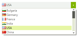
The RadDropDownList.DropDownStyle property determines if the text area at the top of the control can be edited. A setting of DropDown (the default) allows editing and the DropDownList setting shows the text area as read-only.
Figure 1: DropDown
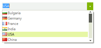
Figure 2: DropDownList
Setting DropDownStyle
this.radDropDownList1.DropDownStyle = Telerik.WinControls.RadDropDownStyle.DropDown;
When RadDropDownList is set to RadDropDownStyle.DropDownList one can control if an image will be displayed in the editor:
Image in Editor
this.radDropDownList1.DropDownStyle = Telerik.WinControls.RadDropDownStyle.DropDownList;
this.radDropDownList1.ShowImageInEditorArea = false;
User Defined Values
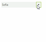
This section describes how user defined values can be added to the data source populating the items in RadDropDownList. For the purpose we are going to bind the control to a BindingList instance and add the newly created item if the Enter key has been pressed.
Figure 3: Adding User Defined Values
Initial Set Up
private BindingList<string> data;

public DropDownListUserDefinedValues()
{
    InitializeComponent();

    this.data = new BindingList<string>();

    this.data.Add("Sofia");
    this.data.Add("New York");
    this.data.Add("Delhi");
    this.data.Add("Tokyo");
    this.data.Add("Berlin");
    this.data.Add("Moscow");
    this.data.Add("Beijing");
    this.data.Add("Bern");
    this.data.Add("Paris");
    this.data.Add("London");

    this.radDropDownList1.DataSource = this.data;
    this.radDropDownList1.KeyUp += radDropDownList1_KeyUp;
}Now we need to handle the event, perform the required checks and update our data source.
Initial Set Up
private void radDropDownList1_KeyUp(object sender, KeyEventArgs e)
{
    string result = this.radDropDownList1.DropDownListElement.Text;
    if (e.KeyCode == Keys.Enter && !this.data.Contains(result))
    {
        this.data.Insert(0, result);
    }

}