Pager Item
Required introduction
When paging functionality is enabled RadPivotGrid renders pager item on bottom and/or on top of the control.
PagerStyle
The appearance of the PagerItem could be fine tuned with the PagerStyle property of RadPivotGrid. In addition to the usual style properties like ForeColor, BackColor, BorderStyle and others, PagerStyle includes a number of options that are unique to the pager item:
Position
PagerStyle.Position property specify where the pager item will be displayed relatively to the RadPivotGrid. The list of possible option is as follows:
-
Top
-
TopAndBottom
-
Bottom

Mode
With the Mode property of the PagerStyle you could control what set of controls to be displayed in the pager item. Possible options are:
-
NextPrev

-
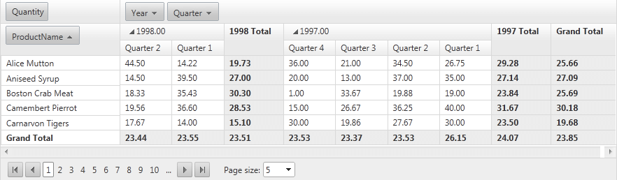
NumericPages

-
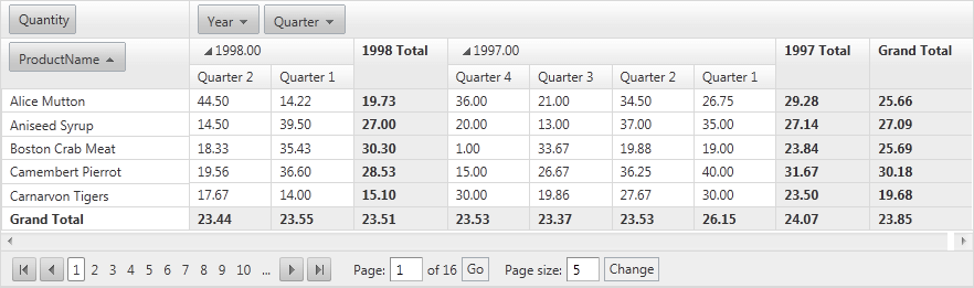
NextPrevAndNumeric
-
NextPrevNumericAndAdvanced
-
Advanced

-
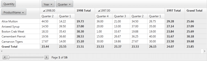
Slider
Appearance
The appearance of the pager in RadPivotGrid could be controlled with the AlwaysVisible property. By default this property has a value of False. When the value is set to True pager item is displayed regardless of the item count.