Fluid and Elastic Capabilities
The RadMonthYearPicker provide elastic and fluid capabilities which allow keeping the control’s component proportion on different mobile devices.
Fluid capability
The fluid capabilities are simply achievable by setting the control’s width in percentages.
Elastic capability
To take advantage elastic functionality advantage you could set a specific font size based on the application target mobile device and follow three simple steps to transform the RadMonthYearPicker control to be elastic:
- By using specific CSS selectors apply "1em" font size for all the Calendar components like this:
<style type="text/css">
    /*Calednar*/ html .RadCalendar,
    /*MonthYearPicker, RadDatePicker FastNavigation Popup*/ html .RadCalendarMonthView,
    /*TimeView Popup*/ html .RadCalendarTimeView,
    /*Input, DateInput*/ html .RadInput, html .riTextBox,
    html .RadPicker {
        font-size: 1em;
    }
</style>- Set the RenderMode property of the Calendar, DatePicker, DateTimePicker, MonthYearPicker controls to "Lightweight"
<telerik:RadMonthYearPicker ID="RadMonthYearPicker2" runat="server" SelectedDate="8.2014" RenderMode="Lightweight" Width="13.3333em" DateInput-Label="Label:">
</telerik:RadMonthYearPicker>-
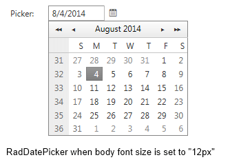
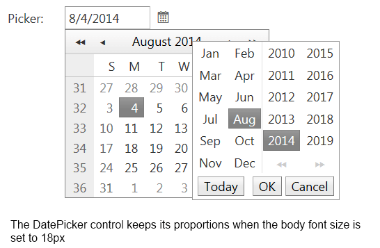
Set the picker components width in "em". In order to keep the default calendar/pickers proportion on mobile devices we would suggest you to set width="13.3333em" as the default width of the components is "160px" and the font-size is originally set to "12px"See the both images bellow that presents the control's elastic capability
- DatePicker control's rendering in case the body font size is set to 12px

- DatePicker control's rendering in case the body font size is set to 18px
