New to Telerik UI for .NET MAUI? Start a free 30-day trial
.NET MAUI Toolbar Visual Structure
Updated on Jan 12, 2026
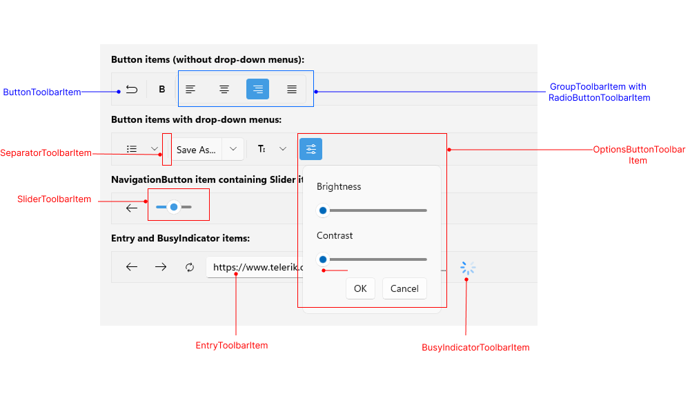
The visual structure of the .NET MAUI Toolbar represents the anatomy of the UI component. Being familiar with the visual elements of the Toolbar allows you to quickly find the information required to configure them.
The following image shows the anatomy of the Toolbar.

Displayed Elements
ButtonToolbarItem—Represents a button in the Toolbar control.ToggleButtonToolbarItem—Represents a toggle button in the Toolbar control.RadioButtonToolbarItem—Represents a radio button in the Toolbar control.EntryToolbarItem—Represents an input field for text entry in the Toolbar control.OptionsButtonToolbarItem—Represents a button displaying an options panel in the RadToolbar control.SliderToolbarItem—Represents a slider in the Toolbar control.ListPickerButtonToolbarItem—Represents a list picker button in the Toolbar control.SeparatorToolbarItem—Represents a separator (which is a UI element) in the Toolbar control.GroupToolbarItem—Organize toolbar items in a group.
All built-in toolbar items are described in the Toolbar Items section.