New to Telerik UI for .NET MAUI? Start a free 30-day trial
.NET MAUI Navigation Buttons Styling
Updated on Oct 24, 2025
The SlideView control exposes styling properties that allow you to customize the Navigation Buttons:
-
NavigateToPreviousItemButtonStyle(Style with target typetelerik:Radbutton)—Defines the custom style that will be applied to the button leading to the previous item. -
NavigateToNextItemButtonStyle(Style with target typetelerik:Radbutton)—Defines the custom style that will be applied to the button leading to the next item.
Example
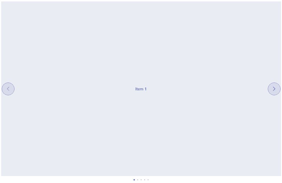
The following example demonstrates how to style the Navigation Buttons of the control.
XAML
<telerik:RadSlideView x:Name="slideView"
                      InteractionMode="Pan"
                      NavigationButtonsVisibility="Visible"
                      NavigateToNextItemButtonStyle="{StaticResource NavigateToNextButtonStyle}"
                      NavigateToPreviousItemButtonStyle="{StaticResource NavigateToPreviousButtonStyle}">
Add Style resources:
XAML
<Style x:Key="NavigateButtonBaseStyle" TargetType="telerik:RadButton">
<Setter Property="FontSize" Value="16" />
<Setter Property="TextColor" Value="#3341A1" />
<Setter Property="BackgroundColor" Value="#1A3341A1" />
<Setter Property="BorderColor" Value="#B33341A1" />
<Setter Property="BorderThickness" Value="1" />
<Setter Property="WidthRequest" Value="{OnPlatform Default=44, MacCatalyst=32}" />
<Setter Property="HeightRequest" Value="{OnPlatform Default=44, MacCatalyst=32}" />
<Setter Property="CornerRadius" Value="{OnPlatform Default=22, MacCatalyst=16}" />
</Style>
<Style x:Key="NavigateToNextButtonStyle" TargetType="telerik:RadButton" BasedOn="{StaticResource NavigateButtonBaseStyle}">
<Setter Property="Text" Value="" />
</Style>
<Style x:Key="NavigateToPreviousButtonStyle" TargetType="telerik:RadButton" BasedOn="{StaticResource NavigateButtonBaseStyle}">
<Setter Property="Text" Value="" />
</Style>And the result below:
For a runnable example with the SlideView Navigation Buttons Styling scenario, see the SDKBrowser Demo Application and go to SlideView > Styling.