New to Telerik UI for .NET MAUI? Start a free 30-day trial
.NET MAUI MaskedEntry Styling
Updated on Jun 25, 2026
The MaskedEntry control delivers a set of options for styling its appearance.
The MaskedEntryBase class exposes the following properties, which are valid for all mask types.:
TextColor(Microsoft.Maui.Graphics)—Defines the color of the text inside the MaskedEntry.FontFamily(string)—Defines the font family of the text inside the MaskedEntry.FontSize(double)—Defines the font size of the text inside the MaskedEntry.EntryCornerRadius(Microsoft.Maui)—Defines the corner radius around the MaskedEntry.EntryBackgroundColor(Microsoft.Maui.Graphics)—Defines the background color of the MaskedEntry.BackgroundColor(Microsoft.Maui.Graphics)—Defines the background color of the masked control.ClearButtonVisibility(Telerik.Maui.Controls.ClearButtonVisibility)—Defines when the clear button is displayed. The default value isWhileEditing.ClearButtonStyle(Stylewith target typeTelerik.Maui.Controls.RadTemplatedButton)—Defines the style of the clear button.
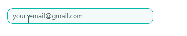
The following example demonstrates how to style the EmailMaskedEntry.
1. Define the control in XAML:
XAML
<telerik:RadEmailMaskedEntry x:Name="emailMaskedEntry"
                             Placeholder="your_email@gmail.com"
                             TextColor="#00897B"
                             EntryBackgroundColor="#F4FAF9"
                             EntryCornerRadius="10"
                             ClearButtonStyle="{StaticResource CustomClearButtonStyle}"
                             AutomationId="emailMask">
    <telerik:RadEmailMaskedEntry.Resources>
        <Style TargetType="telerik:RadEntry">
            <Setter Property="BorderBrush" Value="#00897B" />
            <Setter Property="BorderThickness" Value="1" />
            <Setter Property="VisualStateManager.VisualStateGroups">
                <VisualStateGroupList>
                    <VisualStateGroup Name="CommonStates">
                        <VisualState Name="Normal" />
                        <!-- Applicable for Desktop only -->
                        <VisualState Name="MouseOver">
                            <VisualState.Setters>
                                <Setter Property="telerik:RadEntry.BorderBrush" Value="#00BCA9" />
                            </VisualState.Setters>
                        </VisualState>
                        <VisualState Name="Focused">
                            <VisualState.Setters>
                                <Setter Property="telerik:RadEntry.BackgroundColor" Value="#FFFFFF" />
                                <Setter Property="telerik:RadEntry.BorderBrush" Value="#00BCA9" />
                            </VisualState.Setters>
                        </VisualState>
                        <VisualState Name="Invalid">
                            <VisualState.Setters>
                                <Setter Property="telerik:RadEntry.BorderBrush" Value="#A30111" />
                            </VisualState.Setters>
                        </VisualState>
                        <!-- Applicable for Desktop only -->
                        <VisualState Name="InvalidMouseOver">
                            <VisualState.Setters>
                                <Setter Property="telerik:RadEntry.BorderBrush" Value="#B53340" />
                            </VisualState.Setters>
                        </VisualState>
                        <VisualState Name="InvalidFocused">
                            <VisualState.Setters>
                                <Setter Property="telerik:RadEntry.BackgroundColor" Value="#FFFFFF" />
                                <Setter Property="telerik:RadEntry.BorderBrush" Value="#C76670" />
                            </VisualState.Setters>
                        </VisualState>
                        <VisualState Name="ReadOnly">
                            <VisualState.Setters>
                                <Setter Property="telerik:RadEntry.BackgroundColor" Value="#E5F6F6F6" />
                                <Setter Property="telerik:RadEntry.BorderBrush" Value="#EBEBEB" />
                            </VisualState.Setters>
                        </VisualState>
                        <!-- Applicable for Desktop only -->
                        <VisualState Name="ReadOnlyMouseOver">
                            <VisualState.Setters>
                                <Setter Property="telerik:RadEntry.BackgroundColor" Value="#B2F9F9F9" />
                                <Setter Property="telerik:RadEntry.BorderBrush" Value="#EBEBEB" />
                            </VisualState.Setters>
                        </VisualState>
                        <VisualState Name="ReadOnlyFocused">
                            <VisualState.Setters>
                                <Setter Property="telerik:RadEntry.BackgroundColor" Value="#FFFFFF" />
                                <Setter Property="telerik:RadEntry.BorderBrush" Value="#00BCA9" />
                            </VisualState.Setters>
                        </VisualState>
                        <VisualState Name="ReadOnlyInvalid">
                            <VisualState.Setters>
                                <Setter Property="telerik:RadEntry.BackgroundColor" Value="#E5F6F6F6" />
                                <Setter Property="telerik:RadEntry.BorderBrush" Value="#A30111" />
                            </VisualState.Setters>
                        </VisualState>
                        <!-- Applicable for Desktop only -->
                        <VisualState Name="ReadOnlyInvalidMouseOver">
                            <VisualState.Setters>
                                <Setter Property="telerik:RadEntry.BackgroundColor" Value="#B2F9F9F9" />
                                <Setter Property="telerik:RadEntry.BorderBrush" Value="#A30111" />
                            </VisualState.Setters>
                        </VisualState>
                        <VisualState Name="ReadOnlyInvalidFocused">
                            <VisualState.Setters>
                                <Setter Property="telerik:RadEntry.BackgroundColor" Value="#E5F6F6F6" />
                                <Setter Property="telerik:RadEntry.BorderBrush" Value="#C76670" />
                            </VisualState.Setters>
                        </VisualState>
                        <VisualState Name="Disabled">
                            <VisualState.Setters>
                                <Setter Property="Opacity" Value="0.6" />
                            </VisualState.Setters>
                        </VisualState>
                    </VisualStateGroup>
                </VisualStateGroupList>
            </Setter>
        </Style>
    </telerik:RadEmailMaskedEntry.Resources>
</telerik:RadEmailMaskedEntry>
2. Define the resource for the ClearButtonStyle to the page's resource:
XAML
<Style x:Key="CustomClearButtonStyle" TargetType="telerik:RadTemplatedButton">
    <Setter Property="TextColor" Value="#A30111" />
    <Setter Property="VisualStateManager.VisualStateGroups">
        <VisualStateGroupList>
            <VisualStateGroup Name="CommonStates">
                <VisualState Name="Normal" />
                <!-- Applicable for Desktop only -->
                <VisualState Name="MouseOver">
                    <VisualState.Setters>
                        <Setter Property="telerik:RadTemplatedButton.TextColor" Value="#B53340" />
                    </VisualState.Setters>
                </VisualState>
                <VisualState Name="Pressed">
                    <VisualState.Setters>
                        <Setter Property="telerik:RadTemplatedButton.TextColor" Value="#C76670" />
                    </VisualState.Setters>
                </VisualState>
                <VisualState Name="Disabled" />
            </VisualStateGroup>
        </VisualStateGroupList>
    </Setter>
</Style>
3. Add the telerik namespace:
XAML
xmlns:telerik="clr-namespace:Telerik.Maui.Controls;assembly=Telerik.Maui.Controls"This is the result on WinUI:
For the MaskedEntry Styling example, go to the SDKBrowser Demo Application and navigate to the MaskedEntry > Features category.