New to Telerik UI for .NET MAUI? Start a free 30-day trial
.NET MAUI ListPicker Visual Structure
Updated on Jan 12, 2026
The visual structure of the .NET MAUI ListPicker represents the anatomy of the UI control. Being familiar with the visual elements of the ListPicker allows you to quickly find the information required to configure them.
The images in this article show the anatomy of the ListPicker and its building blocks.
ListPicker Structure

- Placeholder—The text visualized before picking an item from the list of items. A placeholder can be customized through the
PlaceholderTemplateproperty.
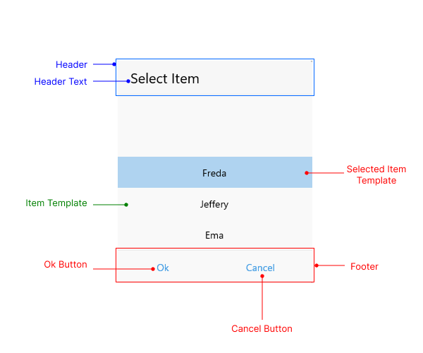
Popup Visual Structure

- Header—The text displayed in the popup header. You can set a direct text through the
HeaderLabelTextproperty or customize the popup header by using theHeaderTemplateproperty. - Header Text—The text that is visualized in the header of the popup.
- Item Template—Defines the template used for displaying the list of items. For more information review the Templates article.
- Selected ItemTemplate—Specifies the template used for visualizing the selected item from the list. For more information review the Templates article.
- Footer—The footer of the popup. By default, it contains the OK and Cancel buttons. You can customize it through the
FooterTemplateproperty. For more information, review the Templates article.