New to Telerik UI for .NET MAUI? Start a free 30-day trial
.NET MAUI ListPicker Templates
Updated over 1 year ago
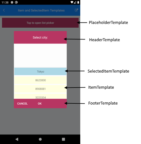
The ListPicker for .NET MAUI provides the following templates:
ItemTemplate(DataTemplate)—Defines the template used for displaying the list of items.SelectedItemTemplate(DataTemplate)—Specifies the template used for visualizing the selected item from the list.PlaceholderTemplate(ControlTemplate)—Defines the template visualized for the placeholder.DisplayTemplate(ControlTemplate)—Defines the template visualized when an item from the list is selected.
Using SelectorSettings property (of type Telerik.Maui.Controls.PickerPopupSelectorSettings) you can define the following templates:
HeaderTemplate(ControlTemplate)—Defines what will be displayed inside the dialog(popup) header.FooterTemplate(ControlTemplate)—Defines what will be displayed inside the dialog(popup) footer.
This is the Visual Structure of the ListPicker templates:
In addition, the ListPicker for .NET MAUI provides the following properties:
ItemsSource(IList)—Specifies the collection used to generate the content of the list picker.ItemLength(double)—Defines the length of the items inside the list.ItemSpacing(double)—Defines the spacing between the items inside the list.SelectedItem(object)—Specifies the selected item of the list pickerDisplayMemberPath(string)—Defines the path of the property which is to be displayed asDisplayString.
Example
The following example demonstrates how to define a sample ListPicker:
XAML
<telerik:RadListPicker PlaceholderTemplate="{StaticResource placeholderTemplate}"
                       ItemTemplate="{StaticResource itemTemplate}"
                       SelectedItemTemplate="{StaticResource selectedItemTemplate}"
                       ItemLength="40"
                       ItemSpacing="4"
                       ItemsSource="{Binding Items}"
                       DisplayMemberPath="Name"
                       x:Name="listPicker"
                       AutomationId="listPicker">
    <telerik:RadListPicker.BindingContext>
        <local:CitiesViewModel/>
    </telerik:RadListPicker.BindingContext>
    <telerik:RadListPicker.PopupSettings>
        <telerik:PickerPopupSettings HeaderTemplate="{StaticResource headerTemplate}"
                                     FooterTemplate="{StaticResource footerTemplate}"/>
    </telerik:RadListPicker.PopupSettings>
    <telerik:RadListPicker.DropDownSettings>
        <telerik:PickerDropDownSettings FooterTemplate="{StaticResource footerTemplate}"/>
    </telerik:RadListPicker.DropDownSettings>
</telerik:RadListPicker>
Define the templates in the page resources:
Item Template
XAML
<DataTemplate x:Key="itemTemplate">
    <Label Text="{Binding Population}"
           BackgroundColor="LightYellow"
           HorizontalTextAlignment="Center"
           VerticalTextAlignment="Center"/>
</DataTemplate>
Template for the Selected Item
XAML
<DataTemplate x:Key="selectedItemTemplate">
    <Label Text="{Binding Name}"
           BackgroundColor="LightBlue"
           HorizontalTextAlignment="Center"
           VerticalTextAlignment="Center"/>
</DataTemplate>
Placeholder Template
XAML
<ControlTemplate x:Key="placeholderTemplate">
    <Grid>
        <Button Text="Tap to open list picker"
               FontAttributes="Bold"
               TextColor="White"
               BackgroundColor="#B73562"
               Padding="20"
               Command="{TemplateBinding ToggleCommand}" />
    </Grid>
</ControlTemplate>
Display Template
XAML
<ControlTemplate x:Key="displayTemplate">
	<StackLayout>
		<Label Text="This is the DisplayTemplate of the ListPicker" FontSize="10"/>
		<Label Text="{TemplateBinding DisplayString}" TextColor="Black" FontSize="15" Grid.Row="1" VerticalTextAlignment="Center"/>
		<StackLayout.GestureRecognizers>
			<TapGestureRecognizer Command="{TemplateBinding ToggleCommand}" />
		</StackLayout.GestureRecognizers>
	</StackLayout>
</ControlTemplate>
Header Template
XAML
<ControlTemplate x:Key="headerTemplate">
    <Grid>
        <Label Text="Select city:"
               TextColor="White"
               Padding="20"
               FontSize="16"
               VerticalTextAlignment="Center"
               HorizontalTextAlignment="Center"
               BackgroundColor="#B73562"/>
    </Grid>
</ControlTemplate>
Footer Template
XAML
<ControlTemplate x:Key="footerTemplate">
    <StackLayout Orientation="Horizontal" Spacing="0" HorizontalOptions="FillAndExpand" BackgroundColor="#B73562">
        <telerik:RadButton Text="Cancel"
                           WidthRequest="80"
                           TextColor="White"
                           BackgroundColor="Transparent"
                           Command="{TemplateBinding CancelCommand}" />
        <telerik:RadButton Text="OK"
                           WidthRequest="80"
                           TextColor="White"
                           BackgroundColor="Transparent"
                           Command="{TemplateBinding AcceptCommand}" />
    </StackLayout>
</ControlTemplate>
Set a sample business model:
C#
public class City
{
    public string Name { get; set; }
    public int Population { get; set; }
}
Define the ViewModel:
C#
public class CitiesViewModel
{
    public CitiesViewModel()
    {
        this.Items = new ObservableCollection<City>
        {
            new City { Name = "Tokyo", Population = 13929286 },
            new City { Name = "New York", Population = 8623000 },
            new City { Name = "London", Population = 8908081 },
            new City { Name = "Madrid", Population = 3223334 },
            new City { Name = "Los Angeles", Population = 4000000},
            new City { Name = "Paris", Population = 2141000 },
            new City { Name = "Beijing", Population = 21540000 },
            new City { Name = "Singapore", Population = 5612000 },
            new City { Name = "New Delhi", Population = 18980000 },
            new City { Name = "Bangkok", Population = 8305218 },
            new City { Name = "Berlin", Population = 3748000 },
        };
    }

    public ObservableCollection<City> Items { get; set; }
}
Add the following namespace:
XAML
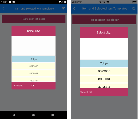
xmlns:telerik="http://schemas.telerik.com/2022/xaml/maui"The following image shows the end result:
For a sample templates example, refer to the ListPicker/Templates folder of the Telerik UI for .NET MAUI SDKBrowser Application.