.NET MAUI ListPicker Modes
The ListPicker for .NET MAUI exposes PickerMode property of Telerik.Maui.Controls.PickerMode type which have two options for setting in the following values:
Popup—Shows the UI for picking a date inside a popup. It's the default value for mobile (Android and iOS);DropDown—Opens the UI for picking a date inside a dropdown. It's the default value for Desktop (Windows, macOS);
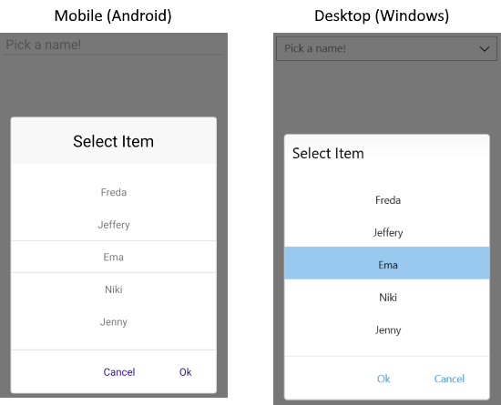
Here is a sample of PickerMode set to Popup:
<telerik:RadListPicker PickerMode="Popup" />Check below the result on mobile and desktop:

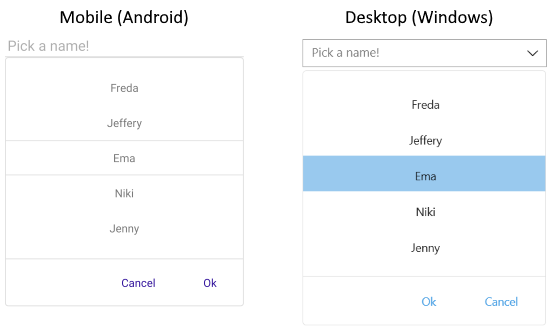
Quick example of PickerMode set to DropDown:
<telerik:RadListPicker PickerMode="DropDown" />Check the result of DropDown mode on mobile and desktop:

Go to Getting Started topic for the complete example with the ListPicker control.
Toggle Button
In addition, ListPicker exposes IsToggleButtonVisible property which when set to True renders an "arrow" button for opening the UI for picking a date. By default, IsToggleButtonVisible is enabled for Desktop together with the DropDown picker mode, and is disabled for mobile platforms. You can explicitly apply it in both cases:
<telerik:RadListPicker PickerMode="DropDown"
							IsToggleButtonVisible="True" />