New to Telerik UI for .NET MAUI? Start a free 30-day trial
.NET MAUI DataGrid BooleanColumn
Updated on Mar 26, 2026
The DataGridBooleanColumn is used to represent boolean values. It uses the CheckBox control to edit its values in EditMode.
Important Properties
PropertyName—Specifies the name of the property of the object type that represents each row within the grid.DataMemberBinding—Defines the binding which points to the data member of the underlying object being displayed in the column's cell.HeaderText—Defines the content that will be displayed in the Header UI that represents the column.CellContentStyle(DataGridTextCellStyle)—Defines the appearance of each cell associated with this column.CellContentStyleSelector—Defines theStyleSelectorinstance that allows for the dynamic appearance on a per-cell basis.CellContentFormat—Defines the custom format for each cell value. TheString.Formatroutine is used and the format passed has to be in the form required by this method.CellContentTemplate(DataTemplate)—Defines the appearance of each cell associated with the concrete column. TheCellContentTemplateenables you to customize the default content of the cell.CellContentTemplateSelector(DataTemplateSelector)—Defines aDataTemplateSelectorinstance that may be used to retrieve dynamic data templates on a per-cell basis.CellEditTemplate(DataTemplate)—Defines the editor associated with the concrete column. TheCellEditTemplateis displayed when the cell is in edit mode.FooterText—Defines the content that will be displayed in the Footer UI that represents the column.FooterStyle(DataGridColumnFooterStyle)—Defines theStyleobject that sets the appearance of each footer cell associated with this column.FooterContentTemplate(DataTemplate)—Defines the appearance of the footer.IsResizable(bool)—Specifies whether the user can resize the DataGrid Column. The default value isTrue.This is only supported inWinUIandMacCatalyst.IsFrozen(bool)—Specifies whether the column is frozen. The default value isFalse.DataGrid(RadDataGrid)—Gets the correspondingRadDataGridcontrol.
For more information about
CellContentStyleandCellDecorationStylerefer to the Columns Styling topic.For
CellContentStyleSelectorandCellDecorationStyleSelector, refer to the Style Selectors topic.
CellContentFormatuses the format string provided by the framework. For more details, refer to theString.Formatarticle.
XAML
<telerik:DataGridBooleanColumn PropertyName="IsChampion"
                               HeaderText="Champion?" />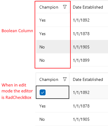
Example with CellContentTemplate and CellEditTemplate
XAML
<telerik:DataGridBooleanColumn PropertyName="IsChampion"
							   HeaderText="Champion?">
	<telerik:DataGridColumn.CellContentTemplate>
		<DataTemplate>
			<Label Text="{Binding IsChampion}"/>
		</DataTemplate>
	</telerik:DataGridColumn.CellContentTemplate>
	<telerik:DataGridColumn.CellEditTemplate>
		<DataTemplate>
			<Switch IsToggled="{Binding IsChampion}"
					VerticalOptions="Center"/>
		</DataTemplate>
	</telerik:DataGridColumn.CellEditTemplate>
</telerik:DataGridBooleanColumn>