.NET MAUI Accordion Overview
Updated over 1 year ago
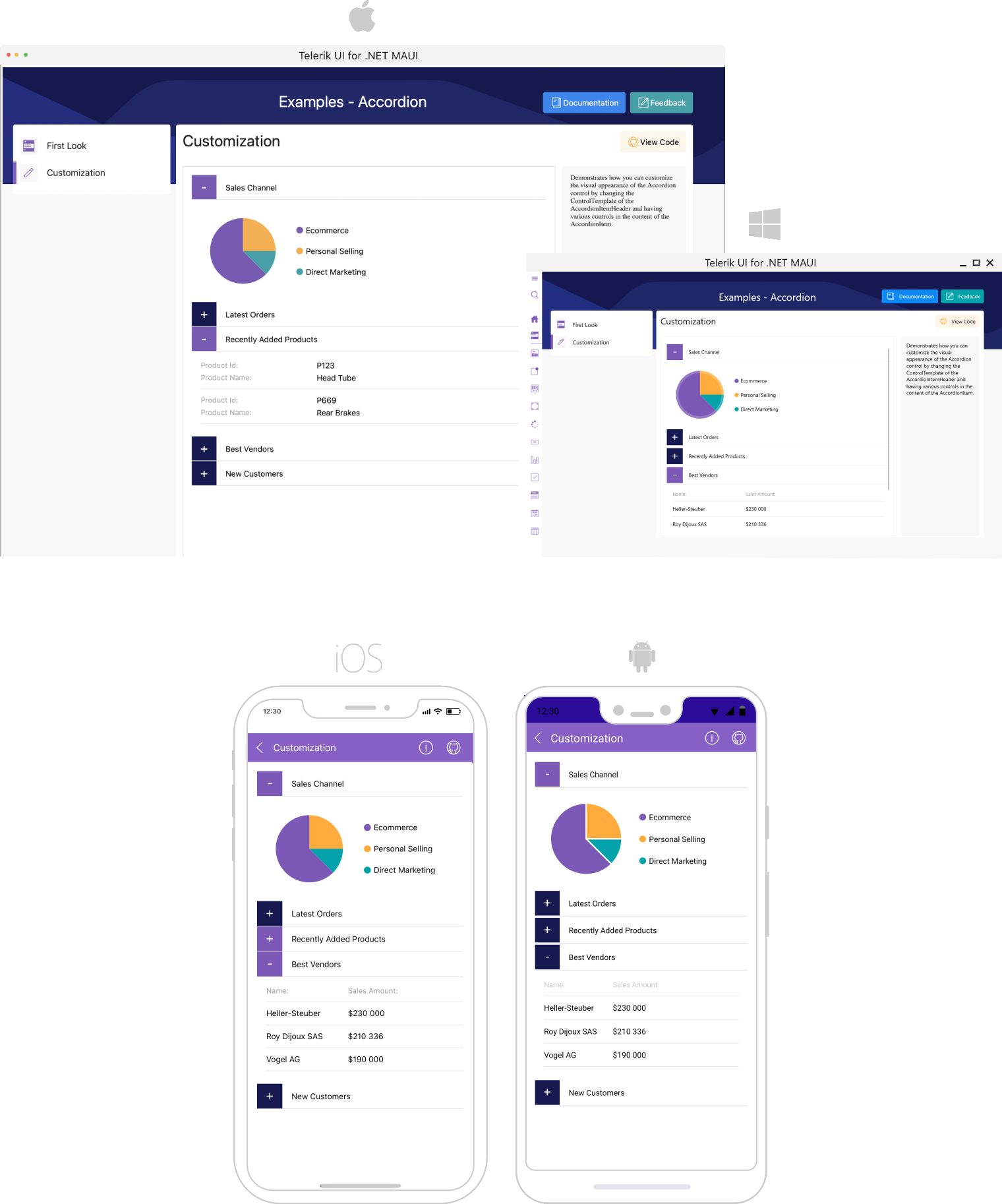
The Telerik UI for .NET MAUI Accordion is a vertically collapsible content panel that displays only one of its items at a time within the available space. RadAccordion helps you save screen space and at the same time present the content to the end user in an accessible way.
 Start Free Trial
Key Features of the .NET MAUI Accordion
- Collapsed/expanded states—Accordion consists of AccordionItems that can present any content. The end users can show or hide this content by interacting with the headers of the control.
- Collapse All Items—You can allow the app users to collapse the Accordion through the
CanCollapseAllItemsBoolean property. - Option for expanding multiple items.
- Customizable items—You have full control over the visual appearance of the Accordion items - you can customize the border style of each item, the border style of items' headers, as well as the indicator text, font, size, location and color.
- Animation while expanding/collapsing—RadAccordion provides slick customizable animation played while the expandable content is expanded/collapsed.
- Applying space between Accordion items.