or
1 answer
160 views
hi,
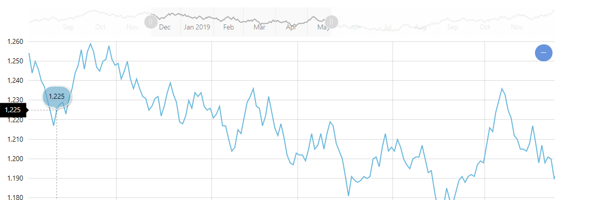
How can I have a scroll map above the RadCartesianChart where I can show the area currently view in the graph as in the image attched?
Thank you
Luigi
How can I have a scroll map above the RadCartesianChart where I can show the area currently view in the graph as in the image attched?
Thank you
Luigi

Martin Ivanov
Telerik team

answered
on
05 May 2021
1 answer
513 views
Is it possible to set an background image for a RadCartesianChart.
Or change the stroke fill color depending on the value at the point?
<telerik:LineSeries.StrokeShapeStyle>
   <Style TargetType="Path">
        <Setter Property="Fill" Value="Red"></Setter>
   </Style>
</telerik:LineSeries.StrokeShapeStyle>1 answer
103 views
hello,
How can i show the percent in the pie slice, and show the DataItem.Category outside the pice slice. But Now the Percent display outside the pice slice as the DataItem.Category.
Thans!
<telerik:PieSeries.LabelDefinitions>
<telerik:ChartSeriesLabelDefinition Margin="-4 0 0 0">
<telerik:ChartSeriesLabelDefinition.Template>
<DataTemplate>
<StackPanel>
<TextBlock Text="{Binding DataItem.Category}" HorizontalAlignment="Center" FontSize="14"/>
<TextBlock Text="{Binding Percent, StringFormat=\{0:N\} %}" FontSize="14"/>
</StackPanel>
</DataTemplate>
</telerik:ChartSeriesLabelDefinition.Template>
</telerik:ChartSeriesLabelDefinition>
</telerik:PieSeries.LabelDefinitions>
Martin Ivanov
Telerik team
answered
on
05 May 2021
5 answers
244 views
Hello.
When using the tooltip content separately, the namespace is shown together.
<telerik:RadButton Height="30" Width="30" telerik:RadToolTipService.Placement="Mouse" telerik:RadToolTipService.ShowDuration="5000"> <telerik:RadButton.Content> <TextBlock Text="" FontFamily="Segoe MDL2 Assets"/> </telerik:RadButton.Content> <telerik:RadToolTipService.ToolTipContent> <telerik:RadToolTipContentView > <TextBlock Text="ToolTip Name"/> </telerik:RadToolTipContentView> </telerik:RadToolTipService.ToolTipContent></telerik:RadButton>
If I use telerik:RadToolTipService.ToolTipContent="Content" it looks correct.
However, the above source was selected because it should be different from the button font setting.
When telerik:RadToolTipContentView is deleted, only other namespaces are shown, textblock content is not.
Please check.
Thanks.
Martin Ivanov
Telerik team
answered
on
05 May 2021
11 answers
189 views
Hello,
Look at the included screenshots. As you can see, when the end of an attribute is outside the current view, the value is in black, not in blue. When the view is scrolled horizontally, it suddenly becomes blue, when the scroll returns to the left, it becomes black again!

Petar Mladenov
Telerik team
answered
on
05 May 2021
1 answer
263 views
I set a global textblock style in app.xaml in order to styling text in dialog:
<Style TargetType="TextBlock" x:Key="{x:Type TextBlock}">
<Setter Property="Width" Value="100"/>
<Setter Property="Margin" Value="5"/>
<Setter Property="VerticalAlignment" Value="Center"/>
<Setter Property="t:StyleManager.Theme" Value="{StaticResource GlobalTheme}"/>
</Style>
But when I run the application I saw that the width property affect the space left for the menu item in toolbar:
This is the appearance without textblock style:
How can I use the style without change the Menu?
Thank you
Luigi
1 answer
263 views
I am using using Drag and Drop to reorder in a List Box, using the example from the ListBox documentation if I drag outside of the List box the dragged item is deleted from the list box. Any way I can stop this from happening???
Martin Ivanov
Telerik team
answered
on
04 May 2021
5 answers
1.1K+ views
Hello.
I am using Revit API as well, so it seems to have a problem. (For similar issues, I will ask elsewhere.)
The xaml designer keeps crashing.
I am using the variable name like Rooms in the xaml source.
<telerik:RadGridView ItemsSource="{Binding Rooms}"/>
This is where the xaml designer exception is thrown.
ArgumentException: 'RadGlyphExtension' is not valid for Setter.Value. The only supported MarkupExtension types are DynamicResourceExtension and BindingBase or derived types.
I don't use glyph. I don't know if this is only the 'Rooms' variable, but there are other exception errors as well.
It succeeds on build, it starts up and works fine until results.
The controller is difficult to place as the error only occurs in the designer.
Why is that so? Could I ask for confirmation?
Thanks

Psyduck
Top achievements
 Rank 5
 Bronze
 Bronze
 Bronze
Rank 5
Bronze
Bronze
Bronze
answered
on
04 May 2021
1 answer
128 views
Hi,
Are there any best practices in order to develop a web application (with kendo for instance) and a wpf application (with UI for WPF) with very similar appearance and user experience?
Thank you
Martin Ivanov
Telerik team
answered
on
04 May 2021
1 answer
394 views
Hi Team,
We want to show the battery status for laptop users in our application designed using Telerik in MVVM pattern using PRISM framework. We want to show the ICON with gauge showing current status of Battery very similar to thermometer design present in Telerik sample application.
We are able to design the Battery similar to mobile application using Viewbox and Borders in WPF. We are not able to implement it in the Telerik RadVerticalLinearScale Custom Items. We want to define the battery status with 3 ranges in which one will be red indicating action required, one will be yellow representing warning and one will be green indicating normal state. Kindly help us design it using RadVerticalLinearGauge.
Below is the code we tried but it is not working. If you have any other way then please help we also tried like thermometer code but we are not able to design the battery as shown in image.
<telerik:RadVerticalLinearGauge Grid.Row="3" Grid.Column="0" Grid.RowSpan="4"><br> <telerik:VerticalLinearScale Min="0" Max="100" MajorTicks="4" RangeLocation="Inside" IsInteractive="True"><br> <telerik:VerticalLinearScale.Ranges><br> <telerik:GaugeRange Background="#FFE50000" Min="0" Max="20" IndicatorBackground="#FFE50000" StartWidth="0.05" EndWidth="0.05"/><br> <telerik:GaugeRange Background="#FFFFFF00" Min="20" Max="30" IndicatorBackground="#FFFFFF00" StartWidth="0.05" EndWidth="0.05"/><br> <telerik:GaugeRange Background="#FF32CD32" Min="30" Max="100" IndicatorBackground="#FF32CD32" StartWidth="0.05" EndWidth="0.05"/><br> </telerik:VerticalLinearScale.Ranges><br> <telerik:VerticalLinearScale.Indicators><br> <telerik:BarIndicator UseRangeColor="True"<br> RangeColorMode="MixedColor" <br> Value="35" /><br> </telerik:VerticalLinearScale.Indicators><br> <telerik:VerticalLinearScale.Template><br> <ControlTemplate><br> <Viewbox Width="80" Height="150"><br> <StackPanel Orientation="Vertical"><br> <Border Background="#00c000" CornerRadius="2,2,0,0" Padding="2" Width="20" Height="7" Margin="0,-2,0,-2"/><br> <Border BorderBrush="#00c000" BorderThickness="2" CornerRadius="5" Padding="2" Width="50" Height="100"><br> <Grid><br> <Grid.RowDefinitions><br> <RowDefinition /><br> <RowDefinition Height="Auto" /><br> </Grid.RowDefinitions><br> <Border Height="75" Grid.Row="1" Background="#00c000" CornerRadius="2" Padding="2" /><br> </Grid><br> </Border><br> </StackPanel><br> </Viewbox><br> </ControlTemplate><br> </telerik:VerticalLinearScale.Template><br> </telerik:VerticalLinearScale><br> </telerik:RadVerticalLinearGauge>
Hi Martin,
Thanks for the code sample tried to implement the way you have shown but it does not look like the expected design shared in the sample image. We have Windows application which we have designed using telerik control and was able to achieve the same design using rad linear Gauge. You can check below attached image for the same. We are migrating this application to WPF and we are not able to design this part. Can you look at windows control and helps us design the same way?
Or can we achieve the same thing using any other way like using path for designing the battery icon like you people had designed the thermometer? Kindly help.
Attaching changedbatterydesignonResize for reference.