or
1 answer
87 views
At present I am using Telerik assemblies 2012.1.507.40 but my teammate when logged into the product download page can only see 2012.1.326 (Mar 26, 2012).
What would be the best course of action to download the full msi for 2012.1.507.40?
Thank you,
What would be the best course of action to download the full msi for 2012.1.507.40?
Thank you,

Tina Stancheva
Telerik team

answered
on
29 May 2012
6 answers
185 views
First :
I'm working in a domain using well known objects ... let say, water distribution.
The objects are, most of the time, always the same.
Most of the time, the first things to do is to layout all the objects and make connections between them. For instance, layout the water distribution of a city. It seams that I can do this in an easy way with the new (beta) diagram feature, using WPF and MVVM.
It seams really nice by the way!
Second :
Let's complicate the thing a little bit.
I would like my application to be modular. I discovered prims/unity. Searching your blogs/forums, it seams feasible to use rad controls in a prism environment.
I found some ways to use RadDocking with prism and also some examples on how to use the ribbon with prism.
But founding no "Here is the way to do" solution, I known that it won't be as easy as the diagram part, but that's OK for me.
Third :
Here is the funny part.
Let's say there is an existing diagram for a city.
All the layout is done and I can have basic information when I'm selecting an element (the kind, a part number, the color, the placement, the links, etc.)
But after that, I would like to have a set of .dll files to add or remove from the application installation folder that will adapt the application so that it can be used by different people. But keep in mind that the diagram is always the same.
As an example, take the maintenance team and inventory team as 2 separate kinds of users.
By clicking on a water pump, I would like to have a new/expanded property view (and even ribbon tab, commands) that are designed by kind of user:
The idea is that my data repository contains all the information for my domain object, but I want to be able to have a modular application displaying only the necessary part that could interest the user. In fact, it could be sold as 3 different applications if necessary.
My question is :
- It seems easy to build a diagram
- It seems feasible to build a diagram inside a modular application
=> It is possible to build a modular diagram application so that it fill the needs explained in the third part of this post?
Any advice or real experiences are welcomed.
Regards,
Nic
I'm working in a domain using well known objects ... let say, water distribution.
The objects are, most of the time, always the same.
- Distribution pipes
- Pumps
- Captors
- Motors
- etc.
Most of the time, the first things to do is to layout all the objects and make connections between them. For instance, layout the water distribution of a city. It seams that I can do this in an easy way with the new (beta) diagram feature, using WPF and MVVM.
It seams really nice by the way!
Second :
Let's complicate the thing a little bit.
I would like my application to be modular. I discovered prims/unity. Searching your blogs/forums, it seams feasible to use rad controls in a prism environment.
I found some ways to use RadDocking with prism and also some examples on how to use the ribbon with prism.
But founding no "Here is the way to do" solution, I known that it won't be as easy as the diagram part, but that's OK for me.
Third :
Here is the funny part.
Let's say there is an existing diagram for a city.
All the layout is done and I can have basic information when I'm selecting an element (the kind, a part number, the color, the placement, the links, etc.)
But after that, I would like to have a set of .dll files to add or remove from the application installation folder that will adapt the application so that it can be used by different people. But keep in mind that the diagram is always the same.
As an example, take the maintenance team and inventory team as 2 separate kinds of users.
By clicking on a water pump, I would like to have a new/expanded property view (and even ribbon tab, commands) that are designed by kind of user:
- Maintenance : when was the last maintenance and who did it, when is the next one and who will do it, etc.
- inventory team : do we have spare parts and how many. Where are the parts buy, what is the cost, etc.
I could also have new diagram element that can be added to the existing diagram.
The idea is that my data repository contains all the information for my domain object, but I want to be able to have a modular application displaying only the necessary part that could interest the user. In fact, it could be sold as 3 different applications if necessary.
My question is :
- It seems easy to build a diagram
- It seems feasible to build a diagram inside a modular application
=> It is possible to build a modular diagram application so that it fill the needs explained in the third part of this post?
Any advice or real experiences are welcomed.
Regards,
Nic
2 answers
202 views
In a sample application the Background of the Seperator and the Contextmenu are ignored.
Is this a Bug or am I doing something wrong?
See attached Image. Seperator has a gray background and the ContextMenu is not LimeGreen.
Is this a Bug or am I doing something wrong?
See attached Image. Seperator has a gray background and the ContextMenu is not LimeGreen.
<Window x:Class="WpfApplication1.MainWindow" xmlns:telerik="http://schemas.telerik.com/2008/xaml/presentation" Title="MainWindow" Height="350" Width="525"> <Grid> <telerik:RadTreeListView> <telerik:RadContextMenu.ContextMenu> <telerik:RadContextMenu x:Name="treeContextMenu" Background="LimeGreen"> <telerik:RadMenuItem Header="Test 1" Background="White"/> <telerik:RadMenuItem Header="Test 2" Background="White"/> <telerik:RadMenuItem IsSeparator="True" Background="White"/> <telerik:RadMenuItem Header="Test 3" Background="White"/> <telerik:RadMenuItem Header="Test 4" Background="White"/> <telerik:RadMenuItem Header="Test 5" Background="White"/> </telerik:RadContextMenu> </telerik:RadContextMenu.ContextMenu> </telerik:RadTreeListView> </Grid></Window>1 answer
221 views
Hello
I am using the RadDocking control to manage our application main layout. I wanted to implement a Save/Load functionality in order to provide a better user experience. To do that I added a SaveLayout and LoadLayout menu Items that uses the RadDocking.SaveLayout and RadDocking.LoadLayout methods (http://www.telerik.com/help/wpf/raddocking-features-save-load-layout.html) . The layout structure is saved and loaded properly, but I noticed that the ‘IsPinned’ property of the panes is not being properly restored. It looks like that property is not being included in the saved layout structure and therefore not being restored.
As an example:
1- Start the application. All Panes are pinned.
2- The user saves the layout.
3- The user unpin a pane
4- The user loads the layout.
5- … the pin remains unpinned….
Is this an expected behaviour? If not, How can I accomplish what I am looking for (5- The pane is restored as pinned)?
Thanks,
Boyan
Telerik team
answered
on
29 May 2012
1 answer
620 views
Hello,
I'm trying to style a RadTreeViewItem to take up all available space in the TreeList width. I have three items of bound data I want to show in a treeitem. The first two being an image and a name, and the last being an image indicating a status that is to be right aligned to the very edge of the treeview where the scroll bar would appear.
In order to do this in a WPF tree view, one has to completely override the treeview item style and use dock panels to change the effect as described here: http://leecampbell.blogspot.ca/2009/01/horizontal-stretch-on-treeviewitems.html
I've tried different forms of Grids and dock panels, but the result always looks the same - as if the items are displayed in a stack panel. I can see that the selected item style actually spans the width of the tree, can I get the item template to display in this manor?

Petar Mladenov
Telerik team
answered
on
29 May 2012
5 answers
362 views
Is there a way of dynamically adding series to the chart view at runtime? Ideally within an MVVM implementation although that's not strictly necessary.
Thanks,
Gareth.
Thanks,
Gareth.
1 answer
304 views
I'm trying to set the KeyboardNavigation.TabNavigation property to Local using a style template. For some reason, it's not working, even in this most basic format:
The setter of the Mask property works, but the tab navigation in radMaskedInput1 still acts like it's set to Continue. The tab navigation in radMaskedNumericInput2 properly only puts the cursor in the input box once and then exits on the next tab.
I'm using RadControls for WPF v.2011.2.920.40
<StackPanel> <telerik:RadMaskedNumericInput Name="radMaskedNumericInput1"> <telerik:RadMaskedNumericInput.Style> <Style TargetType="telerik:RadMaskedNumericInput"> <Setter Property="KeyboardNavigation.TabNavigation" Value="Local"/> <Setter Property="Mask" Value="#3.4"></Setter> </Style> </telerik:RadMaskedNumericInput.Style> </telerik:RadMaskedNumericInput> <telerik:RadMaskedNumericInput Name="radMaskedNumericInput2" KeyboardNavigation.TabNavigation="Local" Mask="#6.3"/></StackPanel>The setter of the Mask property works, but the tab navigation in radMaskedInput1 still acts like it's set to Continue. The tab navigation in radMaskedNumericInput2 properly only puts the cursor in the input box once and then exits on the next tab.
I'm using RadControls for WPF v.2011.2.920.40
Tina Stancheva
Telerik team
answered
on
29 May 2012
15 answers
866 views
I was trying the new VS2010 with Blend 4 RC, Edit a copy is
unavailable/grayed out. All styles under Edit additional styles are
grayed out from Telerik components. Now I cannot edit RoyStyle and such,
please help me.
Vanya Pavlova
Telerik team
answered
on
29 May 2012
3 answers
149 views
Hello,
I am having big performance issues with UI coding in Visual Studio 2010. The IDE itself hangs for few seconds when scrolling or editing few characters in the project XAML file. The code behind is not a problem and it works okay. There are no other extensions installed than Telerik WPF Extensions and the Visual Studio has all latest updates.
So my guess is, it has something to do with controls, because it works much faster on a project without Telerik controls. The problem is frustrating, I spend hours coding a simple interface instead of minutes, just because I wait for IDE to respond. I have already tried changing the Visual Studio settings such as: disabling Toolbox auto population, changing to software rendering, and few tweaks. The Studio hangs when editing XAML code, no matter what, so it must be something in connection with my Telerik setup. I tried this on my workstation and my laptop and it works the same.
The problem is either bad XAML code (too long perhaps - 285 lines), or something with controls configuration.
Can you please help me?
Thank you,
Dal Rupnik

Vlad
Telerik team
answered
on
29 May 2012
3 answers
248 views
We identified several issues with our new Upgrade Wizard shortly after our Q2 2011 release.
The following circumstances are known to cause issues when using the Upgrade Wizard:
- Having any invalid references in your project (marked with a warning sign in Visual Studio)
- Having COM references in your project
- Holding a project reference to a project which has not yet been built
- Holding a project reference to a project whose output assembly name differs from the project's name
All of the above issues have already been addressed and an update has been released through the Visual Studio Online Gallery:
Telerik WPF VSExtensions
You should be able to use the Visual Studio 2010 Extension Manager to download the update.
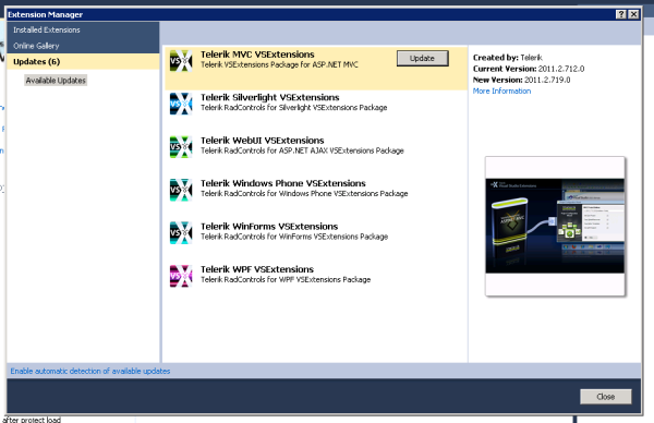
Best regards,
The Telerik Team
Legoless
Top achievements
 Rank 1
Rank 1
answered
on
29 May 2012


