or
1 answer
259 views
I've followed your help sample and created a custom style selector like this:-
I have also created the necessary styles in my view XAML:-
The problem is, I'm programmatically creating the RadGridView columns in my view model. I can't simply assign an instance of my custom style selector to the column's CellStyleSelector property as there is nothing linking that instance to the styles in the XAML. Am I going about this the wrong way?
public class BlockTypeStyleSelector : StyleSelector{ public override Style SelectStyle(object item, DependencyObject container) { if (item is SampleRun) { var sampleRun = item as SampleRun; switch (sampleRun.BlockType) { case BlockType.NormalBlock: return NormalBlockStyle; case BlockType.CalibrationBlock: return CalibrationBlockStyle; } } return null; } public Style NormalBlockStyle { get; set; } public Style CalibrationBlockStyle { get; set; }}I have also created the necessary styles in my view XAML:-
<GridStyleSelectors:BlockTypeStyleSelector x:Key="blockTypeStyle"> <GridStyleSelectors:BlockTypeStyleSelector.NormalBlockStyle> <Style TargetType="telerik:GridViewCell"> <Setter Property="Background" Value="White"/> </Style> </GridStyleSelectors:BlockTypeStyleSelector.NormalBlockStyle> <GridStyleSelectors:BlockTypeStyleSelector.CalibrationBlockStyle> <Style TargetType="telerik:GridViewCell"> <Setter Property="Background" Value="PaleGoldenrod"/> </Style> </GridStyleSelectors:BlockTypeStyleSelector.CalibrationBlockStyle></GridStyleSelectors:BlockTypeStyleSelector>The problem is, I'm programmatically creating the RadGridView columns in my view model. I can't simply assign an instance of my custom style selector to the column's CellStyleSelector property as there is nothing linking that instance to the styles in the XAML. Am I going about this the wrong way?

Maya
Telerik team

answered
on
08 Nov 2012
1 answer
182 views
Hello,
how do i set own row style colors (not only alternating colors). Are there events or dependency properties to bind colors to data model?
I have a pivot grid and want to set background colors in some rows.
Regards,
AM
how do i set own row style colors (not only alternating colors). Are there events or dependency properties to bind colors to data model?
I have a pivot grid and want to set background colors in some rows.
Regards,
AM
Rosen Vladimirov
Telerik team
answered
on
08 Nov 2012
10 answers
1.3K+ views
I'm having an issue with mysterious spacing showing up between my columns. In the attached picture you can see it between the first two columns. I'm not sure if this is being caused my header row/column styling or cell styling. It looks like even when there are no rows some of the headers seem to have different spacing between them. Any ideas what might cause this?
Here are the styles I'm using.
Here are the styles I'm using.
<Style TargetType="{x:Type telerik:RadGridView}"> <Setter Property="Background" Value="{StaticResource GridBackgroundBrush}" /> <Setter Property="GridLinesVisibility" Value="None" /> </Style><Style TargetType="{x:Type telerik:GridViewHeaderRow}"> <Setter Property="Template"> <Setter.Value> <ControlTemplate TargetType="{x:Type telerik:GridViewHeaderRow}"> <SelectiveScrollingGrid> <SelectiveScrollingGrid.ColumnDefinitions> <ColumnDefinition Width="Auto"/> <ColumnDefinition Width="Auto"/> <ColumnDefinition Width="Auto"/> <ColumnDefinition Width="*"/> </SelectiveScrollingGrid.ColumnDefinitions> <Border x:Name="PART_GridViewHeaderRowBorder" BorderBrush="{TemplateBinding BorderBrush}" BorderThickness="{TemplateBinding BorderThickness}" Grid.ColumnSpan="4" HorizontalAlignment="{TemplateBinding HorizontalContentAlignment}" Padding="{TemplateBinding Padding}" VerticalAlignment="{TemplateBinding VerticalContentAlignment}"> <Border Background="{TemplateBinding Background}"/> </Border> <telerik:DataCellsPresenter x:Name="PART_DataCellsPresenter" Grid.Column="3" IsTabStop="False" /> <Border x:Name="PART_IndicatorPresenter" BorderThickness="0" SelectiveScrollingGrid.SelectiveScrollingOrientation="Vertical" Visibility="Collapsed"> <Border Background="{StaticResource ResourceKey=GridBackgroundBrush}"/> </Border> <telerik:IndentPresenter x:Name="PART_IndentPresenter" Grid.Column="1" IsTabStop="False" IndentLevel="{TemplateBinding IndentLevel}" MinHeight="{TemplateBinding MinHeight}" SelectiveScrollingGrid.SelectiveScrollingOrientation="Vertical"> <telerik:IndentPresenter.ItemTemplate> <DataTemplate> <telerik:GridViewHeaderIndentCell IsTabStop="False" /> </DataTemplate> </telerik:IndentPresenter.ItemTemplate> </telerik:IndentPresenter> <Border x:Name="PART_HierarchyIndentPresenter" BorderThickness="1" Grid.Column="2" SelectiveScrollingGrid.SelectiveScrollingOrientation="Vertical" Width="25"> <Border.Visibility> <Binding Path="HasHierarchy" RelativeSource="{RelativeSource TemplatedParent}"> <Binding.Converter> <BooleanToVisibilityConverter/> </Binding.Converter> </Binding> </Border.Visibility> </Border> </SelectiveScrollingGrid> </ControlTemplate> </Setter.Value> </Setter> <Setter Property="Background" Value="{DynamicResource GridBackgroundBrush}"/> <Setter Property="MinHeight" Value="27"/> <Setter Property="BorderThickness" Value="0"/> <Setter Property="VerticalContentAlignment" Value="Stretch"/> <Setter Property="HorizontalContentAlignment" Value="Stretch"/> <Setter Property="Padding" Value="0"/> <Setter Property="SnapsToDevicePixels" Value="True"/></Style><Style x:Key="BaseTelerikCell" TargetType="{x:Type telerik:GridViewCell}"> <Setter Property="Template"> <Setter.Value> <ControlTemplate TargetType="{x:Type telerik:GridViewCell}"> <Grid Background="{TemplateBinding Background}"> <Border VerticalAlignment="Stretch" BorderThickness="{StaticResource GridGapThickness}" BorderBrush="{StaticResource GridBackgroundBrush}"> <ContentPresenter x:Name="CellContentPresenter" VerticalAlignment="Center"/> </Border> </Grid> </ControlTemplate> </Setter.Value> </Setter> <Style.Triggers> <Trigger Property="IsSelected" Value="True"> <Setter Property="Background"> <Setter.Value> <SolidColorBrush Color="{DynamicResource {x:Static SystemColors.WindowColorKey}}"/> </Setter.Value> </Setter> <Setter Property="Foreground"> <Setter.Value> <SolidColorBrush Color="{DynamicResource {x:Static SystemColors.WindowTextColorKey}}"/> </Setter.Value> </Setter> </Trigger> </Style.Triggers> </Style><Thickness x:Key="GridGapThickness" Bottom="1" Top="1" Right="1.5" Left="1.5" /> <ControlTemplate x:Key="GridViewHeaderCellControlTemplate1" TargetType="{x:Type telerik:GridViewHeaderCell}"> <Grid x:Name="PART_HeaderCellGrid"> <Grid.ColumnDefinitions> <ColumnDefinition Width="*"/> <ColumnDefinition Width="Auto"/> </Grid.ColumnDefinitions> <Border x:Name="GridViewHeaderCell" BorderBrush="{x:Null}" Grid.ColumnSpan="2"> <Border BorderBrush="{StaticResource GridBackgroundBrush}" Background="LightGray" BorderThickness="{StaticResource GridGapThickness}"/> </Border> <Border x:Name="GridViewHeaderCell_Over" BorderBrush="LightGray" BorderThickness="{TemplateBinding BorderThickness}" Grid.ColumnSpan="2" Opacity="0" /> <Border x:Name="GridViewHeaderCell_Selected" BorderThickness="{TemplateBinding BorderThickness}" Grid.ColumnSpan="2" Opacity="0"> </Border> <ContentControl x:Name="ContentPresenter" ContentTemplate="{TemplateBinding ContentTemplate}" Content="{TemplateBinding Content}" Grid.Column="0" Foreground="LightGray" HorizontalAlignment="{TemplateBinding HorizontalContentAlignment}" IsTabStop="{TemplateBinding IsTabStop}" Margin="{TemplateBinding Padding}" VerticalAlignment="{TemplateBinding VerticalContentAlignment}"> <ContentControl.Style> <Style TargetType="{x:Type ContentControl}"> <Setter Property="HorizontalContentAlignment" Value="Stretch"/> <Setter Property="VerticalContentAlignment" Value="Stretch"/> </Style> </ContentControl.Style> </ContentControl> <Path x:Name="PART_SortIndicator" Grid.ColumnSpan="2" Data="M0,0L1,0 2,0 3,0 4,0 5,0 5,1 4,1 4,2 3,2 3,3 2,3 2,2 1,2 1,1 0,1 0,0z" Fill="Black" HorizontalAlignment="Center" Height="3" Margin="0,3,0,0" Opacity="0" RenderTransformOrigin="0.5,0.5" Stretch="Fill" VerticalAlignment="Top" Width="5"> <Path.RenderTransform> <TransformGroup> <ScaleTransform ScaleY="-1" ScaleX="1"/> <SkewTransform AngleY="0" AngleX="0"/> <RotateTransform Angle="0"/> <TranslateTransform X="0" Y="0"/> </TransformGroup> </Path.RenderTransform> </Path> <telerik:FilteringDropDown x:Name="PART_DistinctFilterControl" Grid.Column="1" IsTabStop="False" Margin="0,0,8,0" Visibility="{TemplateBinding FilteringUIVisibility}"> <telerik:StyleManager.Theme> <telerik:Office_BlackTheme/> </telerik:StyleManager.Theme> </telerik:FilteringDropDown> <Thumb x:Name="PART_LeftHeaderGripper" Grid.ColumnSpan="2" HorizontalAlignment="Left" IsTabStop="{TemplateBinding IsTabStop}"> <Thumb.Style> <Style TargetType="{x:Type Thumb}"> <Setter Property="Width" Value="8"/> <Setter Property="Background" Value="Transparent"/> <Setter Property="BorderBrush" Value="Transparent"/> <Setter Property="BorderThickness" Value="0"/> <Setter Property="HorizontalContentAlignment" Value="Stretch"/> <Setter Property="VerticalContentAlignment" Value="Stretch"/> <Setter Property="Padding" Value="0"/> <Setter Property="Cursor" Value="SizeWE"/> <Setter Property="Template"> <Setter.Value> <ControlTemplate TargetType="{x:Type Thumb}"> <Border BorderBrush="{TemplateBinding BorderBrush}" BorderThickness="{TemplateBinding BorderThickness}" Background="{TemplateBinding Background}" HorizontalAlignment="{TemplateBinding HorizontalContentAlignment}" Padding="{TemplateBinding Padding}" VerticalAlignment="{TemplateBinding VerticalContentAlignment}"/> </ControlTemplate> </Setter.Value> </Setter> </Style> </Thumb.Style> </Thumb> <Thumb x:Name="PART_RightHeaderGripper" Grid.ColumnSpan="2" HorizontalAlignment="Right" IsTabStop="{TemplateBinding IsTabStop}"> <Thumb.Style> <Style TargetType="{x:Type Thumb}"> <Setter Property="Width" Value="8"/> <Setter Property="Background" Value="Transparent"/> <Setter Property="BorderBrush" Value="Transparent"/> <Setter Property="BorderThickness" Value="0"/> <Setter Property="HorizontalContentAlignment" Value="Stretch"/> <Setter Property="VerticalContentAlignment" Value="Stretch"/> <Setter Property="Padding" Value="0"/> <Setter Property="Cursor" Value="SizeWE"/> <Setter Property="Template"> <Setter.Value> <ControlTemplate TargetType="{x:Type Thumb}"> <Border BorderBrush="{TemplateBinding BorderBrush}" BorderThickness="{TemplateBinding BorderThickness}" Background="{TemplateBinding Background}" HorizontalAlignment="{TemplateBinding HorizontalContentAlignment}" Padding="{TemplateBinding Padding}" VerticalAlignment="{TemplateBinding VerticalContentAlignment}"/> </ControlTemplate> </Setter.Value> </Setter> </Style> </Thumb.Style> </Thumb> </Grid> <ControlTemplate.Triggers> <Trigger Property="SortingState" Value="Ascending"> <Setter Property="Foreground" Value="Black"/> <Setter Property="Opacity" TargetName="PART_SortIndicator" Value="1"/> <Setter Property="LayoutTransform" TargetName="PART_SortIndicator"> <Setter.Value> <ScaleTransform ScaleY="1" ScaleX="1"/> </Setter.Value> </Setter> <Setter Property="Opacity" TargetName="GridViewHeaderCell_Selected" Value="1"/> </Trigger> <Trigger Property="SortingState" Value="Descending"> <Setter Property="Foreground" Value="Black"/> <Setter Property="Opacity" TargetName="PART_SortIndicator" Value="1"/> <Setter Property="LayoutTransform" TargetName="PART_SortIndicator"> <Setter.Value> <ScaleTransform ScaleY="-1" ScaleX="1"/> </Setter.Value> </Setter> <Setter Property="Opacity" TargetName="GridViewHeaderCell_Selected" Value="1"/> </Trigger> <Trigger Property="SortingState" Value="None"> <Setter Property="Opacity" TargetName="PART_SortIndicator" Value="0"/> </Trigger> </ControlTemplate.Triggers> </ControlTemplate> <Style x:Key="DefaultHeaderColumnStyle" TargetType="telerik:GridViewHeaderCell"> <Setter Property="Template" Value="{StaticResource GridViewHeaderCellControlTemplate1}"/> <Setter Property="Foreground" Value="Black" /> <Setter Property="Background" Value="{x:Null}"/> <Setter Property="BorderBrush" Value="{x:Null}"/> <Setter Property="BorderThickness" Value="0"/> </Style>
Dimitrina
Telerik team
answered
on
08 Nov 2012
1 answer
130 views
Hello,
We have an application with a couple of RadListboxes and one schedule view. We have custom appointments and Slots. Part of the business logic is simulate the progress of a day and make the appointments read-only when they are below the current simulation time. We found when the users try to drag an appointment inside a read-only slot the Schedule view is not accepting any other drag and drop. We did not find an event to prevent this, we will appreciate any ideas about this problem.
Thanks.
Francisco.
We have an application with a couple of RadListboxes and one schedule view. We have custom appointments and Slots. Part of the business logic is simulate the progress of a day and make the appointments read-only when they are below the current simulation time. We found when the users try to drag an appointment inside a read-only slot the Schedule view is not accepting any other drag and drop. We did not find an event to prevent this, we will appreciate any ideas about this problem.
Thanks.
Francisco.
Yana
Telerik team
answered
on
08 Nov 2012
6 answers
477 views
Hi,
I have a RadComboBox binded to objects in my ViewModel. I have it as IsEdiatble = true since I want users to be able to add a new value if it does not exist in the drop down list. So far, I can type the new value but I can't find a way on getting that new value input by the user. Any help will be apreciated:
NOTE: When the selected item changes I am using a Command propoerty from my ViewModel and it is working properly.
My Bindings:
MyObject = A Class with 2 properties (FieldName (String) and TableName (String))
FieldList = Generic List<MyObject>
SlectedField = MyObject
ValueChanged = a command property (ICommand)
ItemsSource = {Binding FieldList} SelectedValuePath="FieldName" DisplayMemberPath="FieldName" SelectedItem={Binding SlectedField} Command={Binding ValueChanged}
Thanks.
I have a RadComboBox binded to objects in my ViewModel. I have it as IsEdiatble = true since I want users to be able to add a new value if it does not exist in the drop down list. So far, I can type the new value but I can't find a way on getting that new value input by the user. Any help will be apreciated:
NOTE: When the selected item changes I am using a Command propoerty from my ViewModel and it is working properly.
My Bindings:
MyObject = A Class with 2 properties (FieldName (String) and TableName (String))
FieldList = Generic List<MyObject>
SlectedField = MyObject
ValueChanged = a command property (ICommand)
ItemsSource = {Binding FieldList} SelectedValuePath="FieldName" DisplayMemberPath="FieldName" SelectedItem={Binding SlectedField} Command={Binding ValueChanged}
Thanks.

0 answers
138 views
I've used
how can I hide the sum data in group panel?
<telerik:GridViewDataColumn.AggregateFunctions>
     <telerik:SumFunction />
</telerik:GridViewDataColumn.AggregateFunctions>
and a Group panel
how can I hide the sum data in group panel?
1 answer
120 views
I've set UseAutoGeneratedItems = false
and add in the legenditems manually by setting the color of each item randomly.
How do I get the legenditem color to match the bar color
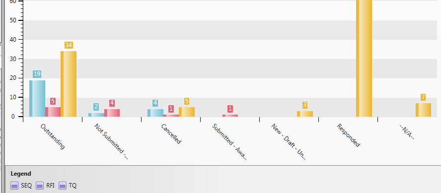
How do I get the legenditem color to match the bar color
Petar Marchev
Telerik team
answered
on
08 Nov 2012
2 answers
173 views
Is there a way to add in extra wordings to the auto generated legend item label?
I simply wanted to an aggregation type used in from the the legend label heading. So instead of a label showing "Outstanding category" from the dataseries, I wanted a "Count of Outstanding category" or "Sum of Outstanding Category" as the legend label.
Any suggestions will be helpful. Thanks
I simply wanted to an aggregation type used in from the the legend label heading. So instead of a label showing "Outstanding category" from the dataseries, I wanted a "Count of Outstanding category" or "Sum of Outstanding Category" as the legend label.
Any suggestions will be helpful. Thanks
3 answers
225 views
I created a RadTreeViewItem and want to set the CheckState to be 'On', but I can't seem to find the ToggleState enumeration at all. The intellisense for System.Windows.Automation just gives me: "Automation Properties", "Peers", "Provider" I thought I was just missing a reference, but I have everything that any of the code samples seem to have. I do see the documentation on MSDN for it as well, but it just does not appear. Any ideas on what I'm missing here?
Michael
Michael
2 answers
168 views
I have a RadGridView, which is bound to a QueryableCollectionView.
I want the customer to be able to take full advantage of sorting, grouping, etc. But there is a default multi-column sort I want to start them off with.
As an example, suppose each record has a ticket number, a priority, and a date. When they turn off all sorting on the grid, the rows should be sorted by ticket number. But I want the grid to start out sorted by priority and then date.
And an additional complication - the columns are dynamically created, populated in code, not in XAML. I've tried setting SortingState as I add the columns, but it doesn't seem to "stick".
I want the customer to be able to take full advantage of sorting, grouping, etc. But there is a default multi-column sort I want to start them off with.
As an example, suppose each record has a ticket number, a priority, and a date. When they turn off all sorting on the grid, the rows should be sorted by ticket number. But I want the grid to start out sorted by priority and then date.
And an additional complication - the columns are dynamically created, populated in code, not in XAML. I've tried setting SortingState as I add the columns, but it doesn't seem to "stick".