
DuelingCats
Top achievements
 Rank 2
DuelingCats
asked on 10 Dec 2012, 02:00 PM
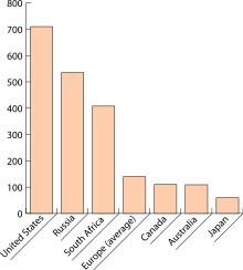
1. Is it possible to have labels below each column like in this fashion. I looked at the example here, but I want a label each column. Each column is a different datafield that only occurs once, like in the example I linked.
2. Is it possible to make the line on a line series thicker?
2. Is it possible to make the line on a line series thicker?
4 Answers, 1 is accepted
0
Accepted


Hello,
You can rotate the labels on the x-axis through the RotationAngle property in the LabelsApperance tag inside XAxis. Note that they will be centered in the space allocated for the given category (e.g. if there are three series, for example, the center of the label rectangle will be below the middle series column). You can see that in the demo you linked - expland the XAxis configurator and change the Labels Rotation Angl value. You can run it locally so you can set longer text for the x-axis categories.
So, what I would advise is that you have only one series and create the x-axis labels as required - you can databind the labels to a given column in your datasource that will hold the strings (e.g. United states, Russia, Japan,...). Another column can hold the respective values for each country on each row so you can databind the series to that column. If you cannot databind your chart you can create the items for both the x-axis and the series programmatically and set the desired string and value to them.
On changing the line series - I am sorry to say that this is not possible at the moment. This request is logged here, so you can monitor, vote and comment on the feature.
Kind regards,
Marin Bratanov
the Telerik team
If you want to get updates on new releases, tips and tricks and sneak peeks at our product labs directly from the developers working on the RadControls for ASP.NET AJAX, subscribe to their blog feed now.
0
DuelingCats
Top achievements
Rank 2
answered on 11 Dec 2012, 01:45 PM
Thanks for the suggestion Marin. I setup my graph as you described and it is working properly. One more question regarding this. I noticed that with having all my data in one column series, my bars are the same color. Would I be able to make the bars different colors?
0
Hello,
Your target screenshot didn't have different colos which is why I suggested this option. Currently it is not possible to have different color for each item in the same series with RadHtmlChart. The concept of a data series is that it must look uniform so that it is clear to the user which items are part of which series. Nevertheless, the request for fine control over the colors of the chart items is logged here.
Kind regards,
Marin Bratanov
the Telerik team
If you want to get updates on new releases, tips and tricks and sneak peeks at our product labs directly from the developers working on the RadControls for ASP.NET AJAX, subscribe to their blog feed now.
0
DuelingCats
Top achievements
Rank 2
answered on 11 Dec 2012, 01:56 PM
Thanks again Marin. I appreciate your quick reply.