How to manually style the Scheduler component

1 Answer 14 Views
Scheduler
Thomas
Top achievements
Rank 1
Iron
Thomas asked on 26 Mar 2024, 08:16 PM
My team and I are trying to apply a very specific style to the Scheduler component. This is what the design team has requested the Scheduler to look like:


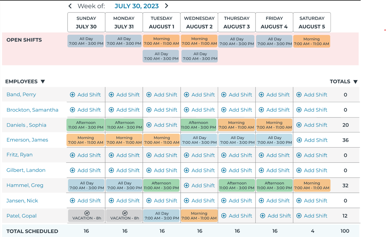
We want the Scheduler for its drag and drop functionality since items need to be dragged from the 'OPEN SHIFTS' area to the grid below. Currently we have only found styling for the slots. Is there anyway to apply custom styling to be closer to this specified design? If not, what would be the suggested alternative approach?

1 Answer, 1 is accepted

Sort by
0
Filip
Telerik team
answered on 28 Mar 2024, 03:52 PM

Hi, Thomas,

The Scheduler also allows to customize the items of a specific view, more information can be found in the following article:

https://www.telerik.com/kendo-react-ui/components/scheduler/customization/items/item/#toc-customizing-the-item-styles

The same approach can be used to add custom elements in the markup such as a plus sign. I have prepared a small example that can be used as a starting point for the implementation:

https://stackblitz.com/edit/react-v78iby-9cwfkv?file=app%2Fmain.jsx

Here for the MonthView, I am passing a `customItem` component that conditionally changes the `SchedulerItem`  backgroundColor to the item prop based on the `props.dataItem.title`. The plus sign is rendered inside the `SchedulerItem` markup:

 <SchedulerItem
      {...props}
      style={{
        ...props.style,
        backgroundColor: backgroundColor,
      }}
    >
      <div style={{ padding: '4px' }}>
        <span style={{ color: titleColor }}>
          <svg
            xmlns="http://www.w3.org/2000/svg"
            width="16"
            height="16"
            fill="currentColor"
            class="bi bi-plus"
            viewBox="0 0 16 16"
          >
            <path d="M8 4a.5.5 0 0 1 .5.5v3h3a.5.5 0 0 1 0 1h-3v3a.5.5 0 0 1-1 0v-3h-3a.5.5 0 0 1 0-1h3v-3A.5.5 0 0 1 8 4" />
          </svg>
        </span>
        <span style={{ color: titleColor }}>{props.dataItem.title}</span>
      </div>
    </SchedulerItem>
  );

I hope this helps but please let me know in case further assistance is required.

Regards,
Filip
Progress Telerik

Stay tuned by visiting our public roadmap and feedback portal pages! Or perhaps, if you are new to our Kendo family, check out our getting started resources!

Tags
Scheduler
Asked by
Thomas
Top achievements
Rank 1
Iron
Answers by
Filip
Telerik team
Share this question
or