Xamarin Apps Can Wait in Style

Summarize with AI:
Come explore how the Busy Indicator in Telerik UI for Xamarin can help your apps wait in style.
Building a compelling user experience in mobile apps is hard. Most users have dozens of apps on smartphones or tablets - each competing for attention. App usage is dominated by necessities or apps that provide a delightful user experience. While we developers cannot be designers, we can all do little things to help, not hurt our app's user experience.
For mobile app users, waiting for an operation to complete has to be a rather frustrating user experience. Most modern apps do a fair bit of heavy lifting and there are two golden user experience rules as you keep the user waiting:
- Always let the user know when they are waiting on something
- Never make the user wait on something they have not asked for
If building cross-platform apps with Xamarin, you should strive to let the user know visually when your app is busy. This could be a service call over the wire, a heavy I/O operation or any data processing - bottom line is, the user should know exactly what the app is doing at all times. If the user is kept in the dark, he/she may try interacting with the busy UI thread and get frustrated - leading to low app usage or worse, uninstall.
Your Xamarin apps can wait in style for any heavy lifting. Sure, there are built-in options on a per platform basis, but a well-engineered cross-platform Busy Indicator adds a lot of flexibility to a developer's arsenal. This article dives into how Telerik UI for Xamarin can help your Xamarin apps re-assure the user and drive up app engagement.
The Basics
The Busy Indicator in Telerik UI for Xamarin allows you to display a variety of notifications whenever the app is performing a long-running process - obviously leading to a more informative UI and smoother UX. And you can do this from any Xamarin app - Xamarin.iOS, Xamarin.Android or Xamarin.Forms.
Before we start, you'll want to make sure you have all your references right in your Xamarin project. The Telerik Busy Indicator does use SkiaSharp graphics library - simply follow the docs to set up your project right in your Windows or Mac development environment.
The Busy Indicator is a layout control that can display two views depending on its current state - busy and not-busy. There is a pivotal IsBusy property - set it to True to see the indicator and false to see normal content. This simplicity makes it super easy to work with the Busy Indicator or retrofit the control to existing layouts on which you would like to show progress indicators.
Here's the first step to get started - in Xamarin.Forms XAML:
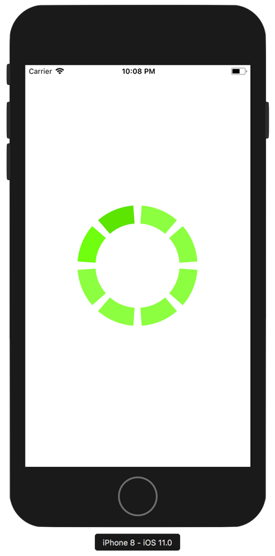
<?xml version="1.0" encoding="utf-8"?><ContentPage xmlns="http://xamarin.com/schemas/2014/forms" xmlns:x="http://schemas.microsoft.com/winfx/2009/xaml" xmlns:TelerikBusyIndicator="clr-namespace:Telerik.XamarinForms.Primitives;assembly=Telerik.XamarinForms.Primitives"><TelerikBusyIndicator:RadBusyIndicator x:Name="BusyIndicator" IsBusy="True"> <TelerikBusyIndicator:RadBusyIndicator.Content> <!-- Actual displayable content goes here /> </TelerikBusyIndicator:RadBusyIndicator.Content></TelerikBusyIndicator:RadBusyIndicator></ContentPage>Notice how we're simply setting the IsBusy to True in our XAML markup - and without any other code to reset it, the Busy Indicator is always visible in its default mode, like below. Developers should use the Busy Indicator layout control to hold the content that is to be displayed after a long running operation - and flip the IsBusy flag appropriately to show/hide the indicator over the content placeholder.
Timing is Everything
Since the Busy Indicator is overlaid on top of regular content, timing things right to show/hide it is important. This needs awareness of how UI threading works - thankfully, most of the complexity is hidden away if using Async-Await C# pattern. The code to hide the Busy Indicator must execute after the long-running operation has completed its course - right before results come back to the UI thread in Task form. The following is a standard way of handling the Busy Indicator's mode:
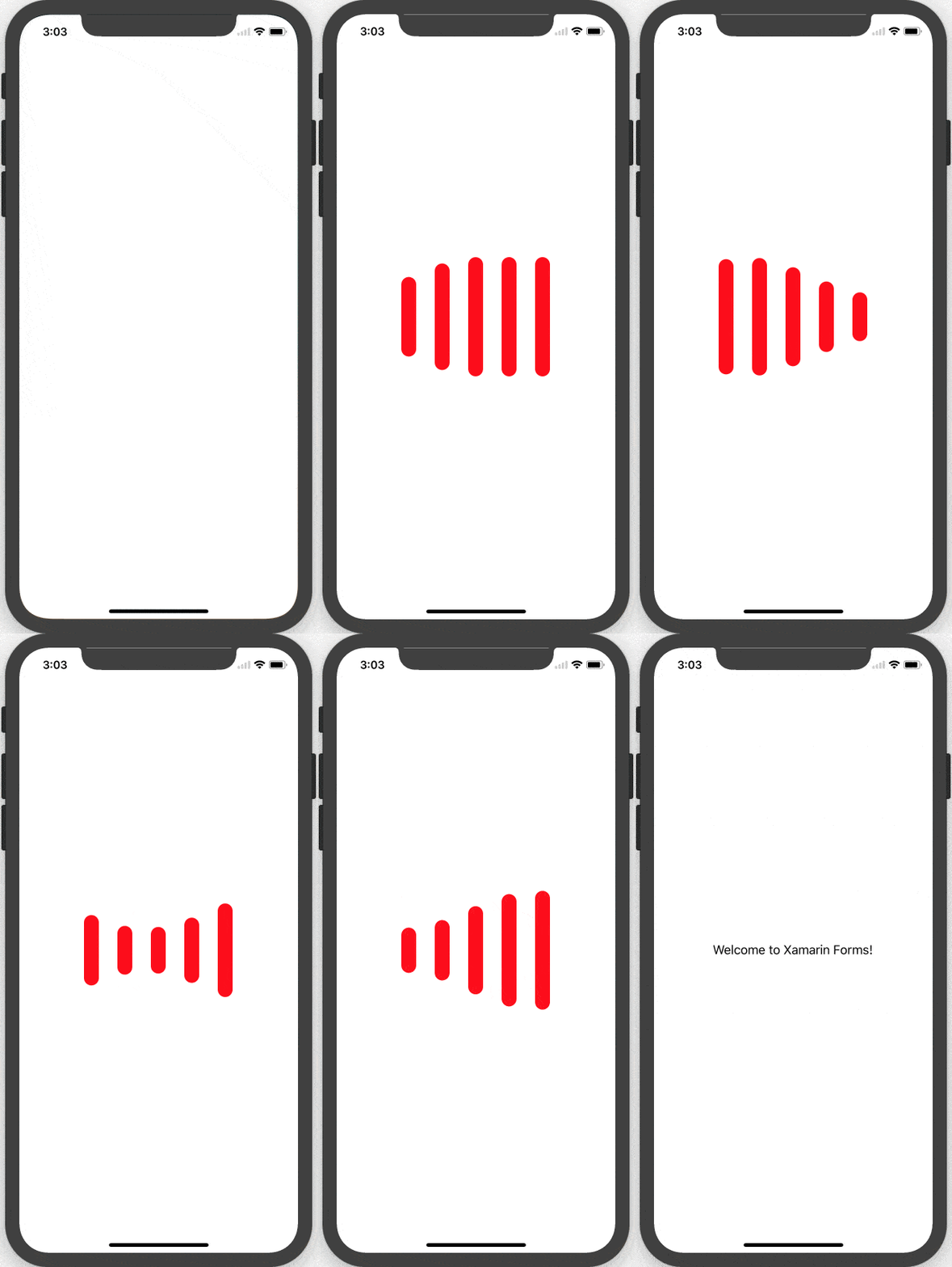
public BusyIndicatorDemo(){ InitializeComponent(); DummyWait(); // Proceed with app operations.}private async Task<T> DummyWait(){ await Task.Delay(5000); BusyIndicator.IsBusy = false;}Notice how we're faking some delay in our Async-Await pattern - this is where you'll do your heavy lifting. Control execution goes back to calling function .. but once your operation is done, the code to hide the Busy Indicator executes. This example shows you a timed delay before the Busy Indicator hides to show content underneath.
Animations
Now that you've gotten the hang of how to use the Busy Indicator, let's talk customizations to make the control look exactly the way you want. Three simple properties can help here:
AnimationContentWidthRequestAnimationContentHeightRequestAnimationColor
All of the properties can be set from code or XAML markup, like so:
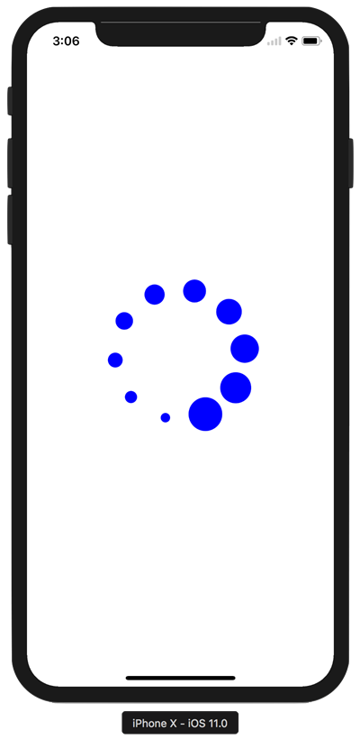
<TelerikBusyIndicator:RadBusyIndicator x:Name="BusyIndicator" AnimationContentHeightRequest="100" AnimationContentWidthRequest="100" AnimationColor = "Blue" IsBusy="True"> ...</TelerikBusyIndicator>Simple settings can add variety to how you display the Busy Indicator:
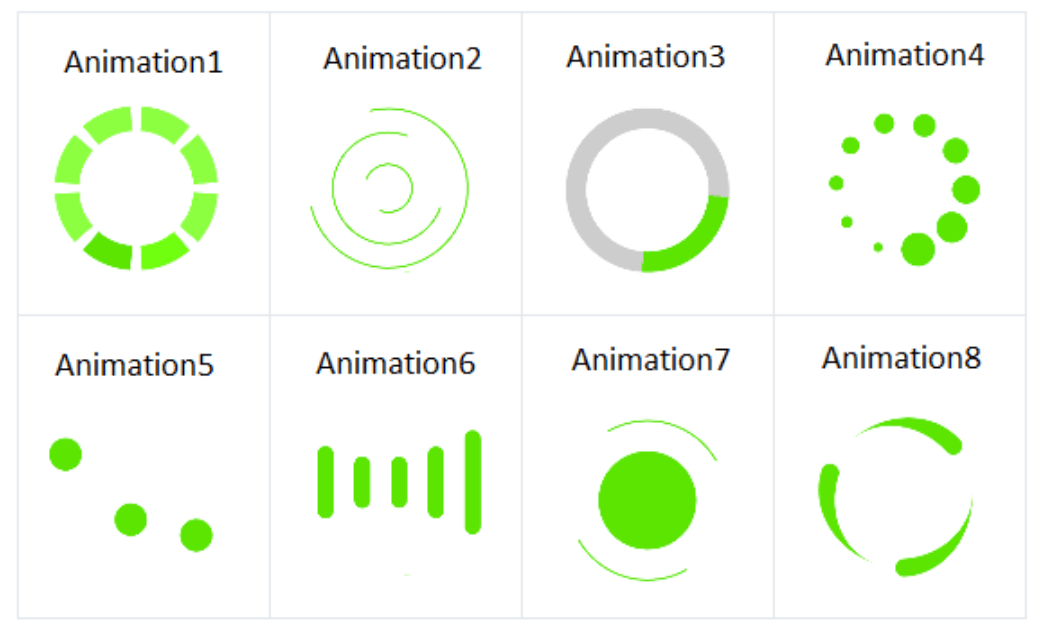
Another important control property is the AnimationType - it is an Enum accepting values named Animation1 to Animation8, like so:
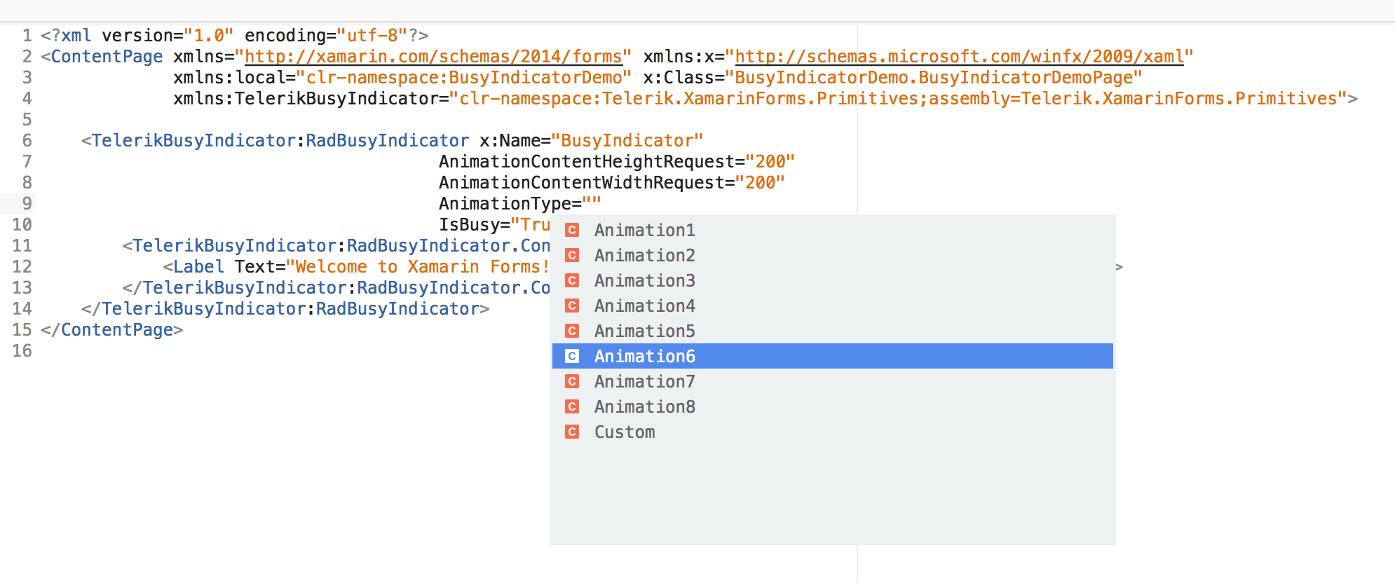
These are the built-in animations that the Busy Indicator offers - you can see how you have a variety of modes that fit your app's style. How fun!
Customizations
Did you notice one of the Enum values for AnimationType is Custom? Yup, this is your playground to use whatever custom animations your app needs. Say you wanted 90's style blinking text as your content loads - here's how you can:
<TelerikBusyIndicator:RadBusyIndicator x:Name="BusyIndicator" AnimationType="Custom" IsBusy="True"> <TelerikBusyIndicator:RadBusyIndicator.BusyContent> <Label HorizontalOptions="Center" Text="Loading ..." VerticalOptions="Center" /> </TelerikBusyIndicator:RadBusyIndicator.BusyContent></TelerikBusyIndicator:RadBusyIndicator>// Code BehindRadDoubleAnimation animation = new RadDoubleAnimation() { Duration = 800, From = 0.1, To = 1, PropertyPath = "Opacity", Target = BusyIndicator.BusyContent, RepeatForever = true, AutoReverse = true };
BusyIndicator.Animations.Add(animation);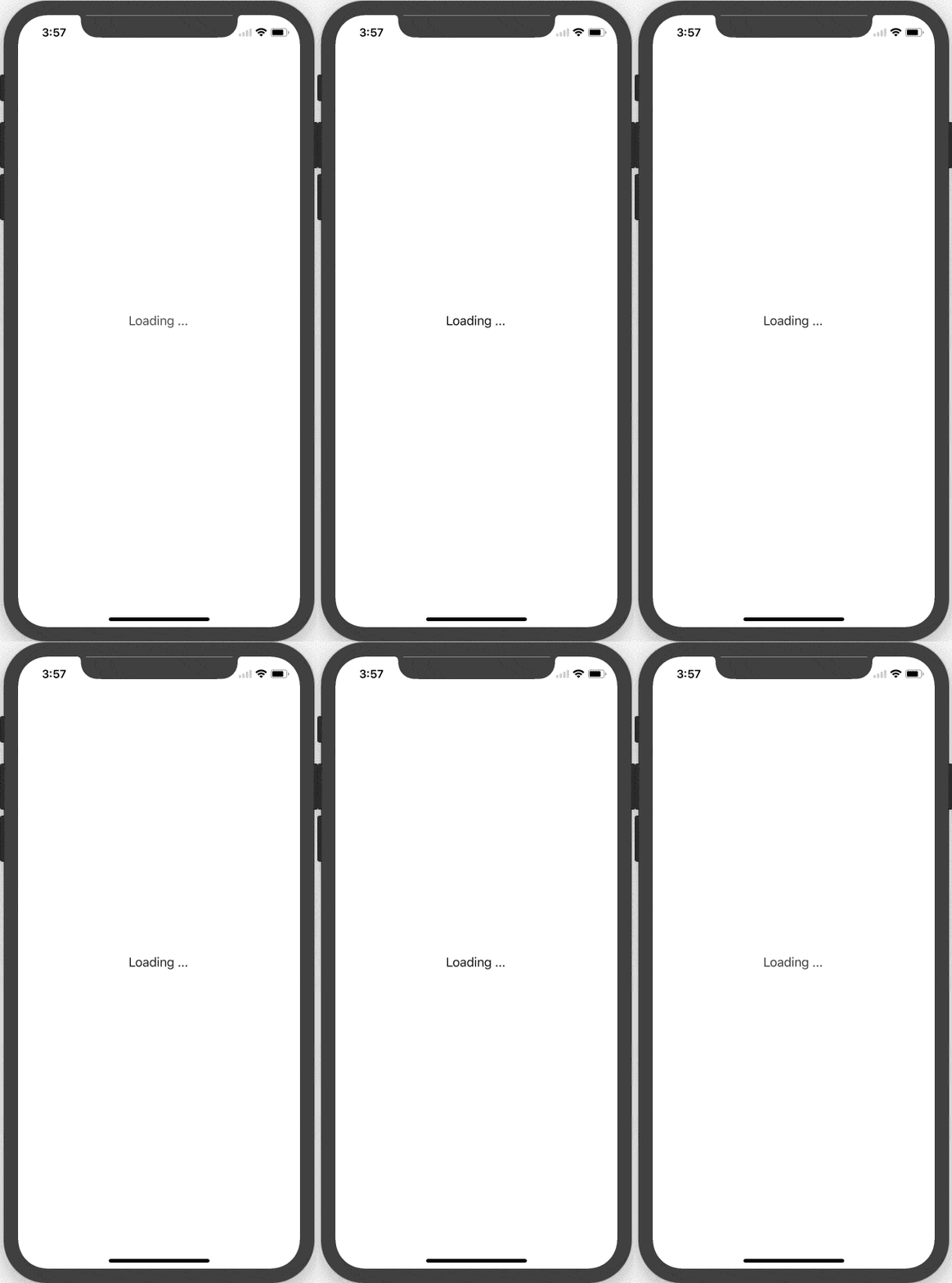
Want to take the Busy Indicator to extreme levels of customizations? Sure you can - with custom imagery and some math knowledge. Check out this example from our QSF Demo - included in Telerik UI for Xamarin download.
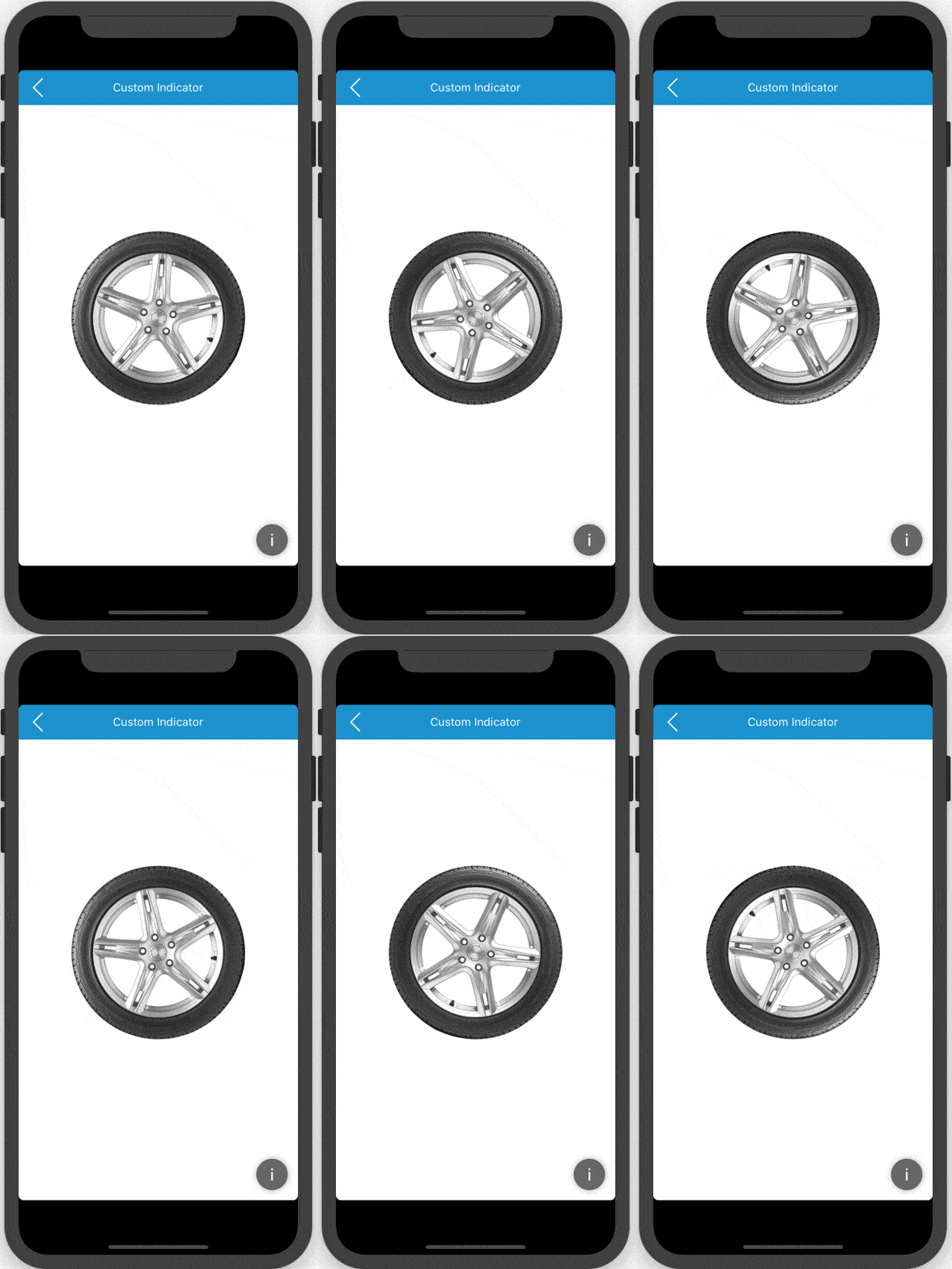
And here's the code to hook up the custom image with custom animation - you all have the source code to this:
<Grid BackgroundColor="White"> <controls:RadBusyIndicator AnimationContentHeightRequest="200" AnimationContentWidthRequest="200" AnimationType="Custom" InputTransparent="True" IsBusy="True"> <controls:RadBusyIndicator.Animations> <common:RadDoubleAnimation Easing="Linear" PropertyPath="Rotation" RepeatForever="True" Target="{Reference Name=image}" From="0" To="360" /> </controls:RadBusyIndicator.Animations> <controls:RadBusyIndicator.BusyContent> <Image x:Name="image" AnchorX="0.5" AnchorY="0.5" Aspect="AspectFit" HeightRequest="200" HorizontalOptions="Center" VerticalOptions="Center" WidthRequest="200"> <Image.Source> <OnPlatform x:TypeArguments="ImageSource"> <On Platform="iOS,Android">tyre.png</On> <On Platform="UWP">assets/tyre.png</On> </OnPlatform> </Image.Source> </Image> </controls:RadBusyIndicator.BusyContent> </controls:RadBusyIndicator></Grid>Wait Classy
Long stort short - it is best UX practice to always let the user know when your app is doing any heavy lifting. And with the Busy Indicator in Telerik UI for Xamarin, you can make the app wait in style. Go with the built-in animations or roll your custom ones - the Busy Indicator will look and behave exactly how you want for your Xamarin apps.

Sam Basu
Sam Basu is a technologist, author, speaker, Microsoft MVP and gadget lover. With a long developer background, he also worked as a Developer Advocacy Manager for advocating modern web/mobile/cloud development platforms on Microsoft/Telerik/Kendo UI technology stacks. His spare times call for travel, fast cars, cricket and culinary adventures with the family.
