What’s New in Unite UX 1.4.0 and 1.5.0

Summarize with AI:
There were two Unite UX releases in the past month that bring commenting functionality, guided onboarding, performance optimizations and much more.
Commenting Functionality

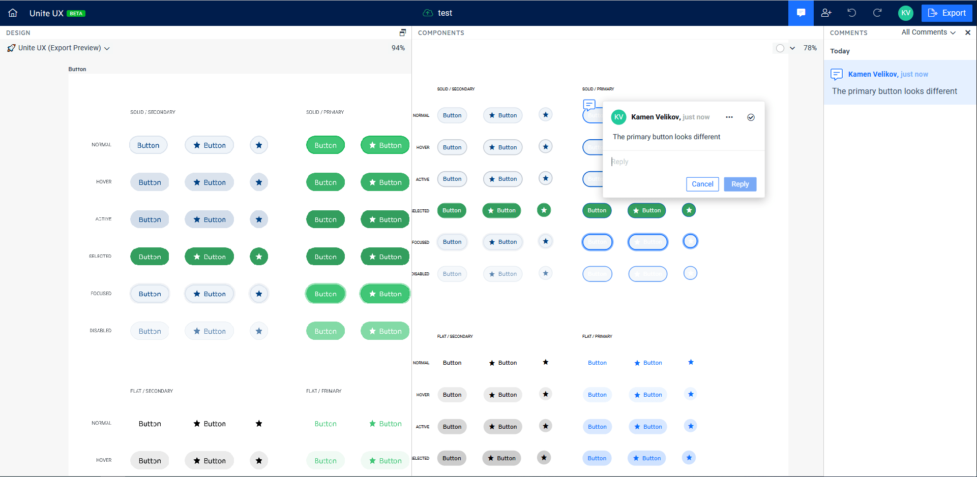
With this release, we’re introducing the commenting functionality that extends the collaborative capabilities of Unite UX. Now you don’t have to leave the app to give feedback about the design or the implementation of your components. Just click on the spot and leave your thoughts. Use @ to mention anyone that has access to your project to notify them via email. Resolve the threads that are already fixed and build your design system just as intended.
Onboarding

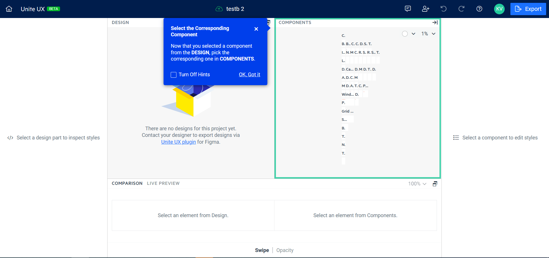
The new Unite UX comes with some predefined flows that explain in detail how to get started using the product. You will see guided tutorials, tips and tricks and key functionalities, highlighted to help you get most of the product in no time. So, make sure not to skip it, but even if you do, you can always go back to it using the ‘?’ button in the toolbar.
Link functionality

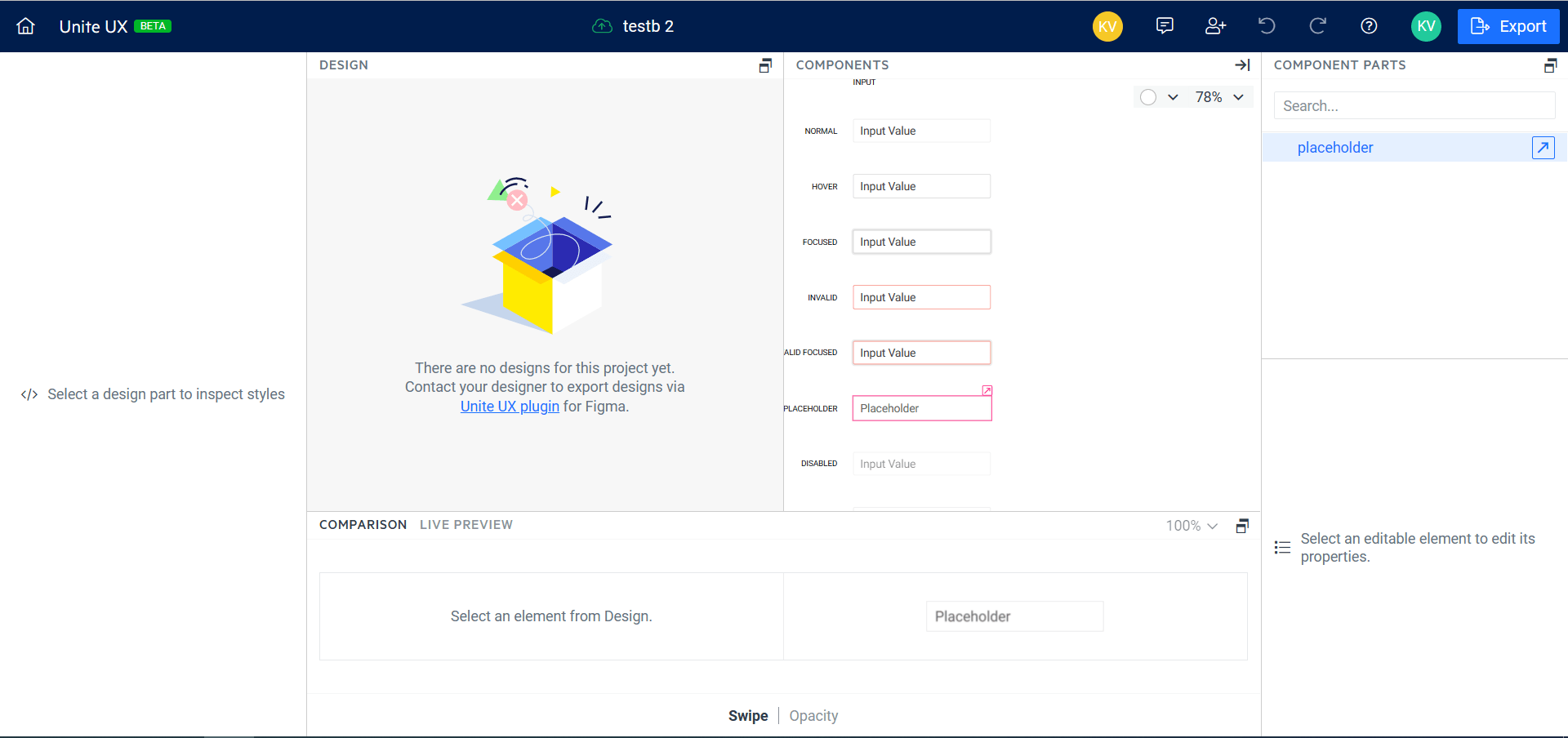
The 1.5.0 release brings a new type of component parts—links. Sometimes, the components are complex and some of the parts are hidden in the components tree. To improve the visibility of some parts and at the same time preserve the top-right to bottom-left styling from one place algorithm, we’ve extracted such parts and visualize them as links to their original parts where they can be edited. This will improve the overall visibility of the parts and preserve the natural way of styling things.
Performance Optimizations
.png?sfvrsn=f6d119c3_0)
The performance of the Unite UX is of highest importance for the team. With this release, we managed to locate and fix some bottlenecks, making the app blazing fast. No more endless loading indicator—everything will load before you know it.
New Component Templates
The 1.5.0 release includes 2 new components: The Card and the TextArea in the list of supported components. At the same time, we’ve optimized the existing component parts to be more intuitive and easier to style—we have included the No Records template for the grid and redesigned the Button Group templates. And last but not least, all common drop-down (popup, list and items) templates are extracted to separate page in order to be styled globally.
Various Bug Fixes
Performance and quality come hand in hand. That’s why we’re always trying to fix as many things as we can—especially the things that are reported from our users. Here are the things we’ve fixed in the 1.4.0 release:
- Some component states cannot be styled
- Font detection doesn’t work with some (icon) fonts
- Cannot change the color of the circle in Radio button
- Icon styles are not exported correctly
- Improved Font export performance
- Other minor fixes
Get your Unite UX Trial
If you still haven’t had the chance to try Unite UX, you can start your 21-day trial now.

Kamen Velikov
Kamen is software developer and manager of the Fiddler team at Progress. He has more than 11 years of professional experience in software development. Programming has always been his passion and he feels lucky to work his hobby. In his free time, he enjoys traveling, motorcycling, freshly-roasted coffee, and trying new experiences. Geek by design. Writing is a new thing to him and he’ll appreciate your feedback and comments.
