What’s New in Telerik UI for ASP.NET Core R3 2019

Summarize with AI:
We're excited to announce what's new in Telerik UI for ASP.NET Core. Read on to learn all about the new components and enhancements.
The third major version of Telerik UI for ASP.NET Core for 2019 is here and it is compatible with the official ASP.NET Core 3.0 Release Candidate! Check out the new components: Timeline, Filter, Rating, Card and Diagram and the Telerik Document Processing Library. In R3, you'll also find new features and multiple enhancements related to Search Panel in the Grid, PDFViewer, localization, accessibility and available online resources.
Support for ASP.NET Core 3.0 Release Candidate
The first exciting news that we want to announce is that the Telerik UI for ASP.NET Core components are now compatible with ASP.NET Core 3.0 Release Candidate. This ensures that those of you who are eager for the official release of ASP.NET Core 3.0 later this month are ready to incorporate the latest release of Telerik components into your projects.
New ASP.NET Core Component Timeline
The new Timeline component will enable you to visualize time events in your applications in an interactive and captivating style.
As with all Telerik UI for ASP.NET components the Timeline control can be integrated in your pages using both HTML and TAG Helpers.
Adding the following code using Tag Helper:
<kendo-timeline name="timeline" orientation="horizontal" datadatefield="EventDate" datatitlefield="Title" datasubtitlefield="Subtitle" datadescriptionfield="Description" dataactionsfield="Actions" dataimagesfield="Images"> <datasource> <transport> <read url="/Timeline/GetEvents" /> </transport> <schema> <model> <fields> <field name="EventDate" type="date"></field> </fields> </model> </schema> </datasource></kendo-timeline>Produces this beautiful result:

In this example, the Timeline events are displayed in a horizontal orientation with events laid out along a horizontal time axis. However, you can easily configure the layout to a vertical orientation with events displayed along a vertical time axis. Each of the events can be expanded with its detailed content or collapsed, and we have ensured each event item to have intuitive customizations in terms of content, images, text, colors and fonts.
New ASP.NET Core Component Rating
The new Rating component exposes multiple customization options for rendering and behavior to suit any scenario in your application:
- Custom icons – from classical stars to a more sophisticated svg icons
- Rating scale (including handling avg. values)
- Custom labels and tooltips
- Templates
- Accessibility, keyboard navigation and RTL Support
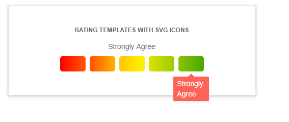
Telerik UI for ASP.NET Core Rating Component
Adding the following code using HTML helper:
@(Html.Kendo().Rating() .Name("rating") .Min(1) .Max(6) .Value(3) .ItemTemplate("<i class='k-icon k-i-heart-outline'></i>") .SelectedTemplate("<i class='k-icon k-i-heart'></i>") .HoveredTemplate("<i class='k-icon k-i-heart'></i>"))Produces this on our page:

New ASP.NET Core Component Filter
You can use the new Filter component with any data bound controls to enable the building of complex filtering expressions in a visual and user-friendly way.
Using the following code:
@(Html.Kendo().Filter<Kendo.Mvc.Examples.Models.ProductViewModel>() .Name("filter") .MainLogic(FilterCompositionLogicalOperator.And) .Fields(f => { f.Add(p=>p.ProductName).Label("Product Name"); f.Add(p=>p.UnitsInStock).Label("Units In Stock"); }) .FilterExpression(f => { f.Add(p => p.ProductName).StartsWith("Тea"); f.Add(p => p.UnitsInStock).IsGreaterThanOrEqualTo(100); }) .DataSource("dataSource1") )
Delivers the result shown below:

Telerik UI for ASP.NET Core Filter Component
New Document Processing Library
In R3 2019 we have added Telerik Document Processing as part of our offering. Telerik Document Processing for ASP.NET Core is a set of UI-independent and cross-platform libraries that enables processing content between different formats, PDF files generation, archive files management and will include the following libraries:
- PDFProcessing – built with performance and stability in mind, the document processing library enables your application to create, import and export files to and from PDF formats. The document model allows you to generate sleek documents with differently formatted text, images, shapes and more.
- ZipLibrary - to load data from existing ZIP archives or create and edit ZIPs with data like images, docx or pdf files that can be used by other applications. You can also create ZIP archives in memory or use a stream to get data and add it to a ZIP archive.
- SpreadStreamProcessing - create and export large amounts of data with excellent performance. You can also append data to already existing document stream. The generated document can be exported directly to a file on the file system or to a stream (for example, to send it to the client)
- WordsProcessing – manage and export documents to DOCX, RTF and plain text format without having to rely on third-party software (such as Microsoft Office). The rich text capabilities include tables, images, built-in styles and themes, various font types, sizes and colors.
New ASP.NET Core Component Card
In many of today’s applications content needs to be organized in a flexible way. That’s why we added The Card component in R3 2019. You have control over the configuration of card header, body and actions. To visualize the content in a more appealing way you can also accommodate images, lists, groups, separators and more.
Card components are perfect match for applications such as analytical dashboards, blogs, e-commerce and social platforms.

Telerik UI for ASP.NET Core Card Component
New ASP.NET Core Component Diagram
We have extended the suite of components for ASP.NET Core with one more member - the Diagram. The Diagramming control will enable you to create various types of interactive diagrams and flowcharts with a set of predefined shapes and the option to create custom ones.
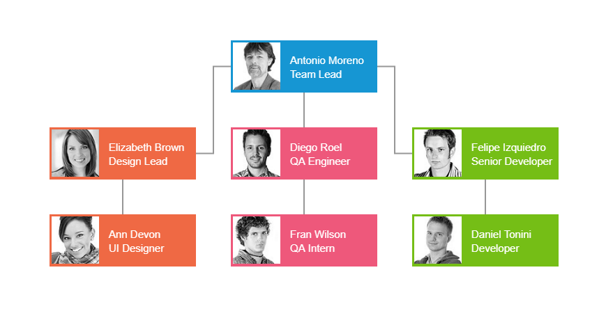 Telerik UI for ASP.NET Core Diagram Component
The Diagramming component also allows export to PDF and CRUD operations enabling users to easily manage data within your app.
Enhancing the Grid
In addition to the current grid filtering options, we implemented a built-in search panel so users can easily search through the data and filter only relevant records in the Grid. The search panel will add a search text box inside the grid toolbar and allow you to configure which grid fields will be searchable.
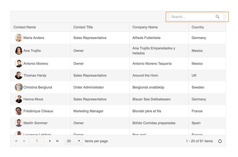
Telerik UI for ASP.NET Core Grid Search Panel
PDFViewer Enhancements
In R2 2019, we announced a new PDFViewer component that allows users to view and interact with PDF files without the need to download them locally. Based on your feedback, in the R3 2019 release we have applied some improvements and extended the component with zoom and scale functionality along with FitToWidth / FitToPage, search within the document, print functionality, plus panning and text selection.
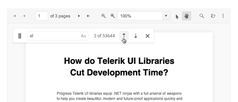
Telerik UI for ASP.NET Core PDFViewer Enhancements
Accessibility Improvements
As web accessibility is an important aspect of applications, we continuously work towards ensuring Telerik UI components are compliant to the technical standards implied by WAI-ARIA, WCAG 2.1, and Section 508. In R3 2019 we improved accessibility for the Grid, Editor, and MultiColumnComobBox components.
To find our more about the importance of Accessibility and how it affects your applications, check out our whitepaper that we published earlier this year.
Localization Enhancements
You are now able to localize the messages in the following components: AutoComplete, ComboBox, DropDownList, MultiSelect, MultiColumnComboBox. The localization to specific language can be set via the configuration options of the widget.
Setting Request Headers in Data Source Configuration
We have also added a Headers configuration option to enable you to easily set request headers in the data source.
Improvements on Documentation, Demos and Getting Started Experience
As requested by our community of developers, the Telerik UI for ASP.NET Core Team published its API Reference to enable further extension and customizations of the components when developing impactful applications.
Along with building of new components and features, we are also continuously investing in updating and improving the documentation and demos that support your development work. We have also added a series of videos related to Getting Started with Telerik UI for ASP.NET Core.
Try it Out and Learn More at the Webinar
Download the latest version of Telerik UI for ASP.NET Core, try it out and let us know what you think on our feedback portal. Be sure to sign up for the Telerik R3 2019 release webinar on October 2 for a deeper look at all the new features in the release.
RESERVE YOUR SEAT
Thank you for your continuous support and happy ASP.NET Core coding!

Maria Ivanova
Maria Ivanova is a Manager of Product Management at Progress, for Telerik and Kendo UI components and developer tooling. She joined the company in 2019 as a Product Manager for Telerik UI web components and is passionate about developing impactful and innovative software products. Maria believes that to create great products, it's important to challenge the status quo, closely collaborate with customers, and embrace a spirit of experimentation.
