Vue Basics: How to Build Complex Forms in Vue

Summarize with AI:
Using a demo project, we will walk through all the concepts and tips that will help understand how to build forms in Vue that efficiently handle complex data and user interaction.
☝️ Before we even dive in, let’s first answer a simple question: What do we consider a complex form in Vue?
Well, any form that has multiple steps. Take a shopping checkout process. 🛒 Here, you’ll need state management to store the data as the customer navigates through different views.
The same applies for nested inputs 📂 when forms require organized sections for details like separate billing and shipping addresses. We will need to validate the values according to specific rules or use a state management system (spoiler alert: I will introduce you to our friends Zod and Pinia).
📬 Another example is when you need to integrate with external APIs, like Google address validation API for real-time postal address verification. As we don’t control the response time, this comes with additional limitations we will have to take into account.
And let’s not forget fields that dynamically adapt to user input, such as the phone number field that displays the country name/flag as the user types it in.
😃 So if you have to deal with any of these types of forms, you are in the right place to understand how to build forms in Vue that efficiently handle complex data and user interaction. 🧙
The Basics
Project Setup
🧚✨ Together we will build a form for an educational app, 👩🏫 where the user:
- Selects the subject they want to study
- Chooses the platforms from where we will compose the curriculum
- Fills out a checkout form
- Pays for the study package
👩🎤 I know, this rocks! 🤘
Let’s set up our project using Vite:
- Open your terminal and run
npm create vite@latestin the folder of your choice. - Choose the following: Typescript + Vue Router + Pinia + Vitest + Cypress + ESLint + Prettier + Vue DevTools.
- Open your project in VS Code using this command, like the cool kids do:
cd the-name-of-your-project; code. - Run these commands in your VS Code built-in terminal:
npm install
npm run format
npm run dev
- We will also be using Tailwind CSS. Follow these steps to get it up and running in your project:
npm install -D tailwindcss postcss autoprefixer;
npx tailwindcss init -p
- Then, in your
tailwind.config.js:
content: [
  "./index.html",
  "./src/**/*.{vue,js,ts}",
],
- Then, import tailwind in your
main.css:
@tailwind base;
@tailwind components;
@tailwind utilities;
- Now all you have to do is clean your components and views 😉 or you can download my version here. (I know, I could have told you earlier, but where is the fun in that?!)
Two-way Data Binding (v-model)
v-model is the glue that holds your data and UI in perfect harmony. It synchronizes in real time the state of your application with what the user interacts with. You will use this feature a lot when building forms in Vue.
For instance, if you have a username input, as soon as the user inputs their name (let’s say: nada), you can display a “Hello, nada!” without having to go through the hassle of setting up event listeners to detect changes and updates your data.
<!-- Random example -->

<template>
  <div>
    <input v-model="userName" placeholder="Enter your name" />
    <p>Hello, {{ userName }}!</p>
  </div>
</template>

<script>
import { defineComponent, ref } from 'vue';

export default defineComponent({
  name: 'GreetingExample',

  setup() {
    const userName = ref('');

    return { userName };
  }
});
</script>
Another neat feature of two-way data binding is that components and their parent components can communicate. Let’s see how this plays in our new app:
- Create a
FieldInput.vuecomponent:
<template>
  <div class="mb-4">
    <!-- Conditionally render the label if the 'label' prop is provided -->
    <label
      v-if="label"
      :for="id"
      class="mb-2 block text-lg font-semibold text-gray-700"
    >
      {{ label }}
    </label>

    <!-- Input field bound directly to 'internalValue' using v-model -->
    <input
      :id="id"
      v-model="internalValue"
      :type="type"
      class="shadow-sm focus:ring-indigo-500 focus:border-indigo-500 block w-full sm:text-sm border-gray-300 rounded-md p-2 border"
      :placeholder="placeholder"
    />
  </div>
</template>

<script lang="ts">
import { defineComponent, computed } from 'vue'

export default defineComponent({
 name: 'FieldInput',

  // Define the props that this component accepts
  props: {
  id: {
    type: String,
    required: true
  },
  label: {
    type: String,
    default: ''
  },
  modelValue: {
    type: String,
    required: true
  },
  type: {
    type: String,
    default: 'text'
  },
  placeholder: {
    type: String,
    default: ''
  }
 },

  // Declare the events that this component can emit
 emits: ['update:modelValue'],

  setup(props, { emit }) {
    // Create a computed ref for internalValue
    // The getter returns the current value of the modelValue prop
    // The setter emits the 'update:modelValue' event when the value changes
    const internalValue = computed({
      get() {
        // Return the current value of modelValue prop
        return props.modelValue
      },
      set(value) {
        // Emit the 'update:modelValue' event with the new value
        emit('update:modelValue', value)
      }
  })

    return {
      // Return the computed ref to make it available in the template
      internalValue
    }
  }
})
</script>
- Add your new component to the
HomeView.vue:
<template>
  <div class="w-full min-h-screen">
    <form class="mt-40 p-6 mx-auto md:shadow-2xl rounded-lg md:w-1/2 lg:1/3">
      <FieldInput
        id="subject"
        label="Subject"
        v-model="subject"
        placeholder="Type the subject you want to learn here..."
      />
    </form>
  </div>
</template>

<script lang="ts">
import { defineComponent, ref, onMounted } from 'vue'
import FieldInput from '@/components/fields/FieldInput.vue'

export default defineComponent({
  name: 'App',

  components: {
    FieldInput,
  },

  setup() {
    const subject = ref('')

    return {
      subject
    }
  }
})
</script>
Multi-step Forms, Nested Inputs, Dynamic Fields
Managing Fields Based on User Input: Dynamic Fields
Clean and user-friendly forms rely on dynamic fields—fields that are displayed based on the user’s input.
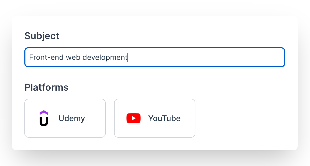
In our example, we will display a card selector when the user starts inputting the subject to study.
- Let’s create our
FieldCardSelector.vue:
<template>
  <div class="mb-4">
    <!-- Conditionally render the label if the 'label' prop is provided -->
    <label v-if="label" :for="id" class="mb-2 block text-lg font-semibold text-gray-700">
      {{ label }}
    </label>

    <!-- Input field bound directly to 'internalValue' using v-model -->
    <input
      :id="id"
      v-model="internalValue"
      :type="type"
      class="shadow-sm focus:ring-indigo-500 focus:border-indigo-500 block w-full sm:text-sm border-gray-300 rounded-md p-2 border"
      :placeholder="placeholder"
    />
  </div>
</template>

<script lang="ts">
import { defineComponent, computed } from 'vue'

export default defineComponent({
  name: 'FieldInput',

  // Define the props that this component accepts
  props: {
    id: {
      type: String,
      required: true
    },
    label: {
      type: String,
      default: ''
    },
    modelValue: {
      type: String,
      required: true
    },
    type: {
      type: String,
      default: 'text'
    },
    placeholder: {
      type: String,
      default: ''
    }
  },

  // Declare the events that this component can emit
  emits: ['update:modelValue'],

  setup(props, { emit }) {
    // Create a computed ref for internalValue
    // The getter returns the current value of the modelValue prop
    // The setter emits the 'update:modelValue' event when the value changes
    const internalValue = computed({
      get() {
        // Return the current value of modelValue prop
        return props.modelValue
      },
      set(value) {
        // Emit the 'update:modelValue' event with the new value
        emit('update:modelValue', value)
      }
    })

    return {
      // Return the computed ref to make it available in the template
      internalValue
    }
  }
})
</script>
- Then in our
HomeView.vue, we will display it only if our user has filled in the subject input (ifsubject.length > 0). 😁 This is something we can do thanks to thev-modeland thecomputedthat detects changes in the value of the subject input.
<template>
  <div class="w-full min-h-screen">
    <!-- Form to collect user inputs -->
    <form class="mt-40 p-6 mx-auto md:shadow-2xl rounded-lg md:w-1/2 lg:1/3">
      <!-- FieldInput component for entering the subject -->
      <FieldInput
        id="subject"
        label="Subject"
        v-model="subject"
        placeholder="Type the subject you want to learn here..."
      />

      <!-- Conditionally render FieldCardSelector based on the subject input -->
      <FieldCardSelector
        v-if="subject.length > 0"
        id="platforms"
        label="Platforms"
        v-model="selectedOptions"
        :options="options"
        class="mt-6"
      />
    </form>
  </div>
</template>

<script lang="ts">
import { defineComponent, ref, onMounted } from 'vue'
import FieldInput from '@/components/fields/FieldInput.vue'
import FieldCardSelector from '@/components/fields/FieldCardSelector.vue'

// Define the Platform interface for type-checking
interface Platform {
  id: number
  name: string
  icon: string
  url: string
}

export default defineComponent({
  name: 'HomeView',
  components: {
    FieldInput,
    FieldCardSelector
  },
  setup() {
    // Holds the subject input value
    const subject = ref('')
    // Holds the selected platform options
    const selectedOptions = ref<string[]>([])
    // Holds the list of platform options
    const options = ref<{ value: string; text: string; logo: string }[]>([])

    // Fetch platform options when the component is mounted
    onMounted(async () => {
      // Fetch platform data from a JSON file
      const response = await fetch('/platforms.json')
      const data = await response.json()
      // Map the platform data to the options array
      options.value = data.platforms.map((platform: Platform) => ({
        value: platform.id.toString(),
        text: platform.name,
        logo: platform.icon
      }))
    })

    // Return state variables and methods to be used in the template
    return {
      subject,
      selectedOptions,
      options,
    }
  }
})
</script>
The options are fetched from this platforms.json:
{
  "platforms": [
    {
      "id": 1,
      "name": "Udemy",
      "icon": "/img/udemy.png",
      "url": "https://www.udemy.com/"
    },
    {
      "id": 2,
      "name": "YouTube",
      "icon": "/img/youtube.jpeg",
      "url": "https://www.youtube.com/"
    }
  ]
}
Preserving State Between Steps
Now, what happens when our user inputs the subject to study and platforms from which to fetch the courses? 🚀 We create a curriculum based on the stated needs and move to the checkout page.
- Let’s create our
BaseButton.vue:
<template>
  <button
    :type="type"
    :class="[
      'inline-flex items-center justify-center px-4 py-2 border border-transparent text-md font-semibold rounded-md shadow-sm focus:outline-none focus:ring-2 focus:ring-offset-2',
      {
        'bg-blue-600 text-white hover:bg-blue-700 focus:ring-blue-500': variant === 'primary',
        'bg-gray-600 text-white hover:bg-gray-700 focus:ring-gray-500': variant === 'secondary',
        'bg-red-600 text-white hover:bg-red-700 focus:ring-red-500': variant === 'danger',
        'bg-white text-gray-700 border-gray-300 hover:bg-gray-50 focus:ring-indigo-500':
          variant === 'outline'
      }
    ]"
    @click="onClick"
  >
    <slot></slot>
  </button>
</template>

<script lang="ts">
import { defineComponent } from 'vue'
import type { PropType } from 'vue'

export default defineComponent({
  name: 'BaseButton',

  props: {
    type: {
      type: String as PropType<'button' | 'submit' | 'reset'>,
      default: 'button'
    },
    variant: {
      type: String as PropType<'primary' | 'secondary' | 'danger' | 'outline'>,
      default: 'primary'
    }
  },
  emits: ['click'],

  setup(props, { emit }) {
    const onClick = (event: Event) => {
      emit('click', event)
    }

    return {
      onClick
    }
  }
})
</script>
- Now let’s add it to our form in
HomeView.vueand use it to move to the next step where a preview of the curriculum we made is displayed:
<template>
  <div class="w-full min-h-screen">
    <form @submit.prevent="onGenerateCurriculum" class="mt-40 p-6 mx-auto md:shadow-2xl rounded-lg md:w-1/2">
      <FieldInput
        id="subject"
        label="Subject"
        v-model="subject"
        placeholder="Type the subject you want to learn here..."
      />

      <FieldCardSelector
        v-if="subject.length > 0"
        id="platforms"
        label="Platforms"
        v-model="selectedPlatforms"
        :options="options"
        class="mt-6"
      />

      <BaseButton
        v-if="subject.length && selectedPlatforms.length > 0"
        type="submit"
        variant="primary"
        class="mt-6 w-full"
      >
        Generate my Curriculum
      </BaseButton>
    </form>
  </div>
</template>

<script lang="ts">
import { defineComponent, ref, onMounted } from 'vue';
import { useRouter } from 'vue-router';

import FieldInput from '@/components/fields/FieldInput.vue';
import FieldCardSelector from '@/components/fields/FieldCardSelector.vue';
import BaseButton from '@/components/base/BaseButton.vue';

import type { Platform } from '@/interfaces';

export default defineComponent({
  name: 'HomeView',

  components: {
    BaseButton,
    FieldInput,
    FieldCardSelector
  },
  setup() {
    const router = useRouter();

    const subject = ref('');
    const selectedPlatforms = ref<string[]>([]);

    const options = ref<{ value: string; text: string; logo: string }[]>([]);

    onMounted(async () => {
      const response = await fetch('/platforms.json');
      const data = await response.json();

      options.value = data.platforms.map((platform: Platform) => ({
        value: platform.id.toString(),
        text: platform.name,
        logo: platform.icon,
      }));
    });

    const onGenerateCurriculum = () => {
      router.push({
        name: 'PreviewView',
      });
    };

    return {
      subject,
      selectedPlatforms,
      options,
      onGenerateCurriculum
    };
  }
});
</script>
There is a slight little issue with our logic: How do we know in the next steps what the user has chosen? We could send it to the backend and then ask for it again in a call to the API when loading the next step 😅 but there must be a better way.
🎉 Enter the glorious concept of state management in Vue. Its role is simple: maintain data consistency and accessibility across all our components and views while simplifying its flow.
Using Pinia (or Vuex if you’re not that hip 😏), you can easily preserve your data while the user navigates steps in a complex form without having to always make endless calls to the backend. So let’s implement it together:
- Create a
useCourseStore.ts, where:
import { defineStore } from 'pinia';

// Define the store
export const useCourseStore = defineStore('course', {
  // State: Contains all the state variables that will be shared across the application
  state: () => ({
    subject: '', // Holds the subject the user wants to study
    selectedPlatforms: [] as string[], // Holds the list of selected platforms
  }),

  // Actions: Methods that can modify the state. They can also include business logic.
  actions: {
    // Sets the subject in the state
    setSubject(subject: string) {
      this.subject = subject;
    },
    // Sets the selected platforms in the state
    setSelectedPlatforms(platforms: string[]) {
      this.selectedPlatforms = platforms;
    },
  },

  // Getters: Methods to get derived state or perform calculations based on state
  getters: {
    // Returns the subject from the state
    getSubject: (state) => state.subject,
    // Returns the selected platforms from the state
    getSelectedPlatforms: (state) => state.selectedPlatforms,
  },
});
- Modify the
HomeView.vueand particularly theonGenerateCurriculumfunction to store the user’s input in the store:
<script lang="ts">
import { defineComponent, ref, onMounted } from 'vue';
import { useRouter } from 'vue-router';
// Import the useCourseStore function to access the store
import { useCourseStore } from '@/stores/useCourseStore';

import FieldInput from '@/components/fields/FieldInput.vue';
import FieldCardSelector from '@/components/fields/FieldCardSelector.vue';
import BaseButton from '@/components/base/BaseButton.vue';

import type { Platform } from '@/interfaces';

export default defineComponent({
  name: 'HomeView',

  components: {
    BaseButton,
    FieldInput,
    FieldCardSelector
  },
  setup() {
    const router = useRouter();
    // Initialize the course store to access and manipulate its state
    const courseStore = useCourseStore(); // Define

    const subject = ref('');
    const selectedPlatforms = ref<string[]>([]);

    const options = ref<{ value: string; text: string; logo: string }[]>([]);

    onMounted(async () => {
      const response = await fetch('/platforms.json');
      const data = await response.json();

      options.value = data.platforms.map((platform: Platform) => ({
        value: platform.id.toString(),
        text: platform.name,
        logo: platform.icon,
      }));
    });

    const onGenerateCurriculum = () => {
      // Update the store with the current subject and selected platforms
      courseStore.setSubject(subject.value);
      courseStore.setSelectedPlatforms(selectedPlatforms.value);

      router.push({
        name: 'PreviewView',
      });
    };

    return {
      subject,
      selectedPlatforms,
      options,
      onGenerateCurriculum
    };
  }
});
</script>
See? It’s as easy as 1, 2, 3! 🕺 Now, you only have to use the getters to call the data anywhere in your app.
Managing Nested Field Data
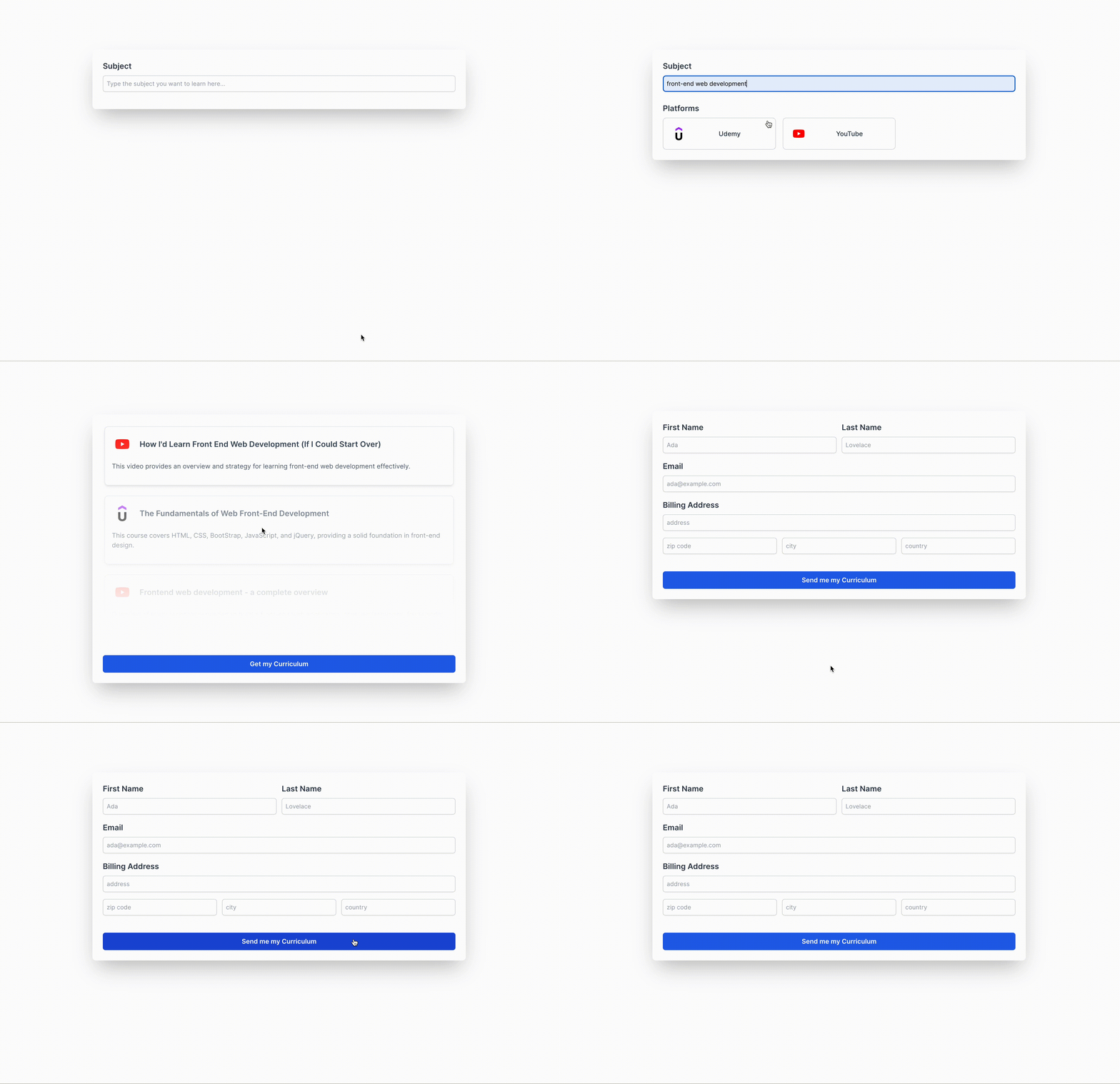
So now, our user is redirected to the checkout page after clicking on the Get my Curriculum call to action. And, of course, as with any checkout page, we have a billing address which is a nested field.
You can find the code for the preview page here:
Here is our CheckoutView.vue:
<template>
  <div class="w-full min-h-screen pt-40">
    <form @submit.prevent="onCheckout" class="p-6 mx-auto md:shadow-2xl rounded-lg md:w-1/2">
      <div class="md:grid md:grid-cols-2 md:gap-3">
        <FieldInput id="firstName" label="First Name" v-model="firstName" placeholder="Ada" />

        <FieldInput id="lastName" label="Last Name" v-model="lastName" placeholder="Lovelace" />
      </div>

      <FieldInput
        id="email"
        label="Email"
        v-model="email"
        type="email"
        placeholder="ada@example.com"
      />

      <FieldInput id="address" label="Billing Address" v-model="address" placeholder="address" />

      <div class="md:grid md:grid-cols-3 md:gap-3">
        <FieldInput id="zip" v-model="zip" placeholder="zip code" />

        <FieldInput id="city" v-model="city" placeholder="city" />

        <FieldInput id="country" v-model="country" placeholder="country" />
      </div>

      <BaseButton type="submit" variant="primary" class="mt-6 w-full">
        Send me my Curriculum
      </BaseButton>
    </form>
  </div>
</template>

<script lang="ts">
import { defineComponent, ref } from 'vue'

import FieldInput from '@/components/fields/FieldInput.vue'
import BaseButton from '@/components/base/BaseButton.vue'

export default defineComponent({
  name: 'CheckoutView',

  components: {
    BaseButton,
    FieldInput
  },
  setup() {
    const firstName = ref('')
    const lastName = ref('')
    const email = ref('')
    const address = ref('')
    const zip = ref('')
    const city = ref('')
    const country = ref('')

    const onCheckout = () => {
      console.log('Checkout', {
        firstName: firstName.value,
        lastName: lastName.value,
        email: email.value,
        fullAddress: `${address.value}, ${zip.value}, ${city.value}, ${country.value}`,
      })
    }

    return {
      firstName,
      lastName,
      email,
      address,
      zip,
      city,
      country,
      onCheckout
    }
  }
})
</script>
For now, I’m just console-logging the data our user gives us. But, as you can see with our billing address nested inputs, you may need to send the full address to your backend.
Input Validation
So far we haven’t added any validation to our form. Let’s see together what input validation we can put in place. 😉
Built-in Validation
I classify built-in validation features into three categories:
- UX design
- HTML5 input attributes
- And, of course, Vue’s built-in validation features
Building input validation into the UX may not seem like the first thing you’d think of as a developer or as a designer, but developers and designers with enough experience know that integrating validation when designing the UX is crucial to minimize friction and provide a clear and seamless experience.
This is why, in the first part of our form, we only display the platform’s field card selector after the user has typed in a subject. The user also cannot move to the next step, as we don’t display the button until they’ve chosen at least one platform.
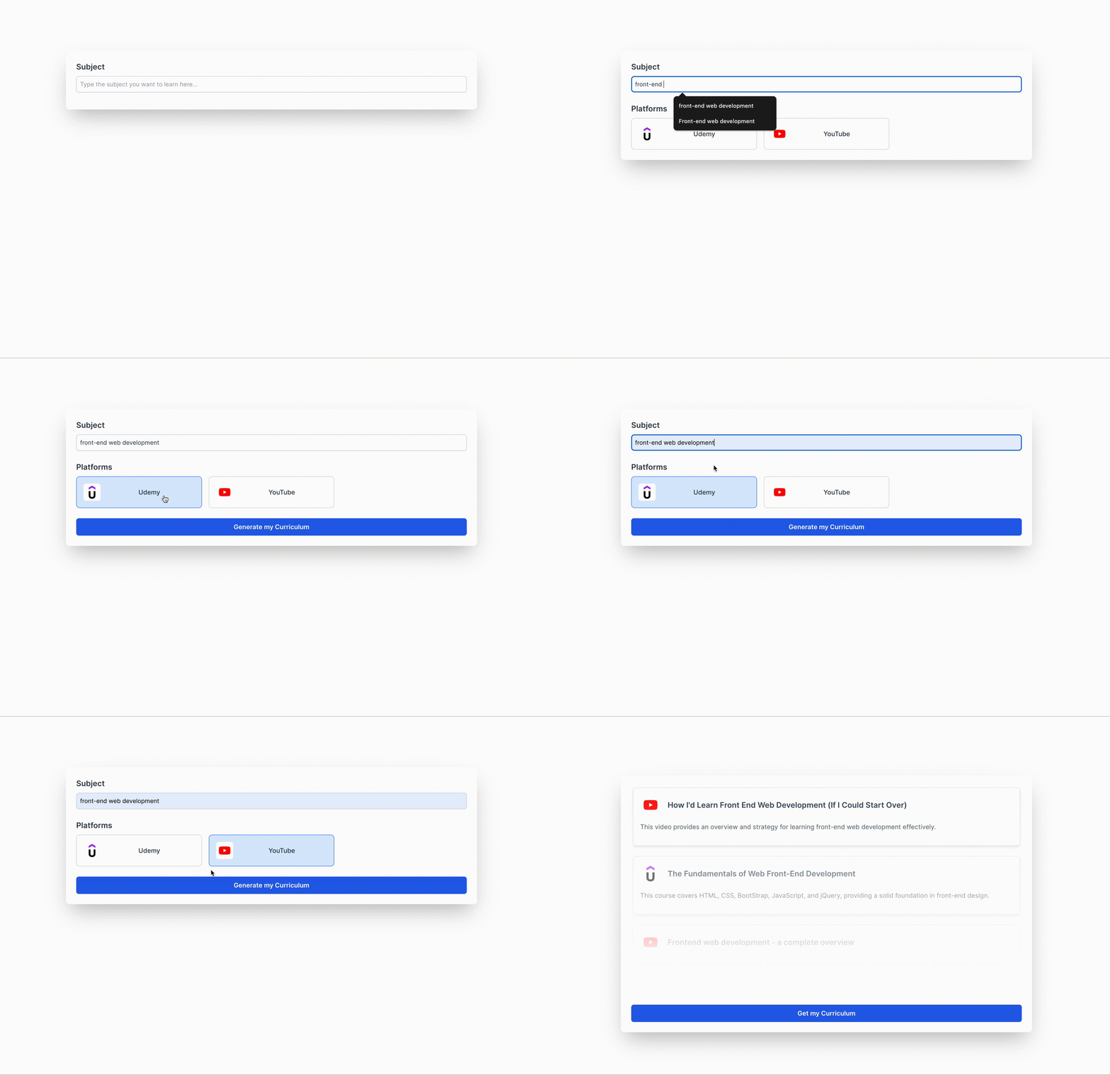
This was done using just two lines of code in HomeView.vue: v-if="subject.length > 0" and v-if="subject.length && selectedPlatforms.length > 0".
<form @submit.prevent="onGenerateCurriculum" class="p-6 mx-auto md:shadow-2xl rounded-lg md:w-1/2">
  <FieldInput
    id="subject"
    label="Subject"
    v-model="subject"
    placeholder="Type the subject you want to learn here..."
  />

  <FieldCardSelector
    v-if="subject.length > 0"
    id="platforms"
    label="Platforms"
    v-model="selectedPlatforms"
    :options="options"
    class="mt-6"
  />

  <BaseButton
    v-if="subject.length && selectedPlatforms.length > 0"
    type="submit"
    variant="primary"
    class="mt-6 w-full"
  >
    Generate my Curriculum
  </BaseButton>
</form>
I know, neat! 😃 This approach helps users know exactly what they need to do without any hassle for them and the developer too!
Let’s now, use HTML5 and Vue’s built-in validation features in our CheckoutView.vue. 🖖
Right now, when you click on the “Send me my curriculum” button without filling in any input, the console log is empty and nothing on the screen shows that something must be filled.
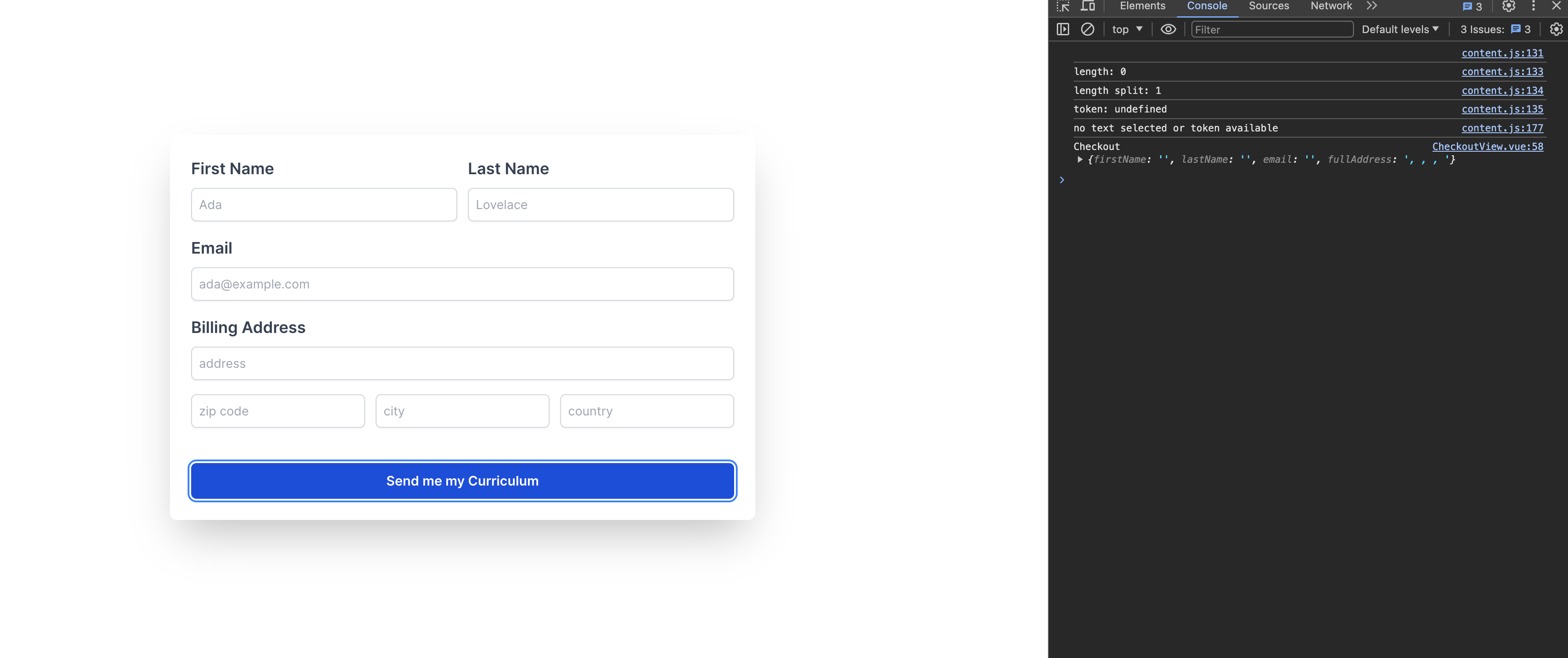
It is, to say the least, very confusing for a user!
Let’s fix that by first requiring every field in this form:
- Go to
FieldInput.vueand add the required attribute to the input tag add the required prop and set it to false:
<template>
    ...

    <input
      :id="id"
      v-model="internalValue"
      :required="required"
      :type="type"
      class="shadow-sm focus:ring-indigo-500 focus:border-indigo-500 block w-full sm:text-sm border-gray-300 rounded-md p-2 border"
      :placeholder="placeholder"
    />

	...
</template>

<script lang="ts">
...

export default defineComponent({
  ...

  props: {
    ...
    required: {
      type: Boolean,
      default: false
    },
    ...
  },

  ...
})
</script>
- Set the required prop to true in
CheckoutView.vueon every field input:
<template>
  <div class="w-full min-h-screen pt-40">
    <form @submit.prevent="onCheckout" class="p-6 mx-auto md:shadow-2xl rounded-lg md:w-1/2">
      <div class="md:grid md:grid-cols-2 md:gap-3">
        <FieldInput id="firstName" label="First Name" v-model="firstName" placeholder="Ada" required />

        <FieldInput id="lastName" label="Last Name" v-model="lastName" placeholder="Lovelace" required />
      </div>

      <FieldInput
        id="email"
        label="Email"
        v-model="email"
        type="email"
        placeholder="ada@example.com"
        required
      />

      <FieldInput id="address" label="Billing Address" v-model="address" placeholder="address" required />

      <div class="md:grid md:grid-cols-3 md:gap-3">
        <FieldInput id="zip" v-model="zip" placeholder="zip code" required />

        <FieldInput id="city" v-model="city" placeholder="city" required />

        <FieldInput id="country" v-model="country" placeholder="country" required />
      </div>

      <BaseButton type="submit" variant="primary" class="mt-6 w-full">
        Send me my Curriculum
      </BaseButton>
    </form>
  </div>
</template>
Using only HTML5 required attribute you can at least tell your user what’s missing now. 🕺 You will notice also that the console log isn’t executed until all inputs are filled.
🍒 The cherry on the cake is the email validation. That’s because we used the type="email" attribute for the email field input.
🔗 Here you can find all the attributes available for inputs.
Let’s improve on what we have done so far using Vue’s reactivity to display clear error messages to our users:
- First, let’s change our
FieldInput.vueto include an error message using anerrorMessageand anonBlurfunction ➕ change the field’s border and outline color to red when the error message is displayed:
<template>
  <div class="mb-4">
    ...

    <input
      :id="id"
      v-model="internalValue"
      :required="required"
      :type="type"
      @blur="onBlur"
      :class="[
        'shadow-sm block w-full sm:text-sm rounded-md p-2 border outline-none focus:ring-1',
        required && errorMessage.length > 0 ? 'border-red-500 focus:ring-red-500 focus:border-red-500' : 'border-gray-300 focus:ring-indigo-500 focus:border-indigo-500'
      ]"
      :placeholder="placeholder"
    />

    <div v-if="required && errorMessage.length > 0" class="text-sm text-red-500 mt-1">
	    {{ errorMessage }}
    </div>
  </div>
</template>

<script lang="ts">
import { defineComponent, ref, computed } from  'vue'

export default defineComponent({
  ...

  props: {
    required: {
      type: Boolean,
      default: false
    },
    errorMessage: {
      type: String,
      default: ''
    },
    ...
  },

  ...

  setup(props, { emit }) {
    const touched = ref(false)

    ...

    const showError = computed(() => {
      return touched.value && props.errorMessage.length > 0
    })

    const onBlur = () => {
      touched.value = true
    }

    return {
      internalValue,
      showError,
      onBlur
    }
  }
})
</script>
- Then in the
CheckoutView.vue, we will add theerrorMessageprop we created. The text for the error message will be generated through thegetErrorfunction:
<template>
  <div class="w-full min-h-screen pt-40">
    <form @submit.prevent="onCheckout" class="p-6 mx-auto md:shadow-2xl rounded-lg md:w-1/2">
      <div class="md:grid md:grid-cols-2 md:gap-3">
        <FieldInput
          id="firstName"
          label="First Name"
          v-model="firstName"
          placeholder="Ada"
          required
          :error-message="getError('First Name')"
        />

        <FieldInput
          id="lastName"
          label="Last Name"
          v-model="lastName"
          placeholder="Lovelace"
          required
          :error-message="getError('Last Name')"
        />
      </div>

      <FieldInput
        id="email"
        label="Email"
        v-model="email"
        type="email"
        placeholder="ada@example.com"
        required
        :error-message="getError('Email')"
      />

      <FieldInput
        id="address"
        label="Billing Address"
        v-model="address"
        placeholder="address"
        required
        :error-message="getError('Address')"
      />

      <div class="md:grid md:grid-cols-3 md:gap-3">
        <FieldInput
          id="zip"
          v-model="zip"
          placeholder="zip code"
          required
          :error-message="getError('Zip Code')"
        />

        <FieldInput
          id="city"
          v-model="city"
          placeholder="city"
          required
          :error-message="getError('City')"
        />

        <FieldInput
          id="country"
          v-model="country"
          placeholder="country"
          required
          :error-message="getError('Country')"
        />
      </div>

      ...
    </form>
  </div>
</template>

<script lang="ts">
...

export default defineComponent({
  ...

  setup() {
    ...

    const getError = (fieldName: string) => {
      if (fieldName === 'Email' && email.value && !/^[^\s@]+@[^\s@]+\.[^\s@]+$/.test(email.value)) {
        return 'Invalid email'
      } else {
        return `${fieldName} is required`
      }
    }

    return {
      firstName,
      lastName,
      email,
      address,
      zip,
      city,
      country,
      onCheckout,
      getError
    }
  }
})
</script>
And voilà!
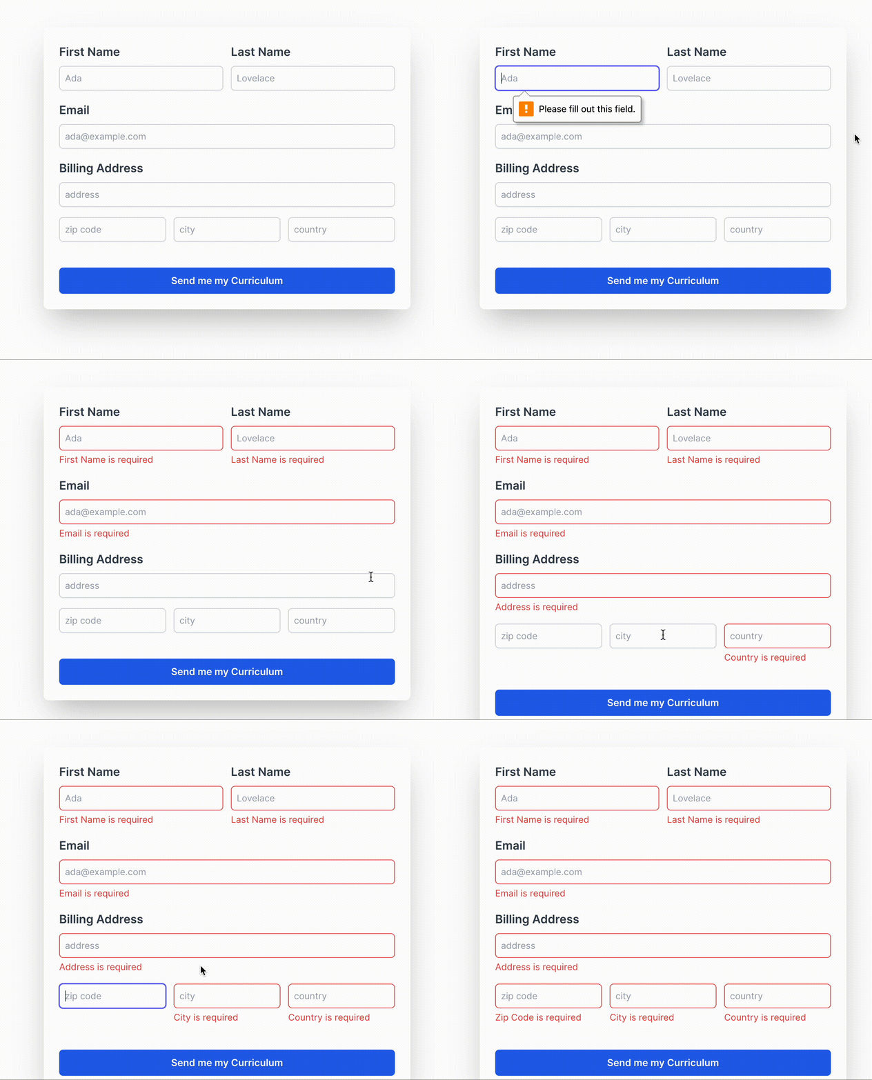
As you can see, it seems that when we click on the button the HTML required attribute does its job. But the error message is only displayed for the first input (if we filled the first it would be displayed for the second). I don’t think this is an optimal UX. 🙃 Another thing is that you only display the error message after we move on to another element without filling in the input field.
We could solve these issues by using watchers and so on. But honestly, I’d rather avoid this by using third-party input validation libraries that can be more reliable than newly implemented custom code. 😉 Plus, it saves so many lines of code, and the less code you have to write, the less chance your code will mutate into noodle code. 🍜
Third-party Input Validation Libraries
You’ve probably come across VeeValidate and Vuelidate in articles about building forms in Vue or Nuxt. 🤓 In this article, though, we want to build complex forms in scalable apps. 😏 So we’re going to use the VeeValidate in combination with Zod.
Combining both will get us the benefits of VeeValidate’s real-time validation without having to use a billion watchers and Zod’s schema validation that centralizes our validation rules. Beautiful!
Let’s get started then:
- Of course we need to install VeeValidate and Zod along with Zod’s typed schemas for VeeValidate:
npm install vee-validate zod @vee-validate/zod --legacy-peer-deps
☝️ I’m using
--legacy-peer-depsbecause they conflict with the latest version of eslint I installed.
- Create a
schemasfolder in thesrcdirectory where you’ll create avalidationSchema.tsfile where we will centralize our validation rules:
import zod from 'zod';

const validationSchema = zod.object({
  firstName: zod.string().min(1, { message: 'First Name is required' }),
  lastName: zod.string().min(1, { message: 'Last Name is required' }),
  email: zod.string().min(1, { message: 'Email is required' }).email({ message: 'Must be a valid email' }),
  address: zod.string().min(1, { message: 'Address is required' }),
  zip: zod.string().min(1, { message: 'Zip Code is required' }),
  city: zod.string().min(1, { message: 'City is required' }),
  country: zod.string().min(1, { message: 'Country is required' }),
})

export default validationSchema;
- Now, let’s update our
FieldInput.vuecomponent so it displays error messages passed by VeeValidate:
<template>
  <div class="mb-4">
    <label v-if="label" :for="id" class="mb-2 block text-lg font-semibold text-gray-700">
      {{ label }}
    </label>

    <input
      :id="id"
      :name="id"
      v-model="internalValue"
      :type="type"
      :class="[
        'shadow-sm block w-full sm:text-sm rounded-md p-2 border outline-none focus:ring-1',
        error ? 'border-red-500 focus:ring-red-500 focus:border-red-500' : 'border-gray-300 focus:ring-indigo-500 focus:border-indigo-500'
      ]"
      :placeholder="placeholder"
    />

    <div v-if="error" class="text-sm text-red-500 mt-1">
      {{ error }}
    </div>
  </div>
</template>

<script lang="ts">
import { defineComponent, computed } from 'vue';

export default defineComponent({
  name: 'FieldInput',

  props: {
    id: {
      type: String,
      required: true
    },
    label: {
      type: String,
      default: ''
    },
    modelValue: {
      type: String,
      required: true
    },
    error: {
      type: String,
      default: ''
    },
    type: {
      type: String,
      default: 'text'
    },
    placeholder: {
      type: String,
      default: ''
    }
  },

  emits: ['update:modelValue'],

  setup(props, { emit }) {
    const internalValue = computed({
      get() {
        return props.modelValue
      },
      set(value) {
        emit('update:modelValue', value)
      }
    })

    return {
      internalValue,
    }
  }
})
</script>
- Finally, let’s set up validation in our
CheckoutView.vueform:
<template>
  <div class="w-full min-h-screen pt-40">
    <form @submit.prevent="onCheckout" class="p-6 mx-auto md:shadow-2xl rounded-lg md:w-1/2">
      <div class="md:grid md:grid-cols-2 md:gap-3">
        <FieldInput
          id="firstName"
          label="First Name"
          v-model="firstName"
          placeholder="Ada"
          :error="errors.firstName"
        />

        <FieldInput
          id="lastName"
          label="Last Name"
          v-model="lastName"
          placeholder="Lovelace"
          :error="errors.lastName"
        />
      </div>

      <FieldInput
        id="email"
        label="Email"
        v-model="email"
        type="email"
        placeholder="ada@example.com"
        :error="errors.email"
      />

      <FieldInput
        id="address"
        label="Billing Address"
        v-model="address"
        placeholder="address"
        :error="errors.address"
      />

      <div class="md:grid md:grid-cols-3 md:gap-3">
        <FieldInput
          id="zip"
          v-model="zip"
          placeholder="zip code"
          :error="errors.zip"
        />

        <FieldInput
          id="city"
          v-model="city"
          placeholder="city"
          :error="errors.city"
        />

        <FieldInput
          id="country"
          v-model="country"
          placeholder="country"
          :error="errors.country"
        />
      </div>

      <BaseButton
        class="mt-6 w-full"
        type="submit"
        variant="primary"
      >
        Send me my Curriculum
      </BaseButton>
    </form>
  </div>
</template>

<script lang="ts">
import { defineComponent, ref } from 'vue'
import { useField, useForm } from 'vee-validate';
import { toTypedSchema } from '@vee-validate/zod';
import validationSchema from '@/schemas/validationSchema';

import FieldInput from '@/components/fields/FieldInput.vue'
import BaseButton from '@/components/base/BaseButton.vue'

export default defineComponent({
  name: 'CheckoutView',

  components: {
    BaseButton,
    FieldInput
  },

  setup() {
    const { handleSubmit, errors } = useForm({
      validationSchema: toTypedSchema(validationSchema),
    });

    const { value: firstName } = useField('firstName', undefined, { initialValue: '' });
    const { value: lastName } = useField('lastName', undefined, { initialValue: '' });
    const { value: email } = useField('email', undefined, { initialValue: '' });
    const { value: address } = useField('address', undefined, { initialValue: '' });
    const { value: zip } = useField('zip', undefined, { initialValue: '' });
    const { value: city } = useField('city', undefined, { initialValue: '' });
    const { value: country } = useField('country', undefined, { initialValue: '' });

    const onCheckout = handleSubmit((values) => {
      console.log('Checkout', {
        firstName: firstName.value,
        lastName: lastName.value,
        email: email.value,
        fullAddress: `${address.value}, ${zip.value}, ${city.value}, ${country.value}`
      })
    })

    return {
      firstName,
      lastName,
      email,
      address,
      zip,
      city,
      country,
      errors,
      onCheckout
    }
  }
})
</script>
As you can see, we removed:
- the required attribute/prop from
FieldInput.vue - the
onBlurevent listener - the
showErrorcomputed
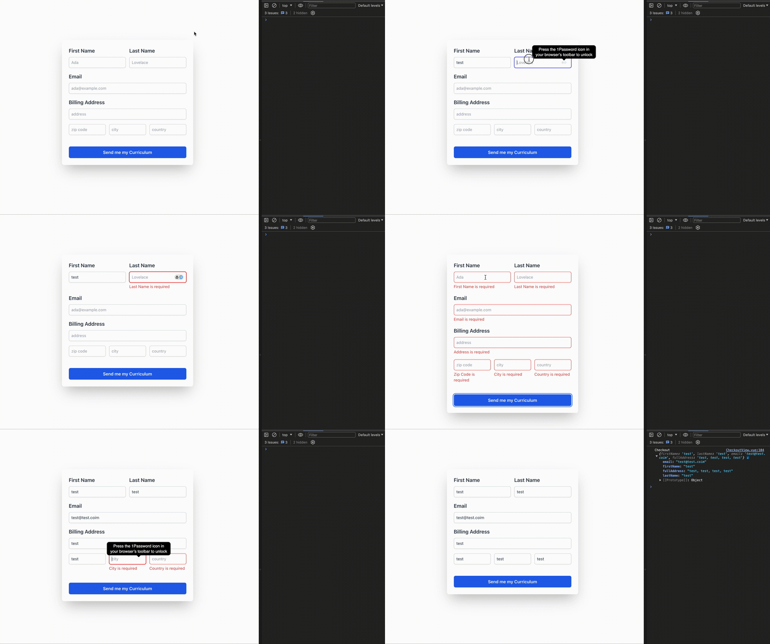
Less code and, as you can see below, with a better user experience as we display the errors:
- when the user submits the form without filling in the fields, or
- when the user does not finish filling in a field before submitting
All this without using a single computed or a watcher. 😏 Beautiful!
Input Validation Using APIs
As you can see, when we filled out our form, we could write anything in the address and it passed validation.
You’ve probably come across an address field in a checkout form when shopping lately where you just input your address and it was validated through Google.
It’s called Google Place Autocomplete and that’s what we gonna do together, folks. 🤠
- ☝️ First, create a Google Cloud Console account to get and activate your Google Maps Platform API key.
When asked to protect your API key by restricting its usage select websites and just use http://localhost:5173/checkout for our example.
Then, create a
.envthat will host your Google Maps API key:VITE_GOOGLE_API_KEY=YOUR_GOOGLE_API_KEYInstall @googlemaps/js-api-loader and its type package:
npm install @googlemaps/js-api-loader --legacy-peer-deps
npm i -D @types/google.maps --legacy-peer-deps
- Create a
utilsdirectory inside yoursrcfolder with aloadGoogleMapsApi.tsfile:
import { Loader } from '@googlemaps/js-api-loader';

// Declare a variable to hold the promise for loading the Google Maps API.
// This ensures that the API is loaded only once and the same promise is reused.
let googleMapsApiPromise: Promise<void> | null = null;

// Function to load the Google Maps API
export const loadGoogleMapsApi = (): Promise<void> => {
  // Check if the promise is already defined
  if (!googleMapsApiPromise) {
    // Create a new Loader instance with the API key and version
    const loader = new Loader({
      apiKey: import.meta.env.VITE_GOOGLE_API_KEY, // Load API key from environment variables
      version: 'weekly', // Use the weekly version of the API to get the latest features and updates
    });

    // Use the Loader to import the 'places' library
    googleMapsApiPromise = loader.importLibrary('places').then(() => {
      // Resolve the promise when the library is successfully loaded
      return Promise.resolve();
    }).catch(error => {
      // If there is an error, reset the promise to null
      googleMapsApiPromise = null;
      // Reject the promise with the error
      return Promise.reject(error);
    });
  }

  // Return the promise (either the existing one or the newly created one)
  return googleMapsApiPromise;
};
- Instead of using our
FieldInput.vuefor filling out the address, let’s create aFieldAddress.vuecomponent:
<template>
  <div class="mb-4">
    <label :for="id" class="mb-2 block text-lg font-semibold text-gray-700">
      {{ label }}
    </label>

    <input
      :id="id"
      :name="id"
      ref="autocompleteInput"
      v-model="internalValue"
      :type="type"
      :class="[
        'shadow-sm block w-full sm:text-sm rounded-md p-2 border outline-none focus:ring-1',
        error ? 'border-red-500 focus:ring-red-500 focus:border-red-500' : 'border-gray-300 focus:ring-indigo-500 focus:border-indigo-500'
      ]"
      :placeholder="placeholder"
    />

    <div v-if="error" class="text-sm text-red-500 mt-1">
      {{ error }}
    </div>
  </div>
</template>

<script lang="ts">
import { defineComponent, ref, watch, onMounted, nextTick } from 'vue';
import { loadGoogleMapsApi } from '@/utils/loadGoogleMapsApi';

export default defineComponent({
  name: 'FieldAddress',

  props: {
    id: {
      type: String,
      required: true
    },
    label: {
      type: String,
      default: ''
    },
    modelValue: {
      type: String,
      required: true
    },
    error: {
      type: String,
      default: ''
    },
    type: {
      type: String,
      default: 'text'
    },
    placeholder: {
      type: String,
      default: ''
    }
  },

  emits: ['update:modelValue', 'address-selected'],

  setup(props, { emit }) {
    // Internal state for the input value, initialized with the prop modelValue
    const internalValue = ref(props.modelValue);

    // Reference to the input element for autocomplete
    const autocompleteInput = ref<HTMLInputElement | null>(null);

    // Function to initialize Google Places Autocomplete
    const initializeAutocomplete = () => {
      if (autocompleteInput.value) {
        const autocomplete = new google.maps.places.Autocomplete(autocompleteInput.value, {
          types: ['address'] // Restrict to address type
        });

        // Add listener for when a place is selected
        autocomplete.addListener('place_changed', async () => {
          const place = autocomplete.getPlace();
          if (place.address_components) {
            const address = place.formatted_address || '';
            // Emit the selected address to the parent component
            emit('update:modelValue', address);
            // Wait for the DOM to update
            await nextTick();
            // Emit the place object to the parent component
            emit('address-selected', place);
          }
        });
      }
    };

    // Watch for changes in the modelValue prop and update internalValue
    watch(() => props.modelValue, (newVal) => {
      internalValue.value = newVal;
    });

    // On component mount, load the Google Maps API and initialize autocomplete
    onMounted(async () => {
      try {
        await loadGoogleMapsApi();
        initializeAutocomplete();
      } catch (error) {
        console.error('Error loading Google Maps API:', error);
      }
    });

    return {
      internalValue,
      autocompleteInput
    };
  }
});
</script>
- And now the only thing left is to update our
CheckoutView.vue:
<template>
  <div class="w-full min-h-screen pt-40">
    <form @submit.prevent="onCheckout" class="p-6 mx-auto md:shadow-2xl rounded-lg md:w-1/2">
      ...

      <FieldAddress
        id="address"
        label="Billing Address"
        v-model="address"
        placeholder="Type your address"
        :error="errors.address"
        @address-selected="onAddressSelected"
      />

      ...
    </form>
  </div>
</template>

<script lang="ts">
...

import FieldInput from '@/components/fields/FieldInput.vue';
import BaseButton from '@/components/base/BaseButton.vue';
import FieldAddress from '@/components/fields/FieldAddress.vue';

export default defineComponent({
  name: 'CheckoutView',

  components: {
    BaseButton,
    FieldInput,
    FieldAddress
  },

  setup() {
    ...

    const onAddressSelected = (place: google.maps.places.PlaceResult) => {
      place.address_components?.forEach(component => {
        const types = component.types;
        if (types.includes('postal_code')) {
          zip.value = component.long_name;
        }
        if (types.includes('locality')) {
          city.value = component.long_name;
        }
        if (types.includes('country')) {
          country.value = component.long_name;
        }
      });
    };

    const onCheckout = handleSubmit((values) => {
      console.log('Checkout', {
        firstName: firstName.value,
        lastName: lastName.value,
        email: email.value,
        fullAddress: `${address.value}, ${zip.value}, ${city.value}, ${country.value}`
      })
    })

    return {
      firstName,
      lastName,
      email,
      address,
      zip,
      city,
      country,
      errors,
      onAddressSelected,
      onCheckout
    }
  }
})
</script>
Let’s see what we have now.
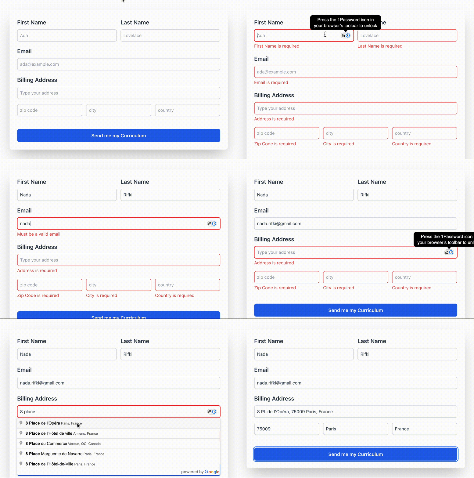
Brilliant and beautiful. That’s what good UX and code look like. Now, just celebrate! 🍻🥳🍻
Last Words
To conclude this article, here are a few things that I’ve learned the hard way 😮💨 and to keep in mind so your forms don’t become your hell on earth:
State management is your best friend: Libraries like our lovely 💛 Pinia 🍍 and our old trooper Vuex will help you maintain data consistency between views in multi-step forms using a few lines of code.
Don’t Repeat Yourself (DRY): Like we did when centralizing our validation roles with Zod, it’s easing to keep your validation rules consistent and you can easily update them. If you want to save time, there are many UI libraries with all the form components you might need for your project with built-in validation like Vuetify, Element UI or even Nuxt UI.
Keep components simple and modular: Like when we created a different input for the address managed by Google Place Autocomplete. It is easier to maintain and your colleagues won’t have to get a PhD just to understand your component that does a million things. Plus, in a few months, it would take you forever to debug it yourself.
Designers are developers’ best friends: Your designer is not your boss nor your enemy—we complement each other! When designers and developers work together, it results in better UX, less complicated code and fewer bugs.
You can reach me on Twitter @RifkiNada. And in case you are curious about my work or other articles, you can look at them here www.nadarifki.com. 😉
Happy coding, my lovely friends.

Nada Rifki
Nada is a JavaScript developer who likes to play with UI components to create interfaces with great UX. She specializes in Vue/Nuxt, and loves sharing anything and everything that could help her fellow frontend web developers. Nada also dabbles in digital marketing, dance and Chinese. You can reach her on Twitter @RifkiNada or visit her website, nadarifki.com.

