Using the Web Share API in React

Summarize with AI:
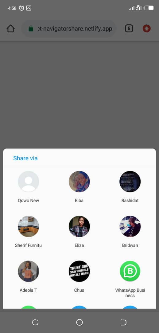
The Web Share API allows users to share resources from the browser using native functionality. Let’s try a different modal display and share mechanism.
You have probably shared content on your device with either your contacts or to some other applications. This could be through copy/paste, using the share feature in web apps that pops up a new window or the native share capability of mobile devices.
The UX for sharing resources from one app to the other in mobile OS allows users to initiate a share action that brings up a picker dialog where you can choose the destination of what you want to share.

There’s a specification that defines the API that would allow you to utilize this device capability and allow users to share resources from a web app, just like they could in native apps. This API is called the Web Share API.
The Web Share API allows users to share resources easily from the web browser to any random destination. It handles share functionality natively, without having to write too much code. In this post, I’m going to show you how to use this API in a React application.
Let’s Begin!
Let’s create a new React app using create-react-app. Run the command below in your command-line application:
npx create-react-app sharer
Open the application in your preferred code editor and go to App.js. Replace the content in it with the code you see below:
import React from "react";
import "./App.css";
function App() {
  return <div className="App"></div>;
}
export default App;
Let’s sprinkle a bit of CSS to make the app look nice. Open up App.css and replace it with the content below.
html {
  box-sizing: border-box;
}

*,
*::before,
*::after {
  box-sizing: inherit;
  padding: 0;
  margin: 0;
}
.App {
  font-family: "Jost", sans-serif;
  position: relative;
  height: 100vh;
  display: flex;
  justify-content: center;
  align-items: center;
  background: #eee;
  color: #888;
}

button {
  border: 0;
  padding: 0 20px;
  border-radius: 4px;
  cursor: pointer;
}
.close-button {
  align-self: center;
  padding: 0;
  background: transparent;
  font-size: 1.6rem;
  color: #666;
}

.share-button-wrapper {
  padding: 10px 20px;
  background: #ddd;
  border-radius: 4px;
  text-transform: uppercase;
  letter-spacing: 2px;
  font-size: 0.9rem;
  cursor: pointer;
}

.share-modal {
  position: absolute;
  z-index: 9999;
  width: 80%;
  max-width: 400px;
  box-shadow: 0 0 5px #eee;
  transform: translateY(-200%);
  transition: 0.2s cubic-bezier(0.165, 0.84, 0.44, 1);
}

.share-modal.opened {
  background: #fff;
  transform: translateY(0%);
}

.modal-header,
.modal-body,
.modal-footer {
  display: flex;
  padding: 20px;
}

.modal-header {
  justify-content: space-between;
  padding: 15px 20px;
}

.modal-title {
  align-self: center;
  font-weight: 600;
  text-transform: uppercase;
  letter-spacing: 0.7px;
  font-size: 0.9rem;
  color: #666;
}

.modal-body {
  flex: 1;
  display: grid;
  grid-gap: 20px;
}

.modal-body > .row {
  display: grid;
  grid-template-rows: 1fr;
  grid-template-columns: 1fr 1fr;
  grid-gap: 20px;
}

.modal-body > .row > div {
  align-self: center;
  justify-self: center;
  width: 100%;
}

.modal-body > .row > div > button {
  height: 35px;
  width: 100%;
  padding: 0 25px;
  background: transparent;
  color: #888;
  border: 1px solid #eee;
  text-transform: uppercase;
  letter-spacing: 2px;
  font-size: 0.8rem;
  cursor: pointer;
}

.modal-footer-link {
  align-self: center;
  background: #eee;
  padding: 10px 15px;
  margin-right: 10px;
  border-radius: 4px;
  text-transform: lowercase;
  letter-spacing: 2px;
  font-size: 0.8rem;
  white-space: nowrap;
  overflow: hidden;
  text-overflow: ellipsis;
}

.modal-footer-button {
  flex: 1 0 auto;
  text-transform: uppercase;
  color: #fff;
  background: #ff008d;
  font-weight: 600;
}
Create a file named Share.js in the src folder. This component will be responsible to trigger the share pop-up. Add the content below in Share.js.
import React from "react";
function Share({ label }) {
  return (
    <button className="sharer-button">
      <span className="sharer-button-text">{label}</span>
    </button>
  );
}
export default Share;
Next, we will import and use the Share component in App.js. Add an import statement to Share.js after line 1, in App.js
import Share from "./Share";
Then update the function to return the code below:
return (
  <div>
    <Share
      label="Share"
      title="My Web Share Adventures"
      text="Hello World! I shared this content via Web Share"
    />
  </div>
);
Here, we passed props label, title and text to the Share component. Nothing special is happening yet even if we click the button. Let’s make that happen.
Update Share.js with the following:
function Share({ label, text, title }) {
  const canonical = document.querySelector("link[rel=canonical]");
  let url = canonical ? canonical.href : document.location.href;
  const shareDetails = { url, title, text };

  const handleSharing = async () => {
    if (navigator.share) {
      try {
        await navigator
          .share(shareDetails)
          .then(() =>
            console.log("Hooray! Your content was shared to tha world")
          );
      } catch (error) {
        console.log(`Oops! I couldn't share to the world because: ${error}`);
      }
    } else {
      // fallback code
      console.log(
        "Web share is currently not supported on this browser. Please provide a callback"
      );
    }
  };
  return (
    <button className="sharer-button" onClick={handleSharing}>
      <span className="sharer-button-text">{label}</span>
    </button>
  );
}
We added a function named handleSharing that will use the Web Share API to trigger the share picker and allow the user to select the destination. It checks if the browser supports the API by calling if (navigator.share). If it doesn’t, a message is printed in the console. Otherwise, it calls navigator.share() to trigger the native sharing mechanism of the device the browser is running on.
It accepts an object which contains properties for the URL, text and title to be shared. It returns a promise that, when the promise fulfills, prints a success message in the console.
The promise returned from navigator.share() will reject immediately if the parameter is not correctly specified, and will also reject if the user cancels sharing. Otherwise, it’ll succeed when the user has chosen a destination.
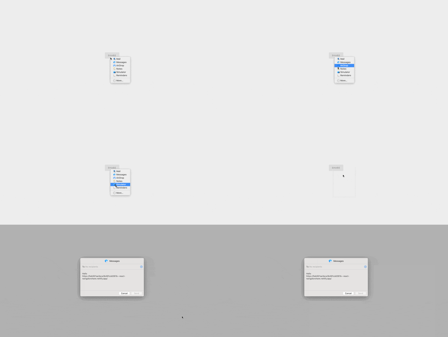
For unsupported browsers, nothing happens for now except a message in the console. Let’s fix that by displaying a modal in this case.
Create a file named ShareModal.js in the src directory and update it with the following:
import React, { Fragment } from "react";
function ShareModal({ modalVisible, shareData, handleClose }) {
return (
<>
<div className={`${"share-modal"} ${modalVisible ? "opened" : "closed"}`}>
<section className="modal-header">
<h3 className="modal-title">Share Via</h3>
<button className="close-button" onClick={() => handleClose(false)}>
×
</button>
</section>
<section className="modal-body">
<div className="row">
<div>
<button>Facebook</button>
</div>
<div>
<button>Twitter</button>
</div>
</div>
<div className="row">
<div>
<button>Instagram</button>
</div>
<div>
<button>Tiktok</button>
</div>
</div>
</section>
<section className="modal-footer">
<div className="modal-footer-link">{shareData.url}</div>
<button className="modal-footer-button">Copy Link</button>
</section>
</div>
</>
);
}
export default ShareModal;
This is the markup for a modal. It receives props to determine when to open or close the prop, and details about the resource to share.
Now update Share.js by adding data to the state to determine when to show or hide the modal.
const [showModal, setShowModal] = useState(false);
Then we update the handleSharing function by calling setShowModal(true) in the else block, when the Web Share API is not supported by the browser.
else {
    // fallback code
    setShowModal(true); //this is the line added in this snippet
    // .... other code statement below
  }
The last piece to get it working is to render the ShareModal. Update the return statement for Share.js to the code below.
return (
  <>
    <button className="sharer-button" onClick={handleSharing}>
      <span className="sharer-button-text">{label}</span>
    </button>

    <ShareModal
      handleClose={setShowModal}
      shareData={shareDetails}
      modalVisible={showModal}
    />
  </>
);
That’s it! Now you can run the React app and see how it works.

You can find the demo online here.
It’s important to note that this has limited browser support. See MDN for compatibility chart.
Wrap-up
There has been improvement and addition to web specifications in recent years. Some of them are the Service Worker API and Web Bluetooth API.
In this post, I talked about Web Share API and how you can use the Web Share API in a React app. We built a sample app with a fallback mechanism to display a different modal with the capability to share using a different mechanism.
I didn’t go into details implementing that part since our focus is on the Web Share API, but you can play around with the project and implement that by yourself. If you run into errors while doing that, feel free to leave a comment, email me or send a DM on Twitter.
The source code is on GitHub.
References:

Peter Mbanugo
Peter is a software consultant, technical trainer and OSS contributor/maintainer with excellent interpersonal and motivational abilities to develop collaborative relationships among high-functioning teams. He focuses on cloud-native architectures, serverless, continuous deployment/delivery, and developer experience. You can follow him on Twitter.
