
Using Bootstrap with React: Practical Examples

Summarize with AI:
See how to use Bootstrap with React three ways: Bootstrap directly with utility classes, react-bootstrap and KendoReact with Bootstrap theming.
Building modern web applications requires both functionality and appealing design. React excels at creating dynamic user interfaces, while Bootstrap provides a comprehensive CSS framework for responsive, professional-looking designs. When you combine these two technologies, you get a toolkit for rapid UI application development.
In this React Bootstrap tutorial, we’ll explore how to use Bootstrap with React through practical examples. We’ll cover three different approaches:
- Installing Bootstrap directly via npm and using utility classes
- Leveraging the react-bootstrap component library for React-specific components
- Using Progress KendoReact components with Bootstrap theming for enterprise-grade applications
Getting Started: Installing Bootstrap in Your React Project
Let’s start with the most direct approach, installing Bootstrap as a dependency in your React application. This method gives you access to all of Bootstrap’s utility classes and components while maintaining full control over your styling.
First, install Bootstrap using npm or yarn:
npm install bootstrap
Once installed, import Bootstrap’s CSS into your main application file (typically src/main.jsx or src/App.jsx):
import { StrictMode } from 'react';
import { createRoot } from 'react-dom/client';
import App from './App.jsx';

import 'bootstrap/dist/css/bootstrap.min.css';

createRoot(document.getElementById('root')).render(
  <StrictMode>
    <App />
  </StrictMode>
);
Now, you can start using Bootstrap classes throughout your React components. Let’s build a practical example: a product card component that showcases Bootstrap’s styling capabilities.
React Bootstrap Example: Building a Product Dashboard
We’ll create a product dashboard that demonstrates various Bootstrap components working together in a React application. This example will show you how to use Bootstrap with React for real-world scenarios.
First, we’ll create a ProductCard component:
export function ProductCard({ product }) {
  return (
    <div className="card h-100 shadow-sm">
      <img
        src={product.image}
        className="card-img-top"
        alt={product.name}
        style={{ height: '200px', objectFit: 'cover' }}
      />
      <div className="card-body d-flex flex-column">
        <h5 className="card-title">{product.name}</h5>
        <p className="card-text text-muted flex-grow-1">
          {product.description}
        </p>
        <div className="d-flex justify-content-between align-items-center">
          <span className="h5 text-primary mb-0">${product.price}</span>
          <button className="btn btn-outline-primary">Add to Cart</button>
        </div>
      </div>
    </div>
  );
}
Next, let’s create a main dashboard component that uses Bootstrap’s grid system:
import { useState } from 'react';

export function ProductDashboard() {
  const [products] = useState([
    {
      id: 1,
      name: "Wireless Headphones",
      description: "High-quality wireless headphones with noise cancellation",
      price: 199.99,
      image: "https://via.placeholder.com/300x200"
    },
    {
      id: 2,
      name: "Smart Watch",
      description: "Feature-rich smartwatch with health monitoring",
      price: 299.99,
      image: "https://via.placeholder.com/300x200"
    },
    {
      id: 3,
      name: "Laptop Stand",
      description: "Ergonomic adjustable laptop stand for better posture",
      price: 79.99,
      image: "https://via.placeholder.com/300x200"
    }
  ]);

  const [searchTerm, setSearchTerm] = useState('');

  const filteredProducts = products.filter(product =>
    product.name.toLowerCase().includes(searchTerm.toLowerCase())
  );

  return (
    <div className="container-fluid py-4">
      {/* Header Section */}
      <div className="row mb-4">
        <div className="col-12">
          <div className="d-flex justify-content-between align-items-center">
            <h1 className="display-4 fw-bold text-primary">Product Store</h1>
            <div className="d-flex gap-2">
              <input
                type="text"
                className="form-control"
                placeholder="Search products..."
                value={searchTerm}
                onChange={(e) => setSearchTerm(e.target.value)}
                style={{ width: '250px' }}
              />
              <button className="btn btn-primary">
                <i className="bi bi-search"></i> Search
              </button>
            </div>
          </div>
        </div>
      </div>

      {/* Alert for empty search */}
      {searchTerm && filteredProducts.length === 0 && (
        <div className="alert alert-warning" role="alert">
          <i className="bi bi-exclamation-triangle"></i> No products found matching "{searchTerm}"
        </div>
      )}

      {/* Products Grid */}
      <div className="row g-4">
        {filteredProducts.map(product => (
          <div key={product.id} className="col-lg-4 col-md-6 col-sm-12">
            <ProductCard product={product} />
          </div>
        ))}
      </div>

      {/* Statistics Section */}
      <div className="row mt-5">
        <div className="col-12">
          <div className="card bg-light">
            <div className="card-body">
              <div className="row text-center">
                <div className="col-md-4">
                  <h3 className="text-primary">{products.length}</h3>
                  <p className="text-muted">Total Products</p>
                </div>
                <div className="col-md-4">
                  <h3 className="text-success">{filteredProducts.length}</h3>
                  <p className="text-muted">Showing</p>
                </div>
                <div className="col-md-4">
                  <h3 className="text-info">$579.97</h3>
                  <p className="text-muted">Total Value</p>
                </div>
              </div>
            </div>
          </div>
        </div>
      </div>
    </div>
  );
}

export default ProductDashboard;
We can finally render this dashboard in our main App component:
import { ProductDashboard } from './ProductDashboard';

function App() {
  return <ProductDashboard />;
}

export default App;
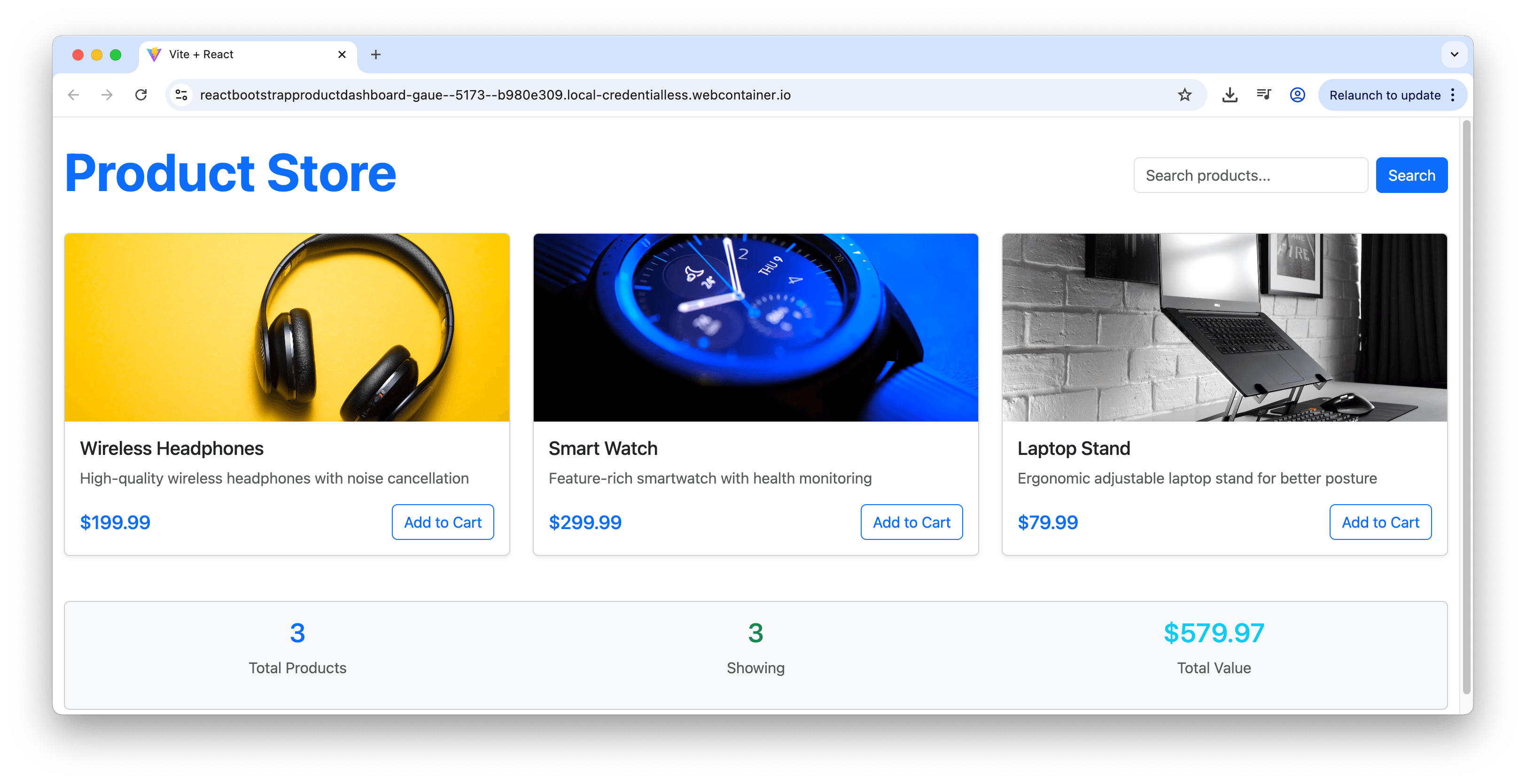
The result is a professional-looking product dashboard with a large “Product Store” heading, search functionality in the top-right corner and a responsive grid of product cards. Each card displays the product image, name, description and price with a clean Bootstrap-styled “Add to Cart” button.
This example demonstrates several Bootstrap features working together in React:
- Grid system: Responsive columns that adapt to different screen sizes
- Cards: Clean product presentation with consistent styling
- Forms: Search functionality with Bootstrap form controls
- Alerts: Conditional messaging for empty search results
- Utilities: Spacing, colors, and alignment classes
Test the above in this StackBlitz demo.
Using react-bootstrap for Component-Based Development
While using Bootstrap’s CSS classes directly works well, the react-bootstrap library provides a more React-centric approach. This library offers prebuilt React components that encapsulate Bootstrap’s functionality while following React patterns and conventions.
We first install the react-bootstrap library:
npm install react-bootstrap
With react-bootstrap installed, we can rebuild our product dashboard using react-bootstrap components. We’ll start by converting our ProductCard component to use react-bootstrap components:
import { Card, Button, Badge } from 'react-bootstrap';

export function ProductCard({ product }) {
  return (
    <Card className="h-100 shadow-sm">
      <Card.Img
        variant="top"
        src={product.image}
        style={{ height: '200px', objectFit: 'cover' }}
      />
      <Card.Body className="d-flex flex-column">
        <Card.Title>{product.name}</Card.Title>
        <Card.Text className="text-muted flex-grow-1">
          {product.description}
        </Card.Text>
        <div className="d-flex justify-content-between align-items-center">
          <h5 className="text-primary mb-0">${product.price}</h5>
          <Button variant="outline-primary">Add to Cart</Button>
        </div>
        {product.isNew && (
          <Badge bg="success" className="position-absolute top-0 start-0 m-2">
            New
          </Badge>
        )}
      </Card.Body>
    </Card>
  );
}
Notice how we’re now using Card, Card.Img, Card.Body, Card.Title and Card.Text components instead of HTML elements with Bootstrap classes. The Button component replaces the HTML button element, and we can use the variant prop to specify the Bootstrap button style.
Now let’s rebuild our dashboard component using react-bootstrap’s layout components:
import { useState } from 'react';
import {
  Container,
  Row,
  Col,
  Form,
  Alert
} from 'react-bootstrap';

function ProductDashboard() {
  const [products] = useState([
    {
      id: 1,
      name: "Wireless Headphones",
      description: "High-quality wireless headphones with noise cancellation",
      price: 199.99,
      image: "https://via.placeholder.com/300x200",
      isNew: true
    },
    {
      id: 2,
      name: "Smart Watch",
      description: "Feature-rich smartwatch with health monitoring",
      price: 299.99,
      image: "https://via.placeholder.com/300x200"
    },
    {
      id: 3,
      name: "Laptop Stand",
      description: "Ergonomic adjustable laptop stand for better posture",
      price: 79.99,
      image: "https://via.placeholder.com/300x200"
    }
  ]);

  const [searchTerm, setSearchTerm] = useState('');
  const [showAlert, setShowAlert] = useState(false);

  const filteredProducts = products.filter(product =>
    product.name.toLowerCase().includes(searchTerm.toLowerCase())
  );

  const handleSearch = (e) => {
    const term = e.target.value;
    setSearchTerm(term);
    setShowAlert(term && filteredProducts.length === 0);
  };

  return (
    <Container fluid className="py-4">
      <Row className="mb-4">
        <Col>
          <div className="d-flex justify-content-between align-items-center">
            <h1 className="display-4 fw-bold text-primary">Product Store</h1>
            <Form.Control
              type="text"
              placeholder="Search products..."
              value={searchTerm}
              onChange={handleSearch}
              style={{ width: '250px' }}
            />
          </div>
        </Col>
      </Row>

      {showAlert && (
        <Alert variant="warning" dismissible onClose={() => setShowAlert(false)}>
          No products found matching "{searchTerm}"
        </Alert>
      )}

      <Row xs={1} md={2} lg={3} className="g-4">
        {filteredProducts.map(product => (
          <Col key={product.id}>
            <ProductCard product={product} />
          </Col>
        ))}
      </Row>

      <Row className="mt-5">
        <Col>
          <Card bg="light">
            <Card.Body>
              <Row className="text-center">
                <Col md={4}>
                  <h3 className="text-primary">{products.length}</h3>
                  <p className="text-muted">Total Products</p>
                </Col>
                <Col md={4}>
                  <h3 className="text-success">{filteredProducts.length}</h3>
                  <p className="text-muted">Showing</p>
                </Col>
                <Col md={4}>
                  <h3 className="text-info">$579.97</h3>
                  <p className="text-muted">Total Value</p>
                </Col>
              </Row>
            </Card.Body>
          </Card>
        </Col>
      </Row>
    </Container>
  );
}

export default ProductDashboard;
The result looks identical to our vanilla Bootstrap example—a clean, professional dashboard with search functionality, product cards and statistics section. The only difference is that we’re now using React components instead of HTML elements with Bootstrap classes.

The react-bootstrap approach offers several advantages:
- Component-based: Each Bootstrap element is a React component with props
- TypeScript support: Better IDE support and type checking
- Event handling: React-style event handlers instead of Bootstrap’s data attributes
- Accessibility: Built-in ARIA attributes and keyboard navigation
Test the above in this StackBlitz demo.
KendoReact with Bootstrap Theme
For enterprise applications requiring components like data grids, charts and complex form controls, Progress KendoReact provides a comprehensive solution. What makes KendoReact particularly appealing for Bootstrap users is its Bootstrap theme support.
KendoReact offers a Bootstrap theme that enables visual consistency with Bootstrap-styled applications. The Telerik and Kendo UI Bootstrap theme is a fully customizable SCSS-based theme that uses Bootstrap metrics to integrate seamlessly with applications already using Bootstrap for layout and styles.
Here’s how to set up KendoReact with the Bootstrap theme:
npm install --save @progress/kendo-theme-bootstrap
We then import the Bootstrap theme in our application:
import '@progress/kendo-theme-bootstrap/dist/all.css';
Now you can use KendoReact components that automatically inherit Bootstrap styling:
import { Grid, GridColumn } from '@progress/kendo-react-grid';
import { Button } from '@progress/kendo-react-buttons';

function EnterpriseProductGrid() {
  const [products] = useState([
    {
      id: 1,
      name: "Wireless Headphones",
      category: "Electronics",
      price: 199.99,
      inStock: true,
    },
    // ... more products
  ]);

  return (
    <div className="container mt-4">
      <div className="row mb-3">
        <div className="col">
          <h2 className="text-primary">Product Management</h2>
          <p className="text-muted">Powered by KendoReact with Bootstrap theme</p>
        </div>
        <div className="col-auto">
          <Button themeColor="primary" className="me-2">
            Add Product
          </Button>
          <Button themeColor="secondary">
            Export Data
          </Button>
        </div>
      </div>

      <Grid data={products} style={{ height: '400px' }}>
        <GridColumn field="name" title="Product Name" />
        <GridColumn field="category" title="Category" />
        <GridColumn field="price" title="Price" format="{0:c}" />
        <GridColumn field="inStock" title="In Stock" />
        <GridColumn field="lastUpdated" title="Last Updated" format="{0:d}" />
      </Grid>
    </div>
  );
}
The KendoReact Bootstrap theme provides several benefits:
- Consistent design: Components match Bootstrap’s visual language
- Advanced functionality: Enterprise-grade components like data grids and charts that Bootstrap and react-bootstrap doesn’t offer
- Customization: Full SCSS customization support
- Professional appearance: Polished components suitable for business applications
Best Practices for Bootstrap and React Integration
When building applications that combine Bootstrap with React, consider these best practices:
1. Choose Your Approach Consistently
Don’t mix different Bootstrap integration methods within the same project. Pick one approach and stick with it for consistency.
2. Leverage CSS Modules for Custom Styling
When you need custom styles alongside Bootstrap, use CSS modules to avoid global namespace conflicts:
import styles from './ProductCard.module.css';

function ProductCard({ product }) {
  return (
    <div className={`card ${styles.customCard}`}>
      {/* Component content */}
    </div>
  );
}
3. Optimize Bundle Size
If using vanilla Bootstrap, consider importing only the components you need:
// Instead of importing all of Bootstrap
import 'bootstrap/dist/css/bootstrap.min.css';

// Import specific components
import 'bootstrap/scss/functions';
import 'bootstrap/scss/variables';
import 'bootstrap/scss/mixins';
import 'bootstrap/scss/grid';
import 'bootstrap/scss/cards';
4. Maintain Responsive Design
Always test your components across different screen sizes and use Bootstrap’s responsive utilities:
function ResponsiveComponent() {
  return (
    <div className="row">
      <div className="col-12 col-md-8 col-lg-6">
        <div className="d-block d-md-flex justify-content-between">
          <span className="fw-bold">Product Name</span>
          <span className="text-muted d-none d-lg-block">SKU: 12345</span>
        </div>
      </div>
    </div>
  );
}
Conclusion
Learning how to use Bootstrap with React opens up powerful possibilities for rapid UI development. Whether you choose to use Bootstrap’s utility classes directly, leverage react-bootstrap components or integrate KendoReact with Bootstrap theming, each approach offers unique advantages for different project requirements.
The key is understanding your project’s needs:
- Use vanilla Bootstrap for maximum control and minimal dependencies.
- Choose react-bootstrap for component-based development with React patterns.
- Consider KendoReact with Bootstrap theme for enterprise applications requiring advanced components.
By mastering these approaches, you’ll be equipped to build responsive web applications that combine React’s functionality with Bootstrap’s proven design system.
Remember that Bootstrap and React work best together when you maintain consistency in your chosen approach and follow React’s best practices for component design and state management.

Hassan Djirdeh
Hassan is a senior frontend engineer and has helped build large production applications at-scale at organizations like Doordash, Instacart and Shopify. Hassan is also a published author and course instructor where he’s helped thousands of students learn in-depth frontend engineering skills like React, Vue, TypeScript, and GraphQL.
Comments
All articles
Topics
Web MobileMobile
Desktop
Design
Productivity
People
