The Power of the Incomplete: Designing Progress

Summarize with AI:
Progress isn’t found in the finish—it’s made in the steps between. Make the in-between visible, and you don’t just show progress—you design it.
Teams are often obsessed with the final result.
But progress isn’t only found in the finish—it happens in the steps between. When we visualize those steps, the incomplete design becomes a powerful tool.
The Illusion of Completeness
When something is complete, it looks done. It suggests certainty. It feels like quality.
But in product development, “final” is an illusion. Just because the tasks are done doesn’t automatically mean the product is good. Dragging tickets to the next column can feel like progress but might hide a serious flaw.
I was building a small LEGO digger with my daughter the other day. It was interesting to see how she was more focused on following the steps correctly than fast-forwarding to a functioning digger.
The instructions were detailed. We used the mobile app with 3D models and animations. You trust the makers that every step is there for a reason. Together with IKEA furniture, it’s one of the few manuals I actually read—and for good reason.
There’s no room for guessing. It’s designed to be assembled in a certain way. Every step is illustrated clearly, and once in a while you get a little overview of your progress.
It’s simplified with micro-success. It’s continuous completeness. The final result is the reward.
The Missing Middle
Most teams describe what should happen at the start and verify what happened at the end. But the middle? It’s often hidden.
The result is rework, misalignment and late feedback.
The solution isn’t more documentation—it’s more visibility.
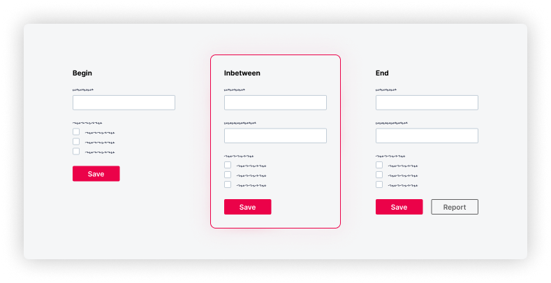
Wireframes, low-fidelity mocks or prototypes can be reverse-designed. From the current state to the desired state, you can show the progression.
Take a common case: An admin console where you manage access entitlements. The current version has a simple form: email, roles, save.
Now the team wants to expand its features:
- Users can get access by adding them to a group (dropdown)
- And generate an access control report for documentation (button)
All those additions lead to a new “final” state.
But each feature introduces its own interface and backend changes. To design this well, you can accompany each user story with a lightweight wireframe or diagram showing how the interface or system evolves—from the simple form to the new version.

This illustration is very basic. So, yes, it might feel like overkill. But all I did was copy the end state and hide the report button.
That might look trivial, but I’ve seen in real projects that this kind of visibility works. It removes unnecessary guessing. It’s childproof—like LEGO.
And it doesn’t take a lot of time to produce—just hiding a few elements and sharing them.
The result is clarity about progress.
Closure
Progress isn’t all about the finish. It’s made in the steps between.
When you visualize those steps intentionally, you don’t just show progress—you design for it.
Don’t just design the result. Design the progress.

Teon Beijl
Teon Beijl is a business designer with over a decade of experience in enterprise software for the oil and gas industry.
Formerly Global Design Lead for reservoir modeling, remote operations and optimization software at Baker Hughes, he now helps people who feel stuck through his own business, Unpuzzler. Teon works with leaders on business design and with professionals on career design, leveraging his experience as both designer and leader to help people create clarity and live on purpose—by design. Connect with Teon on LinkedIn or Substack.

