Check out the New Button Control in Telerik UI for Xamarin

Summarize with AI:
We all use apps when we have to - but we prefer to use beautiful ones. See how you can easily improve your Xamarin Forms app with new round and image-based buttons in Telerik UI for Xamarin.
We all use apps daily. We use them not just because we want to, but because we have to - we just need to get something done. But we prefer beautiful apps with animations, transitions, effects and so forth. That's why when you create an app you want it to deliver the best possible user experience. There are many ways you can do this, but one easy way is to customize your buttons!
Introducing the new Button in Telerik UI for Xamarin
In the Telerik R1 2018 Release we introduced the brand new Button Component for Telerik UI for Xamarin. But why did we implement a new Button when there is already a Xamarin Forms Button?
We wanted one that can do it all. The new Button gives you the ability to:
- Support Telerik themes
- Set an image in the background
- Have rounded corners and be fully circular
- Align the Image and Text as desired
- Have individual stroke thickness on each side
- Do everything a Button could do before
In the next few sections, I will demonstrate a couple of ways to use our new Button and customize its look.
Creating a Round Button
As a start we can make our buttons round. Because I will have two, I have created a style that both buttons will use.
<Style x:Key="roundButtonStyle" TargetType="telerikInput:RadButton">
  <Setter Property="WidthRequest" Value="36" />
  <Setter Property="HeightRequest" Value="36" />
  <Setter Property="BorderRadius" Value="18" />
  <Setter Property="HorizontalOptions" Value="Center" />
  <Setter Property="VerticalOptions" Value="Center" />
  <Setter Property="TextColor" Value="White" />
  <Setter Property="FontAttributes" Value="Bold" />
</Style>

<telerikInput:RadButton
  Text="✗"
  Style="{StaticResource roundButtonStyle}"
  BackgroundColor="#D50000" />

<telerikInput:RadButton
  Text="✓"
  Style="{StaticResource roundButtonStyle}"
  BackgroundColor="#007E00" />
In essence, you need to set the width and height request to the same value, and set the border radius to half of that value. And this is the result I get on a UWP emulator.

Creating an Image Button
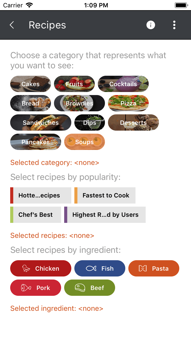
In a similar manner you can create buttons that have longer text, but still have rounded corners. You can find an example of this in our QSF examples (source code). Here the HeightRequest is set to 32 and the BorderRadius to 16. The WidthRequest is not set, because we want the button to autosize. In order to get the image in the back, you can use the BackgroundImage property.
<telerikInput:RadButton.BackgroundImage>
  <OnPlatform x:TypeArguments="FileImageSource">
    <OnPlatform.Platforms>
      <On Platform="iOS, Android" Value="Button_Recipes_Cakes.png" />
      <On Platform="UWP" Value="Assets\Button_Recipes_Cakes.png" />
    </OnPlatform.Platforms>
  </OnPlatform>
</telerikInput:RadButton.BackgroundImage>
This is what you will get on an iOS simulator:

If you need the image to be next to the text and not in the background, you can utilize the Image property.
<telerikInput:RadButton.Image>
  <OnPlatform x:TypeArguments="FileImageSource">
    <OnPlatform.Platforms>
      <On Platform="iOS, Android" Value="Button_Recipes_Chicken.png" />
      <On Platform="UWP" Value="Assets\Button_Recipes_Chicken.png" />
    </OnPlatform.Platforms>
  </OnPlatform>
</telerikInput:RadButton.Image>
Yes, it's that easy! Now go beautify your app and let us know how you like the new Button Component in our suite.
Try It Out and Share Your Feedback
Make sure to download the latest version of the Telerik UI for Xamarin, and try the new Buttons in your mobile app alongside all the other new features that came with the Telerik R1 2018 Release.
Download Telerik UI for Xamarin
We'd love to hear what you think, so please make sure to share your feedback through our Forums or through the Feedback Portal. Additionally, here are some other Telerik UI for Xamarin resources that you can find useful: online documentation, SDK demos, QSF Application and its source code.
Thanks and happy coding!

Petar Marchev
Petar Marchev is a developer in the Telerik XAML Team. Petar has a passion for desktop and mobile application development, code optimizations and multithreaded programming. He is an audiophile and enjoys music from his full range speakers and tube amp.
