GIF Guide: Creating a Progressive Web App with KendoReact

Summarize with AI:
In this GIF Guide, Tara Manicsic walks you through the steps necessary to create a Progressive Web App (PWA) with KendoReact.
What is a Progressive Web App?
Progressive Web Apps (PWAs) are getting more and more attention for good reason. They utilize modern web technologies to make your app more engaging and reliable for your users. These are technologies like service workers and app manifest files. Service Workers are JavaScript files that utilize different APIs like service worker, cache and push APIs. An App Manifest is simply a JSON file that lets the browser know how to display your application. This includes if the app is displayed full-screen (i.e. removing the browser chrome so only the app can be viewed) and choosing the icon to display on a home screen if the user chooses to install your app to their device. You can check out my talk, PWA All the Things, or this article series from Raymond Camden.
In this project we'll create a React PWA using the create-react-app library and KendoReact UI components. I will explain each step we take to make our application more PWA-y including using an app manifest and service worker file. This project will take advantage of the app manifest file to make our application be displayed full-screen to make it more immersive and app-like. We will also use a service worker to cache some of the app's resources so users can interact with it even if they don't have a network connection. The app will be a simple task tracker that lets you add a task and how many times you want to preform that task.
Here's the plan for this tutorial:
- Create a React project using create-react-app
- Install KendoReact components
- Build out the user input
- Edit the App Manifest File
- Configure Offline Caching
- Bask in the Glory of Our Finished App
I setup a repo to guide you through each section where we make code changes. At the end of each section you will see a happy, little octopus (🐙). Clicking the octopus icon will guide you to the commit containing that section's code changes. Thanks, happy, little octopus!
Creating the React Application
There are great tools to create PWAs and one of them is the create-react-app library. In order to be able to use create-react-app in any directory we'll install it globally using the -g flag.
npm i create-react-app -g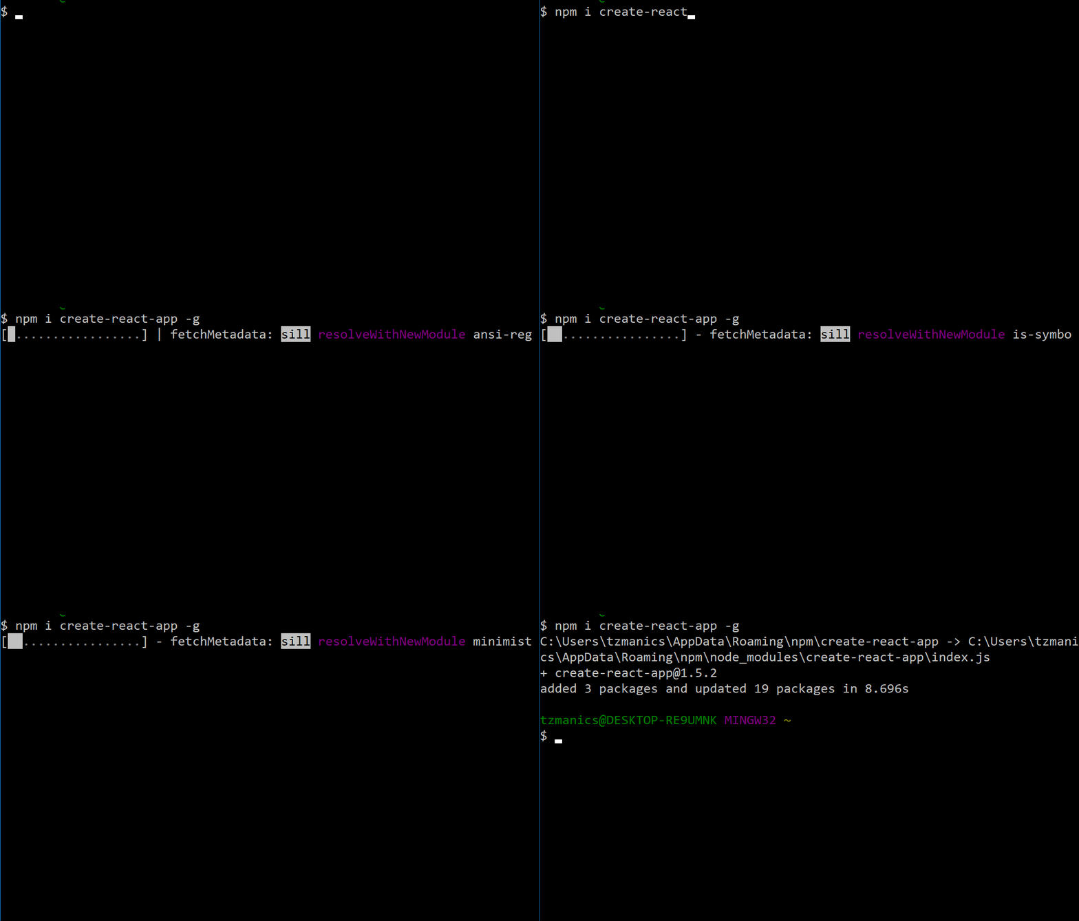
Now that we have create-react-app installed globally, we can go to the directory where we want our application to live and simply run:
create-react-app <project name>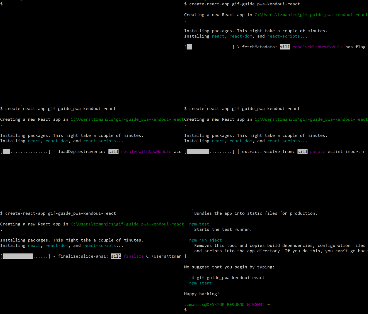
Once our app is created, we can change into the project directory. Then run npm start to see the initial project running.
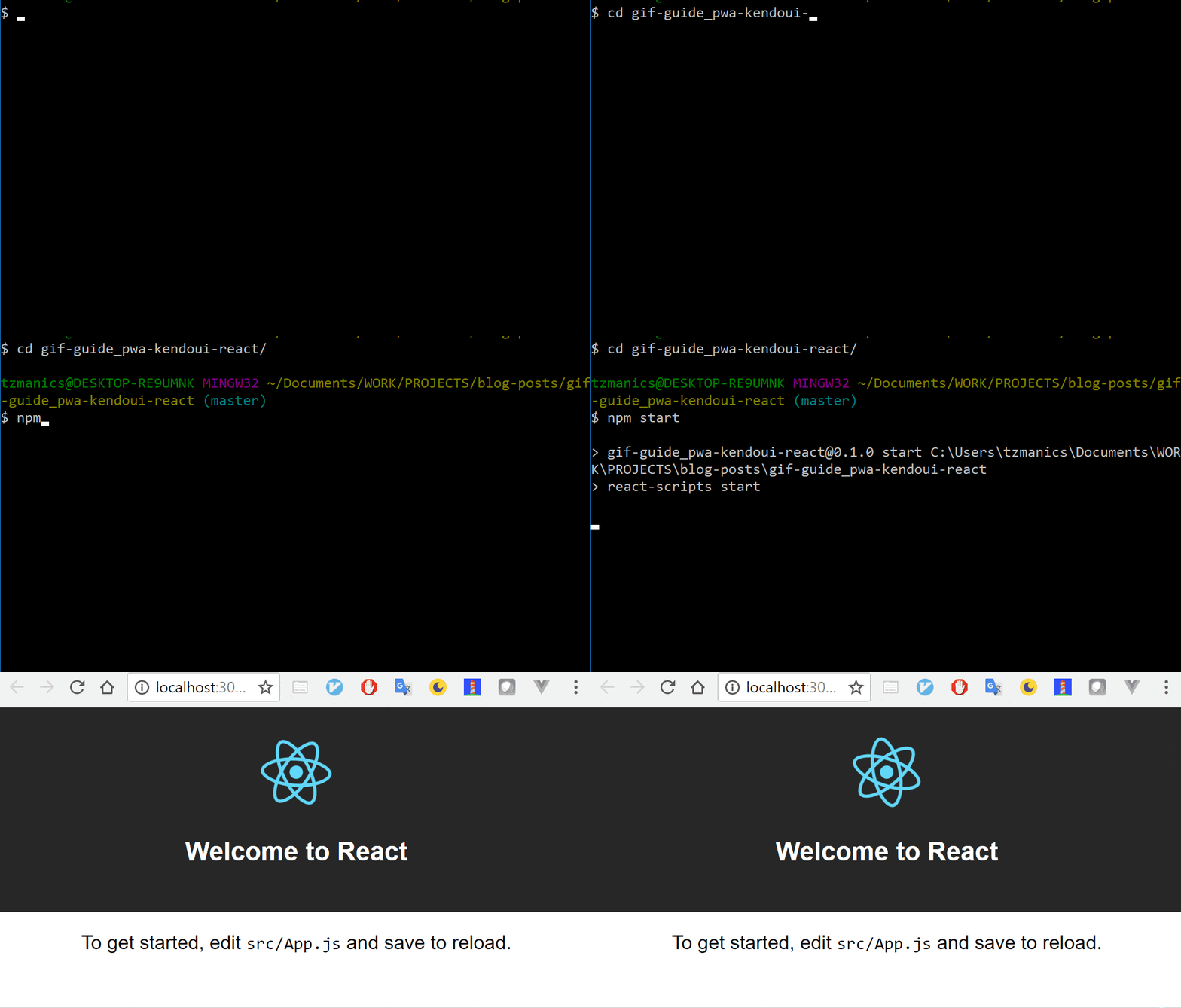
create-react-app makes it so that you can run npm start to get your project running and keep it going in the background. As you make changes, the application will update automatically. For this project, we will keep it running so that we don't have to run npm start again. If you do close it, just remember you can enter npm start anywhere in your project's directory to have it running again.
🐙: Commit covering creating a React application.
Installing and Using the KendoReact UI Components
The running app looks good, now we can install the KendoReact components we'll be using today:
NumericTextBoxto set the iterations amount for each task.Buttonwhich we'll use to submit the new task.
To install the the modules, we just need to run npm i <package location via npm>. Since we're using npm 5+, we don't need to add the -save (-S) flag to save this package as a dependency because it is included by default. Here are the install commands for each component:
NumericTextBox: @progress/kendo-react-inputs @progress/kendo-react-intl *
Button: @progress/kendo-react-buttons
Note: The NumericTextBox also uses the internationalization library, check out more information here.
We can install all of these components at once by running this in our terminal/command prompt:
npm i @progress/kendo-react-inputs @progress/kendo-react-intl @progress/kendo-react-buttons
We will also download the library for the KendoReact Default theme. This makes the component's style look uniform and also adds different interactions, animations and accessibility features. We just install it the same way we installed our components: with npm.
npm i @progress/kendo-theme-default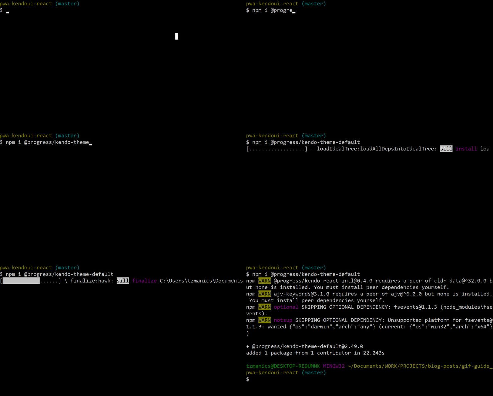
Now that we have all the pieces we need we can get started building up our application. To create, we must first destroy. 😉 Move into the src directory, which is where most of our editing will happen for this project. Inside there we'll open the App.js file and remove the logo.svg file that we will no longer be using. Then remove all the code inside the first <div> in the App.js file.
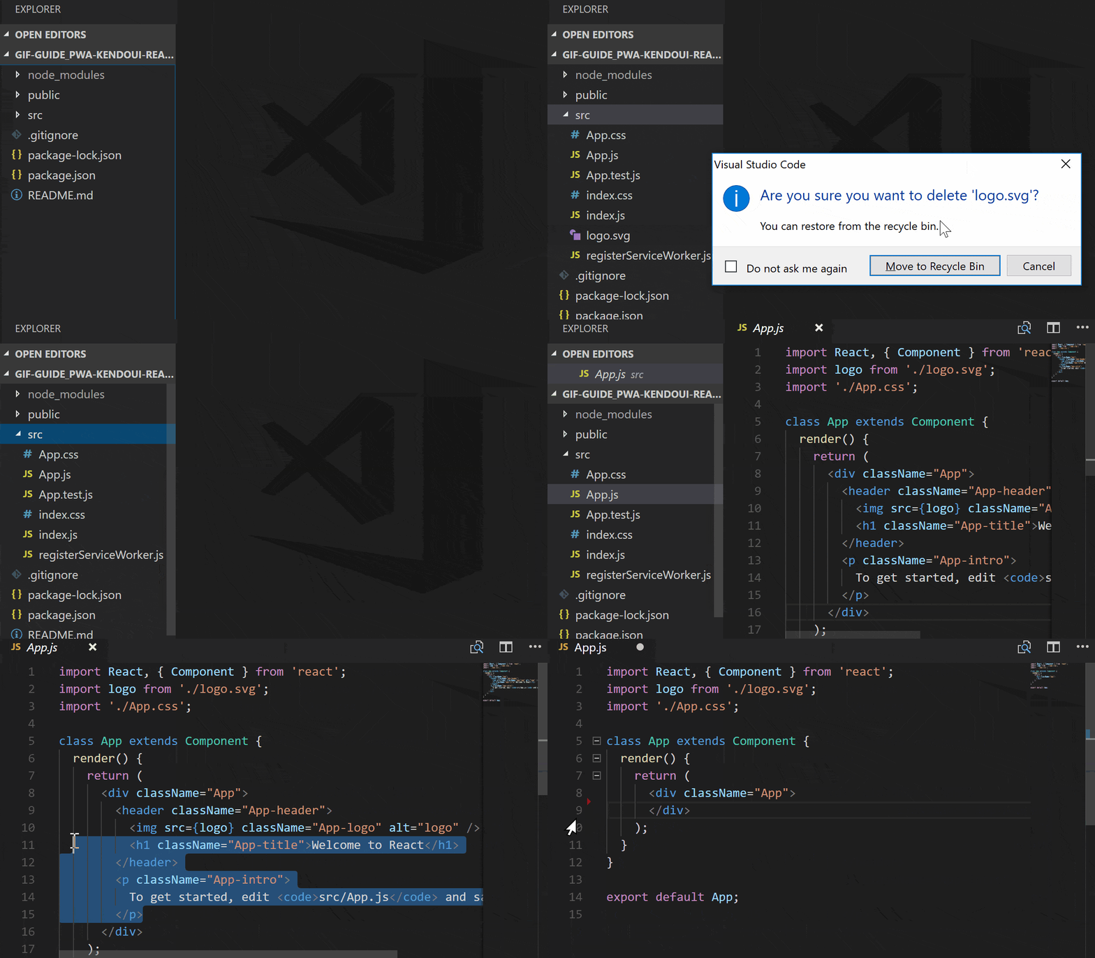
This is how the App.js file will look now:
import React, { Component } from 'react';
import './App.css';

class App extends Component {
  render() {
    return (
      <div className="App">
      </div>
    );
  }
}

export default App;
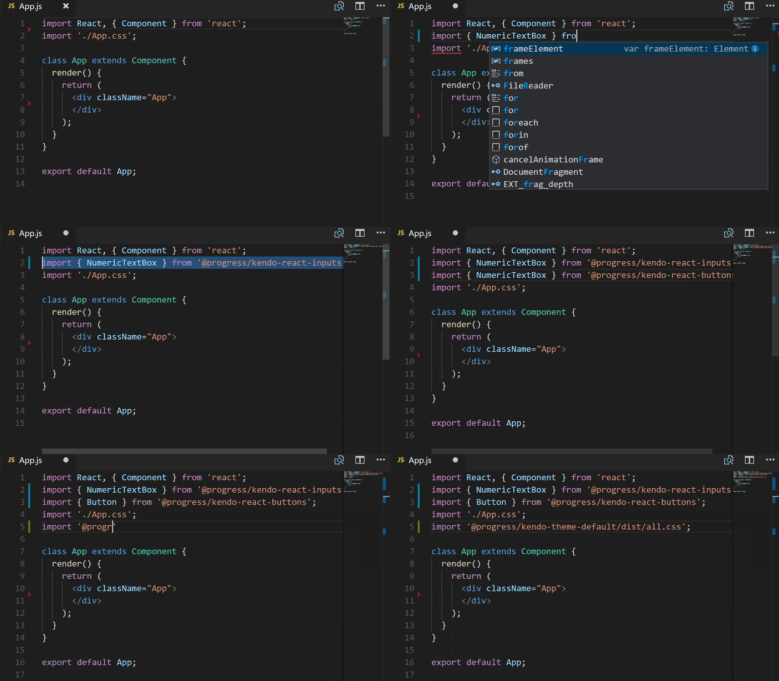
With our clean-ish slate, we can now import the components we'll be using and the style from KendoReact.
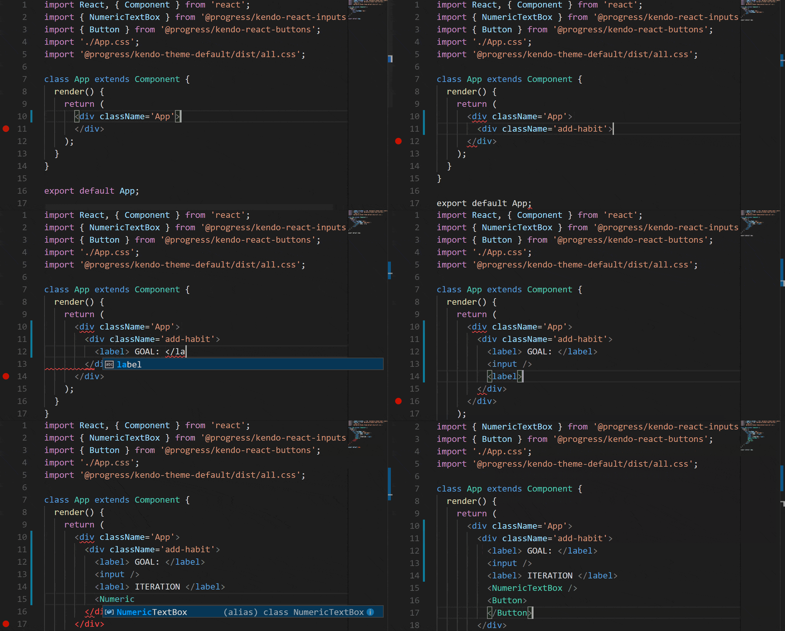
KendoReact pieces are now incorporated into our component we can add them to what we're rendering. For starters, we'll just add the NumericTextBox and Button component without customizing their attributes or giving actions to their event listeners. We'll also add an <input> for user's to give their goal a name.
Here is what the code will look like at this point:
import React, { Component } from 'react';
import { NumericTextBox } from '@progress/kendo-react-inputs';
import { Button } from '@progress/kendo-react-buttons';
import './App.css';
import '@progress/kendo-theme-default/dist/all.css';

class App extends Component {
  render() {
    return (
      <div className='App'>
        <div className='add-habit'>
          <label> GOAL: </label>
          <input />
          <label> ITERATION </label>
          <NumericTextBox />
          <Button></Button>
        </div>
      </div>
    );
  }
}

export default App;
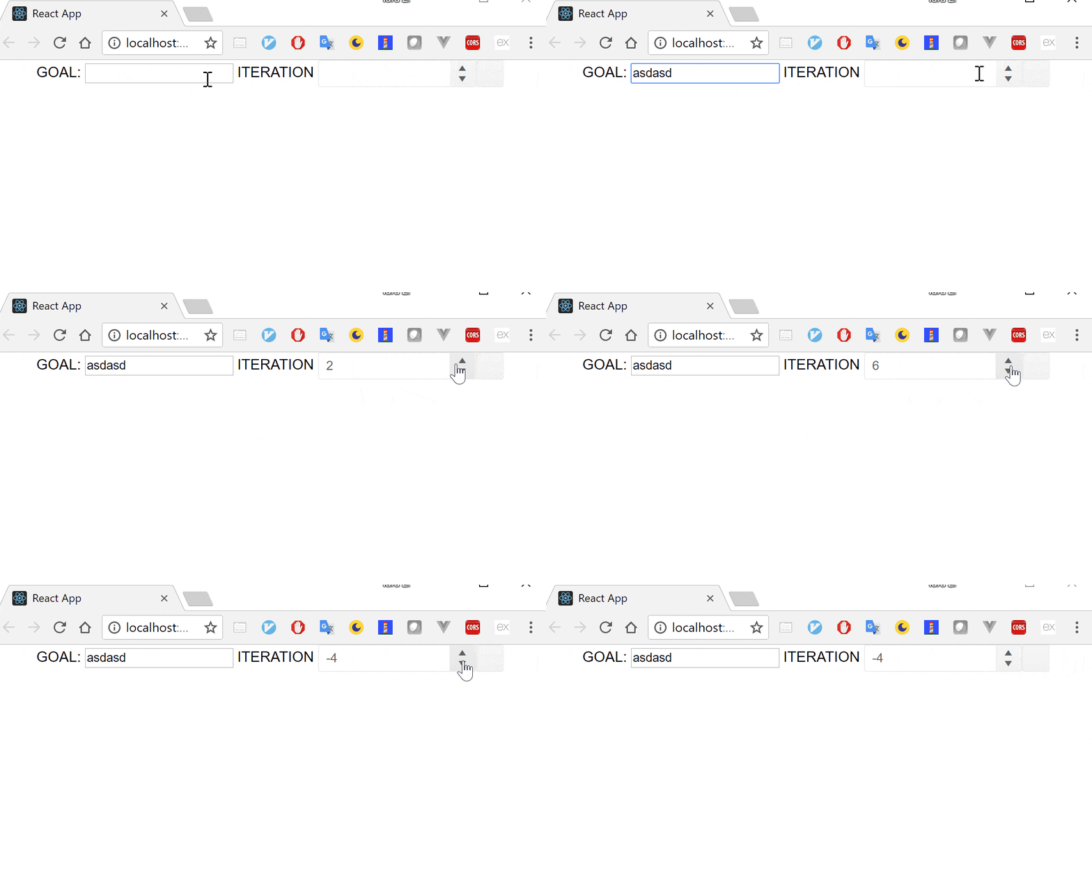
We can see that our running application has the components we added but they don't do anything yet.
🐙: Commit covering installing and adding Kendo UI React components plus code deletion.
Adding Component Functionality
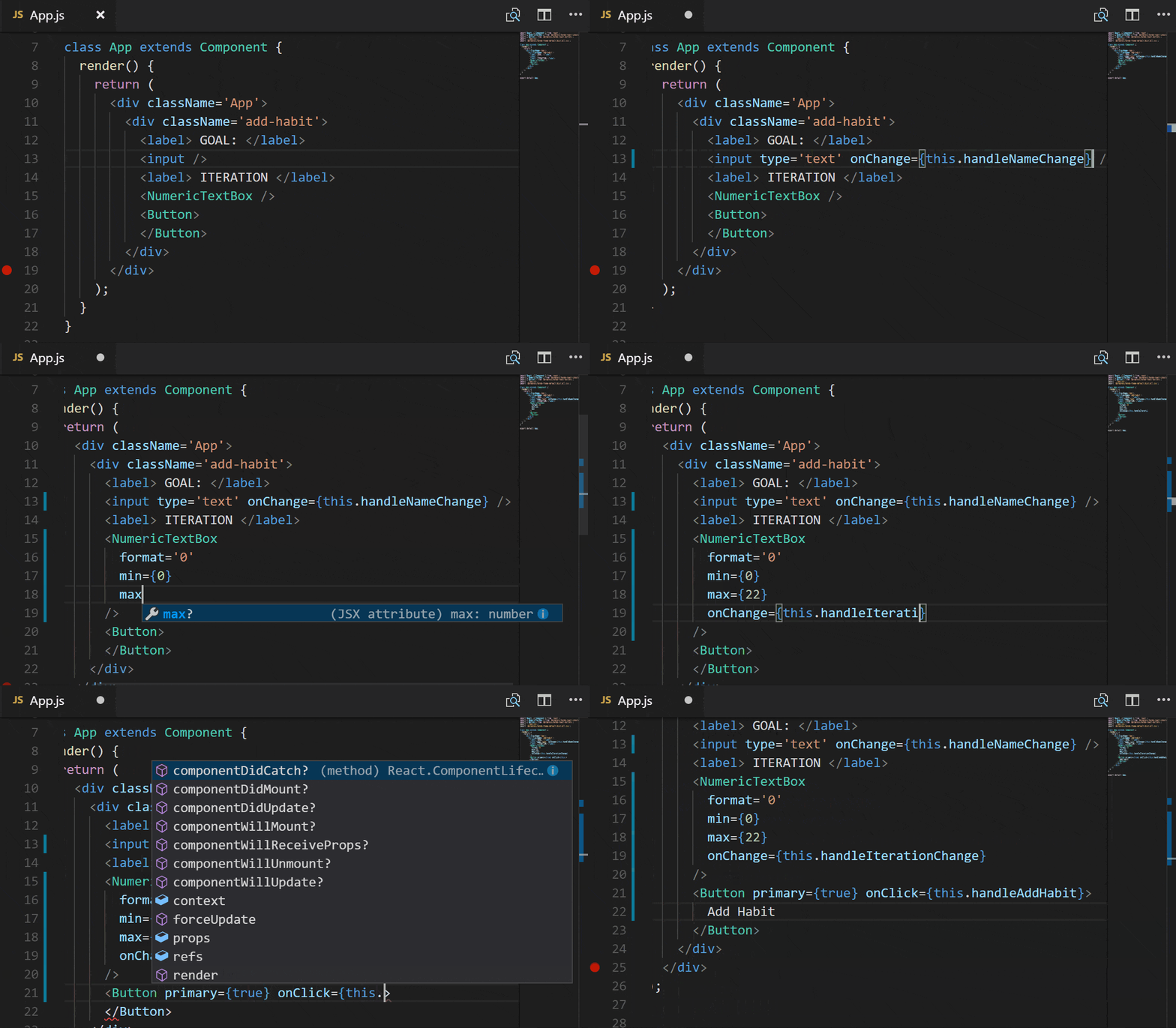
Now that we have everything included and working, we can get our inputs to do some work. First, we'll add some attributes and event listeners to the <input>, NumericTextBox, and Button.
<input>: will get thetypeset totextand we'll listen foronChangeto be triggered. Then it will call on a function we will make calledhandleNameChangethat will store the new name for the habit.NumericTextBox:formatwill be set to 0 so we don't have decimals,minwill be set to 0 so we have no negative numbers,maxwe're setting to 22 just so we don't go too high on our goals. 😉 Then, we'll listen foronChangeto be triggered and call a new function,handleIterationChangeto update the iteration amount.Button: to add some pop 🎈 we'll setprimarytotruemaking it a primary styled. Then we'll listen for theOnClickevent and call a function we'll make calledhandleAddHabitwhich will add the new input amounts as an object to thehabitsarray.
Here is what the new add-habit section will look like:
<div className='add-habit'>
  <label> GOAL: </label>
  <input type='text' onChange={this.handleNameChange} />
  <label> ITERATION </label>
  <NumericTextBox format='0'
                  min={0}
                  max={22}
                  onChange={this.handleIterationChange} />
  <Button primary={true} onClick={this.handleAddHabit}>
    Add Habit
  </Button>
</div>
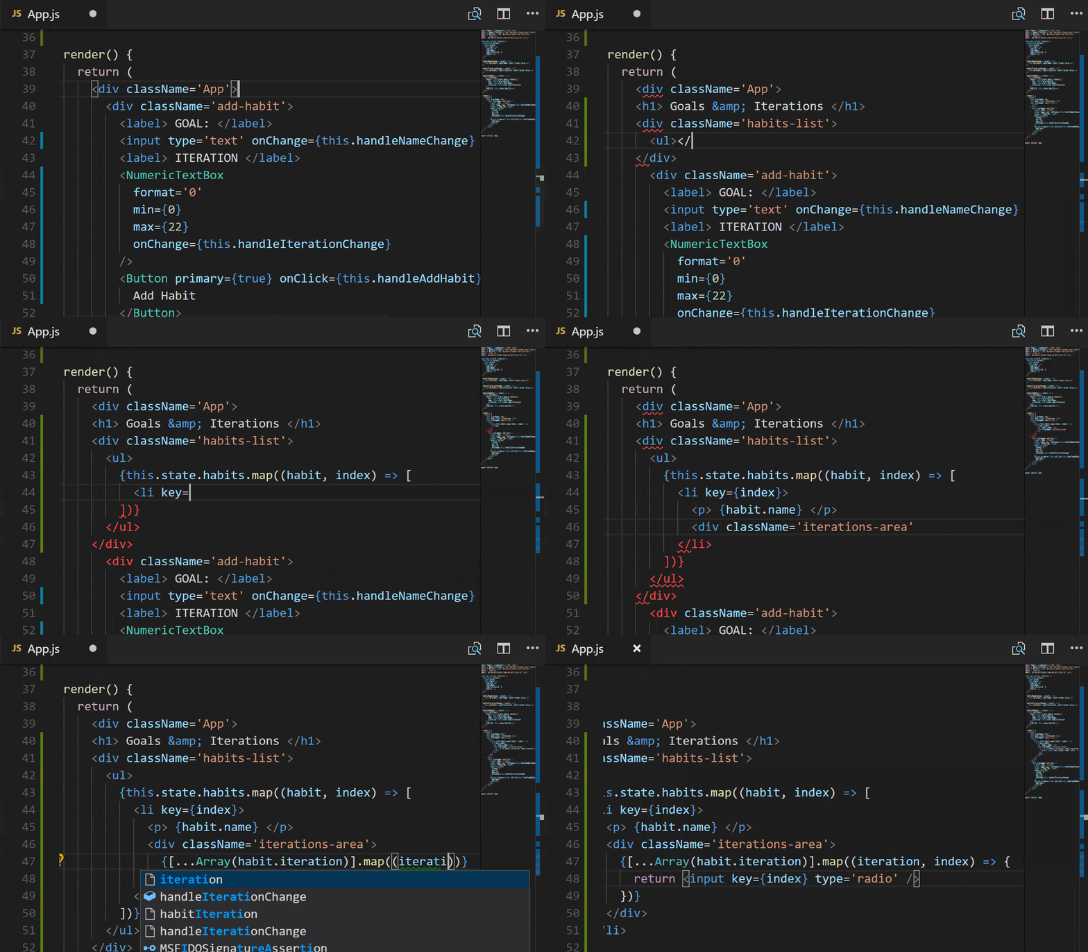
Above that, we want to display all the different habits that get created. First, we'll create a <div> that contains an un-ordered list (<ul>). Then, using map, we'll make a list item (<li>) for every habit that is in the habits array. Next, inside each list item, we'll give the index of the map function to act as a unique key for each item. Inside the list item, we'll list the name of the habit. Then, add a <div> to list the amount of iterations assigned to that habit. To make a radio button for each time iteration, there are a few steps:
- Use
...Arrayand pass it the sethabititerations to create an array with that many items. - Use
mapto iterate through that newly made array. - Return a radio type
<input>for each item in the array.
That is the final part that we will put inside of our render function. Let's take a look:
render() {
  return (
    <div className='App'>
      <h1> Goals & Iterations </h1>
      <div className='habits-list'>
        <ul>
        {this.state.habits.map((habit, index) => [
          <li key={index}>
            <p> {habit.name} </p>
            <div className='iterations-area'>
            {[...Array(habit.iterations)].map((iteration, index) => {
              return <input key={index} type='radio' />
            })}
            </div>
          </li>
        ])}
        </ul>
      </div>
      <div className='add-habit'>
        <label> GOAL: </label>
        <input type='text' onChange={this.handleNameChange} />
        <label> ITERATION </label>
        <NumericTextBox format='0'
                        min={0}
                        max={22}
                        onChange={this.handleIterationChange} />
        <Button primary={true} onClick={this.handleAddHabit}>
          Add Habit
        </Button>
      </div>
    </div>
  );
}
Adding Functions for Fun Things
Above, we discussed the functions we were adding to our event listeners. Let's go over those, as well as the key/value pairs we'll be adding to the state object.
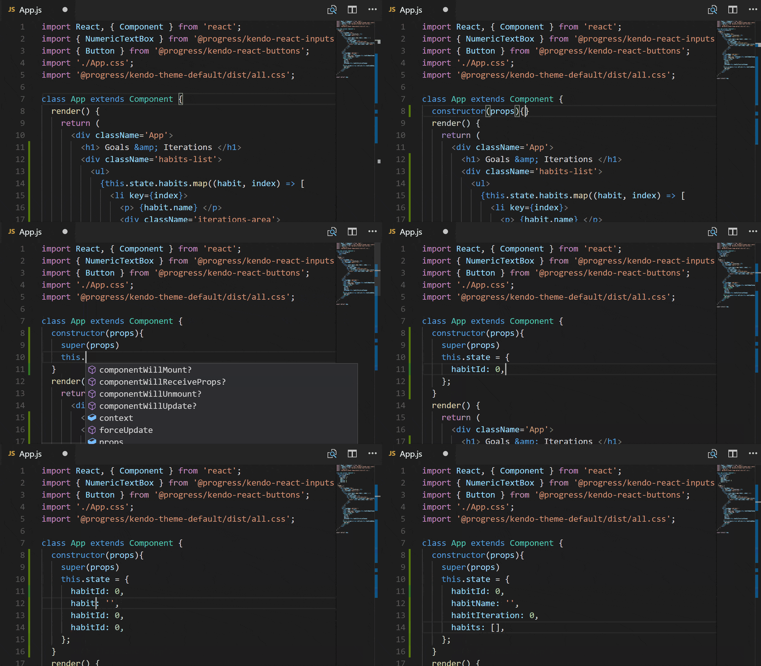
Adding to this.state:
habitId: right now we won't be using thehabitIdbut we will in the future when we make the habit list more persistent.habitName: whatever our awesome user decides to name their habit.habitIteration: the amount of times they want to check off that they've carried out that habit to eventually make the goal amount.habits: the array of habits.
As you will see when we code out the functions, all of these values will change every time the user interacts with the inputs we added in the render function. For instance, when they change the name it will be updated in this.state to reflect that. Then if they hit the "Add Goal" button, an object with that new name and iteration amount will be added to existing array.
Our lovely functions:
handleNameChange: changinghabitNameonce the user has entered it into the<input>field.handleIterationChange: settinghabitIterationwhen the value is changed inside theNumericTextBox.handleAddHabit: takes the current values set tohabitNameandhabitIteration, then builds out ahabitobject that is added to thehabitarray.
Let's code it out! We'll start with assigning the values inside of this.state:
Finally, we can add our functions:
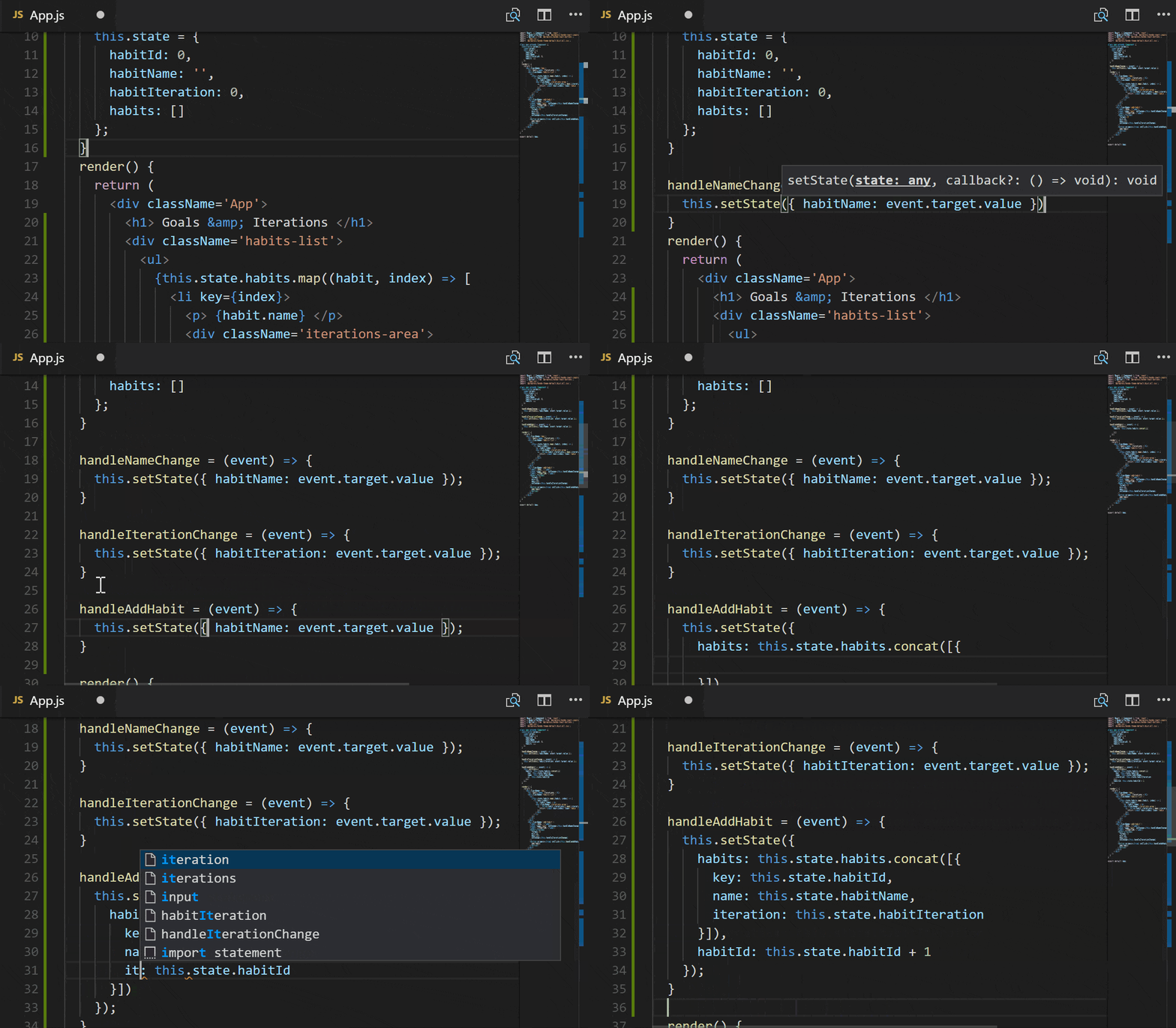
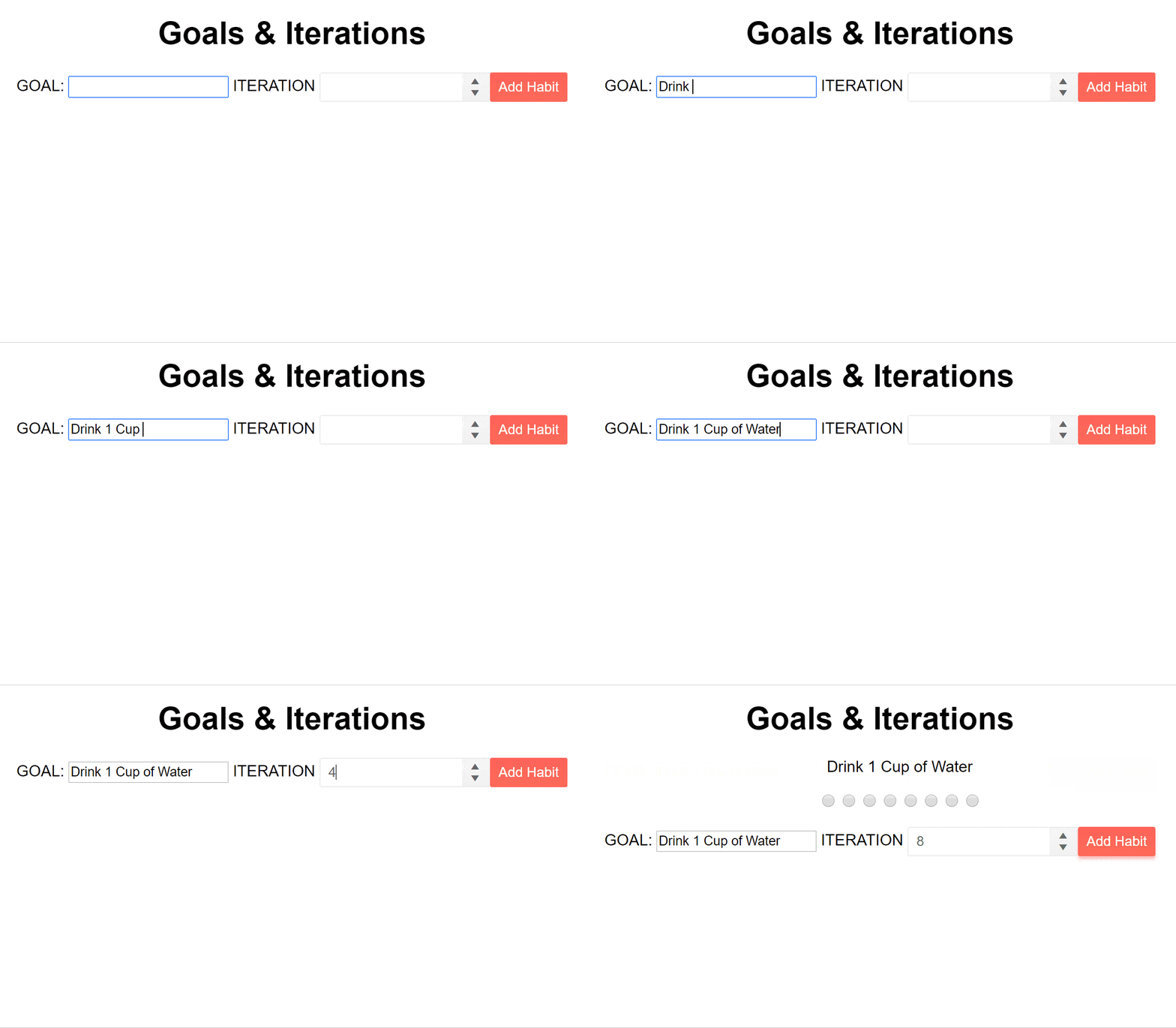
Let's take a look at what we have so far:
This is what the whole App.js file looks like now that we're all done:
import React, { Component } from 'react';
import { NumericTextBox } from '@progress/kendo-react-inputs';
import { Button } from '@progress/kendo-react-buttons';
import './App.css';
import '@progress/kendo-theme-default/dist/all.css';
class App extends Component {
constructor(props){
super(props)
this.state = {
habitId: 0,
habitName: '',
habitIteration: 0,
habits: []
};
}
handleNameChange = (event) => {
this.setState({ habitName: event.target.value });
}
handleIterationChange = (event) => {
this.setState({ habitIteration: event.target.value });
}
handleAddHabit = (event) => {
this.setState({
habits: this.state.habits.concat([{
key: this.state.habitId,
name: this.state.habitName,
iteration: this.state.habitIteration
}]),
habitId: this.state.habitId + 1
});
}
render() {
return (
<div className='App'>
<h1> Goals & Iterations </h1>
<div className='habits-list'>
<ul>
{this.state.habits.map((habit, index) => [
<li key={index}>
<p> {habit.name} </p>
<div className='iterations-area'>
{[...Array(habit.iteration)].map((iteration, index) => {
return <input key={index} type='radio' />
})}
</div>
</li>
])}
</ul>
</div>
<div className='add-habit'>
<label> GOAL: </label>
<input type='text' onChange={this.handleNameChange} />
<label> ITERATION </label>
<NumericTextBox
format='0'
min={0}
max={22}
onChange={this.handleIterationChange}
/>
<Button primary={true} onClick={this.handleAddHabit}>
Add Habit
</Button>
</div>
</div>
);
}
}
export default App;🐙: Commit for adding styling.
Let's Get This Styled
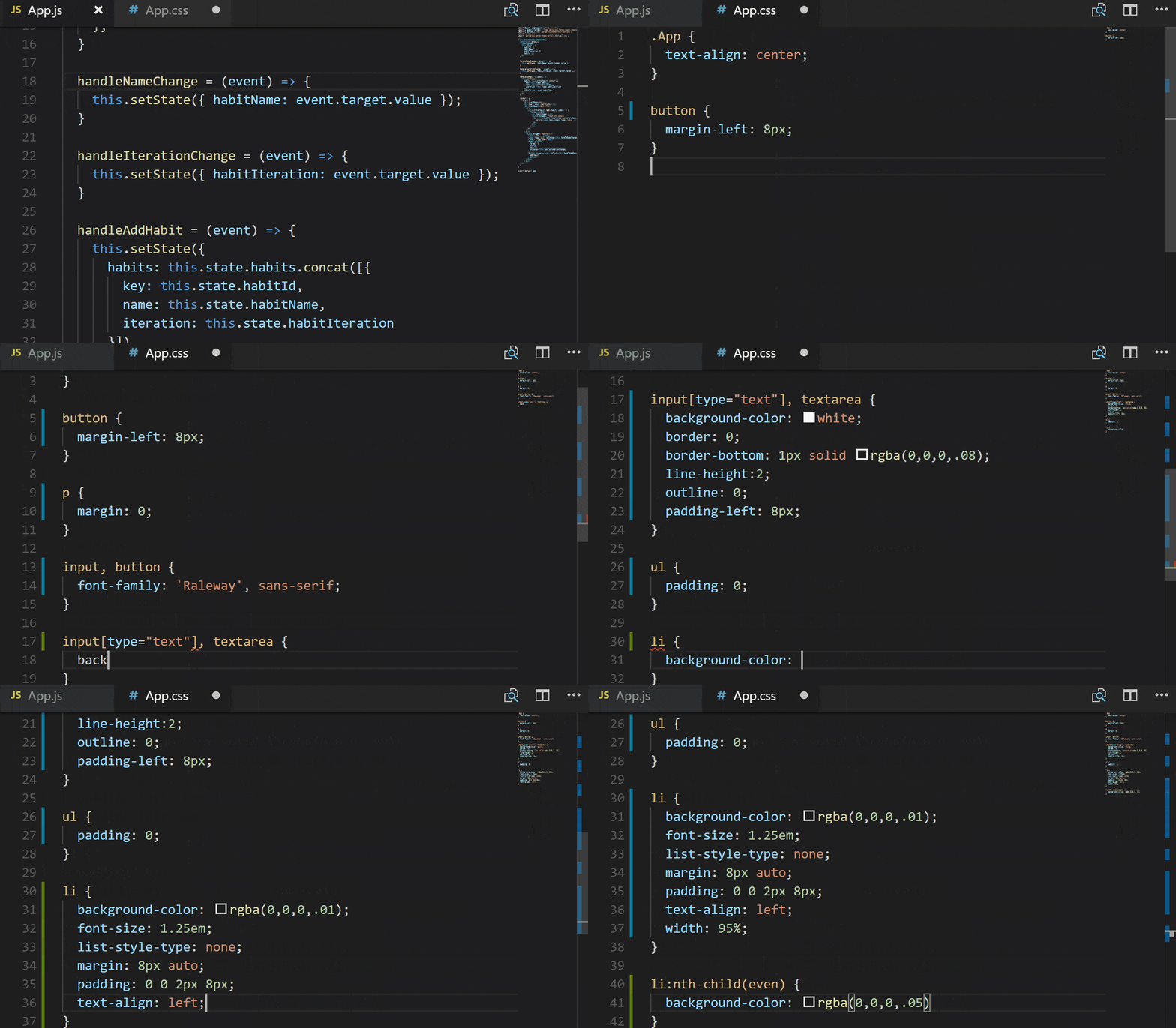
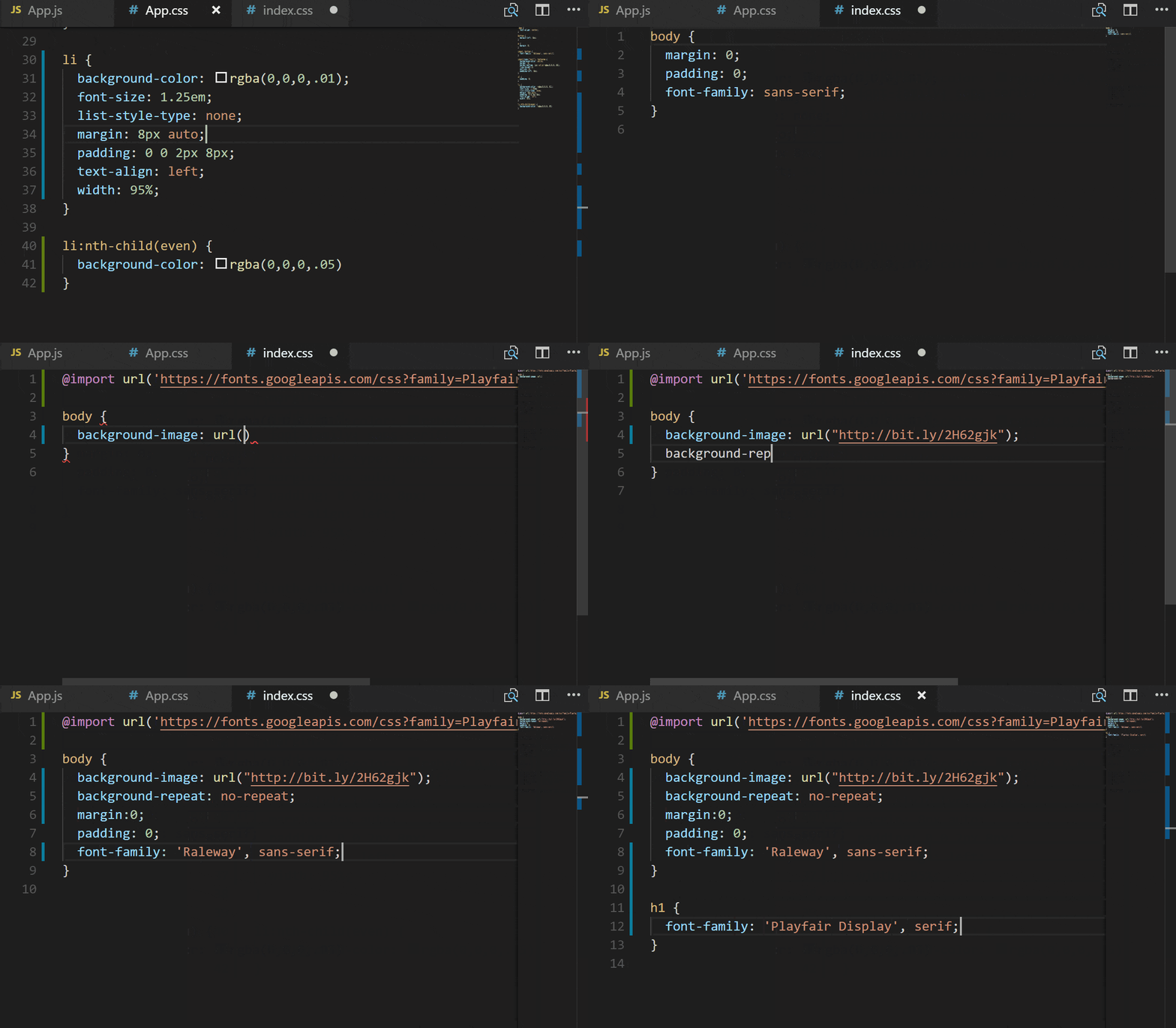
Although the components are styled well using the Kendo UI default theme, let's add a bit more styling in the App.css file.
Here is the final version of the src/App.css stylesheet for the component:
.App {
  text-align: center;
}

button {
  margin-left: 8px;
}

p {
  margin: 0;
}

input, button {
  font-family: 'Raleway', sans-serif;
}

input[type="text"], textarea {
  background-color: white;
  border: 0;
  border-bottom: 1px solid rgba(0,0,0,.08);
  line-height:2;
  outline: 0;
  padding-left: 8px;
}

ul {
  padding: 0;
}

li {
  background-color: rgba(0,0,0,.01);
  font-size: 1.25em;
  list-style-type: none;
  margin: 8px auto;
  padding: 0 0 2px 8px;
  text-align: left;
  width: 95%;
}

li:nth-child(even) {
  background-color: rgba(0,0,0,.05)
}
We also need to make some more general styling changes that can be applied to the whole application and all its components. To do this, we'll edit the base index.css file.
Voila, the final bit of styling in src/index.css we need to look oh-so-fancy:
@import url('https://fonts.googleapis.com/css?family=Playfair+Display:400,700|Raleway');

body {
  background-image: url("http://bit.ly/2H62gjk");
  background-repeat: no-repeat;
  margin:0;
  padding: 0;
  font-family: 'Raleway', sans-serif;
}

h1 {
  font-family: 'Playfair Display', serif;
}
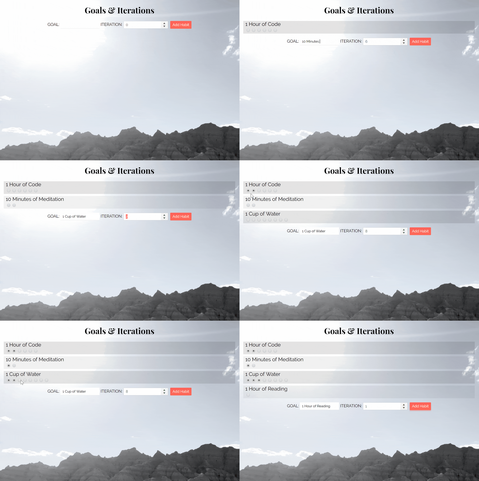
Put it all together and what do you got:
🐙: Commit for adding styling.
Editing the App Manifest
Now that we have our lovely application up and running, it's time to PWA it. In my opinion, one of the easiest ways to start turning your existing app into a PWA is by adding an app manifest file. The manifest.json file is a basic JSON, key/value pair file that lets the browser know how to display your application. Because we used create-react-app, there is already an app manifest file in our project's public directory.
There are many things that you can change in the manifest.json file, and here are the ones we'll set today:
short_name: should not exceed 12 chars and is the name used if the application name is too long. Mostly you'll see it used when an app is added to a mobile device's home screen. *BONUS*short_namesupports Emojis, so Emoji your heart out! 😉♥✨🐺name: this is a mandatory string used to identify your app, usually restricted to 45 characters.theme_color: this color will affect the way an app looks dependent on the browser, e.g. the color of the search bar, or bordersbackground_color: when the app loads there is a little bit of time for resources to load, sobackground_colorlets you display something in that time so the user knows something is happening.
A few other items we won't really be changing because they are set at what we want:
icons: this is an array of image objects (withsrc,sizesandtypevalues) used to represent your app, for instance, when someone installs your app to their mobile home screen or on a list of applications. We don't actually change the value this time, just the image we have saved under public/favicon.ico.display: this one setting can allow your app to be displayed full-screen on your user's device by setting it to 'standalone' (which it's already set to). The other option is 'browser' which leaves the browser chrome around your app.start_url: this lets you decide where your app will load when opened from a device where it was installed on the home screen. The setting ./index.html works in our case.
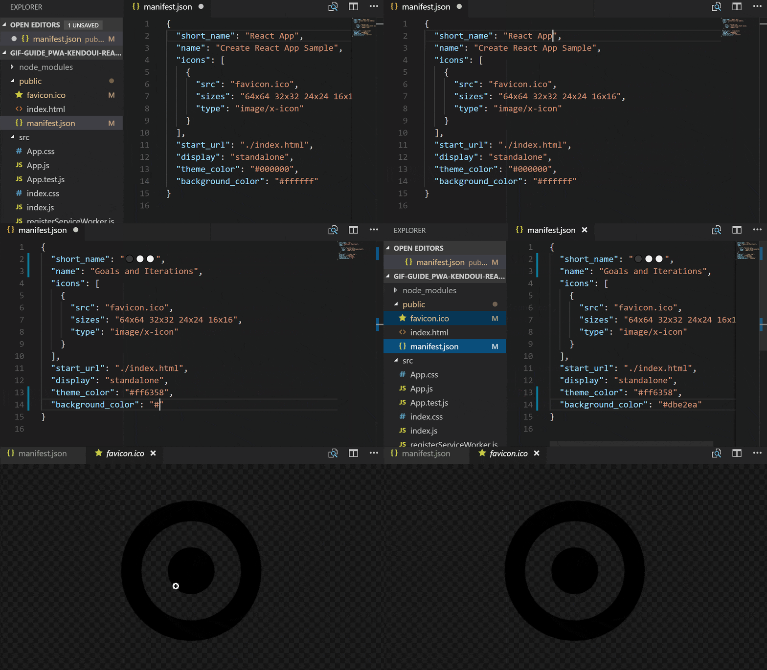
Everything put where we would like it, the manifest.json file will now look like this:
{
  "short_name": "⚫⚪⚪",
  "name": "Goals and Iterations",
  "icons": [
    {
      "src": "favicon.ico",
      "sizes": "64x64 32x32 24x24 16x16",
      "type": "image/x-icon"
    }
  ],
  "start_url": "./index.html",
  "display": "standalone",
  "theme_color": "#ff6358",
  "background_color": "#dbe2ea"
}
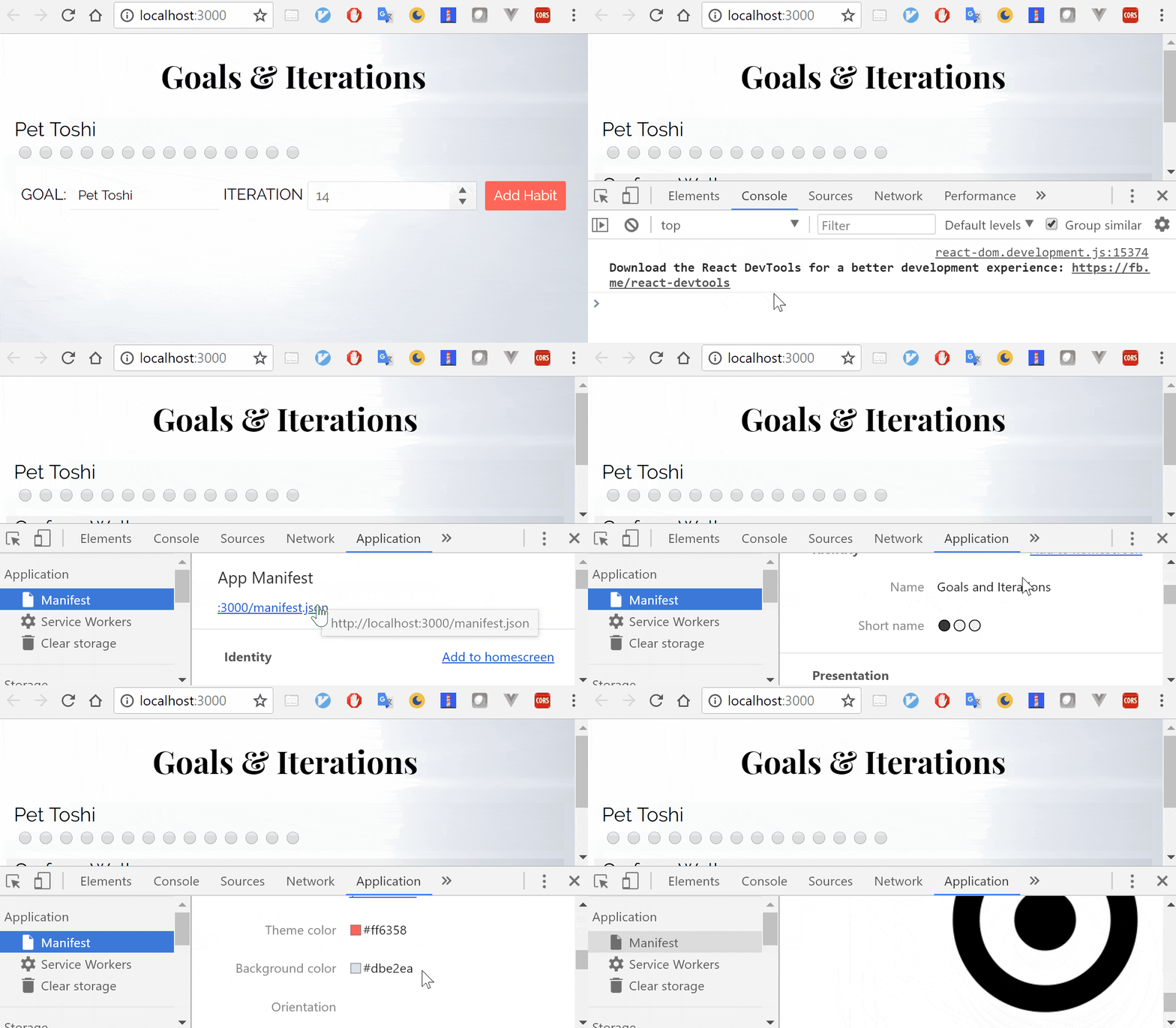
Before you even have the app hosted, you can check to make sure the app manifest information is being passed through correctly. Within Chrome Dev Tools (opened by either right-clicking the page and selecting 'Inspect' or typing Ctrl+Shift+I on Windows and Cmd+Shift+I on macOS) you'll first navigate to the 'Application' tab. In the left-side menu is the option to check out information under 'Manifest'. There you can find information supplied by the manifest.json regarding identity, presentation and icons.
🐙: Commit for configuring the app manifest.
Time to Go Offline
Now that we have the app manifest configured, let's give our users the capability to use this goals list offline. We can do this by caching files with a Service Worker! This will store the main files so that a user can access them whether or not they have a connection to the network. Lucky for us, we used create-react-app and it comes with a pre-made caching service worker! 🙌
If you look inside the src directory, there is a file named registerServiceWorker.js. In that file, there is an abundant amount of comments that walk you through each step of what this file does. I highly recommend reading through it. Note, before a service worker can work it needs to be registered (basically a way for the service worker to be connected to your app). So, the first time a user visits your app, the service worker will register and cache the files. After that initial visit, as long as the user doesn't clear their cache, your app can serve up cached files for an instant load, regardless of network connectivity.
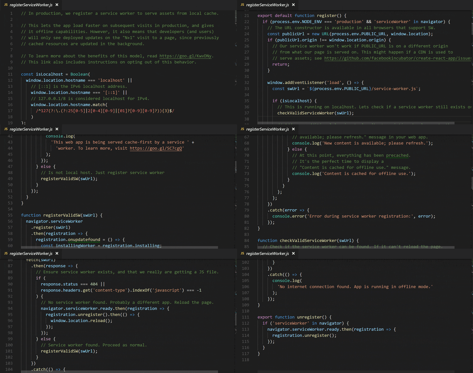
Service workers are progressive, it checks to see if it is supported on line 21:
if (process.env.NODE_ENV === 'production' && 'serviceWorker' in navigator)This way if it is not supported, it simply does not run this code and nothing gets broken. Well, nothing pertaining to the service worker. 😉 In that same line, you may notice that it is also checking to see if we're in production environment. So that we can check out our service worker in action, let me show you how to quickly build and serve up our application.
Serving Up the App
First things first, we want to build the app as we have it saved now by running npm run build in the project's directory:
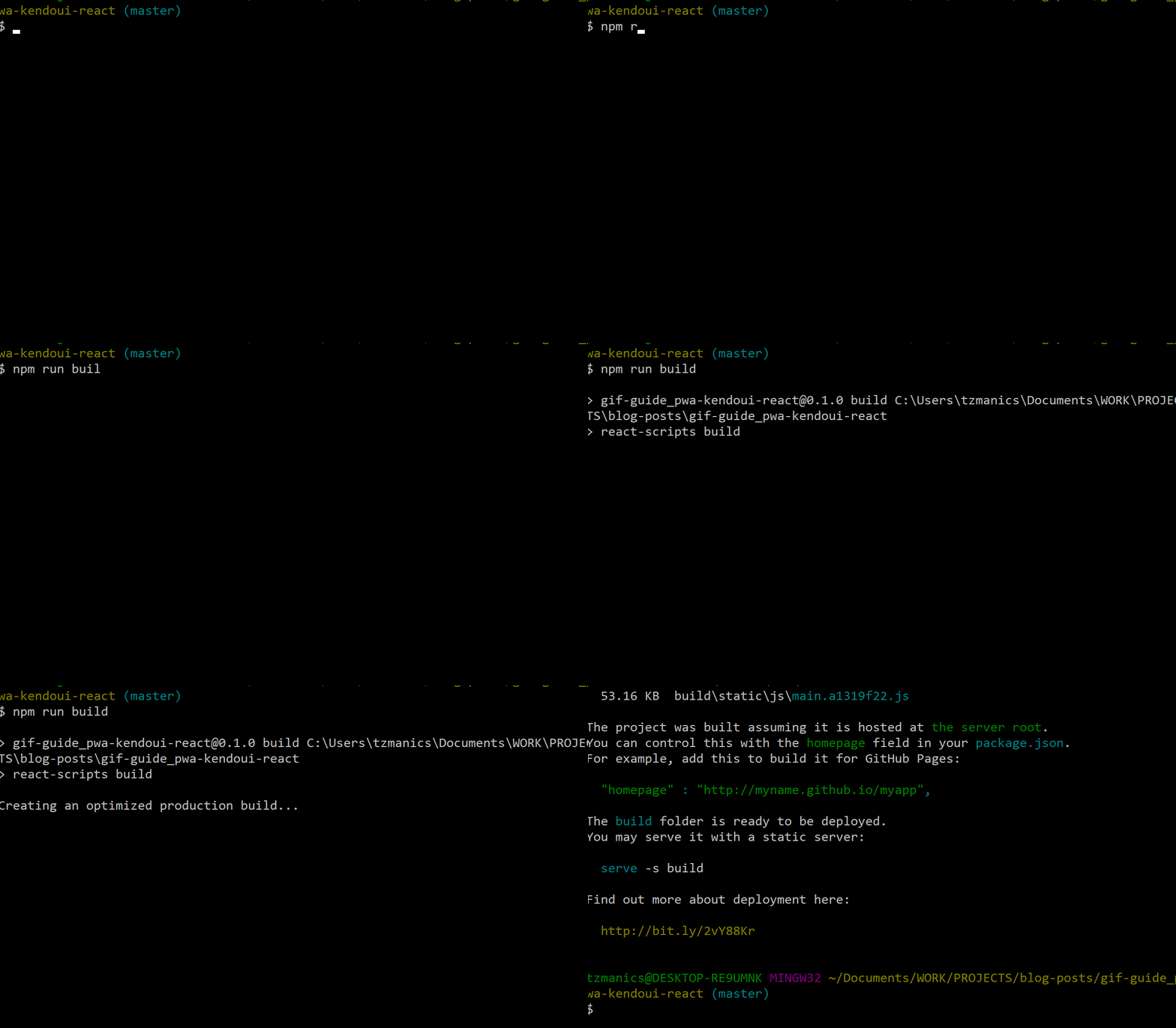
Now for a nice, easy library to serve up our app we'll globally install the (aptly-named) module, serve:

Once that is installed, we can just run serve -s build to let it know to serve up the files we have in our build folder. Then, open up a tab in our browser and paste the already copied link to http://localhost:5000. We see our app working as usual.
Now, let's look under the hood - more specifically, in the dev tools. Head back over to the Application tab, the one we opened to look at the app manifest. We can find the Service Worker tab in the left menu where we found the Manifest tab. This is a great place to help you debug your service worker and make sure that it is received and registered. For even more fun 🎢, we can click the box next to 'Offline'. Then hit refresh on the page to see how our app would respond without a network connection. If you recall from the service worker file, we should also see a message in the console. Let's check it out:
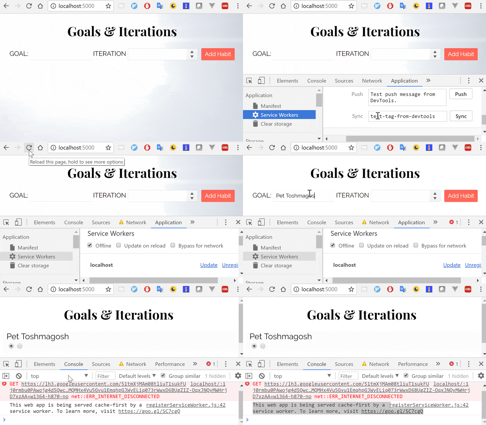
As you can see, we did lose the background image since that was being pulled from a website. Everything else survived the disconnection 😎. All this with NO code changes, how 'bout that.
Wrap it Up 🎬
This has been a very intro introduction to what you can do with KendoReact and create-react-app to start building a PWA. There is so much more that you can do: make the goal list persistent, give the user a splash screen when the app is loading, cache goals added even when the user is offline. With that, I hand you the reigns and wish you a lovely PWA journey. Remember to reach out if you have any questions along the way. Happy coding! 👩💻
Resources

Tara Z. Manicsic
Tara Z. Manicsic is a lifelong student, teacher, and maker. She has spent her career using JavaScript on both back-end and front-end to create applications. A Developer Advocate for Progress, Google Developer Expert, and international technical speaker, she focuses on conveying the codebase she has learned. She also works in her community launching & directing the Cincinnati Chapter of Women Who Code and the Cincinnati branch of NodeSchool.

