
Getting Started with PIE and Other DataViz Charts
Summarize with AI:
So you’ve got an amazing app or service, more users than you can count, and a ton of data that you want to share with the world. So what do you do with that data? Do you write your own charts and graphs in pure HTML and CSS? Do you slog through the process of drawing your own with a raw HTML Canvas or SVG library? Or do you sit back, relax and drop a few Kendo UI DataViz controls in place, tell them where to grab your data and take a vacation while the rest of the internet tries to get browser compatibility in to their hand-built charts?
I think the answer is pretty obvious. I’m not about to take the time to learn how to use an API directly on top of SVG, Canvas or any other technologies to build charts. I want to display charts in my app, not build charts for any app. But now that you’ve got your DataViz license and the files donwloaded, where do you start? And how can you more effectively show the information you have?
Not to worry. It’s easy to get started, get data loaded in to your charts, and have them display the information you need in the manner that best fits your users.
Reference The JavaScript
Kendo UI provides a lot of files in the download. There are individual files for every aspect, including the DataViz charts. There’s also the all-in-one “kendo.all.min.js” file, which - as the name implies - is all of the JavaScript for all Kendo UI features in one file.
If this is your first time working with Kendo UI, the easiest way to get started is to reference the “all” file. This way you only have one file to reference, and you’re set for the JavaScript side of things.
<script src="/kendoui/js/kendo.all.min.js">
Do note the size of this file, though. It’s quite large because it contains EVERYTHING in Kendo UI - all of the Web widgets, all of the DataViz charts and graphs, and all of the Kendo UI Mobile bits, too.
If you’re familiar with Kendo UI, I recommend not using the “all” file in your production projects. You can limit the files you need and reduce the size significantly, this way.
In the case of DataViz, you could go with another single file:
<script src="/kendoui/js/kendo.dataviz.min.js">
This file contains all of DataViz and the things it depends on, without any of the Web or Mobile bits. If you know you need a large majority of the DataViz charts and graphs, you may want to use this file.
Lastly, you always have the option of including invidual files or creating a custom build (note: you need a Telerik.com / KendoUI.com login to view this link) that only has the bits that you need. If you’d like to include only the files you need, see this page on the JavaScript dependencies.
Reference The CSS Files
The DataViz styling is a bit of a hybrid approach between CSS and vector graphics with style rendered in to them. According to the DataViz styling documentation,
The Kendo UI DataViz widgets use a mix of browser technologies to attain the required precision and responsiveness. The visualizations are rendered as vector graphics. Their layout is computed in advance. In contrast, interactive features are built using traditional HTML elements. As a result, appearance settings are split between declarative options and traditional CSS.
This means that you need to include the CSS files for Kendo UI DataViz, including the theme that you wish to use. For example, if I want to include the stylishly new “flat” theme, I would reference these files:
<link rel="stylesheet" href="/kendoui/styles/kendo.dataviz.css">
<link rel="stylesheet" href="/kendoui/styles/kendo.dataviz.flat.css">
Note that you need to include the base “kendo.dataviz.css” file before the theme-specific file to make sure everything turns out correctly.
Set The Chart Theme
Remember that note about dual-mode styling (CSS and vector graphics) from a moment ago? This means you need to set the theme within the charts, directly, in addition to including the correct theme CSS files.
$("#chart").kendoChart({

  // set the theme to flat for this chart
  theme: "flat",

  // ... other options for the chart
});
Basically, the vector graphics don’t use the CSS files directly. But when you set the theme to the same name as the CSS file that you included, you will get a consistent look and feel for the charts’ vector graphics and the other interactive bits that are built with HTML and CSS.
Create A Chart With A Series
Ok, I’ve already given away the secret to this one. Creating
a Kendo UI DataViz chart is as simple as any other Kendo UI
control. You only need to call the appropriate .kendo****
method from a jQuery selector to create the chart you want.
You should note that the .kendo**** method to call is most
likely going to be .kendoChart, though. There are some
exceptions to this, like the .kendoSparkLine call. But for
the most part, the majority of charts are created with the
.kendoChart method. The thing that sets apart the chart
types is the series type that you specify in the chart
options.
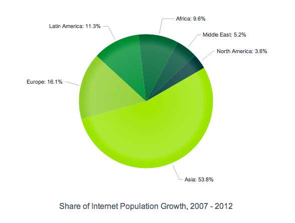
For example, set the series type to pie (along with
the title and a few other options for the chart):
$("#chart").kendoChart({
  title: {
      position: "bottom",
      text: "Share of Internet Population Growth, 2007 - 2012"
  },
  legend: {
      visible: false
  },
  chartArea: {
      background: ""
  },
  seriesDefaults: {
      labels: {
          visible: true,
          background: "transparent",
          template: "#= category #: #= value#%"
      }
  },
  series: [{
      type: "pie"
  }]
});
The result is … !!!
Well, nothing. It turns out we haven’t specified any data to show, so there isn’t anything to render!
Set Some Data To Show
In order to do anything useful, the DataViz charts need data.
It’s easy to hard code some data in to the charts, too. You
just need to add a data parameter to the series section:
$("#chart").kendoChart({
    title: {
        position: "bottom",
        text: "Share of Internet Population Growth, 2007 - 2012"
    },
    legend: {
        visible: false
    },
    chartArea: {
        background: ""
    },
    seriesDefaults: {
        labels: {
            visible: true,
            background: "transparent",
            template: "#= category #: #= value#%"
        }
    },
    series: [{
        type: "pie",
        startAngle: 150,
        data: [{
            category: "Asia",
            value: 53.8,
            color: "#9de219"
        },{
            category: "Europe",
            value: 16.1,
            color: "#90cc38"
        },{
            category: "Latin America",
            value: 11.3,
            color: "#068c35"
        },{
            category: "Africa",
            value: 9.6,
            color: "#006634"
        },{
            category: "Middle East",
            value: 5.2,
            color: "#004d38"
        },{
            category: "North America",
            value: 3.6,
            color: "#033939"
        }]
    }],
    tooltip: {
        visible: true,
        format: "{0}%"
    }
});
}
And the result of this is actually something useful!
But you don’t want to hard code your data all the time, do you?
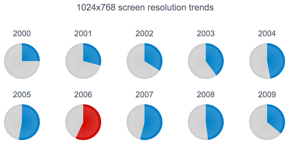
Reference Data From An API
Adding a dataSource to the chart options will let you specify any valid
Kendo UI DataSource
configuration. The easiest way to get started is to point your dataSource at
a JSON-based API end-point. Specify the dataType as “json” and the DataSource
will know how to work with the data from that end-point.
$("#chart" + year).kendoChart({
    dataSource: {
        transport: {
            read: {
                url: "http://example.com/api/screen-resolution",
                dataType: "json"
            }
        },
        filter: {
            field: "year", operator: "eq", value: year
        },
        sort: {
            field: "year",
            dir: "asc"
        }
    },
    title: {
        text: year
    },
    legend: {
        position: "top"
    },
    seriesDefaults: {
        type: "pie"
    },
    series: [{
        field: "share",
        categoryField: "resolution",
        padding: 0
    }],
    tooltip: {
        visible: true,
        format: "N0",
        template: "#= category # - #= kendo.format('{0:P}', percentage)#"
    }
});
Put this together with multiple charts, like our demo page shows and you can end up with a nice little dashboard of data.
More Than Just Pie-Charts
I have to admit. I love pie-charts, pie, and π but I especially love cherry-pie-charts. They’re the best.

Kendo UI’s DataViz has far more than just this one pie-chart, though. There are bar charts, line charts, radial charts, spark lines, guages, stock charts and so much more!
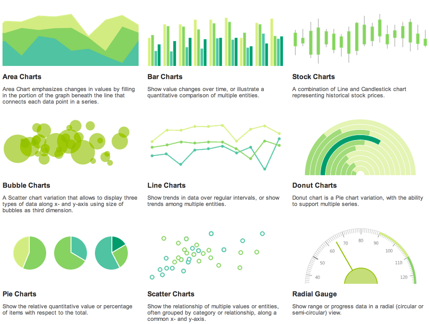
Be sure to check out the demo section and the documentation for a more complete list of what Kendo UI DataViz can do, and how to do it!
BUT WAIT! THERE’S MORE!
Kendo UI’s DataViz charts and graphs are already impressive, if you ask me. But we’re not done, yet. We’ve got a bunch of new features, a few new charts and other surprises up our sleeves! If you’d like to see what we’re up to and get a closer look at the next big thing in our charts and graphs toolbelt, be sure to sign up for the Q3 2013 Release Keynote.

Derick Bailey
About the Author
Derick Bailey is a Developer Advocate for Kendo UI, a developer, speaker, trainer, screen-caster and much more. He's been slinging code since the late 80’s and doing it professionally since the mid 90's. These days, Derick spends his time primarily writing javascript with back-end languages of all types, including Ruby,