Easy Forms Over Data for Xamarin.Forms Apps

Summarize with AI:
Mobile apps have come a long way in the last 10 years. We now have Artificial Intelligence powering apps and amazing visualizations with Augmented/Mixed Reality. However, ask mobile developers what's the one thing that most apps end up having - yup, forms over data. Boring as it may sound, forms are essential to capture user data, like as in Login screens, Registration forms or Feedback data.
So how do we Xamarin developers do forms over data? We can handcode every bit of UI and painfully hook it up to our data backend. Alternatively, we can be smart and let some intelligent reflections and data binding do the heavy lifting for us.
The DataForm control in Telerik UI for Xamarin is here to alleviate all developer pains around forms over data in Xamarin apps and provide tons of customization options. Let's dive in, shall we?
The Basics
The rich and famous of the world do not fly like mere mortals do - they fly in private or business jets. Folks who fly private, do not pick airline routes - they pick their luxury and the needed plane just shows up where they need be. Say you are writing a Xamarin mobile app for such a private jet company - and you list out all the jets available. The user can simply swipe over to book a flight, like so:

The next screen would need a form unfortunately - because you need to capture some flight details. You want to make the process as smooth as possible - both for the user and for yourself, the developer. When presenting forms over data in Xamarin.Forms apps, most developers already have a business object at hand - it is just a matter of presenting the data and controlling exactly how the user gets to interact with it. Let's say the following is our Customer business object - notice the NotifyPropertyChangedBase inheritance. You would want easy data binding between your form and the business object behind it.
using System;using Telerik.XamarinForms.Common;using Telerik.XamarinForms.Common.DataAnnotations;namespace Aviation{ public class Customer : NotifyPropertyChangedBase { private string customerFirstName; public string CustomerLastName { ... } public int CustomerAge { ... } public bool CustomerHasLapChild { ... } public double CustomerWeight { ... } public DateTime OutboundDate { ... } public DateTime InboundDate { ... } public string DepartureAirport { ... } public string ArrivalAirport { ... } public string CustomerFirstName { get { return this.customerFirstName; } set { this.customerFirstName = value; this.OnPropertyChanged("CustomerFirstName"); } } ... ... }}
To capture this data as a form on screen, you can hand code every bit of UI by yourself - if you have an eternity of time. Alternatively, you can simply let the DataForm do the heavy lifting for you - here's some simple XAML markup to render the form:
<?xml version="1.0" encoding="UTF-8"?><ContentPage xmlns="http://xamarin.com/schemas/2014/forms" xmlns:x="http://schemas.microsoft.com/winfx/2009/xaml" x:Class="Aviation.CustomerView" xmlns:TelerikInput="clr-namespace:Telerik.XamarinForms.Input;assembly=Telerik.XamarinForms.Input"> <ContentPage.Content> <StackLayout Orientation="Vertical"> <TelerikInput:RadDataForm x:Name="CustomerDataForm" /> </StackLayout> </ContentPage.Content></ContentPage>Did you notice that the UI has almost nothing - just a placeholder for the DataForm. The form obviously needs to be fed data - either through XAML binding or in code, like below. The idea is your ViewModel should already have a hydrated object holding the Customer data - simply hand it off to the DataForm.
public CustomerView(){ InitializeComponent(); CustomerViewModel CustomerVM = new CustomerViewModel(); this.CustomerDataForm.Source = CustomerVM.GetSelectedCustomer();}Once you fire it up, you'll see a nicely rendered form on screen - this is the DataForm doing its magic. The form fields should pre-populate with existing object property values and the user is free to make edits. Developers don't need to do a thing to capture the data edits back to their bound object - 2 way data binding retains the changes.
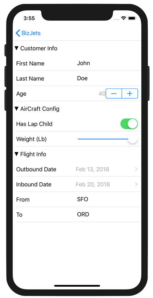
Notice the form with a variety of data editors - like text boxes, number counters, checkboxes, sliders, date/time pickers and such? We did not have the code any of this UI thankfully. The DataForm can reflect on the object properties that it is bound to and render matching editors for corresponding types - entirely automatically. You get default native platform editors out of the box, but you're also free to render specific or custom editors based on your data types.
Once rendered, each of the editors display their native platform behaviors - like date pickers pulling up the familiar picker UI on each platform. The user makes their changes and your business object is updated - one property at a time or in batches.
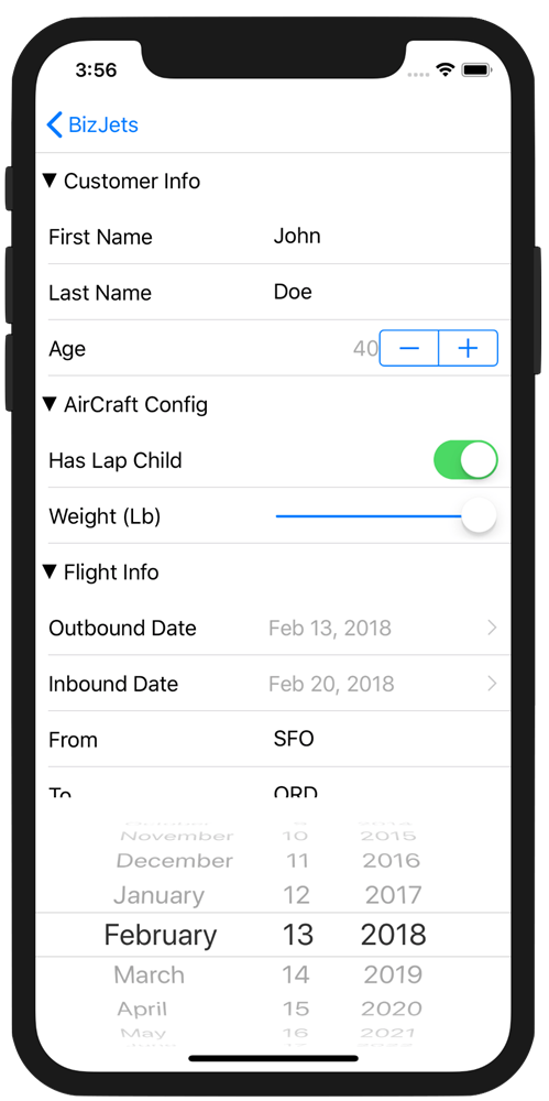
Now, there are few more tricks to control the rendered form editors and their layout. Little additions to our code will make the DataForm render UI as shown - let's take a closer look.
Data Annotations
Most forms over data have some rules around presentation and data edits. This is sort of business logic and it really belongs close to the data. Wouldn't it be nice if developers could just add descriptors to the business object itself to control layout and behavior of the form? Well, sure you can - thanks to Data Annotations. Let's take a look at some handy ones.
DisplayOptions Attribute
The DisplayOptions attribute controls the way an editor is presented - on a granular per property basis. The following settings have a direct impact on how your business object properties are presented through the form:
- Header: Sets the label of the respective editor
- Group: Sets the group which the editor is part of
- Position: Sets the position of the editor in the group layout
- PlaceholderText: Sets the empty content of the editor
Let's take our Customer business object from above and decorate each property with appropriate DisplayOptions for the DataForm to render them correctly.
[DisplayOptions(Header = "First Name", Group = "Customer Info", Position = 1)][NonEmptyValidator("Please enter first name", "OK")]public string CustomerFirstName { get; set; }[DisplayOptions(Header = "Last Name", Group = "Customer Info", Position = 2)][NonEmptyValidator("Please enter last name", "OK")]public string CustomerLastName { get; set; }[DisplayOptions(Header = "Age", Group = "Customer Info", Position = 3)][NumericalRangeValidator(0, 100)] public int CustomerAge { get; set; }[DisplayOptions(Header = "Has Lap Child", Group = "AirCraft Config", Position = 1)]public bool CustomerHasLapChild { get; set; }[DisplayOptions(Header = "Weight (Lb)", Group = "AirCraft Config", Position = 2)]public double CustomerWeight { get; set; }[DisplayOptions(Header = "Outbound Date", Group = "Flight Info", Position = 1)]public DateTime OutboundDate { get; set; }[DisplayOptions(Header = "Inbound Date", Group = "Flight Info", Position = 2)]public DateTime InboundDate { get; set; }[DisplayOptions(Header = "From", Group = "Flight Info", Position = 3)][NonEmptyValidator("Please enter departure airport", "OK")]public string DepartureAirport { get; set; }[DisplayOptions(Header = "To", Group = "Flight Info", Position = 4)][NonEmptyValidator("Please enter arrival airport", "OK")]public string ArrivalAirport { get; set; }ReadOnly Attribute
Business object properties marked with the ReadOnly attribute will force the DataForm to render editors so that user cannot alter the data. Different native platforms may have differences in UI behavior:
- iOS: The editors are in disabled state.
- Android: Viewers are used instead of editors.
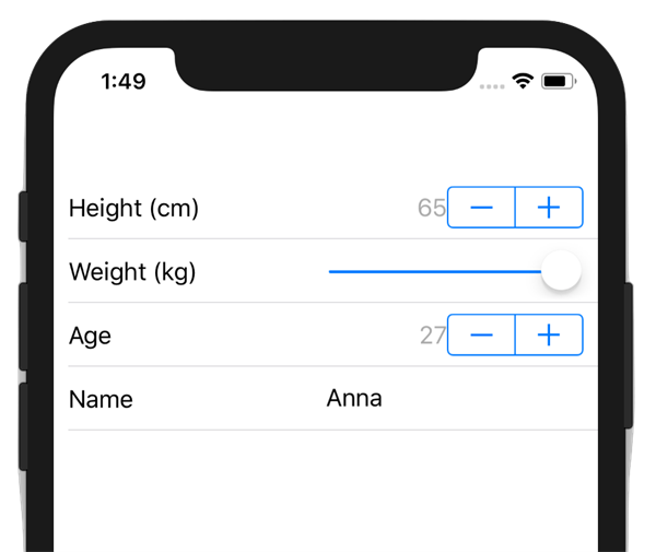
To see an example, let us consider a sample POCO object in our code behind - notice how the Name property is set to ReadOnly and is not meant to be editable:
namespace DataFormPlayground{ public partial class DataFormPlaygroundPage : ContentPage { public DataFormPlaygroundPage() { InitializeComponent(); } } public class SourceItem { [DisplayOptions(Header = "Name")] [ReadOnly] public string Name { get; set; } = "Anna"; [DisplayOptions(Header = "Age")] public int Age { get; set; } = 27; [DisplayOptions(Header = "Weight (kg)")] public double Weight { get; set; } = 180; [DisplayOptions(Header = "Height (cm)")] public int Height { get; set; } = 65; [DisplayOptions(Header = "Votes")] [DisplayValueFormat(Plural = "{0} votes", Single = "{0} vote", Zero = "no votes")] public double Votes { get; set; } }}And here's our XAML markup rendering the Data Form:
<?xml version="1.0" encoding="utf-8"?><ContentPage xmlns="http://xamarin.com/schemas/2014/forms" xmlns:x="http://schemas.microsoft.com/winfx/2009/xaml" xmlns:local="clr-namespace:DataFormPlayground" x:Class="DataFormPlayground.DataFormPlaygroundPage" xmlns:telerikInput="clr-namespace:Telerik.XamarinForms.Input;assembly=Telerik.XamarinForms.Input"> <telerikInput:RadDataForm x:Name="dataForm"> <telerikInput:RadDataForm.Source> <local:SourceItem /> </telerikInput:RadDataForm.Source> </telerikInput:RadDataForm></ContentPage>Fire it up and you'll see that the Name field in the form is read-only and disabled for edits.
Ignore Attribute
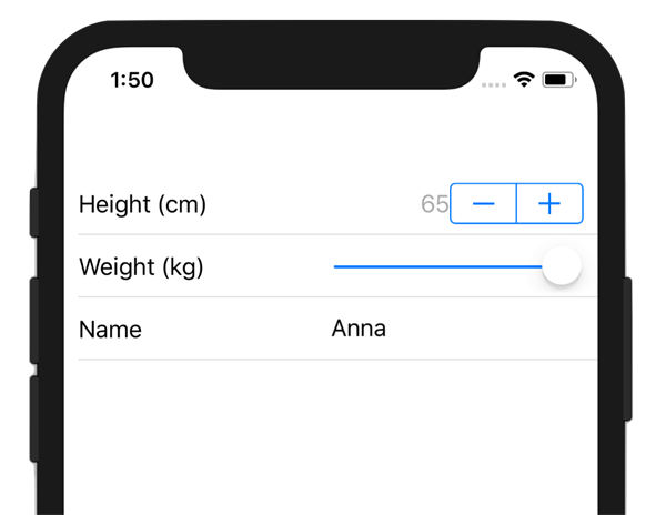
Business object properties marked with the Ignore attribute will force the Telerik DataForm to skip creating an editor for them. Have a complex POCO object with lots of properties and not all of them need to be part of a form? Just ignore them with this attribute and have no Editors rendered. With everything else unchanged from the code above, let us ignore the Age property - it is impolite to ask anyways.
[DisplayOptions(Header = "Age")][Ignore]public int Age { get; set; } = 27;And sure enough, the form skips rendering an editor for the given property:
DisplayValueFormat Attribute
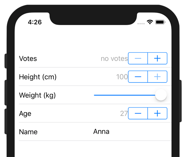
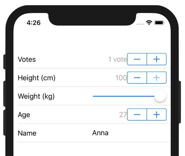
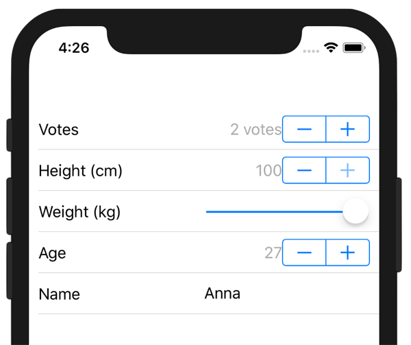
What if you had a scenario where an editor exists for your property type, but you want to fine-tune visualization with the given property value? The DisplayValueFormat attribute comes handy, providing formatting options for Date, Time and NumberPicker editor types.
Let's add a property to count Votes to our SourceItem business object - with a few data annotations. Notice the use of DisplayValueFormat to control what the form descriptor says about the property - based on its value:
[DisplayOptions(Header = "Votes")][DisplayValueFormat(Plural = "{0} votes", Single = "{0} vote", Zero = "no votes")]public double Votes { get; set; }And we can always force the Telerik DataForm to render a specific editor for our object property, like so:
public partial class DataFormPlaygroundPage : ContentPage{ public DataFormPlaygroundPage() { InitializeComponent(); dataForm.RegisterEditor("Votes", EditorType.NumberPickerEditor); }}When fired up, you should see the generic numeric editor for our Votes property, but with descriptors that are appropriate for the property value.
Group Styling
Form over data is often best presented in groups - helps classify form sections and eases data entry for users. The DataForm's group header appearance can be customized with the a simple property - GroupHeaderStyle of type DataFormGroupHeaderStyle. The DataFormGroupHeaderStyle class offers the following properties:
- Background: Gets or sets the background color of the group header
- BackgroundImageSource: Gets or sets a background image for the group header
- Foreground: Gets or sets the group header text color
- Height: Gets or sets the group header height
- IsCollapsible: Gets or sets a value that indicates whether the group will be collapsible
- Padding: Gets or sets the group header content padding
- TextAlignment: Gets or sets the group header text alignment
To see group styling in action, let's write up some fake data in our code behind business object with two groups defined through data annotations:
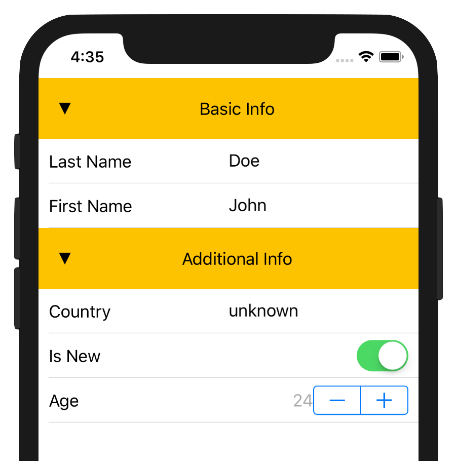
namespace DataFormPlayground{ public partial class GroupedForm : ContentPage { public GroupedForm() { InitializeComponent(); } } public class Customer { [DisplayOptions(Group = "Basic Info", Header = "First Name")] public string FirstName { get; set; } = "John"; [DisplayOptions(Group = "Basic Info", Header = "Last Name")] public string LastName { get; set; } = "Doe"; [DisplayOptions(Group = "Additional Info", Header = "Age")] public int Age { get; set; } = 24; [DisplayOptions(Group = "Additional Info", Header = "Is New")] public bool IsNew { get; set; } = true; [DisplayOptions(Group = "Additional Info", Header = "Country")] public string Country { get; set; } = "unknown"; }}
And here's the XAML markup using the DataFormGroupHeaderStyle:
<?xml version="1.0" encoding="UTF-8"?><ContentPage xmlns="http://xamarin.com/schemas/2014/forms" xmlns:x="http://schemas.microsoft.com/winfx/2009/xaml" xmlns:local="clr-namespace:DataFormPlayground" x:Class="DataFormPlayground.GroupedForm" xmlns:telerikInput="clr-namespace:Telerik.XamarinForms.Input;assembly=Telerik.XamarinForms.Input" xmlns:telerikDataForm="clr-namespace:Telerik.XamarinForms.Input.DataForm;assembly=Telerik.XamarinForms.Input"> <ContentPage.Content> <telerikInput:RadDataForm> <telerikInput:RadDataForm.Source> <local:Customer /> </telerikInput:RadDataForm.Source> <telerikInput:RadDataForm.GroupHeaderStyle> <telerikDataForm:DataFormGroupHeaderStyle Background="#FFC300" Foreground="Black" Height="60" Padding="20" TextAlignment="Center" /> </telerikInput:RadDataForm.GroupHeaderStyle> </telerikInput:RadDataForm> </ContentPage.Content></ContentPage>Fire it up and you see nicely styled groups for your forms - appropriately styled for each platform of course. Your users should have an easier time with form sections and collapsibility may help in data entry.
Forms Made Easy
That's it then. If you are a Xamarin mobile developer, you should strongly consider picking up the DataForm in Telerik UI for Xamarin - as you see, it does alleviate lots of pain points around forms over data. We looked at how easy it is to render forms from a business object, use data annotations to drive form behavior and control form layout. There is much more to the DataForm though - like using custom editors, controlling data commit modes and doing data validations with feedback. To avoid TL;DR, lets pick all that up another day. For now, stay classy and do forms over data with ease. Cheers!

Sam Basu
Sam Basu is a technologist, author, speaker, Microsoft MVP and gadget lover. With a long developer background, he also worked as a Developer Advocacy Manager for advocating modern web/mobile/cloud development platforms on Microsoft/Telerik/Kendo UI technology stacks. His spare times call for travel, fast cars, cricket and culinary adventures with the family.
