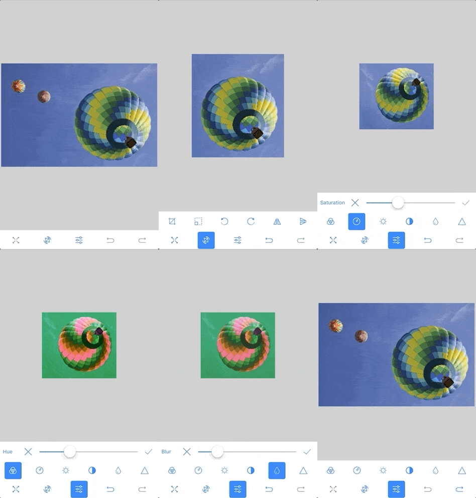
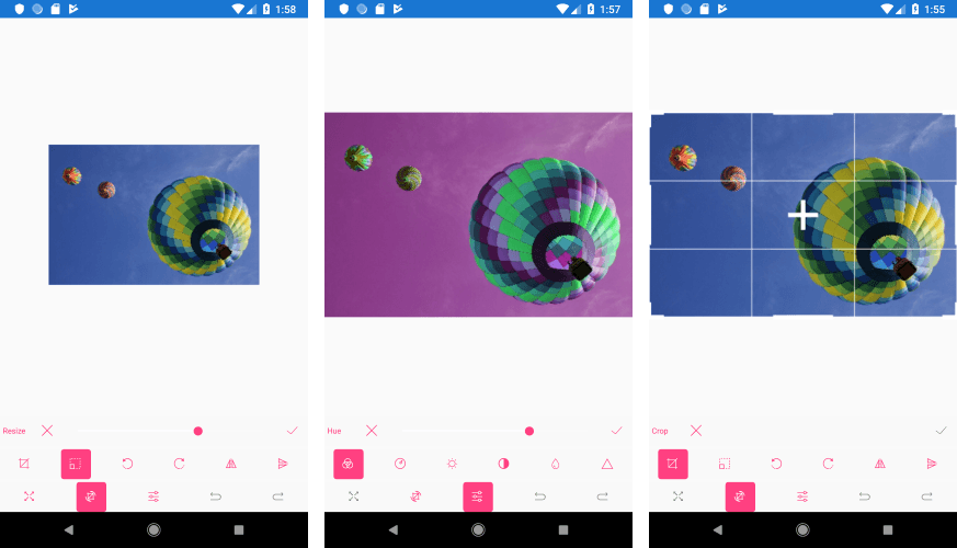
Easily Edit Your Images with an ImageEditor for Xamarin.Forms

Summarize with AI:
The RadImageEditor in Telerik UI for Xamarin allows you and the end users of your mobile application to easily view and edit images in different file formats.
If you use our Telerik UI for Xamarin suite, you can have all editing tools in one place with the RadImageEditorToolbar control. The Toolbar control is designed to enhance further the capabilities of the editor by introducing a set of tools for editing images. It also provides the ability to be customized with just the tools for your needs.
In this blog post I will bring two components to your attention - RadImageEditor and RadImageEditorToolbar. You will get familiar with the features they provide and how to use them. We will learn more about the customization process of the Toolbar and how to apply styles to it.

Xamarin.Forms Image Editor Features
- Import and export images in different formats such as JPEG and PNG—GIF and BMP can be imported only for viewing purposes for the time being
- Various image source options: Images can be loaded from a stream, a file (as embedded resource, or image located on the device) and a URI
- Rich image editing feature set – including transformations and effects
- Undo/Redo support
- Pan and Zoom support
- Custom Commands
- Toolbar with customization capabilities
Image Editor Toolbar
The RadImageEditor control comes with various editing capabilities, and with the help of the ImageEditorToolbar you can provide your users easy and quick way to edit their images. Whether it is for the creation of a full fledged Image Gallery, or simply to add an avatar to their profile, the Image Editor component for Xamarin Forms has got you covered.
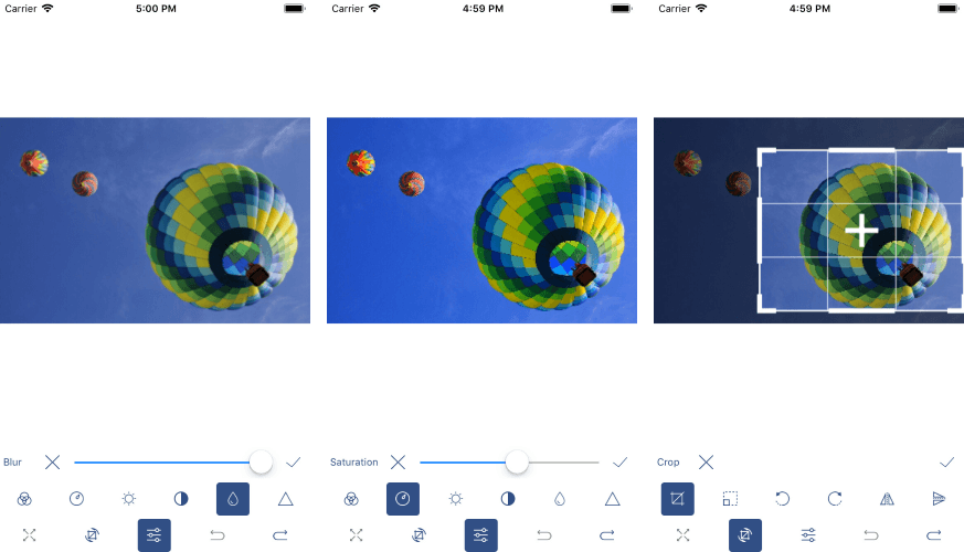
The default Toolbar includes items for all the available image editing options, and additionally you can customize the displayed editing options according to your needs.
The editing capabilities can be separated into three main categories:
- Image transformations which includes operations such as Crop, Rotate, Resize, etc.
- Applying Effects such as Hue, Saturation, Brightness, Contrast and many more.
- Reversing and Re-Applying actions such as Undo, Redo, Reset.
Getting Started with the Image Editor
Now let's create a sample demo app using the editing capabilities of the ImageEditor control.
Add the ImageEditor and ImageEditor Toolbar in your page. Note that we need to attach the ImageEditor control to the Toolbar control. This can be achieved through the Toolbar ImageEditor property. We need this because all Toolbar items execute their actions against the specified image editor.
<Grid>
    <Grid.RowDefinitions>
        <RowDefinition />
        <RowDefinition Height="Auto" />
    </Grid.RowDefinitions>
    <telerikImageEditor:RadImageEditor x:Name="imageEditor">
        <telerikImageEditor:RadImageEditor.Source>
            <OnPlatform x:TypeArguments="ImageSource" Default="image.jpeg">
                <On Platform="UWP">Assets\image.jpeg</On>
            </OnPlatform>
        </telerikImageEditor:RadImageEditor.Source>
    </telerikImageEditor:RadImageEditor>
    <telerikImageEditor:RadImageEditorToolbar Grid.Row="1" ImageEditor="{x:Reference imageEditor}" />
</Grid>
and add the following namespace:
xmlns:telerikImageEditor="clr-namespace:Telerik.XamarinForms.ImageEditor;assembly=Telerik.XamarinForms.ImageEditor"
Note that for the demo, the .jpeg file is loaded from platform resources. Here is how the default Toolbar looks:
On Android

On iOS

Customizing The Image Editor Toolbar
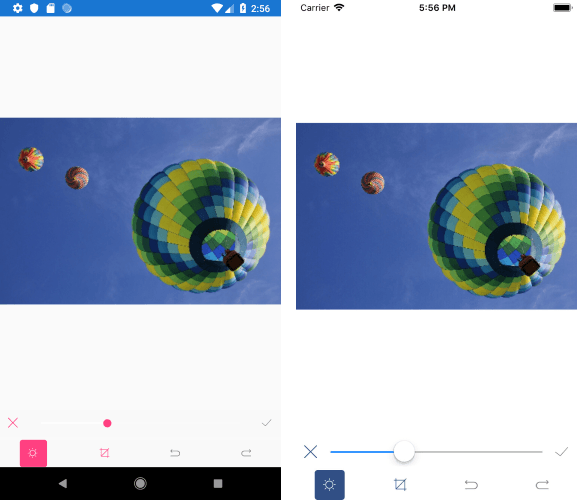
The RadImageEditorToolbar can be easily customized. By default, all ImageEditorToolbar Items are auto-populated. This can be changed by setting the RadImageEditorToolbar AutoGenerateItems property to False.
Let's include in our Demo app the following editing tools: Crop, Undo, Redo and Brightness. When AutoGenerateItems is false we will need to manually add the Crop, Undo, Redo and Brightness as Toolbar Items:
<Grid>
    <Grid.RowDefinitions>
        <RowDefinition />
        <RowDefinition Height="Auto" />
    </Grid.RowDefinitions>
    <telerikImageEditor:RadImageEditor x:Name="imageEditor">
        <telerikImageEditor:RadImageEditor.Source>
            <OnPlatform x:TypeArguments="ImageSource" Default="image.jpeg">
                <On Platform="UWP">Assets\image.jpeg</On>
            </OnPlatform>
        </telerikImageEditor:RadImageEditor.Source>
    </telerikImageEditor:RadImageEditor>
    <telerikImageEditor:RadImageEditorToolbar Grid.Row="1" ImageEditor="{x:Reference imageEditor}" AutoGenerateItems="False">
        <telerikImageEditor:BrightnessToolbarItem />
        <telerikImageEditor:CropToolbarItem/>
        <telerikImageEditor:UndoToolbarItem/>
        <telerikImageEditor:RedoToolbarItem/>
    </telerikImageEditor:RadImageEditorToolbar>
</Grid>
We can extend the snippet above by customizing the Toolbar Item (Brightness). Each Toolbar item from Effects and ImageTransformations can be further customized through the ApplyToolbarItem, CancelToolbarItem and TemplateToolbarItem properties:
<Grid>
    <Grid.RowDefinitions>
        <RowDefinition />
        <RowDefinition Height="Auto" />
    </Grid.RowDefinitions>
    <telerikImageEditor:RadImageEditor x:Name="imageEditor">
        <telerikImageEditor:RadImageEditor.Source>
            <OnPlatform x:TypeArguments="ImageSource" Default="image.jpeg">
                <On Platform="UWP">Assets\image.jpeg</On>
            </OnPlatform>
        </telerikImageEditor:RadImageEditor.Source>
    </telerikImageEditor:RadImageEditor>
    <telerikImageEditor:RadImageEditorToolbar Grid.Row="1" ImageEditor="{x:Reference imageEditor}" AutoGenerateItems="False">
        <telerikImageEditor:BrightnessToolbarItem AutoGenerateItems="False">
            <telerikImageEditor:CancelToolbarItem HorizontalOptions="Start" />
            <telerikImageEditor:TemplateToolbarItem>
                <telerikImageEditor:TemplateToolbarItem.Template>
                    <DataTemplate>
                        <Slider Maximum="2" Minimum="-1" Value="{Binding Value}" />
                    </DataTemplate>
                </telerikImageEditor:TemplateToolbarItem.Template>
            </telerikImageEditor:TemplateToolbarItem>
            <telerikImageEditor:ApplyToolbarItem HorizontalOptions="End" />
        </telerikImageEditor:BrightnessToolbarItem>
        <telerikImageEditor:CropToolbarItem/>
        <telerikImageEditor:UndoToolbarItem />
        <telerikImageEditor:RedoToolbarItem />
    </telerikImageEditor:RadImageEditorToolbar>
</Grid>

Check here for more details about Toolbar customization.
Styling the Image Editor Control
The Default ImageEditorToolbar can be styled through the Style property. You will need to declare the Style in the ResourceDictionary of the page and set its TargetType property to be of type telerikImageEditor:ImageEditorToolbarItem. For more on how to do that, check out this Toolbar Styling article.
If you use a custom Toolbar you can easily apply style on each Toolbar item. For more on this, check here.
Tell Us What You Think
Have we caught your interest with the RadImageEditor and its features? We would love to hear what you think about it. If you have any ideas for features to add, do not hesitate to share this information with us on our Telerik UI for Xamarin Feedback portal.
Don’t forget to check out the various demos of the controls in our SDK Sample Browser and the Telerik UI for Xamarin Demos application.
If you have not yet tried the Telerik UI for Xamarin suite, take it out for a spin with a 30-day free trial, offering all the functionalities and controls at your disposal at zero cost.
Happy coding with our controls!

Dobrinka Yordanova
Dobrinka Yordanova is a Technical Support Engineer, part of the Progress Telerik UI for Xamarin & UWP team in Sofia, Bulgaria. She holds a master's degree in Computer Systems and Technologies. Her passion is traveling around the world and exploring multicultural environments. In her spare time she likes making sushi, playing console games and hanging out with friends.
