
Drawing Performantly in CSS

Summarize with AI:
In the last blog, we showed you how to improve animation performance in CSS with a holiday-themed example. Now, we're going back to tackle the drawing aspect as well!
As I mentioned in my last post, I found this lovely animation online and cleaned it up a bit for a Secret Santa app that me and my husband worked on for the holidays. However, we had to comment out the animation and Christmas tree because it was causing our older MacBook laptop to crash. Not that my newest MacBook fared much better, the fans sounded like we were prepping to go into outer space when the animation ran for more than a few minutes.

Part of our performance problem was the way we were animating the falling snow. I wrote an article on how we fixed this called “Animating Performantly in CSS,” where we reanimate these things in a healthier way. I thought this article would be too much of a monster if I taught both drawing AND animating, so check that first part out for the animation portion. Here was the starting StackBlitz.
To summarize, though, instead of animating the background-position of the snow, we used transform translate to move the snow down the screen. If you can ever animate something using a transform or opacity change, DO IT.
Modern browsers can animate four things really cheaply: position, scale, rotation and opacity. — Paul Lewis & Paul Irish
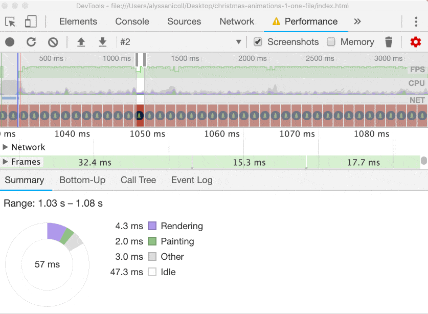
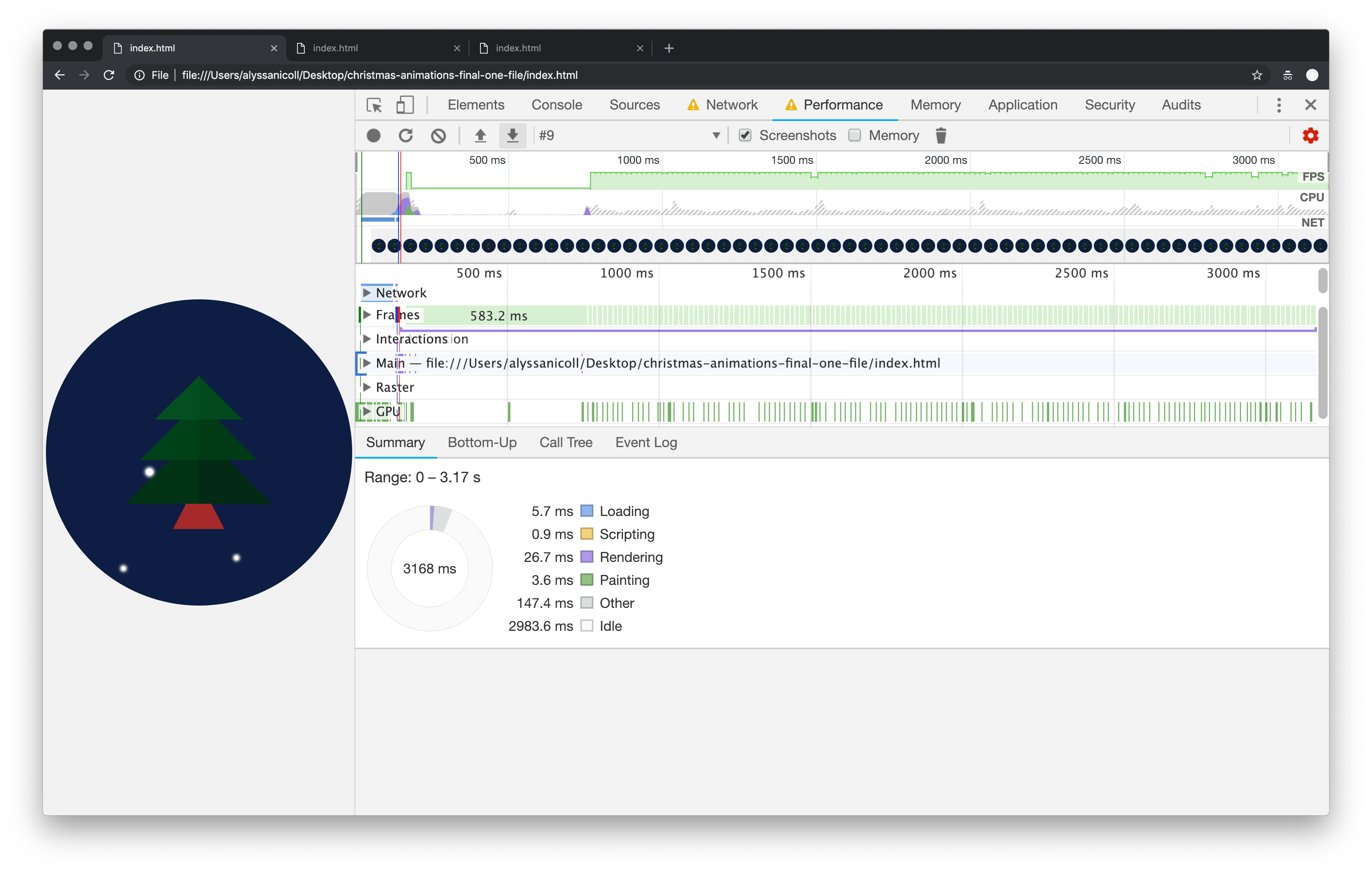
After modifying the animation, we noticed performance improvements. Specifically, the warnings in our performance panel went away! Hurray! However, we still have a painting problem. Here is a perhaps too detailed look at the performance behind the scenes:
Note: For better legibility, some of our screenshots have DevTools undocked to a separate window.
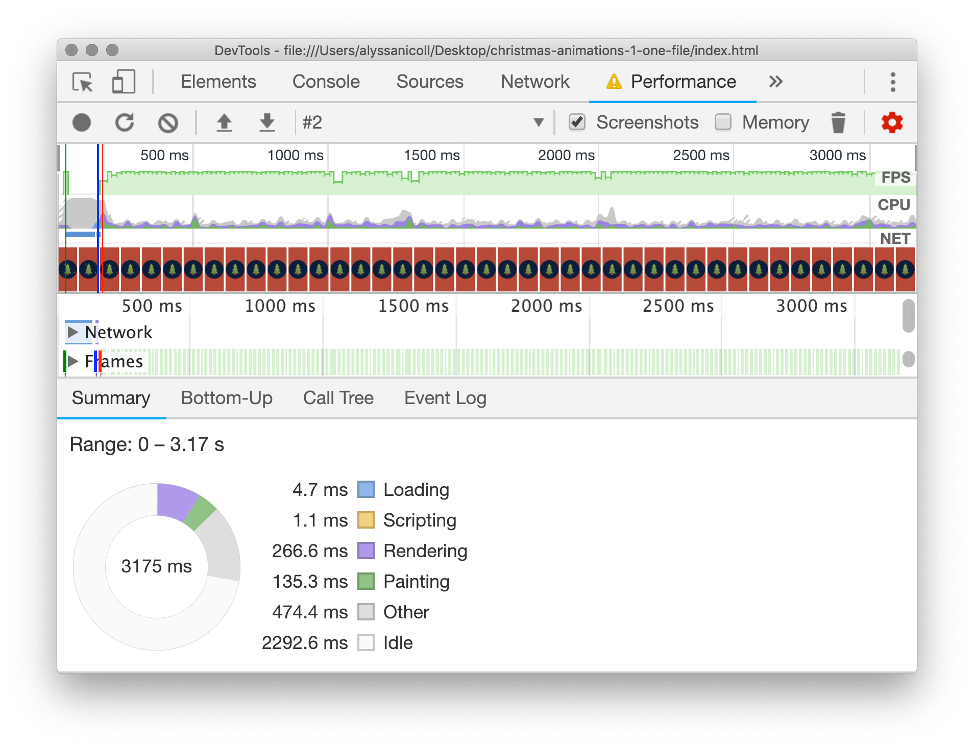
I slowed the CPU down 6x to to simulate a chugging MacBook (I would have put it lower if I could have). Note: All of our tests will be ran at 6x slower CPU, even our final performant code, to compare evenly.
As Paul Lewis explained in his article “Simplify Paint Complexity and Reduce Paint Areas”:
Paint is the process of filling in pixels that eventually get composited to the users' screens. It is often the longest-running of all tasks in the pipeline, and one to avoid if at all possible.
It might not seem like that much painting, but if you scrub through the timeline, you’ll see that every frame has painting of some kind:
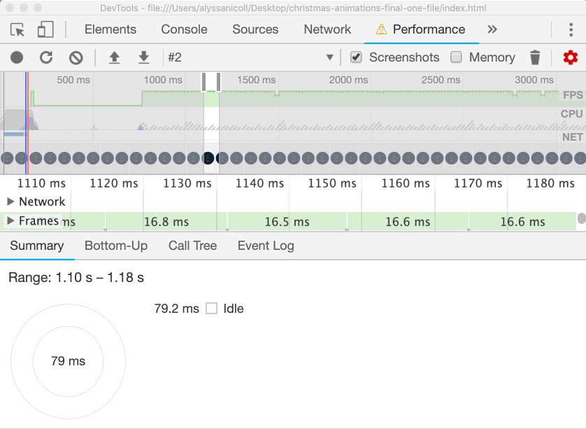
Whereas after we optimize this bad boy, we'll see only an idle CPU in our future frames:
So what did we optimize? Well, let’s take a look at how the tree and snow are being drawn right now.
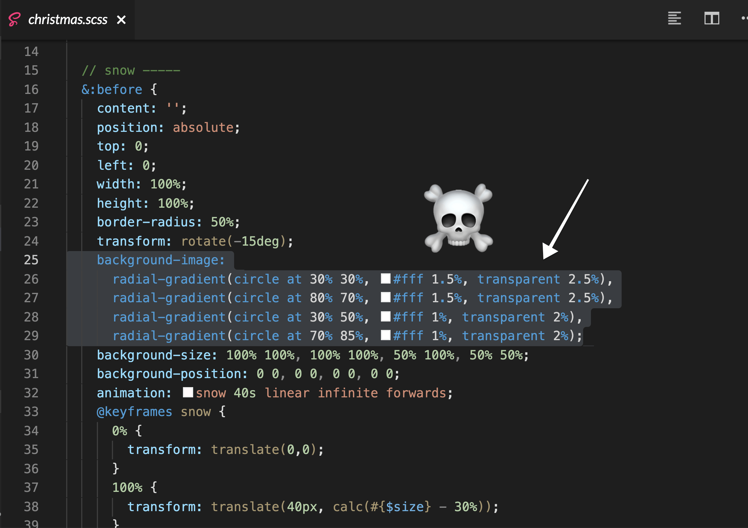
So, the tree is being drawn as multiple linear gradients on the .christmas background image:
background-image:
// top
linear-gradient($gradient-angel, darken($leaf-color,0%) 8%, transparent 8.5%),
linear-gradient(-$gradient-angel, darken($leaf-color,1.5%) 8%, transparent 8.5%),
// middle
linear-gradient($gradient-angel, darken($leaf-color,3%) 10%, transparent 10.5%),
linear-gradient(-$gradient-angel, darken($leaf-color,4.5%) 10%, transparent 10.5%),
// bottom
linear-gradient($gradient-angel, darken($leaf-color,6%) 12%, transparent 12.5%),
linear-gradient(-$gradient-angel, darken($leaf-color,7.5%) 12%, transparent 12.5%),
// trunk
linear-gradient(80deg, darken($trunk-color,0%) 5%, transparent 5.5%),
linear-gradient(-80deg, darken($trunk-color,1.5%) 5%, transparent 5.5%);
background-position:
// leaves-top
$size/2 $size/2.5, $size/2 $size/2.5,
// leaves-middle
$size/2 $size/1.8, $size/2 $size/1.8,
// leaves-bottom
$size/2 $size/1.4, $size/2 $size/1.4,
// trunk
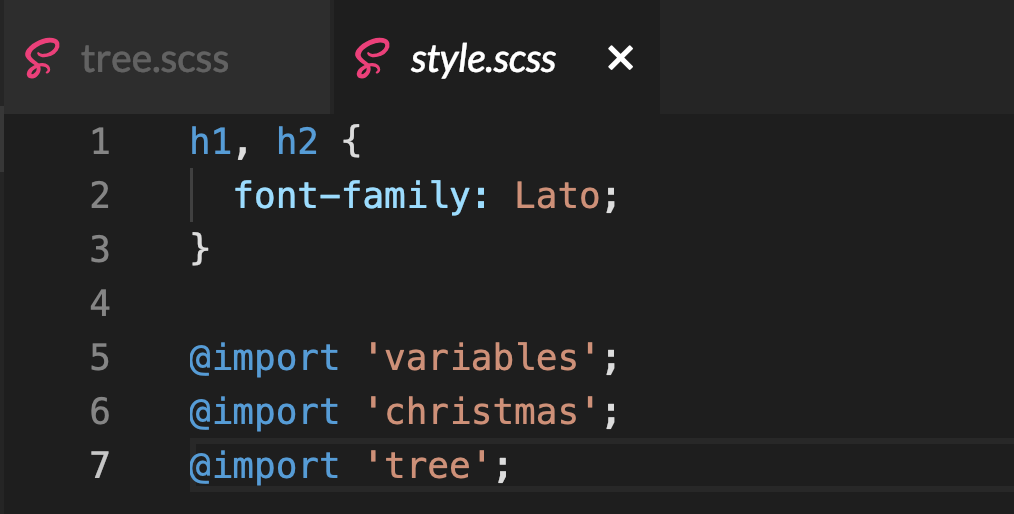
$size/2 $size/1.25, $size/2 $size/1.25;We’ll start by removing any and all tree styles from christmas.scss. Then, create a file called tree.scss that we will be sure and import in the styles.scss.
O Tannenbaum, How Lovely Are Your Positioned Branches
I know drawing/positioning/animating in CSS can be scary at times, so let’s go slow and take it one step at a time. Here is the structure for the tree:
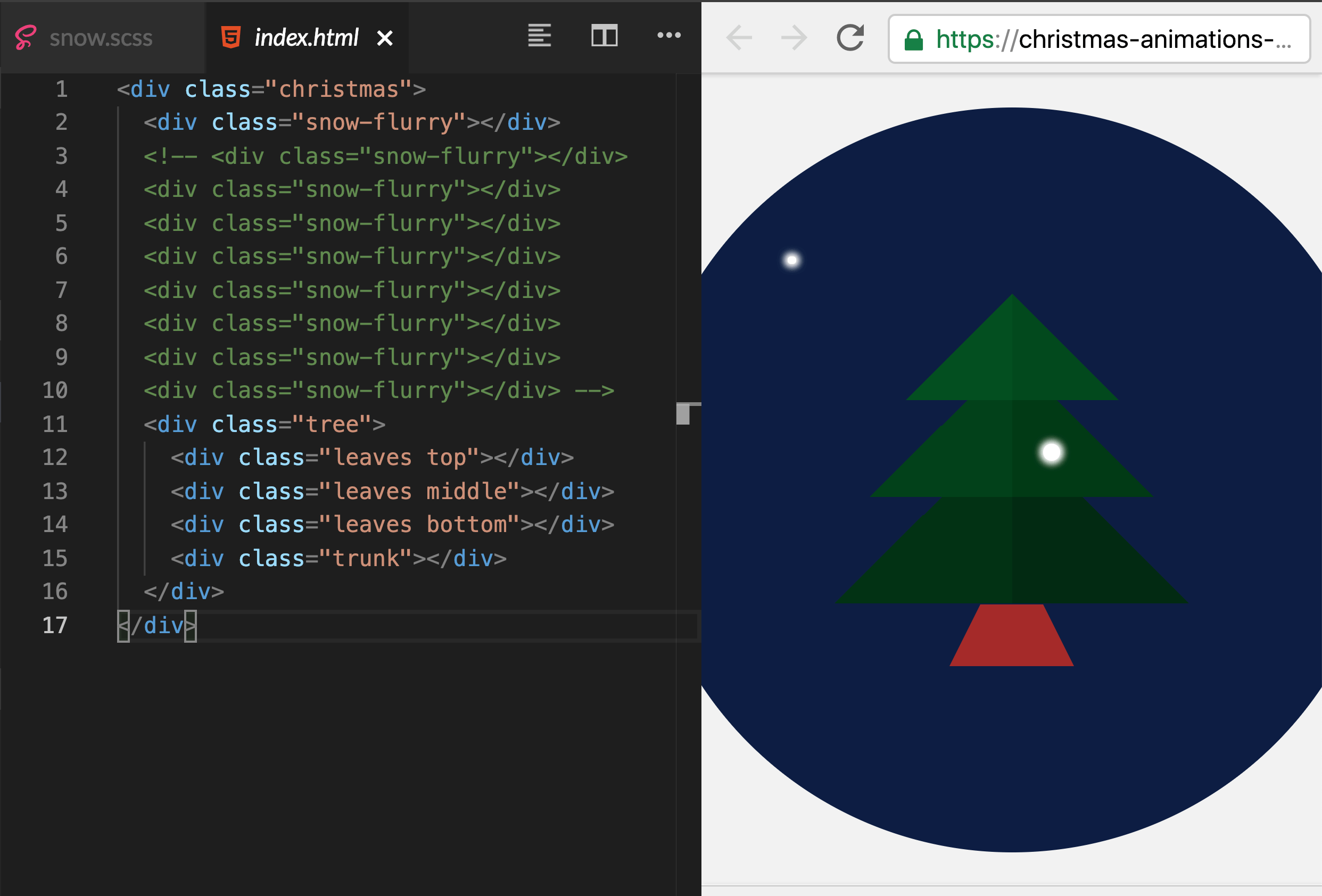
<div class="christmas">
  <div class="tree">
    <div class="leaves top"></div>
    <div class="leaves middle"></div>
    <div class="leaves bottom"></div>
    <div class="trunk"></div>
  </div>
</div>
First we need to position our parent .tree so the leaves and trunk can be positioned.
Position: absolute; Position based on nearest non-static positioned parent (out of the page flow)
// tree.scss

$tree-height: $size / 2;
.tree {
  top: calc(50% - #{$tree-height / 2});
  left: 50%;
  position: absolute;
  width: 0;
  height: $tree-height;
}
We are setting the top of .tree to 50% of .christmas (minus half the $tree-height). The left of .tree is at 50% (the middle).
position: absolute;We are giving the tree position absolute (rather than position fixed like .christmas) because we want the tree and its children to always be positioned in the middle of .christmas. Right now .christmas is position fixed, however, if we wanted to change that and move it about the page, we would need .tree to be position absolute, to stay inside .christmas.
We’ll want to position the leaves and trunk based off the center position of christmas, so we gave it width of 0. If you comment that out, you’ll notice nothing changes, Chrome is guessing the width this .tree should be. But whenever you are positioning children based of a parents exact location, you don’t want to leave the width (or height) up to chance and the browsers interpretation. The height should be, logically, as tall as the tree: height: $tree-height;.
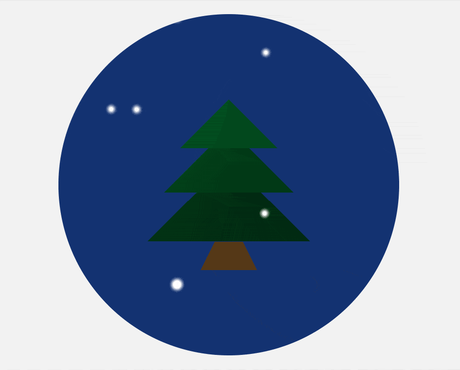
I’ll go ahead and give .tree a border so you can see where it is at on the screen:
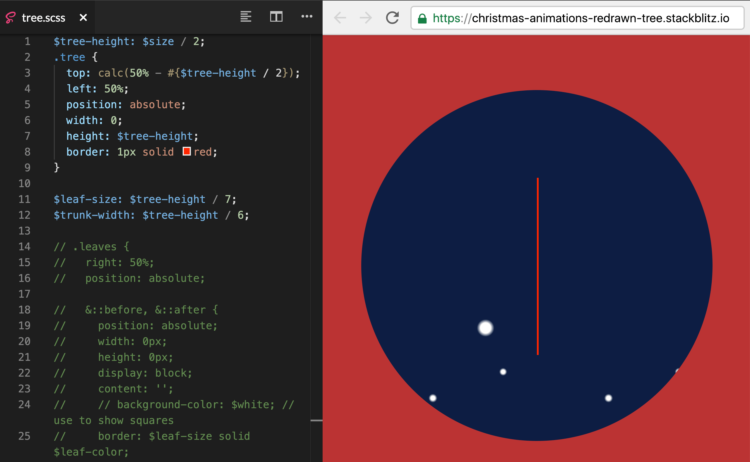
This is exactly where we need .tree to be, we are ready to start drawing the leaves and trunk!
Drawing Triangles
The next step we need to tackle is drawing the triangles to make the leaves! Drawing a triangle in CSS involves a combination of width/height and using borders. Check out this killer post on CSS Tricks called “The Shapes of CSS” for more fun shapes.
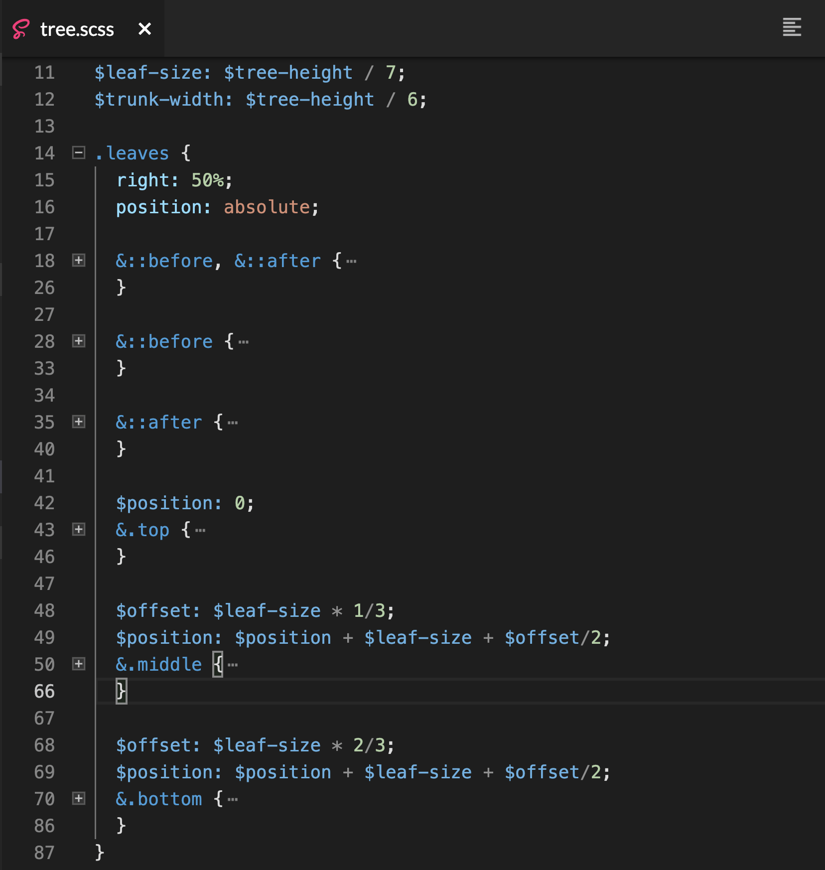
If you jumped ahead and looked at the StackBlitz, you might be overwhelmed by the 75 lines of CSS we used to draw the leaves. However, once broken up into chunks, you’ll see that we are just reusing the same triangle shape over and over again:
$leaf-size: $tree-height / 7;
$trunk-width: $tree-height / 6;
.leaves {
right: 50%;
position: absolute;
&::before, &::after {
position: absolute;
width: 0px;
height: 0px;
display: block;
content: '';
border: $leaf-size solid transparent;
}
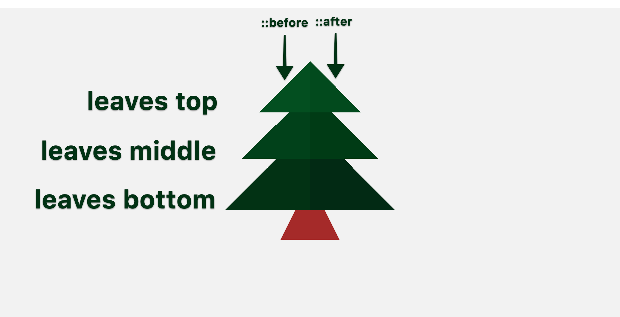
}This first part here is setting the field for Christmas tree leaf success. Alone, it looks ridiculous, but we put a lot of reusable styles for all the ::before and ::after elements. Essentially, every div has a ::before and ::after that we can use to style a triangle. So the three parts of the leaves (top, middle and bottom) give us each a ::before and ::after, creating six leaves in total:
Now for the actual drawing of our triangles:
&::before {
  right: 0;
  border-right-color: $leaf-color;
  border-bottom-color: $leaf-color;
}
&::after {
  left: 0;
  border-left-color: darken($leaf-color, 1.5%);
  border-bottom-color: darken($leaf-color, 1.5%);
}
As you can see, every triangle has its width and height set to zero. We now are giving the ::before elements right and bottom borders, and the ::after elements left and bottom borders, to make the two right angles we need.
We’ll reuse these two ::before and ::after leaf shapes on the .leaves .middle and .leaves .bottom. We will just adjust the size and positioning, as well as the z-index. We also are changing the leaf color to be subtly darker as we go down the tree, to get this nice layered effect.
All we need now is a glorious trunk! For this, we are going to draw a trapezoid!
$trunk-edges: $trunk-width / 2;
.trunk {
  right: calc(50% - #{($trunk-width + ($trunk-edges * 2)) / 2});
  bottom: 0;
  z-index: 1;
  position: absolute;
  width: $trunk-width;
  height: 0;
  border-right: $trunk-edges solid transparent;
  border-bottom: $trunk-width solid $trunk-color;
  border-left: $trunk-edges solid transparent;
}
With this lovely CSS, we are using borders again to draw the desired shape. We are centering the trunk of the tree and placing it at the bottom of .christmas. Finally, we are giving it the lowest z-index, so it is behind all the leaves.

Redrawing the Snow
The final step to our animation and drawing Christmas tree perfection is… THE SNOW! We need to remove the final bits of bad radial gradients inside background-image:
We are going to remove anything snow related from christmas.scss and create a new snow.scss file (that we imported inside our styles.scss). Now drawing spheres is surprisingly easier than drawing triangles or trapezoids. A circle is simply a square with its corners rounded to 50%.
So the goal with our HTML is to be able to add more and more elements and therefore adding more and more snow flurries to the screen. A snow flurry will consist of two pieces of snow (one smaller, one larger) and placed “randomly” in the .christmas scene.
Similar to how we used ::before and ::after pseudo elements to style two leaves on the trees, we’ll do the same for two snowflakes in a flurry. All the duplicate code will be inside .snow-flurry.
$snow-size: 5px;
.snow-flurry {
  position: absolute;
  width: 0;
  height: 0;
  z-index: 5;

  &::before, &::after {
    position: absolute;
    background-color: white;
    border-radius: 50%;
    content: '';
    box-shadow: 0 0 5px 2px white;
  }
}
The second half of these styles are drawing the round flurries for ::before and ::after. IT is also creating a blur on the edges using box-shadow. This is of course a stylistic choice and not mandatory for your flurries to fly!
As we mentioned before, the goal is to have some smaller pieces of snow and some larger. This code allows us to accomplish this with a bit of fun multiplication:
$snow-size: $snow-size * 1.8;
&::before {
  width: $snow-size;
  height: $snow-size;
}

// for smaller snow flakes
$snow-size: $snow-size * .5;
&::after {
  width: $snow-size;
  height: $snow-size;
}
Finally, we are going to take our SASS skills to the next level with this next chunk-o-code:
$flurry-groups-on-screen: 9;
@for $i from 1 through $flurry-groups-on-screen {
  &:nth-child(#{$i})::before {
    top: #{random($size)}px;
    left: #{random($size)}px;
  }
  &:nth-child(#{$i})::after {
    top: #{random($size)}px;
    left: #{random($size)}px;
  }
}
Hold onto your party hats, this really is not that complicated. First off, you’ll see the variable that I lovingly called $flurry-groups-on-screen, which, shockingly, specifies the number of flurry groups on screen. We are using this number to loop through each group and then place each ::before and ::after randomly within the $size of .christmas.
$flurry-groups-on-screen: 9;
@for $i from 1 through $flurry-groups-on-screen {
  &:nth-child(#{$i})::before {
    top: #{random($size)}px;
    left: #{random($size)}px;
  }
  &:nth-child(#{$i})::after {
    top: #{random($size)}px;
    left: #{random($size)}px;
  }
  // so the snow falls at different rates
  &:nth-child(#{$i}) {
    animation: snowing #{random(40) + 20}s linear infinite forwards;
  }
}
Since we are already looping, I thought it would be a shame not to take advantage for a really cool effect. The final part I want to add to this chunk will call our animation (a slightly modified version from before). However, it will randomize the duration of the animation, making the snow fall at different rates! SO COOL!
Now we are ready to add back in the animation and fire this up in the browser!
$snow-size: 5px;
.snow-flurry {
  position: absolute;
  width: 0;
  height: 0;
  z-index: 5;

  @keyframes snowing {
    0% {
      transform: translate(0,-#{$size});
    }
    100% {
      transform: translate(40px, $size);
    }
  }
}
Our starting point for the animation starts at 0, -$size and ends at 40px, $size. It looks killer, especially with our different timings on the falling flakes of snow!
Note: I’ve adjusted the colors of some things to look a bit more pleasing.
Check out the final StackBlitz.
Hopefully you’ve learned a bit about making performant drawings and animations in CSS! I know it can be tricky but so rewarding if you stick to it! We have (of course!) ended with lower CPU usage and MUCH less painting—we can even run this animation now in our Secret Santa app!
If this wasn’t enough animation for you and Angular happens to be your thing too, I’d encourage you to check out this post I wrote about custom animations in Angular. As always, happy coding everyone and happiest of holidays to you all!!

Alyssa Nicoll
Alyssa is an Angular Developer Advocate & GDE. Her two degrees (Web Design & Development and Psychology) feed her speaking career. She has spoken at over 30 conferences internationally, specializing in motivational soft talks, enjoys gaming on Xbox and scuba diving in her spare time. Her DM is always open, come talk sometime.