Diving into the Kendo UI Grid with Angular

Summarize with AI:
Curious to learn more about everything the Kendo UI Grid for Angular can do? Check out this guide to see how you can quickly put together a user-friendly and dynamic grid.
I recently recorded an 8-part video series explaining how to get started with many of our nifty Kendo UI for Angular components. In this video, I talked about the Angular Data Grid, one of our most popular components! Not everyone is a video watcher though, so here is a post detailing all of the features we covered in this episode of the Angular Video 8: Visualizing and Manipulating Data with the Kendo UI Grid!
Of course, if you are a video watcher, you can catch the video in its entirety below:
Basic Structure of THE GRID
You can find an example on our docs page giving an overview of the Grid.
First, check out the source code (click the view source button on the grid example). I’d like to point out some parts of the basic structure or hierarchy of our Kendo UI Grid. Inside our angular component and inside of the template, here you have this outer Kendo Grid wrapper:
<kendo-grid [data]="gridData" [height]="410">
  ...
</kendo-grid>
Inside of that, you have a bunch of Kendo Grid columns:
<kendo-grid [data]="gridData" [height]="410">
  <kendo-grid-column field="ProductID" title="ID" width="40">
  </kendo-grid-column>
  <kendo-grid-column field="ProductName" title="Name" width="250">
  </kendo-grid-column>
  <kendo-grid-column field="Category.CategoryName" title="Category">
  </kendo-grid-column>
  <kendo-grid-column field="UnitPrice" title="Price" width="80">
  </kendo-grid-column>
  <kendo-grid-column field="UnitsInStock" title="In stock" width="80">
  </kendo-grid-column>
  <kendo-grid-column field="Discontinued" title="Discontinued" width="120">
    <ng-template kendogridcelltemplate="" let-dataitem="">
      ...
    </ng-template>
  </kendo-grid-column>
</kendo-grid>
The kendo-grid is where we will property bind things like data or height. The list doesn’t stop there though. As an example of just how flexible and controllable our Grid is, you could also control these things:
- [loading]
- [pageSize]
- [skip]
- [sort]
- [sortable]
- [pageable]
- [scrollable]
- (dataStateChange)
As I mentioned above, here, on the outer element, is where you're going to go ahead and bind the data. So we matched up the entire grid with the set of data we’re using (named gridData in the component): [data]="gridData".
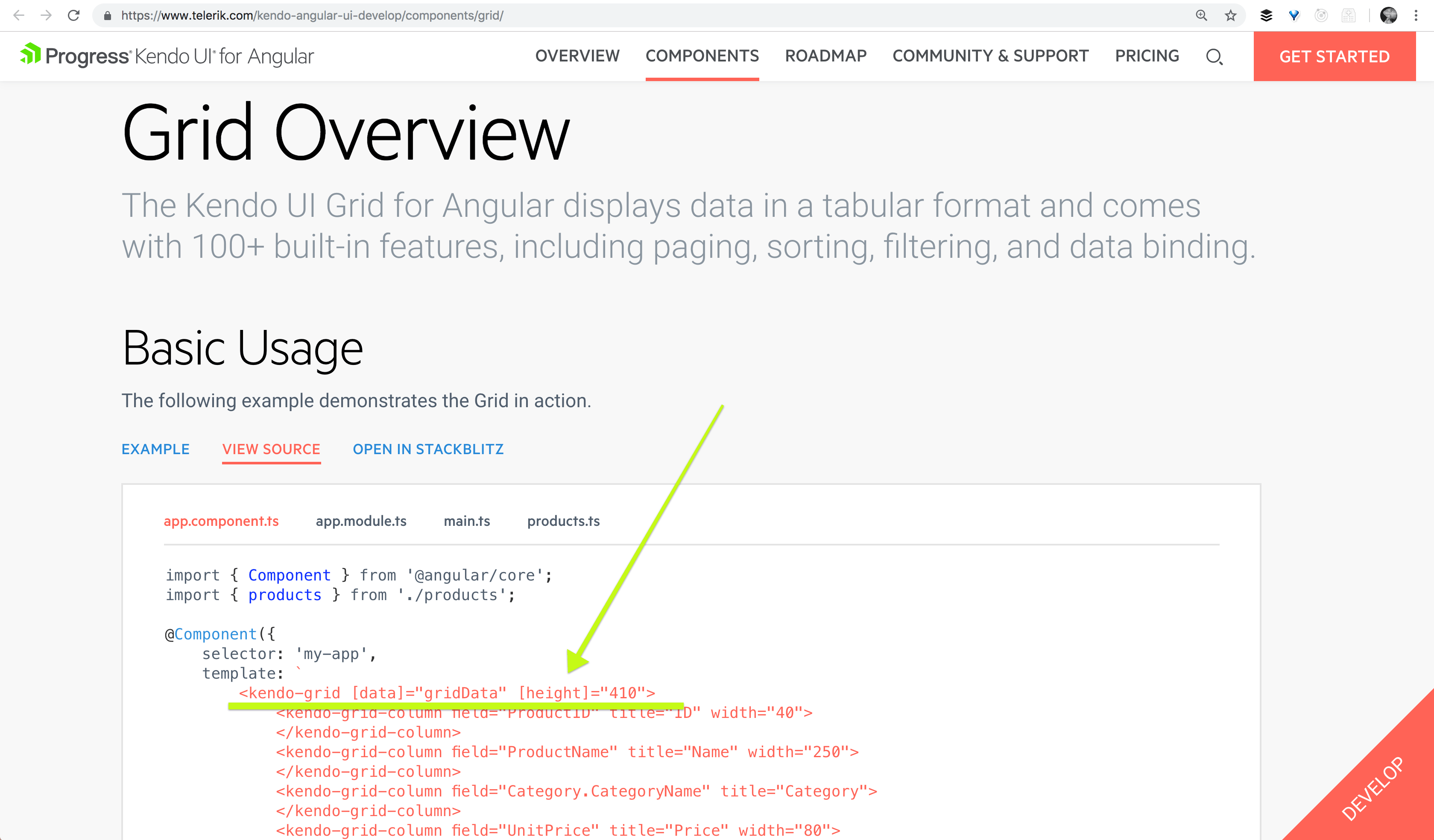
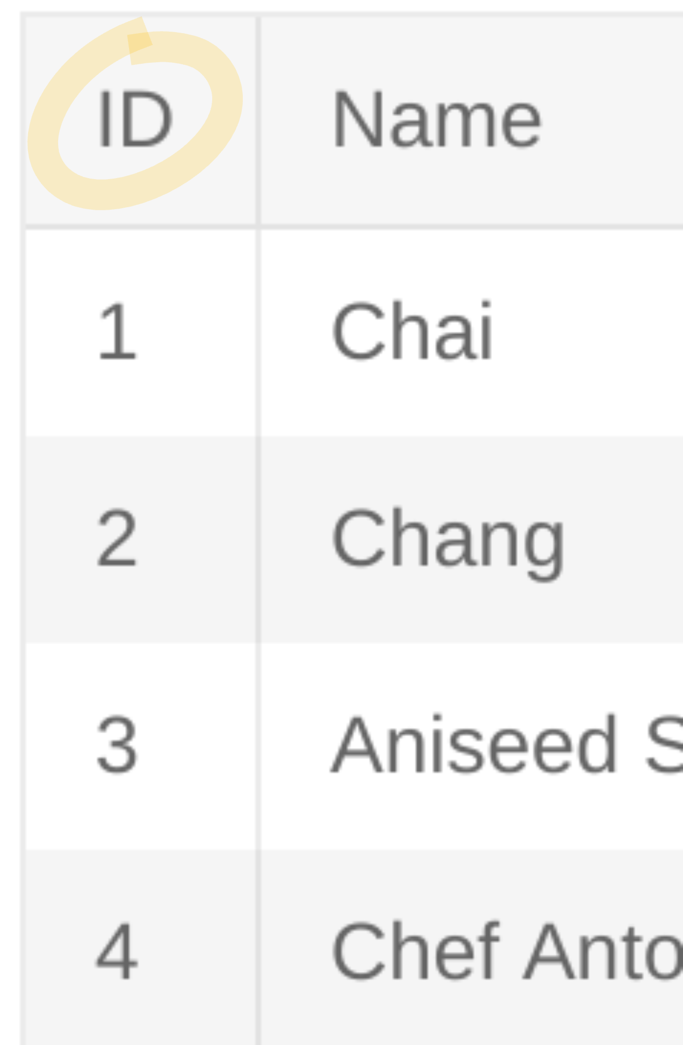
Next, we gave each column a field that matches to a piece of data that column is to represent. You can also provide the title, which will show up at the top of the column.
<kendo-grid-column field="ProductID" title="ID"></kendo-grid-column>.
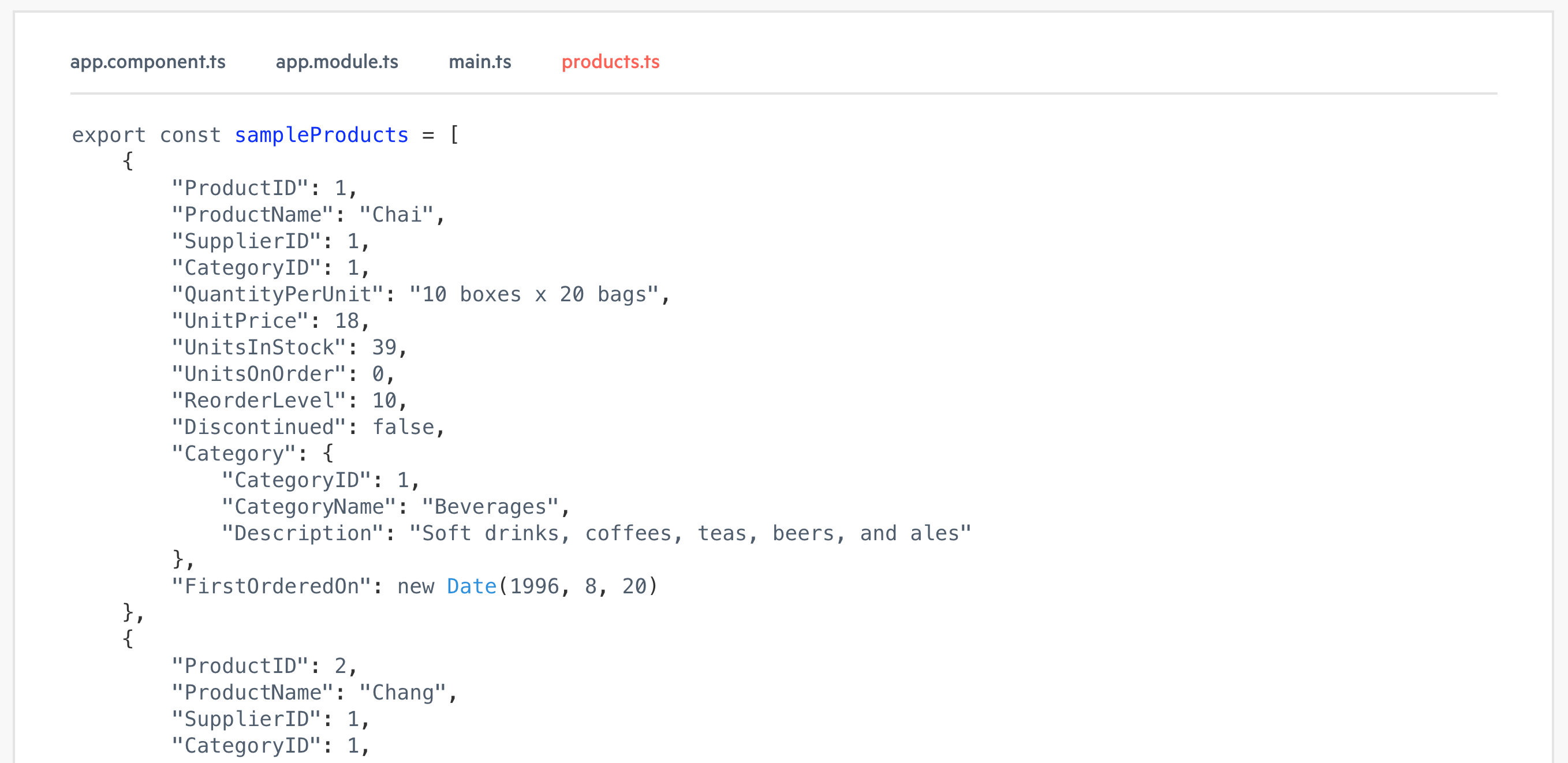
If we check out products.ts, you'll see that it's simply an array of some awesome product data.
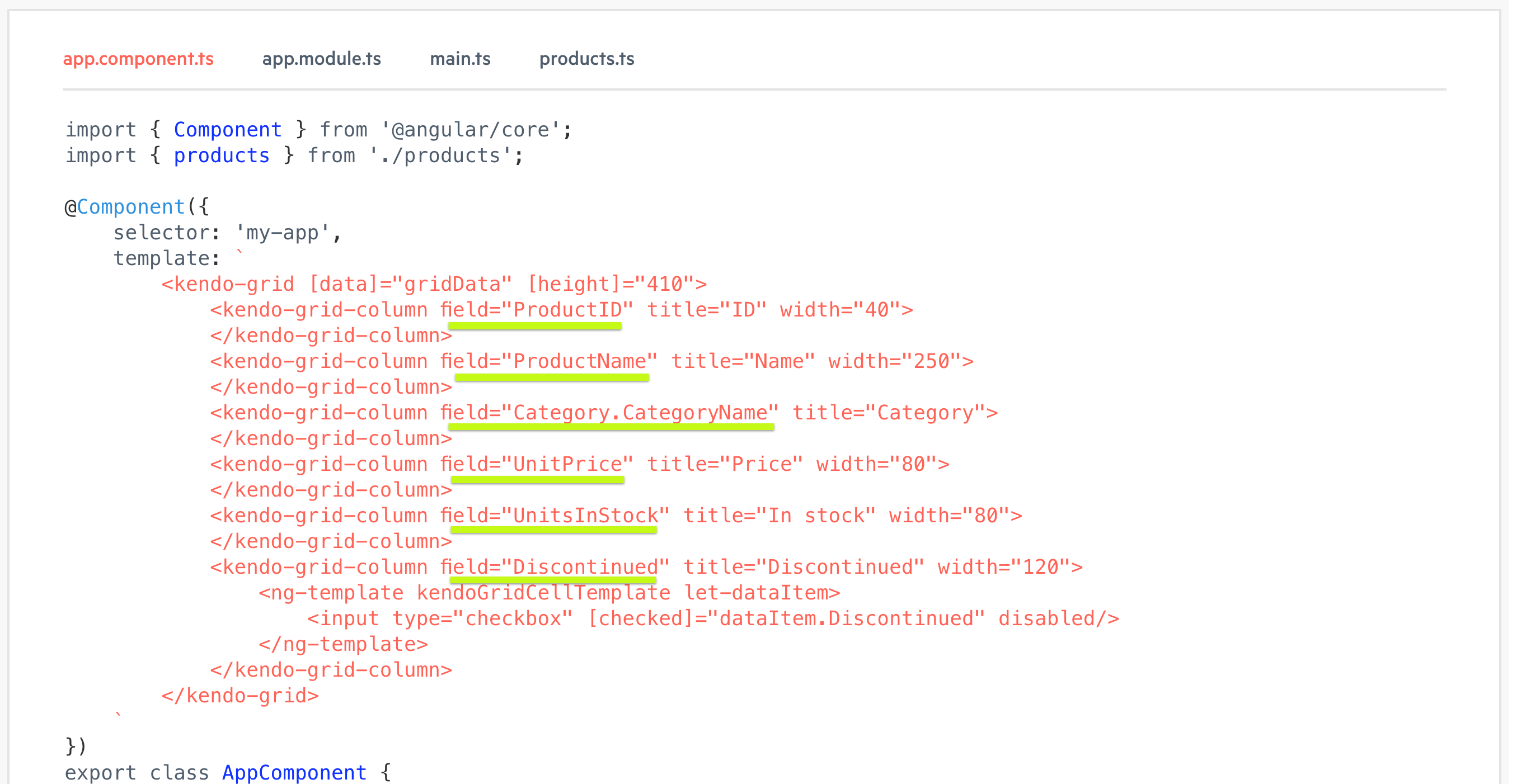
In our component file, we'll see that each of these Kendo Grid columns is also getting a field set. And that is where you are binding, as you probably guessed, the data set that you want to be represented there.
Follow along here with this StackBlitz if you’d like! Otherwise, keep looking at the docs page for The Grid.
If we go over to the preview, we’ll see that we have an ID, name, price and stock et cetera, and these match each of the fields we are passing in. We're also giving each of our Kendo Grids a title which is what is showing up at the very top of our Grid.
Resizing
So the first feature I'd like to dive into is resizing!

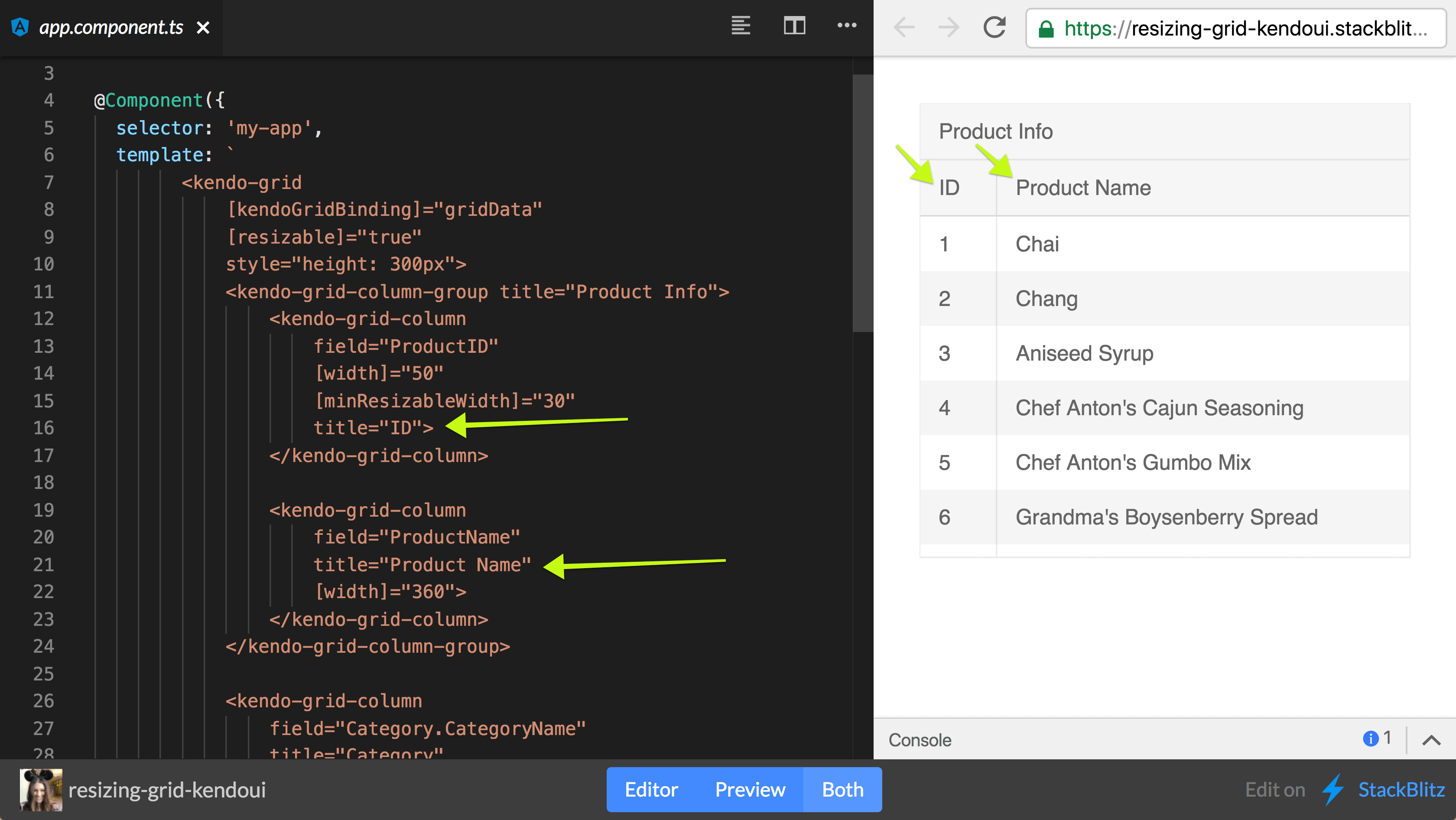
This is the option to have a handle that will grab the edge of a column and resize it to be larger or smaller. It's actually a super simple feature to go ahead and enable. For detailed documentation, check out our docs on resizing the Grid.
In our StackBlitz example (see below), inside of the Kendo Grid tag, all you need to do is set [resizable]="true". This will enable us to have a little handle dragger to grab the edge and resize larger or smaller.
Test out the resizing columns yourself in this StackBlitz!
Data Binding Directives & Filtering
Next, let's talk about data binding directives. In order to really show off why we want to use a data binding directive, I'm going to also show our filtering feature. Thus far, inside of our Kendo Grid, we've only been using property binding to the word data and setting it equal to our Grid data that has all of our customers in it. However, we actually have a data binding directive that you can use and it is called Kendo Grid binding: [kendoGridBinding]="gridData".
So now, if we let everything load in, nothing should change on our chart. We should see it exactly how it was. But, where the real power comes in is when you try to manipulate the data in the chart somehow. Whether that is filtering, sorting, or grouping.
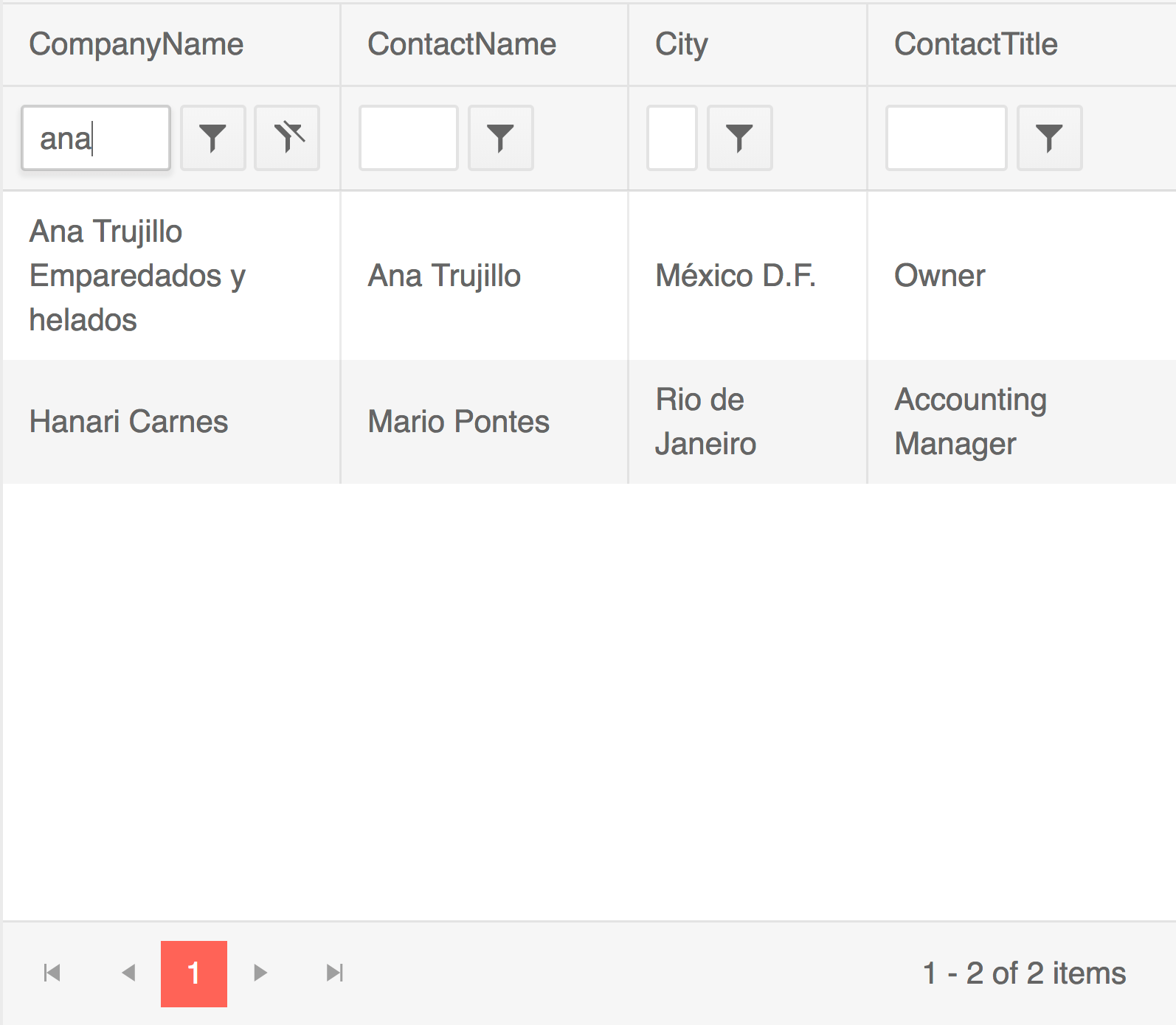
Let's go ahead and try filtering, so we'll set [filterable] = "true". This will provide a field at the top of each column that we can type in and filter by. So if we would like to filter by “ana”, you see that only the names that have “A-N-A” in them, show up in the names column.
Difference Between Using data and kendoGridBinding
If the [data] property is used, then the (dataStateChange) event can be handled and the current state of the Grid can be passed as a second parameter to the process() function. That way the current data operations will be applied to the data set which can then be passed to the [data] property. Check out this StackBlitz for an example of this.
We can also use the magical and wonderful kendoGridBinding when trying to manipulate data in our Grid. You can play around on this StackBlitz to see the differences between binding to data vs kendoGridBinding.
The data binding is more of a static, just slap in our data binding. The [kendoGridBinding] directive manages the data operations automatically, but the same can be achieved when using the [data] binding as well. It simply requires a bit more set up.
Other cool Grid operations include paging and grouping, which we’ll talk about down below. They will be set in the same way as resizable and sorting are set on the kendo-grid with property binding.
<kendo-grid [kendogridbinding]="gridData" [resizeable]="true" [sortable]="true" [pageable]="true" [pageSize]="10" [filterable]="true" [groupable]="true" [height]="510">
  ...
</kendo-grid>
So the kendoGridBinding is super powerful! You can read more about it in our docs under our data binding directives. We also have some customizable options so you can go ahead and make your own directive. But for the rest of our demos, we're going to be using the kendoGridBinding.
Grouping
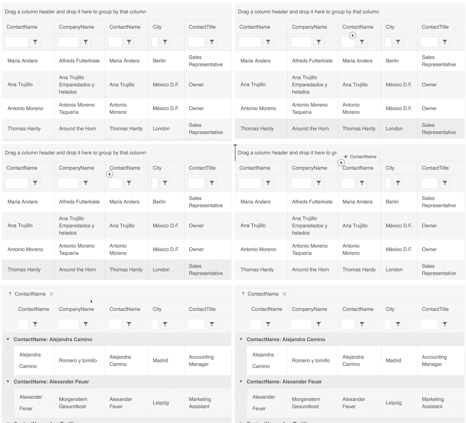
Next, let's talk about the grouping feature of the Kendo UI Grid. Underneath filterable, we're gonna go ahead and add a groupable property binding and set that equal to true.
Now, at the very top of our Grid, you should see something that says “drag a column header and drop it here to group by that column” which is literally what you have to do. So here you see me grouping by contact name by dragging and dropping the column header:
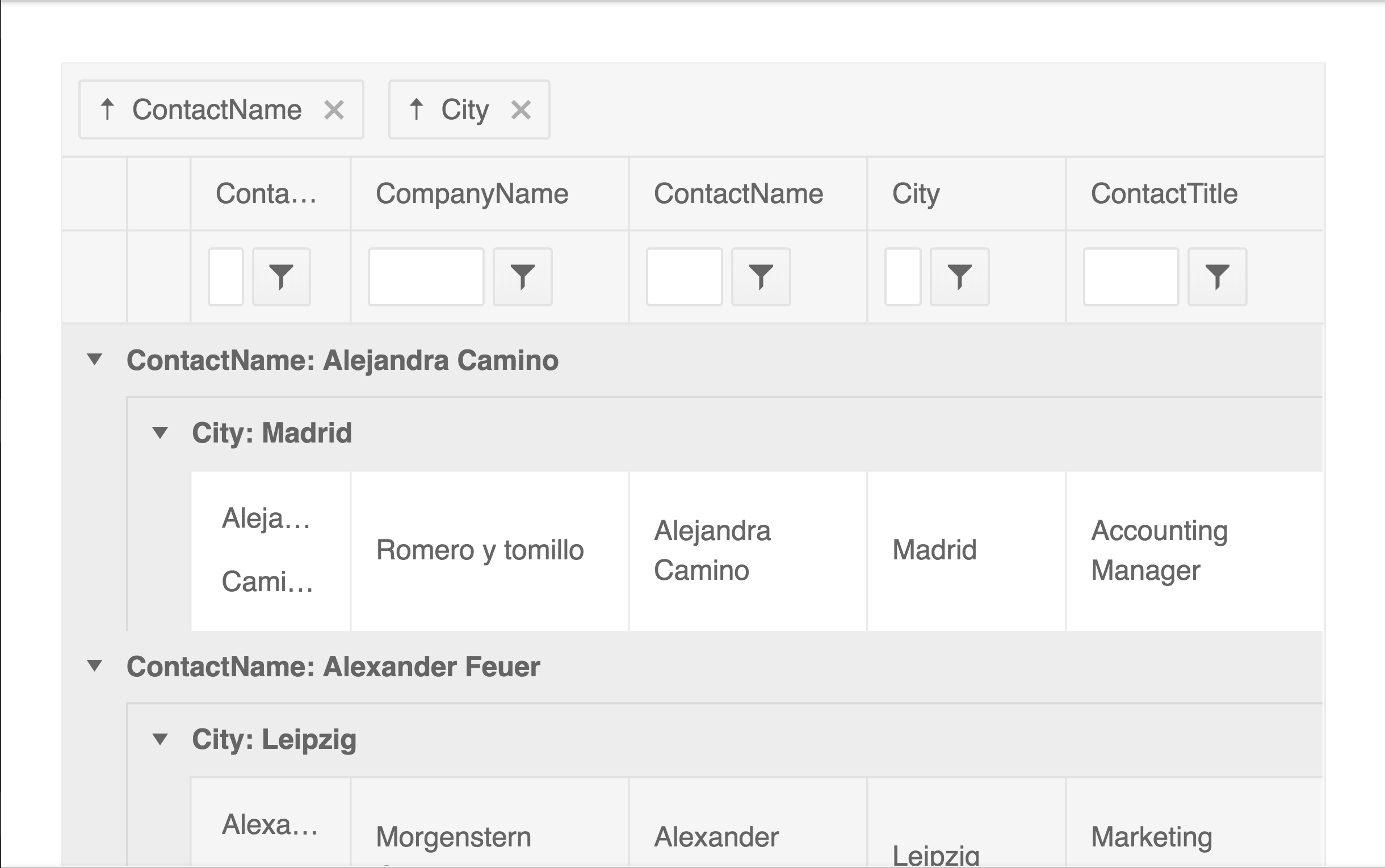
You can also group by multiple columns. They just start nesting it underneath one another:
As a side note, if you wanted to, you could set a default for grouping. So, we could go ahead and set [group]="[{ field: 'City' }]". This, by default, is going to put city up at the top and group by it on load. So if there's something that's very obvious for your company or for your use case that you want your data being grouped by initially, you can go ahead and set it with [group]="…".
🚸 Helpful Hint: 🚸
In our docs, we walk through steps to handle groupChange and dataStateChange events. These are needed if you are not using local data with kendoGridBinding.
To enable grouping:
- Set the
groupableandgroupoptions of the Grid.- Handle the
groupChangeor the emitteddataStateChangeevent.- Manually group the data. The Kendo UI Grid for Angular expects the grouped data to be a collection of
GroupResults.
Sorting
If we’d like to be able to sort, we simply set [sortable]="true" on our kendo-grid. This will make each column clickable so you can sort ascending or descending by that column!
With the default of sortable equals true, you're only able to sort by one column. But, we have multiple options. So instead of passing a boolean into sortable, you could pass an object that let's you specify things like the ability to unsort or sorting by multiple columns! Check it out right here:
Paging and Scrolling
If you have too much data to be displayed reasonably in one table, you can use paging and scrolling to alleviate this issue. By setting [pageable]="true" and then setting the amount of data you wish to display per “page” [pageSize]="8", you can have a nifty, multi-page Grid! I suggest setting [scrollable] to none, for the sake of legibility. [scrollable]="'none'".
You can also pass in an object of configurable info into [pageable]:
[pageable]="{
  buttonCount: buttonCount,
  pageSizes: [5, 10, 20],
  ...
}"
buttonCount controls the numbered buttons down at the bottom. This is simply controlling the number of buttons we’d like to see at a time. We also are passing page sizes. We had originally set eight for a page size to determine how many things we want to show on a page at a time. However, we can also set pageSizes to an array of sizes for the user to choose from themselves!

Well, that is all the time we have right now for covering the Grid. But I'd really encourage you to dive into our docs, we have so many more options. If you're new to Kendo UI for Angular, you can learn more here or just jump into a free 30 day trial today. I really hope you have enjoyed yourself and happy coding everyone!

Alyssa Nicoll
Alyssa is an Angular Developer Advocate & GDE. Her two degrees (Web Design & Development and Psychology) feed her speaking career. She has spoken at over 30 conferences internationally, specializing in motivational soft talks, enjoys gaming on Xbox and scuba diving in her spare time. Her DM is always open, come talk sometime.
