Deep Dive into the World's First TreeView Control for Xamarin

Summarize with AI:
Learn how you can leverage the context of the items in the TreeView control in Telerik UI for Xamarin — the first Xamarin TreeView control on the market.
This blog post is a continuation of my initial publication on the release of the TreeView control in Telerik UI for Xamarin. Below, I will go over how to get started with the TreeView control, defining the requirements and seeing the results. I hope that this will give you a deep dive into the control, so that you can start using it for your mobile application development.
Getting Started
Two important requirements for visualizing hierarchy are the ItemsSource and HierarchyAdapter. Based on what is provided for these, every business object gets indexed and a dedicated context is created. The context is a class which contains meta information describing the hierarchy. It also optimizes and simplifies operations like adding, removing, expanding and collapsing items.
After creating all contexts, the layout of the RadTreeView uses them instead of the business items. Each context is of type TreeViewDataItem and is set as the BindingContext of the respective visual representation of the business item, and exposes the following properties:
Item: object, contains the business objectHeader: string, contains the text extracted from the property set as DisplayMemberPathLevel: uint, describes how deep in the hierarchy the item isIsExpanded: bool, true if the children of the item are visible, otherwise falseIsChecked: nullable bool, true if the checkbox of the item is checked, false if it is unchecked, null if the children are both checked and uncheckedIsLeaf: bool, true if the item has no children, otherwise false
This metadata can be utilized when a custom ItemTemplate is used. With the help of triggers and/or converters, you can dynamically modify the DataTemplate.
Explaining the Default Template
The default ItemTemplate of the RadTreeView also uses this approach to achieve the hierarchical look and feel. The indentation on the different levels is just left Margin applied to the Label visualizing the Header. The expand/collapse indicator is another Label whose Text is changed depending on the IsExpanded and IsLeaf properties. And lastly a RadCheckBox is bound to the IsChecked in TwoWay mode to keep the UI synced with the actual status of the item and vice versa.
Defining Requirements and Actions
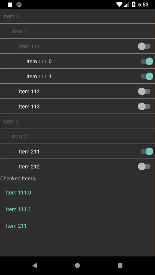
I will create a custom ItemTemplate to cover the requirements:
- Items with and without children should have different
TextColor - All items, except levels 0 and 1, should visualize right-aligned Switch instead RadCheckBox
- The Switch should serve for checking the item
Here is how I will cover the requirements:
- Keeping in mind that all leafs of a tree structure have no children, I will use the
IsLeafflag of the context to differentiate between the items with and without children. - To understand if the Switch should be visualized I will use the
Levelproperty. - I will bind in
TwoWaymode theIsToggledproperty of the Switch to theIsCheckedproperty of the context. To test if the checking functionality works, I will print the content of theCheckedItemscollection of the RadTreeView. This is a collection containing all checked items.
Presenting the Solution
The following DataTemplate covers all requirements:
<DataTemplate>
  <Grid Margin="{Binding Level, Converter={StaticResource levelToMarginConverter}}"
        HeightRequest="40">
    <Grid.ColumnDefinitions>
      <ColumnDefinition />
      <ColumnDefinition />
    </Grid.ColumnDefinitions>
    <Label Text="{Binding Header}"
           VerticalOptions="Center"
           VerticalTextAlignment="Center"
           TextColor="{Binding IsLeaf, Converter={StaticResource isLeafToColorConverter}}" />
    <Switch Grid.Column="1"
            HorizontalOptions="End"
            VerticalOptions="Center"
            IsToggled="{Binding IsChecked, Mode=TwoWay}"
            IsVisible="{Binding Level, Converter={StaticResource levelToVisibilityConverter}}" />
  </Grid>
</DataTemplate>
Here is how it looks like with a simple ItemsSource:

Wrapping Up
Now you should be know how to leverage the full potential of the underlying TreeViewDataItem object. More information about the specific implementation can be found in the small application I created especially for this demo.
In conclusion, we would love to hear what you think about the TreeView control and how we can continue to improve it. It's part of the Telerik UI for Xamarin suite, which you can learn more about at the product page, or download a free 30-day trial and play around with the available 70+ Xamarin controls and Visual Studio Templates.
You can always check out to the detailed documentation for more developer examples, and we we always welcome you to help or share your feedback through our feedback portal.
Thank you and I can't wait to see all the great mobile apps you are going to create!

