
Custom Visual State Management for Xamarin.Forms
 by Sam Basu

Summarize with AI:
With support for VSM in Xamarin.Forms 3.0 and Telerik UI for Xamarin, UI definition and behavior can now live close together, leading to less-verbose and easily understandable code.
With the Xamarin.Forms 3.0 update comes support for a feature that hardcore XAML developers have been craving for a while now: Visual State Manager (VSM). VSM provides developers with a structured way to define user interface behaviors directly in UI markup language. This provides a lot of flexibility for developers to bake in some of the user interaction changes in the UI markup itself—without having to revert to verbose code-behind or MVVM code.
And if building apps with Xamarin.Forms 3.0, you'll likely need polished UI controls that extend the default Xamarin toolset, which means you don’t have to reinvent the wheel for every project and can ship apps faster. This is where Telerik UI for Xamarin shines—a comprehensive suite of sharp, performant cross-platform UI components for Xamarin.Forms apps. Now, if you are a fan of Visual State Managers, you'll be happy to know that VSM support doesn't just work for what's out of the box, but also for complex UI. It also provides you with the option to customize VSM behaviors by writing custom visual states for UI controls. This article showcases custom VSM in Xamarin.Forms working with Telerik UI. So, let’s get going and let the good times roll!
Visual State Manager
VSM support in Xamarin.Forms 3.0 introduces the concept of Visual States for UI. A Xamarin.Forms view/control can have several different visual appearances depending on its underlying state. And developers get to define UX behaviors by laying out rules as to how the UI looks in various visual states. The best part—this can all be done in XAML markup.
Visual states for a UI are defined together in Visual State Groups—a collection of which defines a combined UX behavior. All the visual states within a visual state group are mutually exclusive, and everything is identified by simple text strings.
The Visual State Manager in Xamarin.Forms defines the three most commonly used visual states, all defined within one visual state group named CommonStates:
- Normal
- Disabled
- Focused
This visual state group is supported for all classes that derive from VisualElement, which is the base class for View and Page - so this covers pretty much all UI controls in Xamarin.Forms. VSM can now be utilized to control UI behaviors across these three common visual states, and all of the visual state group definitions can be described in XAML markup.
Custom Visual States
The built-in visual states are great, but what if you wanted to extend the functionality to define some more states? Turns out, defining custom visual states is easy, every class that derives from VisualElement uses the Visual State Manager in the same way. We simply need to invoke VisualStateManager.GoToState() to force the VSM to shift the UI control's state to the corresponding visual state.
Let's take a simple example: a button. While the normal, disabled and focused states come built in, the pressed state of a button is also a common visual state. Let's try adding a custom visual state that recognizes the button's pressed state. Sure, we can use the default Xamarin.Forms button, but the button that comes with Telerik UI for Xamarin is just on steroids. It offers a ton of developer flexibility—rounded corners, rotation, transparency, background images and theming options.
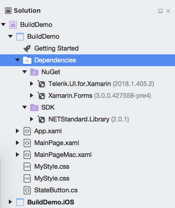
Wouldn't it be cool if we could define custom visual states that work with Xamarin.Forms VSM, but apply toward Telerik UI? Well, we can! First, start a project and get our dependencies right—the only two needed are Xamarin.Forms 3.0 forward and Telerik UI for Xamarin.
The fancy button in Telerik UI for Xamarin is called RadButton - how RAD! The easy way for us to define a custom visual state is to inherit off the RadButton class and define a new button that is aware when it is pressed. Here's some code:
public class StateButton : RadButton
{
  public StateButton()
  {
    this.Pressed += (s, e) => this.IsPressed = true;
    this.Released += (s, e) => this.IsPressed = false;
  }

  public bool IsPressed
  {
    get
    {
      return (bool)this.GetValue(IsPressedProperty);
    }
    set
    {
      this.SetValue(IsPressedProperty, value);
    }
  }

  public static readonly BindableProperty IsPressedProperty =
    BindableProperty.Create(nameof(BackgroundColor),
                            typeof(bool),
                            typeof(StateButton),
                            defaultValue: false,
                            propertyChanged: OnIsPressedPropertyChanged);

  private static void OnIsPressedPropertyChanged(BindableObject bindable, object oldValue, object newValue)
  {
    ((StateButton)bindable).ChangeVisualState();
  }

  protected override void ChangeVisualState()
  {
    if (this.IsPressed)
    {
      VisualStateManager.GoToState(this, "Pressed");
    }
    else
    {
      base.ChangeVisualState();
    }
  }
}
You'll notice that once our button is aware of its pressed state, we can simply ask the Xamarin.Forms VisualStateManager to forcibly go to a defined state accordingly (that being Pressed).
Hooking Up UI
Now that we have a button that understands a custom visual state, let's use it in our Xamarin.Forms UI. To make things a little more interesting, let us try to embed this button in a repeatable DataTemplate - VSM simply works and trickles down the stack. Let's use one of the most common UI paradigms in mobile apps: a list of things. We need some sample dummy data first, so here's some code in our code-behind file:
public MainPage()
{
  InitializeComponent();

  ViewModel VM = new ViewModel();
  this.TelerikListView.ItemsSource = VM.Source;
}

public class SourceItem
{
  public SourceItem(string name)
  {
    this.Name = name;
  }

  public string Name { get; set; }
}

public class ViewModel
{
  public ViewModel()
  {
    this.Source = new List<SourceItem> { new SourceItem("Tom"),
                                         new SourceItem("Anna"),
                                         new SourceItem("Peter"),
                                         new SourceItem("Teodor"),
                                         new SourceItem("Lorenzo"),
                                         new SourceItem("Andrea"),
                                         new SourceItem("Martin") };
  }

  public List<SourceItem> Source { get; set; }
}
Clearly, this is sophisticated code. Okay, fine—we are literally new'ing up a bunch of strings. Now that we have a list of people's names, it's time to bind the collection to a ListView - a label for names, and two buttons each to edit or delete. Here's the XAML markup:
<telerikDataControls:RadListView x:Name="TelerikListView" Margin="0,80,0,0" StyleClass="TelerikTheme">
<telerikDataControls:RadListView.ItemTemplate>
<DataTemplate>
<telerikListView:ListViewTemplateCell>
<telerikListView:ListViewTemplateCell.View>
<StackLayout Orientation="Horizontal">
<Label Margin="10" Text="{Binding Name}" StyleClass="MyLabel" WidthRequest="70" />
<Button Text="Edit" />
<local:StateButton Text="D"
HeightRequest="40"
WidthRequest="40"
FontSize="Micro"
TextColor="Green"
BackgroundColor="Yellow"
BorderRadius="20"/>
</StackLayout>
</telerikListView:ListViewTemplateCell.View>
</telerikListView:ListViewTemplateCell>
</DataTemplate>
</telerikDataControls:RadListView.ItemTemplate>
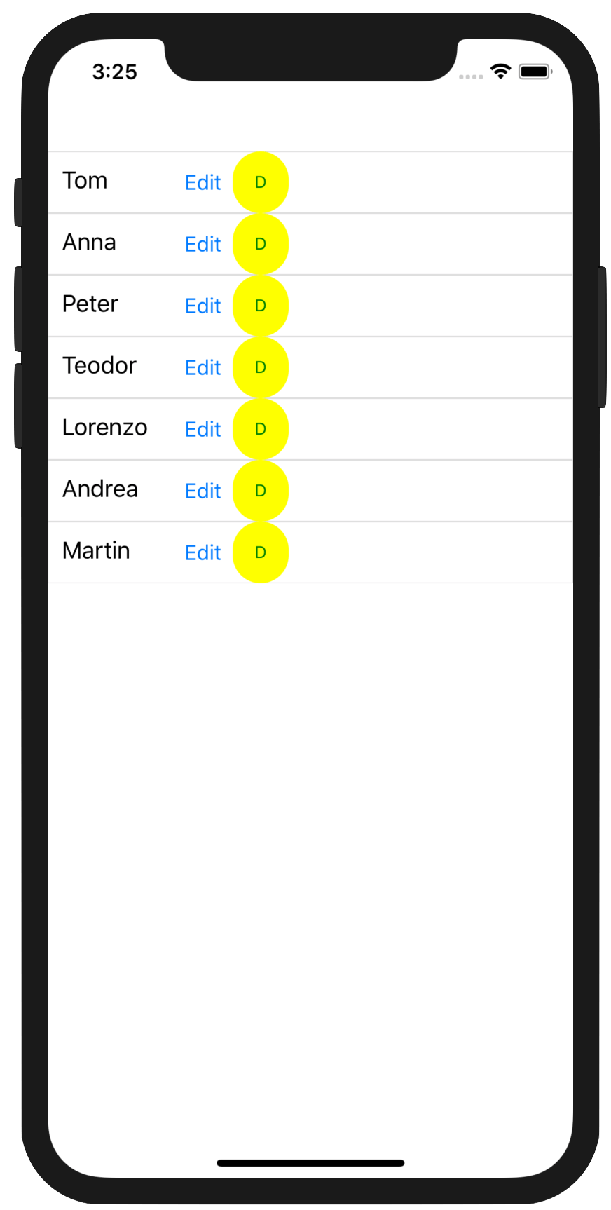
</telerikDataControls:RadListView>Notice how the Telerik button provides additional APIs to round up corners, use custom backgrounds and more - just more ammunition for developers to make their UI look exactly as desired. With UI markup in place and code-behind providing the data to bind, our app screen lights up with the list of names and buttons for each.
Using Custom VSM
With our UI markup bound to our data, we have our app screen showing the list we want. But let's not forget, we used a special button in our ListView's DataTemplate, one that is aware of its pressed state. And we have VisualStateManager being forced to go into a custom visual state when the button is pressed. Now it is time to put it all together. Here's some more UI markup code:
<ContentPage xmlns="http://xamarin.com/schemas/2014/forms"
xmlns:x="http://schemas.microsoft.com/winfx/2009/xaml"
xmlns:local="clr-namespace:BuildDemo"
x:Class="BuildDemo.MainPage"
xmlns:telerikDataControls="clr-namespace:Telerik.XamarinForms.DataControls;assembly=Telerik.XamarinForms.DataControls"
xmlns:telerikListView="clr-namespace:Telerik.XamarinForms.DataControls.ListView;assembly=Telerik.XamarinForms.DataControls"
xmlns:telerikInput="clr-namespace:Telerik.XamarinForms.Input;assembly=Telerik.XamarinForms.Input">
<ContentPage.Resources>
<ResourceDictionary>
<Style TargetType="local:StateButton" ApplyToDerivedTypes="True">
<Setter Property="VisualStateManager.VisualStateGroups">
<VisualStateGroupList x:Name="CommonStates">
<VisualStateGroup>
<VisualState x:Name="Normal" />
<VisualState x:Name="Pressed">
<VisualState.Setters>
<Setter Property="BorderWidth" Value="2"></Setter>
<Setter Property="BorderColor" Value="Green"></Setter>
</VisualState.Setters>
</VisualState>
</VisualStateGroup>
</VisualStateGroupList>
</Setter>
</Style>
</ResourceDictionary>
</ContentPage.Resources>
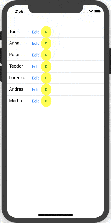
</ContentPage>You'll notice that we're declaring a custom style in our XAML page's ResourceDictionary - and the style applies to our custom StateButton. Inside, we simply define a custom visual state as a part of the visual state group that Xamarin.Forms VSM already supports - the CommonStates. We are declaring the Pressed state as a new custom visual state that the VSM would understand. The style setters set the border width and color properties of the afore-mentioned button. In effect, every time we press our custom StateButtons, we want them to glow with a green border. This is specific UX behavior, defined entirely in XAML markup, possible through the support of Visual State Manager.
Summing Up
Support for Visual State Manager in Xamarin.Forms 3.0 should be a very welcome feature for XAML aficionados. VSM would allow developers to define UI behavior through simple visual state changes, declared entirely within XAML markup. And VSM supports works not just for what's out of the box, but also for custom complex UI like Telerik UI for Xamarin. Xamarin.Forms has built-in support for VSM across all controls now, and developers get to extend functionality by defining custom visual states as needed. UI definition and behavior can now live close together—leading to less-verbose and easily understandable code. Hallelujah to that!
Sam Basu
Sam Basu is a technologist, author, speaker, Microsoft MVP and gadget lover. With a long developer background, he also worked as a Developer Advocacy Manager for advocating modern web/mobile/cloud development platforms on Microsoft/Telerik/Kendo UI technology stacks. His spare times call for travel, fast cars, cricket and culinary adventures with the family.