Creating Accessible Grids with Kendo UI

Summarize with AI:
In this blog, we will look at how to implement an accessible grid using the Kendo UI Grid Components. Note that while we are using a Kendo UI for jQuery component for this example, Kendo UI has native components for Angular, React and Vue as well.
Web accessibility means that people with disabilities can use the web, and how a grid is interpreted differs for sighted and non-sighted users. A sighted user can quickly understand the information because they have a visual of the entire grid. A non-sighted user interacts with a grid differently—assistive technology, like a screen reader, will read the grid one cell at a time. Therefore, the grid must be designed so that contextual information is not lost. Up next, we will see how the grid achieves this and conforms to the Web Content Accessibility Guidelines (WCAG) 2.1.
Making Headers Screen Reader Accessible
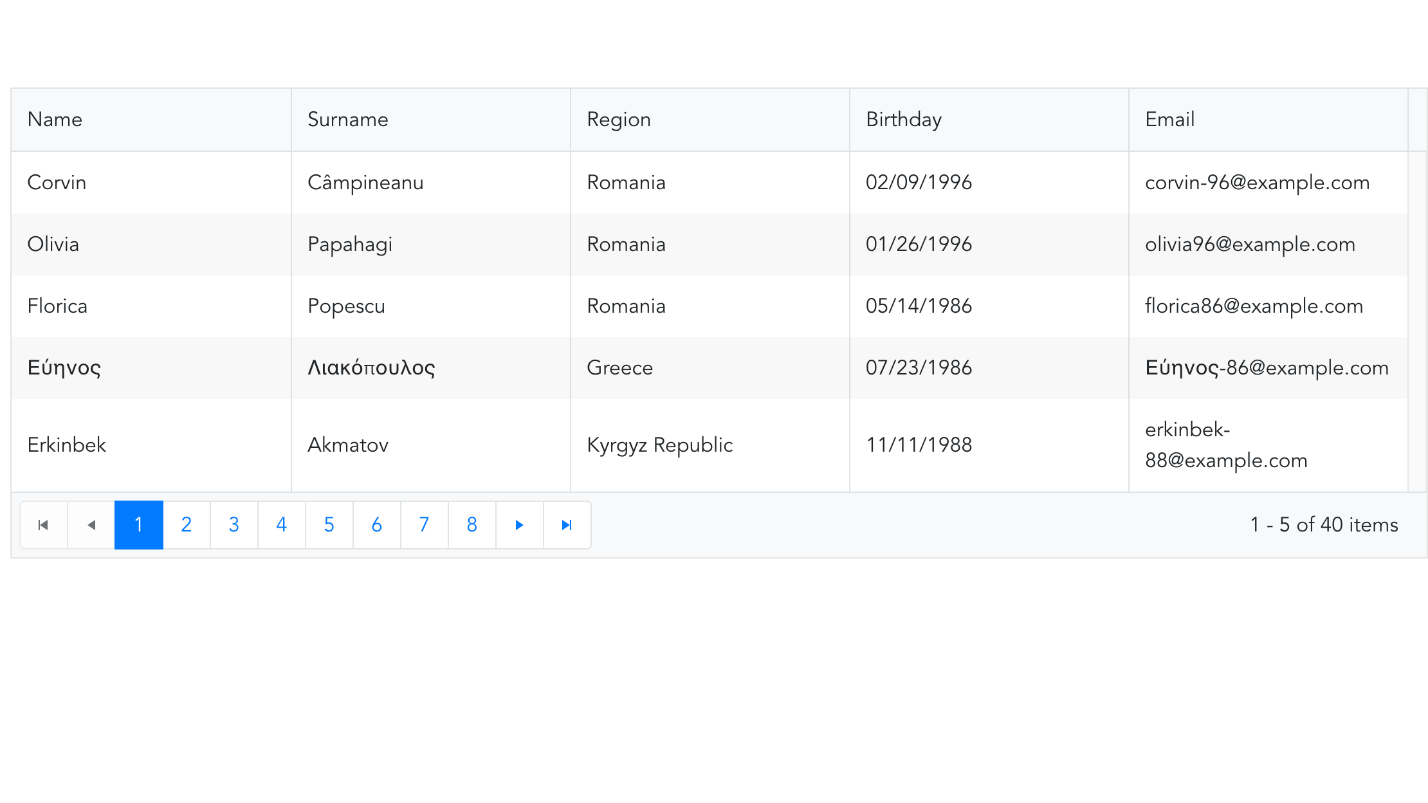
The WCAG success criterion 1.3.1 states, “Information, structure and relationships conveyed through presentation can be programmatically determined or are available in text.” For a grid, the structure and relationships within the data are primarily identified by its headers. The headers are usually the first row or first column of a grid. Headers may also be distinguished from other cells with bold font or a shaded background. These visual cues cannot be interpreted by a non-sighted user. Furthermore, because the headers are always visible, a sighted user knows which data cell is associated with which header. The following is an example table.

If the grid wasn’t designed to be accessible, the first row after the headers would be read as “Corvin, Câmpineanu, Romania, 02/09/1996, corvin-96@example.com.” In this example, you might be able to decipher what each piece of information means but your data may not be as distinct. If you had a grid of financial data, each cell would be a number and it would be virtually impossible to determine what each number meant. For a non-sighted user, there needs to be a way to associate the header with a data cell.
For a table with a simple layout, using the th element to identify header cells is sufficient for a screen reader. However, for tables with a complex layout, the scope attribute should also be added to table headers. The table headers of the Kendo UI Grid have the scope="col" attribute to associate column headers with the data. With these enhancements, a screen reader will now announce the name of the header with the data when the column changes. Using the previous example, the second row would be read as, “Name, Corvin; Surname; Câmpineanu; Region, Romania; Birthday, 02/09/1996; Email, corvin-96@example.com.”
Making Content Keyboard Accessible
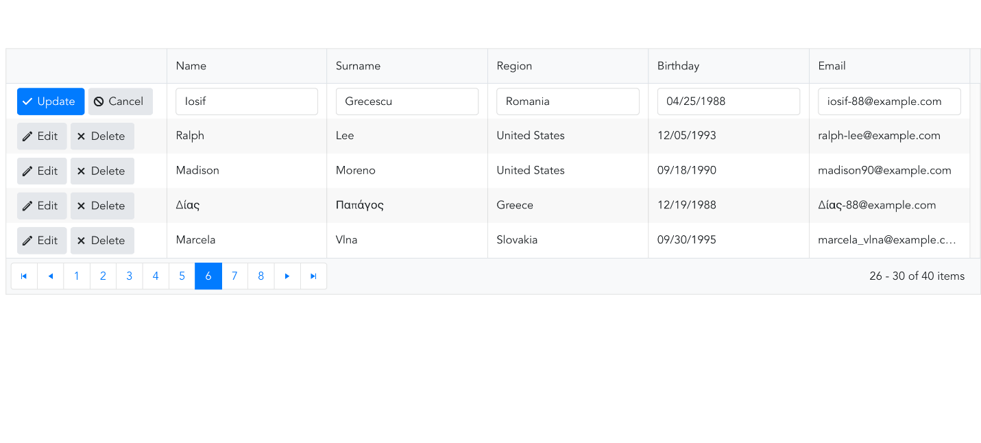
The next accessibility guideline you need to look at is making content keyboard accessible, which is in WCAG Guideline 2.1. There are users who have physical disabilities that prevent them from using a mouse so they rely on the keyboard 100% of the time. Even if a user does not have a physical disability, it can provide greater convenience to have the option to use a keyboard. A Kendo UI Grid can be navigated via keyboard by setting the navigatable attribute to true. This allows you to use the arrow keys to move throughout the grid. This also helps with editing the grid—if you have enabled in-cell editing, instead of clicking the cell to put it in edit mode, the user can press the "enter" key.

In the following example, the editing mode for the grid is inline. But now the edit command can be activated by the keyboard.

There is also a navigate event handler that can be used when navigatable is enabled. The event can be triggered with either the mouse or keyboard. Event handlers such as onClick that can only be triggered by a mouse limit accessibility.
Help Users Navigate
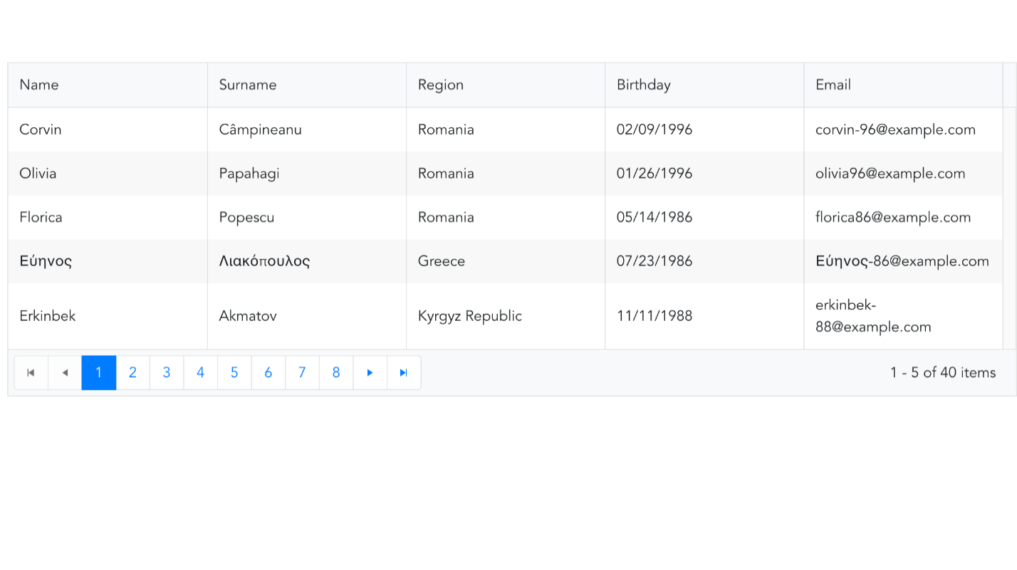
The last accessibility standard we will explore is WCAG Guideline 2.4, which says you should “provide ways to help users navigate, find content and determine where they are." The grid does this in several ways. When the grid is in edit mode, the input element that is in focus is highlighted. When the selectable attribute is enabled, the selected row is given a contrasting background color. If pageable is enabled, a pager will be added to the footer of the table so you can see your location in the grid. By default, there will be a button for each page, with the button for the current page highlighted. The pager can also include an input element so the user can enter the page number to navigate to. Last, the number of data items on the page along with the total number is updated as you page through.

Learn More about Accessibility
We have created a comprehensive whitepaper on accessibility for developers that covers everything from laws to coding to testing. Download the whitepaper:
Accessibility for Developers
Adding Accessibility to Your Apps
One easy way to make sure that you are creating accessible web apps is to start with components from the Kendo UI libraries. Our components are all WCAG compliant and give you great functionality from grids and charts to schedulers and pickers. Get a head start on your app's UI and on accessibility compliance at the same time. Learn more:
Kendo UI

Alberta Williams
Alberta is a software developer and writer from New Orleans. Learn more about Alberta at github.com/albertaw.
