Building a Product Page With Kendo UI for Vue

Summarize with AI:
Product pages are essential components of any ecommerce platform, regardless of product type. In this post, we will build an ecommerce product page using Vue.js and Kendo UI.
You’ve probably visited several ecommerce sites over the years, so you know how important the product pages are.
A product page is a portion of an ecommerce website that contains information about a particular product. This data could include descriptions, images, pricing, check-out information and reviews, among other things. Ensuring the product page is designed well is key to a good ecommerce site. Luckily, today there are many helpful tools for creating a beautiful ecommerce UI.
Choosing a UI Library
Choosing a library for a project might be difficult; however, the library you use will be determined by the type of project you are building.
Kendo UI appears to be the ideal option here because it comes with pre-built components that will be useful in the project.
Quick Overview of Kendo UI
Kendo UI is an HTML5 user interface framework for creating dynamic and high-performance websites and apps. It comes with a plethora of UI widgets, making creation a breeze.
Kendo UI is self-contained and can be used with many frameworks: React, Vue, jQuery and Angular. Visit the documentation for Kendo UI to get started.
Because of its ready-to-use UI components, it improves scalability and flexibility. By adding only a few lines of code to advanced components like charts, schedules and calendars, Kendo UI has been streamlined to the bare minimum, increasing the urge to use it as a go-to library. In this article, we will build an ecommerce product page using Kendo UI for Vue. Without further ado, let’s dive in.
Prerequisites
To follow along with this tutorial, you will need to have:
- A basic understanding of CSS
- Basic knowledge of Vue.js
- Basic knowledge of Node.js
- A text editor
Getting Started
Let’s start with installing Vue CLI with the command below.
yarn global add @vue/cli
Next, we need to use the following Vue CLI command to create a project. Enter the command below in your terminal.
vue create product-page
The above command will construct a starter template and create a folder called product-page.
Kendo UI for Vue must be installed after creating a starting template because we will use it in the project. Open your terminal and enter the following command to install Kendo UI for Vue.
yarn add @progress/kendo-theme-default @progress/kendo-vue-buttons @progress/kendo-vue-layout
After installation, we need to perform one crucial thing for our program to function correctly. You must navigate to the base of your application, which is your project directory’s main.js file, and add the following code:
import Vue from 'vue'
import App from './App.vue'
import "@progress/kendo-theme-default/dist/all.css"

Vue.config.productionTip = false

new Vue({
 render: h => h(App),
}).$mount('#app')
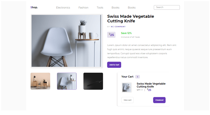
We’ll be creating a simple product page that will be informative for any new users who come to the page. The image below shows the design we will be creating in this project.

When writing code, there is one thing you must always keep in mind: the way you structure your code. The scalability of a program is aided by code structure.
For this post, we will be dividing the UI development into three sections—Header Section, Body Section and Cart Section, starting with the header section.
The Header Section
Create a folder called layouts inside the folder src, a sub-folder called Header, and a file called Header.vue inside that subfolder. Inside the file, paste the code below.
<template>
 <div>
  <header class="header">
   <div class="header__navbar">
    <div class="header__navbar--logo">
     <h3 class="header__navbar--logo-text-one">
      S<span class="header__navbar--logo-text-two">hop.</span>
     </h3>
    </div>
    <div class="header__navbar--nav-links">
     <a href="#">Electronics</a>
     <a href="#">Fashion</a>
     <a href="#">Tools</a>
     <a href="#">Books</a>
     <a href="#">Books</a>
    </div>


    <div class="header__navbar--search">
     <input type="search" placeholder="Search" />
    </div>
   </div>
  </header>
 </div>
</template>

<script>
export default {
 name: "Header",
};
</script>

<style scoped>
.header__navbar {
 display: flex;
 align-items: center;
 justify-content: space-between;
 padding: 2rem;
}

.header__navbar--logo h3 {
 font-weight: 700;
}

.header__navbar--logo-text-one {
 color: #673ab7;
}

.header__navbar--logo-text-two {
 color: #000;
}

.header__navbar--nav-links a {
 color: #939191;
 font-size: 1.2rem;
 font-weight: 400;
 text-decoration: none;
 margin: 0 2rem;
 width: 100%;
}

.header__navbar--search input {
 border-radius: 5px;
 border: 1px solid #939191;
 padding: 0.5rem 1rem;
 outline: none;
}

input::placeholder {
 font-family: "Montserrat", sans-serif;
 color: #939191;
 font-size: 1rem;
 font-weight: 400;
}
</style>
All of the application’s required navigation links are arranged inside this Header component. The HTML header tag was intended to act as a container for all other HTML tags included within it. The logo, navigation links and a search field are all included. Internal styling is used in this case, and it is only applied to that component.
If you’ve observed that your output isn’t appearing, it’s because you didn’t link the child component to the parent component. Create a folder called pages inside the src folder, and then a file called Product.vue inside the folder. This Product component accepts all other components that are supplied to it later. Inside the file, paste the code below.
<template>
 <div class="container">
  <Header />
 </div>
</template>

<script>
import Header from "../../components/layouts/header/Header.vue";

export default {
 name: "Product",
 components: {
  Header,
 },
};
</script>

<style scoped>
</style>
The Header component was imported into the Product component to be rendered, as you can see. Connect the Product component to the main App.vue component, the foundation for all other components. Paste the code below into the App.vue file.
<template>
 <div id="app">
  <Product />
 </div>
</template>

<script>
import Product from "./components/pages/Product.vue";

export default {
 name: "App",
 components: {
  Product,
 },
};
</script>

<style>
#app {
 background-color: #fafafa;
}
</style>
The Product component was imported and registered for use in this instance. You are no longer required to do anything; all other components will be linked to Product.vue, the foundation component.
Using the command below, you can now run your application.
yarn serve
The image below shows our current progress.

The Body Section
The layout is divided into two portions based on the design (left and right). The images on the left are continually changing. Inside the Product.vue file, paste the following code.
<template>
 <div class="container">
  <Header />
  <main>
   <div class="main-container">
     <div v-for="(image, index) in singleImage" :key="index" class="main-container__box-one">
     <avatar :type="'image'" class="main-container__box-one-top">
      <img :src="image.avatar" :eager="true"/>
     </avatar>
     <div class="main-container__box-one-bottom">
      <div v-for="(subImage, index) in imageList" :key="index" class="main-container__box-one-bottom--innerbox">
       <avatar :type="'image'" class="main-container__box-one-top">
        <img :src="subImage.avatar" :eager="true"/>
       </avatar>
      </div>
     </div>
    </div>
   </div>
  </main>
 </div>
</template>

<script>
import Header from "../../components/layouts/header/Header.vue"
import { Avatar } from "@progress/kendo-vue-layout";
import ImageOne from "../../assets/chair1.jpg"
import ImageTwo from "../../assets/chair2.jpg"
import ImageThree from "../../assets/chair1.jpg"
import ImageFour from "../../assets/knife3.jpg"
const imageOne = ImageOne;
const imageTwo = ImageTwo;
const imageThree = ImageThree;
const imageFour = ImageFour;
 const singleImage = [
   {
   avatar: imageOne,
  },
 ]
 const imageList = [
 {
  avatar: imageTwo,
 },
 {
  avatar: imageThree,
 },
 {
  avatar: imageFour,
 },
];
export default {
 name: "Product",
 components: {
  Header,
   avatar: Avatar,
 },
 data: function(){
  return {
   singleImage: singleImage,
   imageList: imageList,
  }
 }
};
</script>

<style scoped>
* {
 padding: 0;
 margin: 0;
 box-sizing: border-box;
}

.container {
 background: #fff;
 font-family: "Montserrat", sans-serif;
 max-width: 1200px;
 margin: 0 auto;
}

.main-container {
 display: flex;
 justify-content: space-between;
 width: 100%;
 padding: 0 2rem;
}

.main-container__box-one {
 width: 100%;
}

.main-container__box-one-top {
 background: #f1f0f0;
 border-radius: 10px;
 overflow: hidden;
 padding: 0.5rem;
}

.main-container__box-one-top img {
 width: 100%;
 height: 100%;
}

.main-container__box-one-bottom {
 display: flex;
 align-items: center;
 justify-content: space-between;
}

.main-container__box-one-bottom--innerbox img {
 width: 100%;
 height: 100%;
}

.main-container__box-one-bottom--innerbox:nth-of-type(2) {
 border: 2px solid #673ab7;
}

.main-container__box-one-bottom div {
 background: #f1f0f0;
 height: 130px;
 width: 150px;
 border-radius: 10px;
 margin: 2rem 0;
 cursor: pointer;
 overflow: hidden;
}
</style>
The images are retrieved from the assets folder. You can use any set of images, just make sure they are referenced from the assets folder.
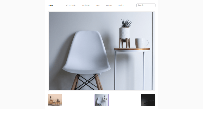
The nth-of-type(n) selector matches every element in its parent—the nth-child of a specific type. A number, a keyword or a formula can all be used as n. The image below shows our current progress.
The avatar is a layout component imported directly from @progress/kendo-vue-layout. It has superpowers for displaying images, icons or initials representing people or other entities. The image below shows our current progress.

The right part of the page provides the product name, description and helpful information for the end user. Inside the Product.vue file, update the code with the following:
<template>
 <div class="container">
  <Header />
  <main>
   <div class="main-container">
    <div v-for="(image, index) in singleImage" :key="index" class="main-container__box-one">
     <avatar :type="'image'" class="main-container__box-one-top">
      <img :src="image.avatar" :eager="true"/>
     </avatar>
     <div class="main-container__box-one-bottom">
      <div v-for="(subImage, index) in imageList" :key="index" class="main-container__box-one-bottom--innerbox">
       <avatar :type="'image'" class="main-container__box-one-top">
        <img :src="subImage.avatar" :eager="true"/>
       </avatar>
      </div>
     </div>
    </div>
    <div class="main-container__box-two">
     <div class="main-container__box-two--title">
      <h1>
       Swiss Made Vegetable <br />
       Cutting Knife
      </h1>
      <p class="author"><span class="author-span">BY</span> KC COMPANY</p>
     </div>
     <div class="sub-container__box-two">
      <div class="sub-container__box-two--price">
       <div class="dollars"><sup class="superscript">$</sup>25</div>
       <div class="percent">
        <h3>Save 12%</h3>
        <p>Inclusive of all Taxes</p>
       </div>
      </div>
      <p class="desc">
       Lorem, ipsum dolor sit amet consectetur adipisicing elit. Rem sint
       fugit quis animi, neque quaerat eaque iure praesentium eum
       temporibus. Corrupti quod eos vitae voluptatem corporis
       repellendus natus commodi inventore.
      </p>
      <div>
       <k-button class="filled">Add to Cart</k-button>
      </div>
     </div>
     <Cart />

    </div>
   </div>
  </main>
 </div>
</template>
<script>
import { Button } from "@progress/kendo-vue-buttons";
import Header from "../../components/layouts/header/Header.vue"
import Cart from "../../components/cart/Cart.vue"
import { Avatar } from "@progress/kendo-vue-layout";
import ImageOne from "../../assets/chair1.jpg"
import ImageTwo from "../../assets/chair2.jpg"
import ImageThree from "../../assets/chair1.jpg"
import ImageFour from "../../assets/knife3.jpg"
const imageOne = ImageOne;
const imageTwo = ImageTwo;
const imageThree = ImageThree;
const imageFour = ImageFour;
 const singleImage = [
   {
   avatar: imageOne,
  },
 ]
 const imageList = [
 {
  avatar: imageTwo,
 },
 {
  avatar: imageThree,
 },
 {
  avatar: imageFour,
 },
];
export default {
 name: "Product",
 components: {
  Header,
  Cart,
  "k-button": Button,
   avatar: Avatar,
 },
 data: function(){
  return {
   singleImage: singleImage,
   imageList: imageList,
  }
 }
};
</script>
<style scoped>
* {
 padding: 0;
 margin: 0;
 box-sizing: border-box;
}
.container {
 background: #fff;
 font-family: "Montserrat", sans-serif;
 max-width: 1200px;
 margin: 0 auto;
}
.main-container {
 display: flex;
 justify-content: space-between;
 width: 100%;
 padding: 0 2rem;
}
.main-container__box-one {
 width: 100%;
 height: 100%;
}
.main-container__box-one-top {
 background: #f1f0f0;
 border-radius: 10px;
 overflow: hidden;
 padding: 0.5rem;
}
.main-container__box-one-top img {
 width: 100%;
 height: 100%;
}
.k-avatar-solid.k-avatar-primary {
 border-color: transparent;
 background-color: #f1f0f0;
 height: 100%;
 width: 100%;
}
.main-container__box-one-bottom {
 display: flex;
 align-items: center;
 justify-content: space-between;
 margin: 2rem 0;
}
.main-container__box-one-bottom--innerbox img {
 width: 100%;
 height: 100%;
}
.main-container__box-one-bottom--innerbox:nth-of-type(2) {
 border: 2px solid #673ab7;
}
.main-container__box-one-bottom div {
 background: #f1f0f0;
 height: 130px;
 width: 150px;
 border-radius: 10px;
 cursor: pointer;
 overflow: hidden;
}
.main-container__box-two {
 display: flex;
 flex-direction: column;
 justify-content: space-between;
 height: 100%;
 width: 100%;
 margin-left: 2rem;
}
.main-container__box-two--title h1 {
 font-size: 1.9rem;
}
.author {
 margin: 1rem 0;
 color: #673ab7;
 font-weight: 700;
 font-size: 0.8rem;
 letter-spacing: 2px;
}
.author-span {
 opacity: 0.7;
 color: rgb(184, 183, 183);
}
.sub-container__box-two--price {
 display: flex;
 justify-content: space-between;
 width: 45%;
 margin: 1rem 0;
}
.dollars {
 background-color: #e5e0ed;
 color: #673ab7;
 font-weight: 700;
 font-size: 1.5rem;
 padding: 0.5rem 0.8rem;
 border-radius: 7px;
 height: 100%;
}
.percent h3 {
 font-size: 1.1rem;
 color: #39d939;
 font-weight: 700;
}
.percent p {
 font-size: 0.9rem;
 color: #939191;
 font-weight: 400;
 margin: 0.5rem 0;
}
.desc {
 color: #939191;
 padding: 1rem 0;
 font-weight: 400;
 line-height: 2;
}
.filled {
 background-color: #673ab7;
 border-radius: 10px;
 color: #fff;
 font-weight: 600;
 padding: 0.9rem 1rem;
 cursor: pointer;
 outline: none;
 border: 1px solid #673ab7;
}
.filled:hover {
 background-color: #6430be;
}
</style>
A parent div was created in the code above to enclose the two-sided parts and render them side by side. It uses grid and flex rules, but in this case, the flex pattern seems more straightforward in this section.
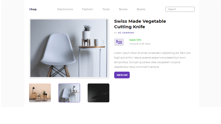
The k-button is a button component imported directly from @progress/kendo-vue-buttons. It is magical for creating buttons quickly. The image below shows our current progress.

The Cart Section
The product page application comes to a close with this section. Create a folder called Cart inside the components folder, and then a file called Cart.vue inside the created folder. The Cart component will be passed into the Product component to make rendering easier. Paste the code below into the created file.
<template>
  <div class="sub-container__box-two--bottom">
    <div>
      <h3 class="cart-count">
        Your Cart <span class="cart-count-span">1</span>
      </h3>
      <div class="sub-container__box-two--flex">
        <div v-for="(cardImage, index) in singleImage" :key="index" class="image-box">
          <avatar :type="'image'" class="main-container__box-one-top">
            <img :src="cardImage.avatar" :eager="true"/>
          </avatar>
          <!-- <img src="../../assets/chair1.jpg" alt="" /> -->
        </div>
        <div>
          <h3>
            Swiss Made Vegetable <br />
            Cutting Knife
          </h3>
          <div class="quantity">
            <p>QTY : 1</p>
            |
            <div class="cart-dollars"><sup class="superscript">$</sup>25</div>
          </div>
        </div>
      </div>
      <div class="cart-group-buttons">
        <k-button class="ghost">View cart</k-button>
        <k-button class="filled">Checkout</k-button>
      </div>
    </div>
  </div>
</template>
<script>
import { Button } from "@progress/kendo-vue-buttons";
import { Avatar } from "@progress/kendo-vue-layout";
import ImageFive from "../../assets/chair1.jpg"
const imageFive = ImageFive;
  const singleImage = [
     {
      avatar: imageFive,
    },
  ]
export default {
   name: "Cart",
   components: {
    "k-button": Button,
     avatar: Avatar,
  },
    data: function(){
    return {
      singleImage: singleImage,
    }
  }
};
</script>
<style scoped>
.sub-container__box-two--bottom {
  background: #fff;
  box-shadow: -1px 1px 4px -2px rgb(0 0 0 / 65%);
  border-radius: 10px;
  padding: 1.5rem 2rem;
  margin: 2rem auto;
  min-width: 400px;
}
.sub-container__box-two--flex {
  display: flex;
  justify-content: space-between;
}
.cart-count {
  padding-bottom: 2rem;
}
.cart-count-span {
  background-color: #e5e0ed;
  color: #673ab7;
  font-weight: 700;
  font-size: 1rem;
  border-radius: 7px;
  height: 100%;
  padding: 0.2rem 0.9rem;
  margin-left: 0.5rem;
}
.image-box {
  background-color: #f1f0f0;
  height: 80px;
  width: 80px;
  border-radius: 10px;
  overflow: hidden;
  padding: 0.5rem;
}
.image-box img {
  width: 100%;
  height: 100%;
}
.quantity {
  display: flex;
  justify-content: space-between;
  align-items: center;
  width: 50%;
}
.quantity p {
  font-size: 0.8rem;
  font-weight: 700;
  color: #939191;
}
.cart-dollars {
  font-size: 1.2rem;
  color: #673ab7;
  font-weight: 700;
}
.superscript {
  color: #939191;
  font-size: 0.9rem;
}
.cart-group-buttons {
  padding-top: 2rem;
  display: flex;
  justify-content: space-between;
}
.ghost {
  background: transparent;
  border: 1px solid #ddd;
  border-radius: 10px;
  color: #939191;
  font-weight: 600;
  padding: 0.9rem 1rem;
  cursor: pointer;
}
.ghost:hover {
  background-color: rgb(209, 209, 209);
}
.filled {
  background-color: #673ab7;
  border-radius: 10px;
  color: #fff;
  font-weight: 600;
  padding: 0.9rem 1rem;
  cursor: pointer;
  outline: none;
  border: 1px solid #673ab7;
}
.filled:hover {
  background-color: #6430be;
}

</style>
The Cart component acts as a counter for any products that the user has added. It maintains track of user products and their quantities.
Conclusion
By the end of this session, we understood what product pages are, why they’re essential in web applications, and how to add a product page section to a web application. I hope you found this guide as beneficial as I did writing it.

Chinedu Imoh
Chinedu is a tech enthusiast focused on full-stack JavaScript and Infrastructure engineering.
