Column Chart
A Column chart displays data as vertical bars whose heights vary according to their value. You can use a Column chart to show a comparison between several sets of data (for example, summaries of sales data for different time periods). Each series is automatically colored differently for easier reading.
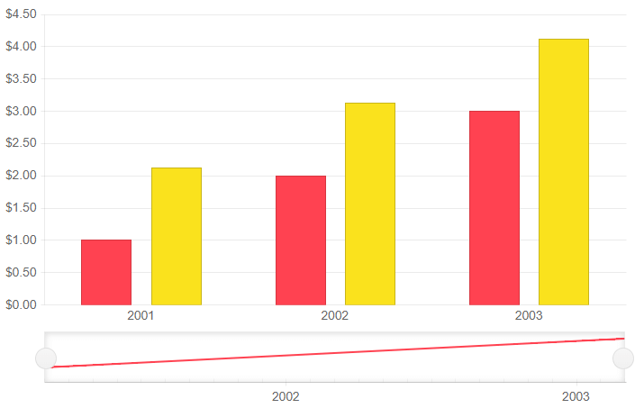
Column series in a stock chart. Results from the first code snippet below.
This article assumes you are familiar with the stock chart basics and data binding.
To add a Column chart to a stock chart component:
- add a
StockChartSeriesto theStockChartSeriesItemscollection - set its
Typeproperty toChartSeriesType.Column - provide a data collection to its
Dataproperty - set the
FieldandCategoryFieldproperties to the corresponding fields in the model that carry the values.
A column chart that shows product revenues
Column series

<TelerikStockChart Height="450px"
                   Width="700px">

    <StockChartCategoryAxes>
        <StockChartCategoryAxis BaseUnit="@ChartCategoryAxisBaseUnit.Years">
            <StockChartCategoryAxisLabels Step="1"></StockChartCategoryAxisLabels>
        </StockChartCategoryAxis>
    </StockChartCategoryAxes>

    <StockChartSeriesItems>
        <StockChartSeries Type="StockChartSeriesType.Column"
                          Name="Product 1"
                          Data="@Data"
                          Field="@nameof(ChartSeriesData.Product1Sales)"
                          CategoryField="@nameof(ChartSeriesData.Year)">
        </StockChartSeries>

        <StockChartSeries Type="StockChartSeriesType.Column"
                          Name="Product 1"
                          Data="@Data"
                          Field="@nameof(ChartSeriesData.Product2Sales)"
                          CategoryField="@nameof(ChartSeriesData.Year)">
        </StockChartSeries>
    </StockChartSeriesItems>

    <StockChartNavigator>
        <StockChartNavigatorSeriesItems>
            <StockChartNavigatorSeries Type="StockChartSeriesType.Line"
                                       Name="Product 1"
                                       Data="@Data"
                                       Field="@(nameof(ChartSeriesData.Product1Sales))"
                                       CategoryField="@(nameof(ChartSeriesData.Year))">
            </StockChartNavigatorSeries>
        </StockChartNavigatorSeriesItems>
    </StockChartNavigator>

</TelerikStockChart>

@code {
    public List<ChartSeriesData> Data { get; set; }

    protected override void OnInitialized()
    {
        Data = ChartSeriesData.GenerateData();
    }

    public class ChartSeriesData
    {
        public int Product1Sales { get; set; }
        public double Product2Sales { get; set; }
        public DateTime Year { get; set; }
        public string SegmentName { get; set; }

        public static List<ChartSeriesData> GenerateData()
        {
            List<ChartSeriesData> data = new List<ChartSeriesData>();

            for (int i = 1; i <= 3; i++)
            {
                var dataItem = new ChartSeriesData
                {
                    Product1Sales = i,
                    Product2Sales = i + 1.123,
                    Year = new DateTime(2000 + i, 3, i),
                    SegmentName = $"{i * 100}"
                };

                data.Add(dataItem);
            }

            return data;
        }
    }
}
Column Chart Specific Appearance Settings
Labels
Each data item is denoted with a label. You can control and customize them through the <StockChartCategoryAxisLabels /> and its children tags.
Visible- hide all labels by setting this parameter tofalse.Step- renders every n-th label, where n is the value(double number) passed to the parameter.Skip- skips the first n labels, where n is the value(double number) passed to the parameter.
Color
The color of a series is controlled through the Color property that can take any valid CSS color (for example, #abcdef, #f00, or blue). The color control the fill color of the area.
Color Field
Column, OHLC and Candlestick charts can take the color of the series item from the ColorField of the data source. You can pass a valid CSS color (for example, #abcdef, #f00, or blue).
Gap and Spacing
You can control the distance between the categories that cluster a data point from each series. To do this, use the Gap property of the series. It is the distance between categories expressed as a percentage of the bar width.
To set the distance between the bars of different series in the same category, use the Spacing property. It is the space between the series items in one series category as a proportion of the width of a single series item.
To create overlap, set negative values.
You can configure the values of Gap and Spacing for the whole chart in the first series and they are applied for all categories and series items.
Customize Chart Elements - Nested Tags Settings
When configuring nested properties and child elements in your chart, the inner tags will contain their parent tag name and add specifics to its end. In general the structure of such nested tags will be <StockChart*Category**Specifics*> where the Category can be one of the following:
- CategoryAxis
- ChartArea
- Legend
- Navigator
- PlotArea
- SeriesItems
- Title
- Tooltip
- ValueAxis
- and others
To customize the chart, look for nested tags and their properties - the inner tags will contain their parent tag name and add specifics to its end. For example, the
StockChartSeriestag has aStockChartSeriesTooltiptag that exposes configuration options and more child tags.
You can customize all aspects of the stock chart by using the settings provided by the nested tags.
For example:
StockChartCategoryAxes > StockChartCategoryAxis > StockChartCategoryAxisLabels tags
This approach can be used with all tags that are applicable for the Chart type.