Toolbar Commands
The Telerik UI for ASP.NET Core FileManager component contains a nested Telerik UI for ASP.NET Core Toolbar component.
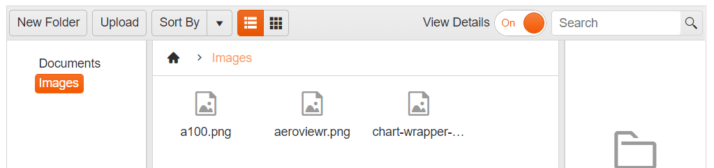
The toolbar has a predefined set of tools which you can show or hide, depending on your preferences and business scenario. By default, the toolbar contains the following tools:
- New Folder button, allowing you to create new folders in the current location.
- Upload Button prompting you with a window to upload files.
- Sort By dropdown, allowing you to sort by a number of predicates
- Views button group to control
- View Details switch button to toggle the Preview Pane visibility
- Search textbox to filter the content
Inbuilt Sort functionality in Telerik UI for ASP.NET Core FileManager:
Customizing the Toolbar Commands
To Enable/Disable a Toolbar command button or update the its text you can use the Toolbar.Items() configuration option:
    .Toolbar(toolbar => toolbar.Items(items =>
        {
            items.Add("").Text("Add New Folder").Enable(false).Command("CreateFolderCommand").Type("button");
}))Adding Custom Commands to the Toolbar
As of Kendo UI R1 2020 SP1 the kendo.ui.filemanager namespace exposes the FileManagerCommand class that could be extended to implement a custom FileManager command. The example below demonstrates how to create a custom command that shows the total size of the selected files.
First, create a new command by extending the FileManagerCommand class.
    <script>
        var filemanagerNS = kendo.ui.filemanager;

        filemanagerNS.commands.MyCustomCommand = filemanagerNS.FileManagerCommand.extend({
            exec: function () {
                var that = this,
                    filemanager = that.filemanager, // get the kendo.ui.FileManager instance
                    options = that.options, // get the options passed through the tool
                    target = options.target, // options.target is available only when command is executed from the context menu
                    selectedFiles = filemanager.getSelected(); // get the selected files

                var totalSize = 0;
                selectedFiles.forEach(function (fileEntry) {
                    totalSize += fileEntry.size;
                });

                kendo.alert(selectedFiles.length + ' file(s) selected; Total size: ' + kendo.getFileSizeMessage(totalSize))
            }
        });
    </script>
Then add the custom command to the FileManager Toolbar:
    .Toolbar(toolbar => toolbar.Items(items =>
        {
            items.Add("").Type("button").Name("GetInfo").Text("Get Info").Command("MyCustomCommand");
}))You can also add the custom command to the ContextMenu of the FileManager
    .ContextMenu(context => context.Items(items =>
        {
            items.Add("rename");
            items.Add("delete");
            items.Add("custom").Name("GetInfo").Text("Get Info").Command("MyCustomCommand").SpriteCssClass("k-icon k-i-info");
}))Overflow
The built-in toolbar provides properties for customizing its overflow behavior and appearance.
The following example demonstrates how to modify the default overflow settings of the toolbar through the Oveflow() configuration.
@(Html.Kendo().FileManager().Name("filemanager")
    .DataSource(ds =>
        {
           ...
        );
    })
    .UploadUrl("Upload", "FileManagerData")
    .Toolbar(tb => tb.Items(items =>
    {
        items.Add("createFolder");
        items.Add("upload");
        items.Add("sortField");
        items.Add("changeView");
        items.Add("spacer");
        items.Add("details");
        items.Add("search");
    })
    .Overflow(o => o
       .Mode(ToolBarOverflowMode.Scroll)
       .ScrollButtons(ScrollButtonsType.Auto)
       .ScrollButtonsPosition(ScrollButtonsPositionType.Start)
       .ScrollDistance(50))
    )
    .ContextMenu(context => context.Items(items => items.Add("rename")))
)For more information on the available overflow options, refer to the Appearance documentation of the ToolBar component.