New to Telerik UI for WinUI? Start a free 30-day trial
Ribbon Button
Updated on Mar 26, 2026
The RadRibbonButton represents the basic button in the set of the RadRibbonView buttons. It inherits the native Microsoft.UI.Xaml.Controls.Button control and extends its functionality in order to provide a better interaction with the RadRibbonView control.
You can access the RadRibbonButton control through an alias pointing to the Telerik.UI.Xaml.Controls namespace:
xmlns:telerik="using:Telerik.UI.Xaml.Controls"
Example 1: Declare RadRibbonButton
XAML
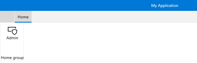
<telerik:RadRibbonView>
	<telerik:RadRibbonTab Header="Home">
		<telerik:RadRibbonGroup Header="Home group"  >
			<telerik:RadRibbonGroup.Variants>
				<ribbonView:GroupVariant Variant="Small"/>
				<ribbonView:GroupVariant Variant="Medium"/>
				<ribbonView:GroupVariant Variant="Large"/>
			</telerik:RadRibbonGroup.Variants>
			<telerik:RadRibbonButton CollapseToSmall="WhenGroupIsSmall"
									CollapseToMedium="WhenGroupIsMedium"
									IsAutoSize="True"
									Size="Large"
									Text="Admin" >
				<telerik:RadRibbonButton.SmallIcon>
					<SymbolIcon Symbol="Admin"/>
				</telerik:RadRibbonButton.SmallIcon>
				<telerik:RadRibbonButton.LargeIcon>
					<SymbolIcon Symbol="Admin"/>
				</telerik:RadRibbonButton.LargeIcon>
			</telerik:RadRibbonButton>
		</telerik:RadRibbonGroup>
	</telerik:RadRibbonTab>
</telerik:RadRibbonView>
This button has its initial size set to Large and its text label set to "Admin". As the IsAutoSize property is set to True, the button will change its size depending on the RadRibbonGroup's size.
Figure 1: RadRibbonButton Example