New to Telerik UI for WinUI? Start a free 30-day trial
Bar Indicators
Updated on Mar 26, 2026
The RadialBarGaugeIndicator and LinearBarGaugeIndicator represent a specific value on the gauge scale as a bar that fills the axis up to this value.
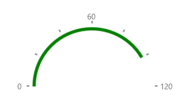
RadialBarGaugeIndicator
Example 1 shows how to add a RadialBarGaugeIndicator to a RadRadialGauge.
Example 1: Creating RadialBarGaugeIndicator
XAML
<Grid xmlns:dataVisualization="using:Telerik.UI.Xaml.Controls.DataVisualization">
	<dataVisualization:RadRadialGauge LabelStep="60" TickStep="20" MaxValue="120" Width="200" LabelRadiusScale="1.10">
		<dataVisualization:RadialBarGaugeIndicator Value="100" Brush="Green" Thickness="5" Margin="10"/>
	</dataVisualization:RadRadialGauge>
</Grid>
Figure 1: RadialBarGaugeIndicator
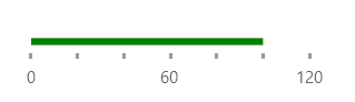
LinearBarGaugeIndicator
Example 2 shows how to add a LinearBarGaugeIndicator to a RadLinearGauge.
Example 2: Creating LinearBarGaugeIndicator
XAML
<telerik:RadLinearGauge LabelStep="60" TickStep="20" MaxValue="120"Width="200">
	<telerik:LinearBarGaugeIndicator Value="100" Brush="Green" Thickness="5" telerik:RadLinearGauge.IndicatorOffset="-10"/>
</telerik:RadLinearGauge>
Figure 2: LinearBarGaugeIndicator