Getting Started with WinUI Expander
This article will provide you with the knowledge required to use the RadExpander control in a basic scenario.
Assembly References
In order to use the RadExpander control, you will need to add references to the following assembly:
Telerik.WinUI.Controls.dllTelerik.Licensing.Runtime.dll
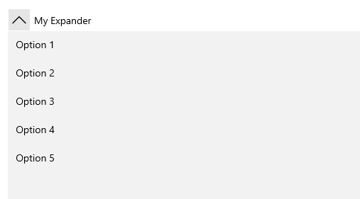
Add а RadExpander to the Project
The RadExpander is a HeaderedContentControl and you can initialize both its Header and Content properties.
Example 1: RadExpander definition
<telerik:RadExpander Header="My Expander">
	<ListBox>
		<ListBoxItem Content="Option 1" />
		<ListBoxItem Content="Option 2" />
		<ListBoxItem Content="Option 3" />
		<ListBoxItem Content="Option 4" />
		<ListBoxItem Content="Option 5" />
	</ListBox>
</telerik:RadExpander>
Figure 1: The RadExpander generated by the code in Example 1
Declaring more complex Header and Content
As both Header and Content properties are of type object there's no limit as to what you can display inside the control.
Example 2 demonstrates a more complex layout with some hard-coded values. You can, of course, introduce an items control and define its ItemContainerStyle and ItemTemplate, for example.
Example 2: More complex content
<telerik:RadExpander x:Name="radExpander"
					 VerticalContentAlignment="Top"
					 IsExpanded="True">
	<telerik:RadExpander.Header>
		<TextBlock Text="Header" />
	</telerik:RadExpander.Header>
	<telerik:RadExpander.Content>
		<Grid>
			<Grid.ColumnDefinitions>
				<ColumnDefinition />
				<ColumnDefinition />
			</Grid.ColumnDefinitions>
			<Grid.RowDefinitions>
				<RowDefinition Height="Auto" />
				<RowDefinition Height="Auto" />
			</Grid.RowDefinitions>
			<Border Height="131"
					Margin="5"
					BorderBrush="#FFDADADA"
					BorderThickness="0,0,1,1"
					CornerRadius="3">
				<Border BorderBrush="#B2ADBDD1"
						BorderThickness="1"
						CornerRadius="2">
					<StackPanel Orientation="Horizontal">
						<Border Width="108"
								Height="108"
								Margin="10 0 0 0"
								BorderBrush="#FFE0E0E0"
								BorderThickness="1">
							<Image Source="/Images/item1.png" Stretch="None" />
						</Border>
						<StackPanel Margin="10 25 10 0">
							<TextBlock Margin="0 0 0 5"
									   FontFamily="Segoe UI"
									   FontSize="16"
									   Foreground="#FF0099CC"
									   Text="Bob Smiil" />
							<TextBlock Margin="0 0 0 5"
									   FontFamily="Segoe UI"
									   FontSize="11"
									   Text="BobSmiil@mail.com" />
							<TextBlock FontFamily="Segoe UI"
									   FontSize="10.667"
									   Text="Phone: 333 2334" />
						</StackPanel>
					</StackPanel>
				</Border>
			</Border>
			<Border Grid.Row="1"
					Height="131"
					Margin="5"
					BorderBrush="#FFDADADA"
					BorderThickness="0,0,1,1"
					CornerRadius="3">
				<Border BorderBrush="#B2ADBDD1"
						BorderThickness="1"
						CornerRadius="2">
					<StackPanel Orientation="Horizontal">
						<Border Width="108"
								Height="108"
								Margin="10 0 0 0"
								BorderBrush="#FFE0E0E0"
								BorderThickness="1">
							<Image Source="/Images/item2.png" Stretch="None" />
						</Border>
						<StackPanel Margin="10 25 15 0">
							<TextBlock Margin="0 0 0 5"
									   FontFamily="Segoe UI"
									   FontSize="16"
									   Foreground="#FF0099CC"
									   Text="Anne Dodsworth" />
							<TextBlock Margin="0 0 0 5"
									   FontFamily="Segoe UI"
									   FontSize="11"
									   Text="Anne Dodsworth@mail.com" />
							<TextBlock FontFamily="Segoe UI"
									   FontSize="10.667"
									   Text="Phone: 333 2334" />
						</StackPanel>
					</StackPanel>
				</Border>
			</Border>
			<Border Grid.Column="1"
					Height="131"
					Margin="5"
					BorderBrush="#FFDADADA"
					BorderThickness="0,0,1,1"
					CornerRadius="3">
				<Border BorderBrush="#B2ADBDD1"
						BorderThickness="1"
						CornerRadius="2">
					<StackPanel Orientation="Horizontal">
						<Border Width="108"
								Height="108"
								Margin="10 0 0 0"
								BorderBrush="#FFE0E0E0"
								BorderThickness="1">
							<Image Source="/Images/item3.png" Stretch="None" />
						</Border>
						<StackPanel Margin="10 25 10 0">
							<TextBlock Margin="0 0 0 5"
									   FontFamily="Segoe UI"
									   FontSize="16"
									   Foreground="#FF0099CC"
									   Text="Andrew Fuller" />
							<TextBlock Margin="0 0 0 5"
									   FontFamily="Segoe UI"
									   FontSize="11"
									   Text="AndrewFuller@mail.com" />
							<TextBlock FontFamily="Segoe UI"
									   FontSize="10.667"
									   Text="Phone: 333 2334" />
						</StackPanel>
					</StackPanel>
				</Border>
			</Border>
			<Border Grid.Row="1"
					Grid.Column="1"
					Height="131"
					Margin="5"
					BorderBrush="#FFDADADA"
					BorderThickness="0,0,1,1"
					CornerRadius="3">
				<Border BorderBrush="#B2ADBDD1"
						BorderThickness="1"
						CornerRadius="2">
					<StackPanel Orientation="Horizontal">
						<Border Width="108"
								Height="108"
								Margin="10 0 0 0"
								BorderBrush="#FFE0E0E0"
								BorderThickness="1">
							<Image Source="/Images/item4.png" Stretch="None" />
						</Border>
						<StackPanel Margin="10 25 15 0">
							<TextBlock Margin="0 0 0 5"
									   FontFamily="Segoe UI"
									   FontSize="16"
									   Foreground="#FF0099CC"
									   Text="Emily Smile" />
							<TextBlock Margin="0 0 0 5"
									   FontFamily="Segoe UI"
									   FontSize="11"
									   Text="EmilySmile@mail.com" />
							<TextBlock FontFamily="Segoe UI"
									   FontSize="10.667"
									   Text="Phone: 333 2334" />
						</StackPanel>
					</StackPanel>
				</Border>
			</Border>
		</Grid>
	</telerik:RadExpander.Content>
</telerik:RadExpander>
Figure 2: The RadExpander generated by the code in Example 2

Change Expand Icon
If you want to replace the default icon displayed by the expander without modifying the template of the control, you can override the TelerikExpander_ExpandCollapseRotatableGlyph resource:
Example 3: Override expand icon
<telerik:RadExpander Header="Header">
<telerik:RadExpander.Resources>
<x:String x:Key="TelerikExpander_ExpandCollapseRotatableGlyph"></x:String>
</telerik:RadExpander.Resources>
</telerik:RadExpander>Telerik UI for WinUI Learning Resources
- Telerik UI for WinUI Expander Component
- Getting Started with Telerik UI for WinUI Components
- Telerik UI for WinUI Installation
- Telerik UI for WinUI Examples
- Telerik UI for WinUI Accessibility
- Telerik UI for WinUI License Agreement