
Telerik UI for .NET MAUI
What's New 2025 Q2
What's New HistoryWhat's New 2025 Q2
Theming Official
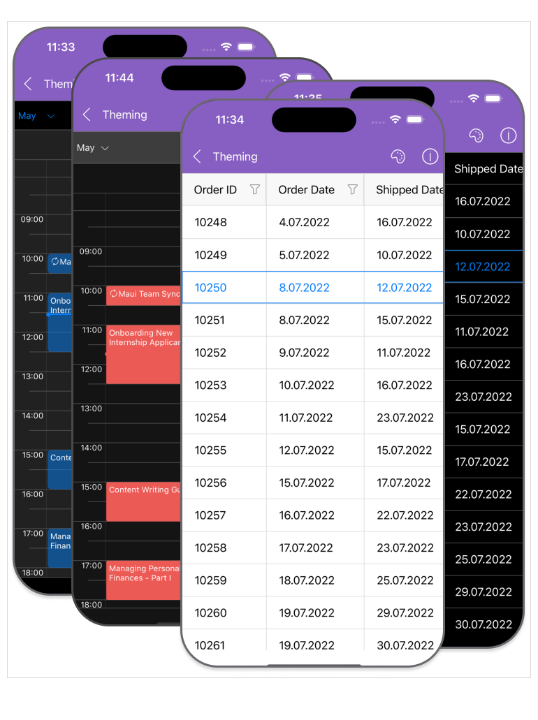
The advanced Theming functionality in Telerik UI for .NET MAUI has now moved from Preview to Official Release, enabling developers to build more visually cohesive and brand-consistent applications than ever before. The Official Theming mechanism empowers you with built-in Light and Dark modes, advanced customization options, and extended support across key controls. Whether you're creating enterprise dashboards or consumer-grade mobile apps, the Theming system helps you accelerate UI development while ensuring a polished, responsive, and modern user experience across all platforms.
It also comes with two predefined themes:
- Platform Theme, which applies a native look and feel per platform—iOS apps will appear with iOS styling, Android apps with Android styling, and so on.
- Telerik Theme, which delivers a consistent appearance across all platforms, allowing you to apply different color swatches to match your brand identity and design language.
Popular components such as DataGrid, CollectionView, Calendar, Scheduler, and ComboBox now fully support the theming system – bringing high-impact design consistency to your development toolkit.
Brand-new TreeDataGrid Component in Telerik UI for .NET MAUI
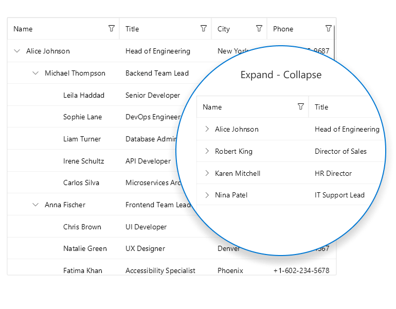
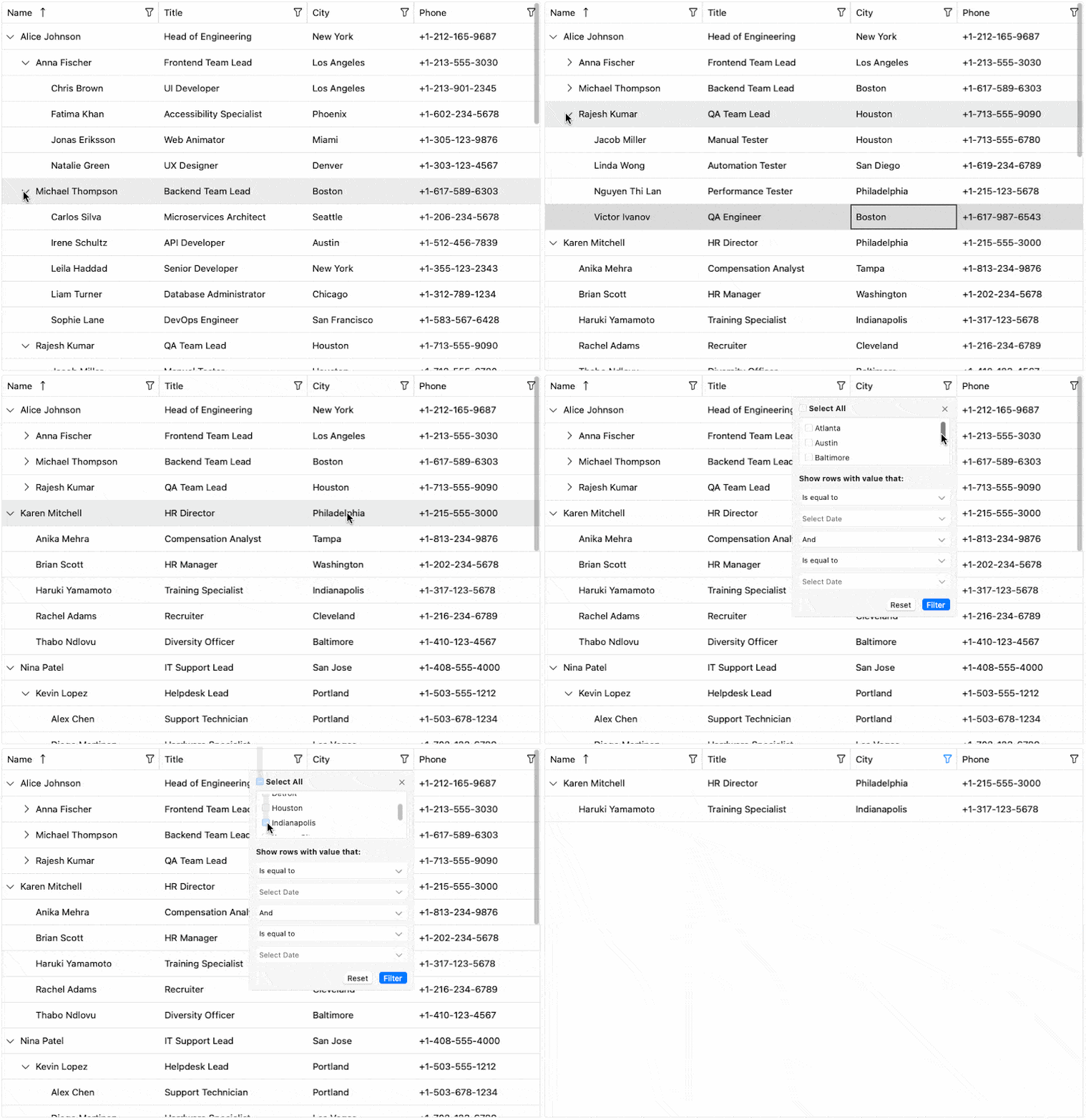
Introducing the brand-new TreeDataGrid component in Telerik UI for .NET MAUI – a powerful fusion of hierarchical data navigation and tabular presentation. The TreeDataGrid control offers the combined functionality of a TreeView and a DataGrid, allowing you to display complex nested data structures in a clear, intuitive grid format. With support for infinite nesting, multiple columns, and rich cell presentation, the TreeDataGrid control is ideal for scenarios where expandable, tree-structured data must be managed efficiently. Apart from the most popular DataGrid functionalities, key features include dynamic add/remove of sub-items, expand/collapse support, auto-expand, customizable indentation, and a flexible IsExpandable option – providing developers with granular control over hierarchical UI rendering.
DataGrid Enhancement: Support for Aligning the Aggregates in Group Header
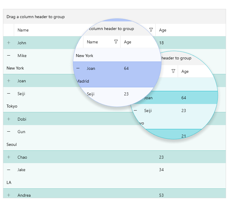
Achieve polished data presentation with new alignment options for aggregate values within grouped headers. Whether you're summarizing financial totals, counting grouped records, or displaying averages, this enhancement ensures your grouped data is neatly formatted, aligned, and visually consistent for improved readability and professionalism.
DataGrid Enhancement: New Row Background Style Selector
Introduce advanced row-level customization with the new Row Background Style Selector, which allows you to apply different styles dynamically based on the row’s content or state. Highlight priority rows, differentiate alternating records or signal validation issues—all while maintaining a clean and coherent look.
CollectionView Enhancement: Sticky Group Headers
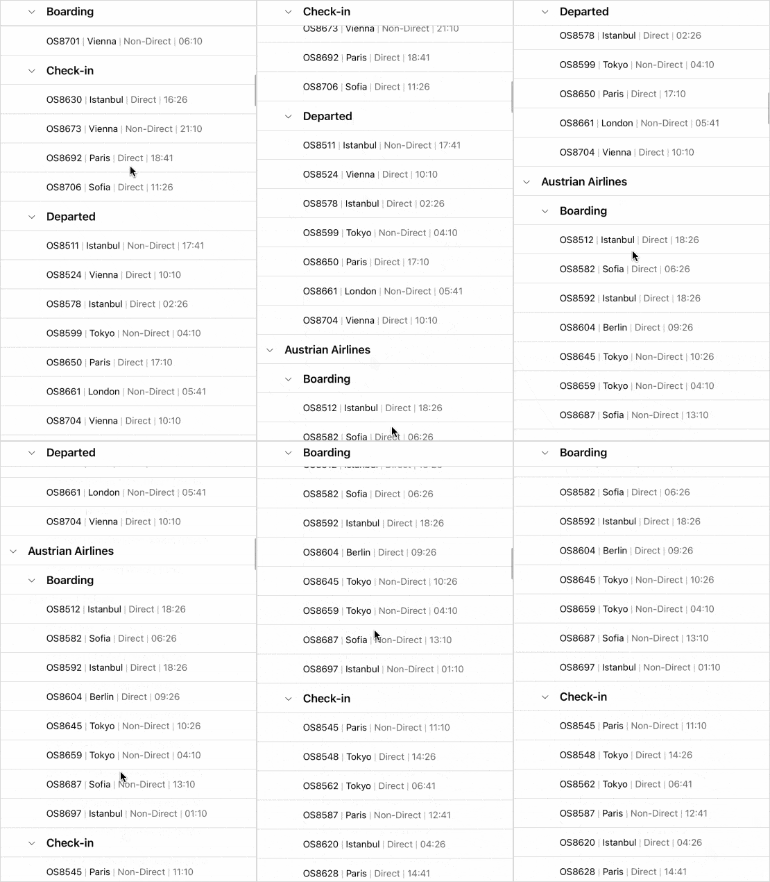
Improve mobile usability with sticky group headers that remain visible at the top of the viewport while users scroll through grouped data. This small yet impactful enhancement ensures context is always preserved, making large data sets easier to navigate on smaller screens.
CollectionView Enhancement: Keyboard Support on Desktop
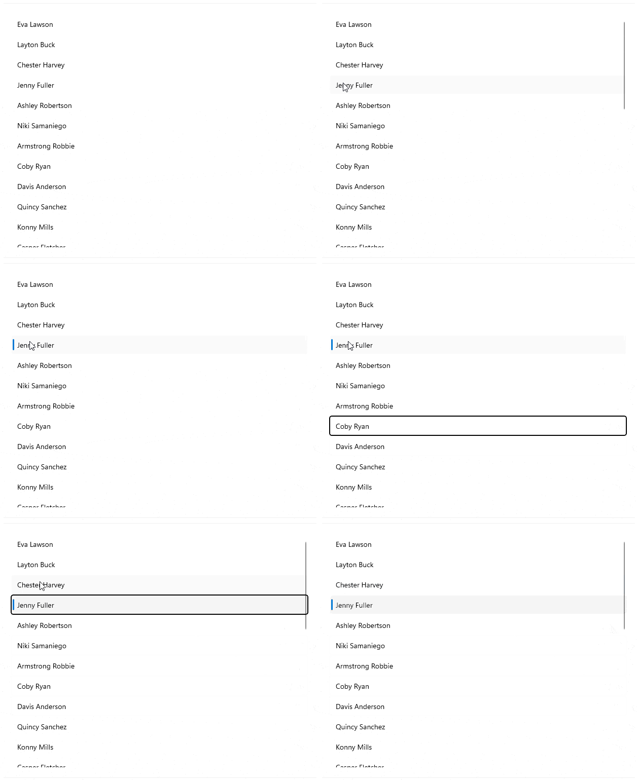
Desktop users can now enjoy a full keyboard navigation experience with the CollectionView component. This update boosts accessibility and usability, allowing for quick navigation, selection, and interaction using standard keyboard shortcuts—perfect for power users and enterprise workflows.
CollectionView Enhancement: Screen Readers' Support
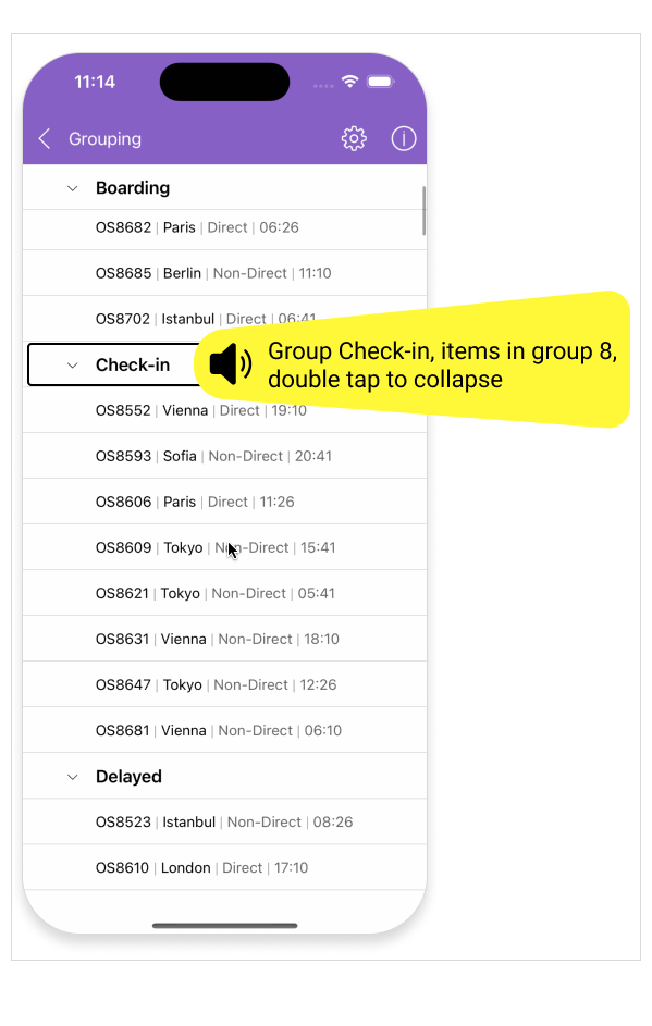
Deliver a more inclusive experience for visually impaired users with added screen reader support for mobile devices. By leveraging accessibility APIs and native platform capabilities, CollectionView can now be seamlessly interpreted by screen readers—ensuring your app is usable by all audiences.
What's New 2025 Q1
DataPager Integration with RadCollectionView
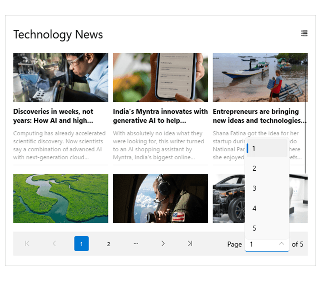
The .NET MAUI DataPager now seamlessly integrates with RadCollectionView, enabling efficient paging for large datasets with minimal performance overhead. This enhancement allows developers to easily manage and navigate paginated data while maintaining smooth scrolling and improved UI responsiveness. With built-in support for page size, navigation controls, and customizable templates, handling large data collections in .NET MAUI apps is now more intuitive and efficient than ever.
Platform Theme with Light and Dark Modes (Preview)
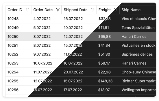
In addition to the built-in Telerik theme, which controls the visual appearance of components—including colors, borders, backgrounds, and typography—Telerik UI for .NET MAUI now introduces a Platform theme with light and dark mode variants. This new theme seamlessly adapts to the system’s appearance, ensuring a consistent look and feel that matches the native light and dark modes of the device running your MAUI application.
Added Theming to the Project Template
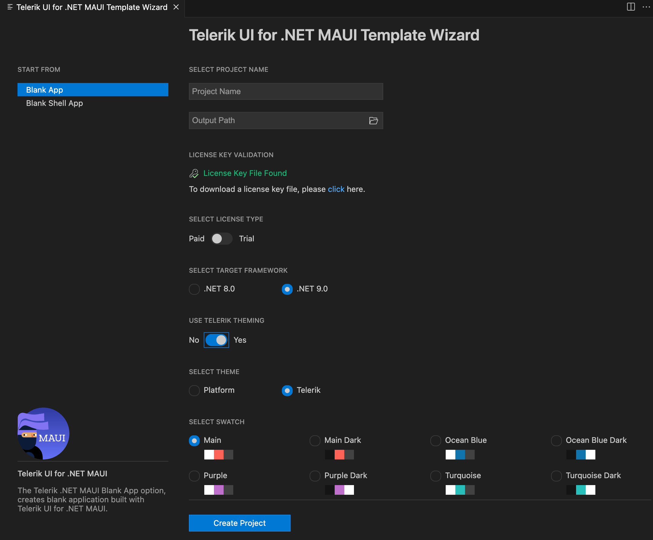
The Q1 2025 release of Telerik UI for MAUI extensions introduces powerful new options to streamline your development workflow. Now, you can select and apply a preview version of the built-in theme directly from the Create New Project Wizard, making it easier than ever to craft beautiful, modern applications — fast.
These professionally designed themes seamlessly control the visual appearance of your UI components, including colors, borders, backgrounds, size, layout, positioning and font sizes. Whether you're building for mobile, tablet, or desktop, your app will maintain a polished, cohesive look across all devices.With multiple color variations to choose from, you can effortlessly align your app’s design with your brand. Focus on functionality while Telerik UI for MAUI perfects the aesthetics, ensuring a stunning and consistent user experience.
Telerik UI for .NET MAUI - 2025 Q2
- What's New 2025 Q2
- Theming Official
- Brand-new TreeDataGrid Component in Telerik UI for .NET MAUI
- DataGrid Enhancement: Support for Aligning the Aggregates in Group Header
- DataGrid Enhancement: New Row Background Style Selector
- CollectionView Enhancement: Sticky Group Headers
- CollectionView Enhancement: Keyboard Support on Desktop
- CollectionView Enhancement: Screen Readers' Support
- What's New 2025 Q1
- DataPager Integration with RadCollectionView
- Platform Theme with Light and Dark Modes (Preview)
- Added Theming to the Project Template
New features & Roadmap
Have a feature request?
Post your feedback via the Feedback Portal or the Public forums
What's new across all Telerik products?

Get the Bits
Download Free TrialSee Telerik UI for .NET MAUI in action and check out how much it can do out-of-the-box.


