Kendo UI for Vue
What's New R2 2023
What's New HistoryDesign System Documentation Site Launch
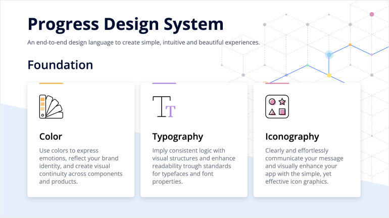
One of the key release items in R2 2023 is the launch of a dedicated design system documentation site. It offers a wide range of resources, design assets and frontend documentation specifically tailored for the Telerik and Kendo UI libraries.
With this initial release, we have included related design and frontend documentation for nearly 20 of the most crucial components.
Our ongoing dedication is to expand this site further, aiming to provide you with all the necessary tools to craft seamless and visually captivating digital experiences and design systems utilizing the power of the Telerik and Kendo UI component libraries.

Vue DateTimePicker Components: New Events
With the new Open/Closed events in the DatePicker, DateTimePicker, TimePicker and DateRangePicker components, you now have even greater control over user interactions and can create dynamic and user-friendly date and time pickers in your Vue applications. The new events empower you to customize the behavior of the picker to meet your specific needs. Now you can effortlessly implement complex logic, perform API calls, update UI elements or trigger other related events when the picker opens or closes.
New Components: Vue GridLayout and StackLayout
The Kendo UI for Vue is now enriched with two new layout components that simplify the process of organizing and aligning elements within web applications: GridLayout and StackLayout. Whether you need to tackle the precise positioning of components on a grid or the alignment of elements in a stack, the Vue GridLayout and StackLayout components enable you to easily create visually appealing and responsive layouts.
See the Vue GridLayout demo
See the Vue StackLayout demo

Vue AutoComplete: Popup Selection Event
The Vue AutoComplete now includes a new Popup Selection event, which is triggered when a user selects an item from the dropdown menu. With this event, you have the ability to respond to the user's selection and perform any necessary actions, such as updating other UI elements, making API calls or handling data manipulation.
Migration from Font to SVG Icons
With the R2 2023 release, the default icon type in the Kendo UI for Vue components and Kendo UI themes is changed from Font to SVG. By eliminating the font icon inline scripts present in the themes, we have managed to reduce the security risk and improve the overall CSP compliance.
New Component: Vue MultiSelectTree
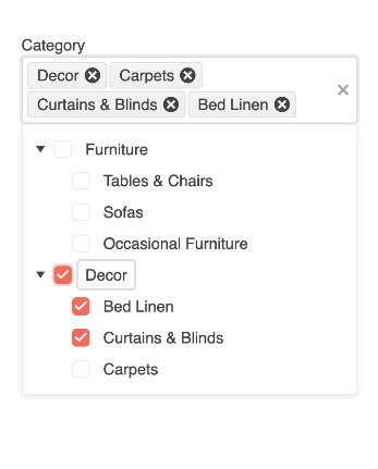
The new Vue MultiSelectTree component helps you to enable users to select one or more items from a hierarchical list of data. The component automatically organizes your data in a tree format and displays it in a dropdown enabling users to easily access and select items.
See the Vue MultiSelectTree demo

Visual Studio Code Scaffolders
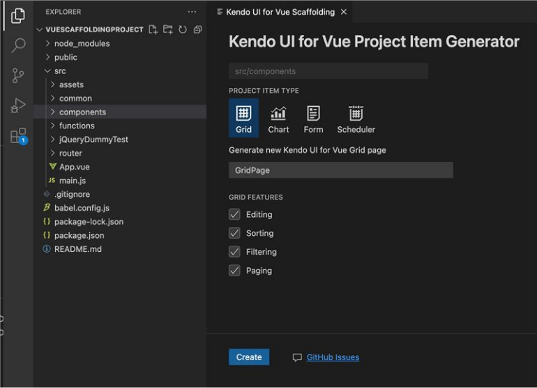
The Kendo UI Productivity Tools have been enhanced with a scaffolding option for the Kendo UI for Vue components. With the scaffolding feature, you can effortlessly create new pages in your Vue.js applications with the most used data-bound Kendo UI for Vue components, including the Data Grid, Scheduler, Chart and Form components. When adding a new project item, the scaffolder will guide you to input the service and model names and also provide the flexibility to configure various component-specific properties.

New Component: Vue DropDownTree
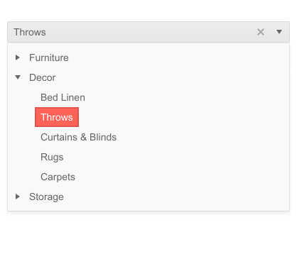
The new DropDownTree component enables you to easily visualize hierarchical data in a tree-like structure.
The key features include:
Filtering - enable users to easily find the desired items in a large dataset with the built-in filtering functionality.
Custom rendering - customize the rendering of the drop-down tree elements.
Forms support - use the components with HTML form elements or with the Kendo UI for Vue Form component.
Keyboard navigation - easily deliver seamless keyboard navigation support, enabling users to interact with the tree using familiar keyboard shortcuts.
Accessibility - built-in accessibility for screen readers and supports WAI-ARIA attributes.

Vue DateRangePicker: Events
The Vue DateRangePicker component now supports a variety of events, allowing you to modify the component behavior based on your needs.
See the Vue DateRangePicker Events demo
Vue DropDown Components: Grouping
The Vue DropDown components (incl. AutoComplete, ComboBox, MultiSelect and DropDownList) now provide the possibility to group similar data items in logical categories to help users easily navigate through the drop-down list.
See the Vue AutoComplete Grouping demo as an example

Kendo UI for Vue - R2 2023
- Design System Documentation Site Launch
- Vue DateTimePicker Components: New Events
- New Components: Vue GridLayout and StackLayout
- Vue AutoComplete: Popup Selection Event
- Migration from Font to SVG Icons
- New Component: Vue MultiSelectTree
- Visual Studio Code Scaffolders
- New Component: Vue DropDownTree
- Vue DateRangePicker: Events
- Vue DropDown Components: Grouping


